Discover Overlooked Dimensions In Your Images With Color Analysis
To better see color within an image it can help to abstract it. By de-emphasizing an image’s representational qualities you can more easily direct your attention to the color relationships within it. In short, you can see them better because you’re not distracted by other concerns.
Using Photoshop, there are many ways to modify an image in order to better reveal it’s color structure.

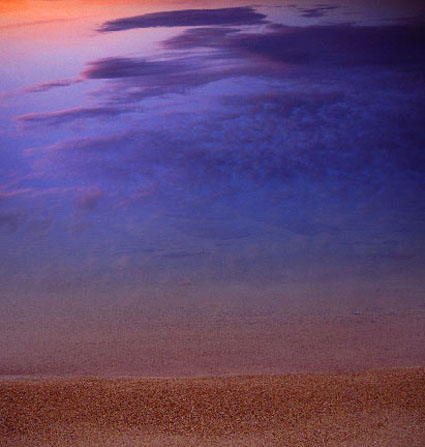
You can blur an image. Blurring an image reduces detail so that you can more easily see the basic composition and the color relationships within it, without getting hung up on the details. (Duplicate the background layer and apply the filter Gaussian Blur.)

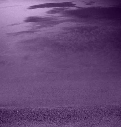
Blur an image substantially and you can reduce an image to a field of color. Compositional elements are significantly downplayed, leaving pure color. (Duplicate the background layer and apply the filter Gaussian Blur with a stronger setting.)
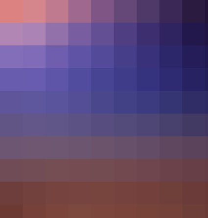
Pixellate an image and you can reduce an image to blocks of color. Composition is eliminated while contrast between colors is more pronounced than in a flat field of color. (Try Filter: Pixellate: Mosaic. This works best for lower resolution files or copies of files.)

Average an image and you can reduce all the colors in an image to one. (Duplicate the Background Layer and apply the filter Average – found under Blur.) This often confirms the dominant color in a composition. Well balanced color photographs containing a variety of hues tend to average towards gray.)
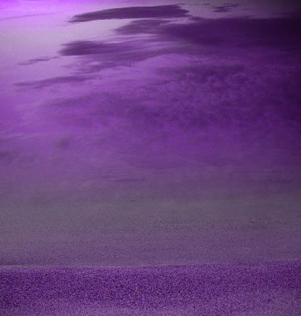
While accents and other important colors can also be used, the dominant color is an excellent choice to further analyze color relationships in an image using Blend Modes. With this technique you can see the variety found in the separate components of color within an image – Luminosity, Saturation, Color, and Hue. (Change the Blend Mode of the averaged layer to the desired color component.)
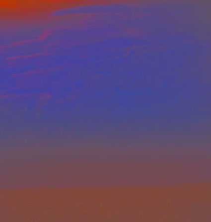
With a Blend Mode of Hue, all values in an image will be driven to the same hue. This will help you see variety in luminosity and saturation more clearly.
With a Blend Mode of Saturation, all values in an image will be driven to the same saturation. This will help you see variety in luminosity and hue more clearly.
With a Blend Mode of Color, all values in an image will be driven to the same hue and saturation. This will help you see variety in luminosity (the tonal structure) more clearly. (This variant is often the most useful as it is the easiest to interpret. With repeated analysis of many different images, you’re likely to note that images with less variety in hue and saturation (particularly neutral ones) will require more luminosity contrast to have an impact. By the same token, images with a great deal of variety in hue and saturation will often appear overly harsh with excessive contrast.)
With a Blend Mode of Luminosity, all values in an image will be driven to the same luminosity. You’ll eliminate contrasts in value which will help you see variety in hue and saturation more clearly.
This type of analysis will better reveal the color relationships at work within an image. You can use the information you’ve gathered by analyzing color relationships in an image not only to better understand it but also to make predictions about how you might improve them.
Increasing contrast in one or more of the elements of color (hue, saturation, luminosity) will increase separation in a composition; conversely, decreasing contrast will create greater unity.
Typically, well-structured images use a large amount of contrast in one color component, a medium amount of contrast in a second component, and a small amount of contrast in a third component.
Learn more in my digital printing and digital photography workshops.
Learn more with my DVDs on Color here.
Learn more with my free color resources here.
No Comments