The Temperature of Color – Warm or Cool
An essential quality of color is temperature. Temperature can be used to attain a color balance. Temperature can be used to enhance spatial relationships within an image. Temperature can be used to elicit psychological responses within the viewer. Understanding and exploring the dynamics of temperature in color can benefit any visual artist.
There are physical characteristics of color linked to temperature. The color temperature of light (Kelvin degrees) is determined by measuring a black body radiator (an object heated so that it emits light). As the physical temperature of the object rises, color transitions from red (long wavelengths – low energy) to blue (short wavelengths – high energy) through ROYGBIV (red, orange, yellow, green, blue, indigo, violet). When it comes to light sources, physically, blue is warmer than red.
There are also psychological qualities of color linked to temperature. Psychologically, blue is cooler than red. These associative qualities of color with regard to temperature are almost universally accepted. This is due in large part to our physical environment – water is blue, plants are green, sunshine is yellow, fire is red.
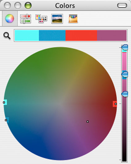
Using the qualities of one sense (touch) to describe the qualities of another (sight) can be a tenuous affair and may lead to ambiguity and confusion. The more precise a language is the more useful it is. The language of HSL (hue, saturation, luminosity) is a very precise language. When using the language of HSL, hue values mark a position measured in degrees on a color wheel. A circle has 360 degrees, so the scale is 0 – 359.
While every degree represents a new hue, you can use broader terms to describe a color family; red, orange, yellow, etc. Think of the color wheel as a clock where every hour marks a new color family.
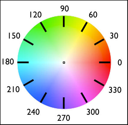
0 red
30 orange
60 yellow
90 yellow green
120 green
150 blue green
180 cyan
210 green blue
240 blue
270 purple
300 magenta
330 blue red
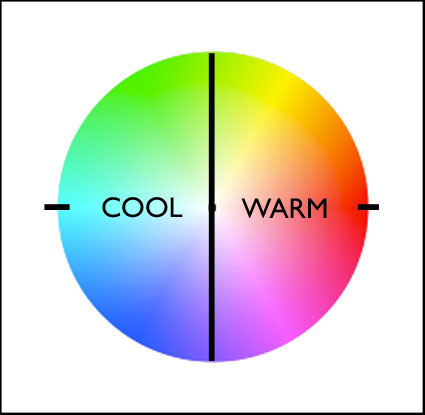
Absolutely warm and cool colors can be found at 0 (red – no warmer color) and 180 (cyan – no cooler color) degrees. Determining whether one color is warmer or cooler than another can be measured by their proximities to these poles. A line between 90 (green yellow) and 270 degrees can be used to broadly demarcate warm colors from cool colors; colors on the right (towards red) are warm while colors on the left (towards cyan) are cool. The association of yellow with the sun, a warm light source, subtly skews the associative quality of warmth towards yellow (60) and away from blue; as a result, colors above the line between 0 and 180 tend to seem warmer than colors below it. (i.e. while both are equally distant from red (0), orange (30) seems warmer than blue red (330).) While one color can be seen as warmer or cooler than another color, each color also has warm and cool components; there are warm yellows and cool yellows, warm blues and cool blues, etc. (Where numerical classifications of colors define hues very specifically (1 degree per hue, 30 degree spread per linguistic color), linguistic specifications of colors (red, orange, yellow, etc) define broad ranges of hues.) Defining the warm and cool endpoints of any linguistic color is useful at a coarse level of granularity but becomes increasingly subjective at a fine degree of granularity. At what point does blue become purple? At what point does blue become green?
It’s possible to describe the adjustment of hue simply in terms of warming and cooling.
Photographic color adjustment strategies rely on adjusting a balance in each of three complements.
Red – Cyan
Green – Magenta
Blue – Yellow
Each set of complements has a warm and cool dynamic.
R (warm) – C (cool)
G (cool) – M (warm)
B (cool) – Y (warm)
Most hue adjustment tools, like Photoshop’s Color Balance, have these complements built into their interface. You can’t increase one hue without decreasing it’s complement.
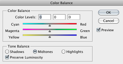
These three complementary axes have different warm/cool dynamics with respect to the color primaries – RGB.
red (warm red) – cyan (cool blue) warm/cool
green (cool green) – magenta (cool red) cool/cool
blue (warm blue) – yellow (warm green) warm/warm
You can analyze the color temperature dynamics at work in any image by sampling it and graphing it. Doing this will not only help you understand how it works, but also how you might improve it.
(See Graphing Color for more on this.)
You can make a field of color appear more dynamic, complex, and three-dimensional by preserving or introducing a variety of warm and cool components in it.
The temperature of color carries spatial associations with it. Warm colors tend to appear to be nearer than cool colors. Again this is universal. It can be overturned by many factors; some factors are related to color, such saturated colors appear nearer than desaturated colors or a progression from light to dark may be the primary element that establishes spatial hierarchy; some factors are not related to color, for instance placement and overlap in composition may be primary spatially, overriding color relationships.
Color balance, spatial proximity, association – these are just three of the uses of warm and cool color dynamics in images. Whether you are adjusting preexisting color relationships or creating new ones, having thoroughly explored the warm and cool dynamics of hue, you can apply that knowledge towards the realization and enhancement of your images.
Exercise
Try this. Define and select the warm and cool endpoints of each linguistic color (ROYGBIV).
At what point does blue become purple? At what point does blue become green?
Because it’s difficult to separate other forms of image content from color, color exercises are best performed abstractly. While it’s useful to check numerical values for colors and color relationships, because these exercises are perceptual (often incorporating physiological and psychological responses that are not physically measurable), determine your answers visually. Train and trust your eye.
Read more Color Theory.
Learn more in my digital photography and digital printing workshops.



Mark M
27.05.2011 at 16:27Interesting post.
A curious thing about color temperature of a black body is that it doesn’t really go through ROYGBIV. You won’t find green or magenta. If you look carefully at the plankian locus plotted on a chromaticity diagram, you’ll see that it threads the needle very carefully on it’s path from red to blue. It doesn’t really go around the hue wheel.
Also, what you are calling ‘linguistic color’ is a pretty well-studied subject within color and category theory normally under the heading ‘basic color terms’ following the work of Brent Berlin and Paul Kay. The interesting thing about basic color terms is that they are not universal. Different cultures break the hue wheel up into different numbers of basic color terms. (more here if you’re interested: http://www.photo-mark.com/notes/2010/jan/22/some-notes-color/ )
johnpaulcaponigro
27.05.2011 at 18:18Both interesting points Mark!
I’ve ordered the book you recommend.
I find the optical wheel above very useful for mapping color relationships theoretically making color choices.
I do wish Apple had put red (0) at 12 o’clock and proceeded clockwise instead of counterclockwise.
jahartford
28.05.2011 at 12:56Hey JP! thanks for this post. it’s helping me with the mapping of colors in my new work from JT and DV so they can be much more cohesive and not seem as random in color choice. Guess it’s time to take another go through your color strategies dvd… 🙂
Bader Alromihi
23.12.2018 at 10:27Great Article, you unscrambled the puzzle beyond cool and warm colors with practical examples from Adobe Color Wheel, thanks.
John Paul Caponigro
23.12.2018 at 12:40You’re welcome! I’m glad you found this article useful.