Softproofing

As a rule, always softproof an image to determine a rendering intent and make printer/substrate specific adjustments to a image file before printing it.
You can get Photoshop to display an image the way it will appear when it’s printed, before you print it, by softproofing an image. If you softproof before you print, you’ll get your best first proof or maybe even a finished print. Not to be confused with a hard proof or physically printed piece, a softproof uses an ICC profile to create an onscreen simulation of an image as it will appear when printed.
Wait. Haven’t you already done this by calibrating and characterizing your monitor with a colorimeter, choosing an editing space along with color management policies in Photoshop, and specifying the right profile for a printer/paper combination with your printer driver? Almost. Doing these things ensures that all of the different color behaviors of the devices you’re using are accurately described and that color conversions are handled precisely, but it doesn’t ensure that you will see exactly how an image will look when printed. Without softproofing, you see how an image looks on a monitor. To see an image on a monitor with the appearance of how it will look when printed, before you print it, you need to take the final step of softproofing the image. This simulation won’t change your file, just it’s appearance. Once softproofed, if you choose to, you can make output specific adjustments to your file before printing to get a better first print.
How To Softproof
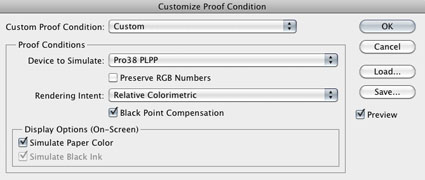
To softproof an image go to View: Proof Set Up: Custom and choose the ICC profile that describes a particular substrate on a particular printer. Photoshop uses the selected ICC profile to simulate the appearance of the final print.
It is essential that you specify the correct ICC profile and that the profile be accurate. The default profile for Proof Set Up characterizes a standard web offset press. If you’re printing to another device, to get an accurate preview, you need to specify a profile that accurately describes its behavior. The softproof is only as good as the profile used. A bad printer profile will give you a bad softproof and a bad print. If you find a profile doesn’t make a good softproof or print, use a better printer profile.
Choose A Rendering Intent
Always softproof an image before printing so that you can choose a rendering intent. Your choice of rendering intent will have a significant impact on print quality. Rendering intents are methods of gamut compression, or how out-of-gamut values are treated relative to in-gamut values. Your choice of four rendering intents can be simplified to two. Forget about Saturation, which is useful for bold graphics but causes color distortions in continuous tone images. Forget about Absolute Colorimetric, which is useful for cross-rendering or simulating the behavior of another device, like making a proof of an offset press – it won’t deliver the best quality a printer is capable of. Use Perceptual to maintain saturation, very often the side effect is that the image is lightened somewhat. Use Relative Colorimetric to maintain tonal relationships, very often some saturation is sacrificed. This is one case where exceptions prove the rule. Always compare these two rendering intents when you softproof. Pick the rendering intent that gives you the view you like the most.
Simulate Ink Black and Paper White
Checking the Simulate Paper White and Ink Black options is advisable. Because a monitor is capable of displaying a brighter white and a darker black than a print, one dulls the whites (Simulate Paper White) and the other dulls the blacks (Ink Black). Activating these features will not make the image look better but it will make the preview more accurately match the print. In my opinion, the preview generated using these features is aggressive, it moves the image in the right direction but it often takes it a little too far. So, I use these options to frame reasonable expectations but I don’t rely on them when making corrections to a file.
Check Black Point Compensation
Use Black Point Compensation. If you don’t, detail in shadows may be clipped and lose separation.
Viewing Light Temperature
The light you view your prints under is important. Printer profiles are generated for specific light temperatures. Typically profiles are generated for viewing under a light temperature of 5000K. The softproof will not be as accurate as it can be if you view the print under another light temperature. If you want to make prints for other light temperatures, such as warmer lights like halogen or tungsten, use a profile optimized for those light temperatures. Alternately, use a 5000K profile, but expect the print to appear warmer than anticipated when viewed under a warmer light. You can make appropriate compensations to your image by color adjusting your file to a slightly cooler color (cyan/blue).
Compare Two Views At Once
It’s helpful to see a file both before and after it has been softproofed simultaneously. To do this, look at two versions of the same file simultaneously. First, softproof the file. Second, duplicate the file (Image: Duplicate); the duplicate will not be softproofed. Comparing the two versions will help you see how your image will change when printed and how to compensate for these changes with additional output-specific adjustments.

Make Output Specific Adjustments
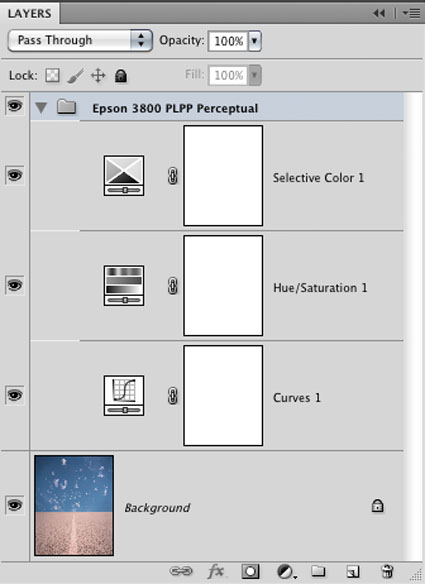
Softproofing does not change the file, it simply previews how the appearance of an image will change when printed. Once you see how an image will change when printed, you may decide to adjust the file to compensate for those changes, before printing. You can make a printer/paper specific set of corrections, while a file is being softproofed. Start by making a new Group with the printer/paper combination included in the title. Then create a set of adjustment layers to make the softproofed image match the unsoftproofed image as closely as possible. Typically, midtone contrast is added with Curves (to compensate for dynamic range compression) and Hue/Saturation is used to boost the saturation of in-gamut colors (to compensate for gamut compression). Use these corrections for printing to that specific output condition (printer/ink/paper/profile) only. Turn the layer set off for all other uses of the image.

Pick Your Battles
Pick your battles. Out-of-gamut means unprintable.
Don’t try to get a blacker black or a whiter white by further adjusting your file’s black points and white points. If an image’s black points and white points were already set precisely, all you’ll succeed in doing is clipping detail. Instead, accept the limitations of ink on paper and compensate with midtone contrast. Alternately, use a paper that can generate a blacker black, for instance switch from a matte to a glossy surface.
If an image contains out-of-gamut color that is too saturated for a device to print don’t try to increase the saturation of the image to make them more saturated. You’ll run the risk of oversaturating in-gamut or printable colors. Instead, accept those limitations and target increases in saturation to in-gamut colors only; they too may be affected by gamut compression and you can take steps to prevent this. You can see which colors are out-of-gamut by dramatically increasing saturation while an image is being softproofed; the colors that change are in-gamut while the colors that don’t change are out-of-gamut.
Ignore Photoshop’s Gamut Warning. It often doesn’t indicate what’s out of gamut accurately, often it’s far too conservative, and it can’t show you where the in-gamut colors that are affected are.
Mindful of these limitations, use any means at your disposal to make the softproofed image match the unsoftproofed image as closely as possible.
It’s inevitable that an image will undergo changes when printed; sometimes a little and sometimes a lot. Always softproof an image before you print so that you can frame reasonable expectations, determine a rendering intent, identify how an image will be affected by gamut-compression, and make corresponding output-specific adjustments.
How accurate can a softproof be? Extremely accurate. Glass transmitting light will always look different than paper absorbing light. However, you can get one to closely simulate the appearance of the other. Softproofing will save you time, materials, and money. Softproofing will help you get better prints.
Read more on Color Management here.
Learn more in my digital photography and digital printing workshops.


No Comments