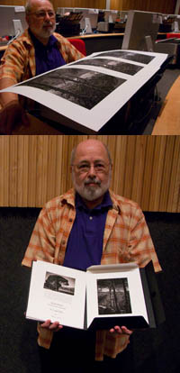
Jay Strojnowksi – Testing Substrates


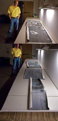
Jay took a risk. He brought in large scale photographs printed on canvas for review. They were different. This triggered a long dialog on mixed media and installations. Now he’s no longer thinking in conventional terms about making prints. In 30 minutes we listed dozens of ideas for expanding the possibilities of printmaking and presentation; multiple media – silk, mylar, metal, transfers; multiple picture languages – photographs, blueprints, text, code; and multiple installations – hung on walls, becoming the walls, drapes, projections. This is one of the things that’s so stimulating about teaching. It’s inspiring to see diverse perspectives. And it’s a privilege to be able to help others realize their visions. I highly recommend you take time to explore your options. Think of the possibilities! You might surprise yourself … and us!
How many ways can you think of enhancing your images with media? Make a list. Then rank the list and try the most promising options.
These are the kinds of dialogs Mac Holbert and I have every day with participants in our the Fine Art of Digital Printing workshop during our extensive One on One and Review sessions. This week we’re at the Hallmark Institute of Photography.
Check out Jay’s website here.
Find out about the Hallmark Institute of Photography here.
Find out more about The Fine Art of Digital Printing workshop here.
Find out about my The Fine Digital Printing workshop series here.

Cemal Ekin – Crafting a Signature Style


Cemal was fairly confident that he wanted an alternative process look so he printed a key image for a series of black and white images on Epson matte papers – UltraSmooth, Velvet, and Watercolor paper.  He like the rich black of the Velvet surface. Then Cemal made two unexpected moves that gave what at first seemed like an antique treatment a very contemporary edge. He “crunched” his shadows running the contrast high, heavily darkened regional areas, and he used heavy sharpening (both Unsharp Mask and High Pass), making them look like photographs drifting towards etchings. He confirmed that this was indeed the most compelling treatment for his images by printing renditions with more shadow detail and less sharpening. Some experiments succeed, some fail. You need to risk failure. In fact, failures aren’t failures if you learn from them – they bring confirmation and direction. This kind of experimentation is necessary to create more distinctive and expressive prints. The key is to do focused experiments that are most likely to give useful or relevant information.
What kinds of focused experiments would help you most? List a few now!
Cemal brought with him a beautiful portfolio of small prints (printed on Moab Entrada and collected in a companion folio). Comparing them to prints of larger scale revealed yet one more facet of his work.
These are the kinds of dialogs Mac Holbert and I have every day with participants in our the Fine Art of Digital Printing workshop during our extensive One on One and Review sessions. This week we’re at the Hallmark Institute of Photography.
Find out about Cemal Ekins here.
Find out about the Hallmark Institute of Photography here.
Find out more about The Fine Art of Digital Printing workshop here.
Find out about my The Fine Digital Printing workshop series here.

New Blog Roll Added


Looking for good blogs? I’ve added a Blog Roll to my blog. It contains all the blogs I track on a regular basis. Here a few of the blogs in my Blogroll.
Jeff Schewe’s PhotoshopNews always contains first rate insider information on what’s happening in the industry. Scott Kelby’s Photoshop Insider does too – and every Wednesday he invites a guest blogger to appear there. Want more insider information? Check out the Lightroom Journal from the Lightroom development team and senior Photoshop Product Manager John Nack’s blog. Martin Evening’s LightroomNews has shares excellent news and technique. Strobist is a fantastic blog on guerilla lighting techniques. Inside Digital Photo offers excellent audio and video coverage of industry news. Many photographers keep you up to date on their progress with blogs, like Joe McNally, Moose Peterson, Andy Biggs, Sean Kernan and many more.
I’ll be adding more names to the list as I find blogs I really like.
Syl Arena (PixSylated) posted a great blog entry on blogs. First he gives excellent advice on how to find great blogs, track them with RSS feeds, and more. Then, he lists his favorite blogs with quick commentaries on what they’re like, post frequency, and links. We agree about many blogs. Many are also on my list but there are a few other great blogs he’s turned me onto with this post. You’ll find his blog is on my list of favorites and mine’s on his. Check it out this great post on PixSylated here.
What are your favorite blogs? Tells us here. Comment!

2880 vs 2400 – Gamut Comparisons


Today, Mac Holbert and I started teaching The Fine Art of Digital Printing at the Hallmark Institute of Photography in Turners Falls, MA. Epson shipped in new 2880 printers for this special event. Epson’s new 2880 uses UltraChrome K3 with Vivid Magenta. How much does Vivid Magenta expand the gamut? Check out these diagrams – 2D, 3D, and 3D looking at Dmax. The 2400 is in white and the 2880 is in full color. Both are graphing Epson Premium Luster Paper. The graphs indicate warm blues, magentas and greens are where it pays off. Slight increase in Dmax. It’s not a dramatic increase but in specific images (polarized skies and saturated foliage, it can be significant. There are also slight tradeoffs in other areas of the spectrum (wherever the white volume extends beyond the color volume).
Words and pictures can work together to tell a fuller story. These diagrams were made with Chromix’s ColorThink. I use it to graph ICC profiles and compare substrates and to compare inksets. Doing this more clearly illustrates the pros and cons of each.
It’s something I do in all of my color management sessions (like the whirlwind tour of color management participants in the FADP workshop got this morning and the sessions you’ll find on my DVD 6 Simple Steps to Color Management).
Check out my Review of Chromix’s ColorThink used to make these graphs.
Check out Chromix here.
Check out my earlier post on the 2880 here.
Check out the 2880 here.
Check out our workshop the Fine Art of Digital Printing here.
Check out my Fine Digital Print workshop series here.
Check out Hallmark’s post on today’s session.

On Press – Banding


We’ve been finishing the last prints for my annual open studio exhibit where I unveil New Work from 2008 for the first time. We ran into subtle banding in a few prints. So how do we trouble shoot it?
First check the file at 100% screen magnification. If it’s in the file add a touch of noise. If you need to use more noise than you’d like, use Noiseware afterwards.
Second check the printer. Is the data transfer fast enough? (Don’t perform other calculation intensive operations while printing. Close other programs if necessary. Make sure your cable connection isn’t too slow or too long.) Are the heads aligned? Are you sure it’s banding and not nozzle clog? (Nozzle clogs are tiny light lines. Banding is dark lines, often thick with soft edges.) Are you printing at high speed? (Try printing it slower.)
Third, as a last resort, rotate the image 90 degrees and try printing it again. Huh? Right! Many of my files are particularly difficult to print – semi-neutral fields with very smooth gradations. These types of images display incompatibilities with printer drivers and their screening frequencies that just don’t happen in most images. It has to do with screening frequencies. Why does rotation help? I don’t have an explanation for it. But it works.
Hopefully all of this will help you with your prints.
Get information on my Annual Exhibit here.
Check my blog for the most up to date information on the event.
Check out my blog during the event to see video of my new installation events.
Check out my Gallery to see more images.
Check out my Gallery during and after the exhibit to see new images.
Check out my workshops series The Fine Digital Print here.

Exhibit – New Work / Annual Open Studio


You’re invited! My Annual Open Studio Exhibit (in my gallery/studio in Cushing, Maine) of New Work from 2008 is open for one weekend only – August 2-3 from 10 a.m. to 5 p.m. I’ll discuss my work daily at 2 p.m, sign books at 3 p.m, and post content online at 6 p.m. This is the best time to see and purchase new work as introductory prices are available for a limited time only. (Thereafter, private viewings for print purchases will scheduled by appointment only.)
This summer’s event simultaneously presents two galleries of work – one highlighting bold color and the other highlighting drawn forms. These new images are my most painterly to date. Upstairs, bright, bold colors exude a lush sensuality, producing an almost physical sensation while evoking strong emotional responses. These new additions to several of my most popular series simply glow. Downstairs, spaciously atmospheric compositions are filled with subtle iridescent whites, grays, and blacks. New work from the series Refraction reveals an evolution in my recent explorations into incorporating drawn elements with photographs.  If photographs are light drawings, these are also drawings of light. Simultaneously representational and abstract, this daring new work contains a powerful energy that transports the viewer.
During the exhibition, video documenting my recent related explorations with environmental performance art can be seen in the studio and here on this blog.
And don’t forget to see the Two Generations (father and son) exhibit at the Maine Media Workshops.
You can see two exhibits in one day!
Get information on my Annual Exhibit here.
Check my blog for the most up to date information on the event.
Check out my blog during the event to see video of my new installations.
Check out my Gallery to see more images.
Check out my Gallery during and after the exhibit to see new images.
Contact us here for print purchases.

Exhibit – Two Generations at MMW


Father and son exhibit together in a special exhibit – Two Generations (Paul Caponigro and John Paul Caponigro) at the Maine Media Workshops. The exhibit runs from July 26 to August 22. Saturday, July 26 from 4-6 pm is the opening and at 7 pm I’ll present a lecture. The following day we’ll run a special workshop (all proceeds benefit scholarships for aspiring photographers at MMW); with a visit to and demonstration in our personal studios – first in my father’s studio (analog) and then in my studio (digital).
Two Generations was first exhibited in 1995 at the Center for Maine Contemporary Art in Rockport, Maine. Following that, it’s traveled to many museums and galleries including the George Eastman House in Rochester, NY. It’s been several years since its last showing. Now, it’s been updated with new work and it’s coming to Maine Media Workshop’s Union Hall in Rockport, Maine. The prints are drawn from my personal collection. There are over 50 prints (silver gelatin and pigmented ink) representing classic highlights from our careers as master printers.
Our work is at once very similar and very different.
Our processes are entirely different. My father remains one of the premiere masters of 20th century technology while I’ve become one of the leading pioneers in 21st century technology. I work primarily in color, my father works primarily in black and white – though we both work with the other palette on a more limited basis.
On a more soulful note, our work is very similar. We both share intense interests in nature and spirituality. Our primary impulses are essentially mystical and poetic. Our themes and our stances towards nature and art are closely allied.
This show is actually somewhat nostalgic for me. At the age of 19, I had my very first group exhibit at The Workshops with my father, George Tice, and Eliot Porter.
Want to hear what happens when father and son share scotch?
Read our father son conversation here (first published in View Camera magazine in 1995).
Check my Calendar for other upcoming events.
Sign up for Insights to receive alerts on special opportunities like this and others coming soon.

I Use – Bogen 3265 Grip Action Ball Head


This is one of the accessories that make using a tripod easier, more fun and more intuitive. This grip is so fluid it doesn’t get in my way. I can move more freely. That means I make images more freely. That means I make more images. That means I make more interesting pictures. That means I make better pictures. The best tripod head may not be the sturdiest, it may be the most fluid. Strike the balance you’re most comfortable with.
There are sturdier heads. If you need super-stability (perhaps you have a very heavy camera or use super long lenses) this may not be the head for you. But it’s plenty steady for me (even with my Canon 1DSMKIII and 100-400 IS zoom).
Check out this product and many others I use in my AStore here.
Check out my PDF Reviews here.
Check out my field workshops here.
Get a 20% discount on my Iceland (8/18-22) workshop here – expires 8/10.
Get a 15% discount on my Fall Foliage (10/17-20) workshop here – until 8/17.
The first 5 Insights Members get $1000 off South America (2/2-14/09), thereafter $250.

I Use – Bogen Carbon Tripods


One of the keys to using a tripod is making it easy to use. This tripod is light and sturdy. That means I carry it with me – even on long walks. I lash it to my backpack or if I’m walking without my backpack I use a camera strap to sling it over my shoulder. It’s all well and good to say “I will use my tripod more!” But it’s like a diet or an exercise routine. You have to make it easy and fun to actually stick with it for the long haul. Get a tripod you like, not what you should like. And use it!
As an aside, many people use tripods to slow down and make more considered images. Try making pictures exclusively without a tripod. Then try making pictures exclusively with a tripod. Compare your experiences. It’s not better or worse, it’s different. Note the differences and what they helped you accomplish and how they affected the way you related to your equipment and subject. Then, next time, choose whether to use a tripod or not to get specific results. It’s a simple thing really. But it makes a big difference!
Check out this product and many others I use in my AStore here.
Check out my PDF Reviews here.
Check out my field workshops here.
Get a 20% discount on my Iceland (8/18-22) workshop here – expires 8/10.
Get a 15% discount on my Fall Foliage (10/17-20) workshop here – until 8/17.
The first 5 Insights Members get $1000 off South America (2/2-14/09), thereafter $250.

I Use – Joby's Gorilla Pod


Gorilla Pod’s. It’s not for your music. It’s for your camera. These little baby’s are adorable! More importantly, they get you thinking about where you can place your tripod in entirely new ways. Put your camera on the floor. Put it on the back of a chair. Put it on the edge of a table. Put it on the top of a door. Put it on a car door, mirror, or bumper. Put it on a beam in the ceiling. Put it on a street sign. Put it on a trash can. You get the idea. It turns where you put your camera into a game. And you get even more creative!
The smallest unit isn’t stable enough – pass on it. All the others are great. While I take extra care when using my Gorilla Pod with my Canon DSLRs (particularly with a long lens), I use my Gorilla Pod without hesitation with my Canon G9 point and shoot – even for video! Video from the ceiling? Yes!
You can see it in use in all of my workshops.
Check out the Gorilla Pod and the other products in my AStore here.
Check out my PDF Reviews here.
Check out my field workshops here.
Get a 20% discount on my Iceland (8/18-22) workshop here – expires 8/10.
Get a 15% discount on my Fall Foliage (10/17-20) workshop here – until 8/17.
The first 5 Insights Members get $1000 off South America (2/2-14/09), thereafter $250.