5 Powerful Ways You Can Use Space In Your Images


Spacey


Spacious


Gracious


Nice Fit


Compact


Packed

Impressionist composer Claude Debussy famously remarked, “Music is the space between the notes.” Space is just as important for images as it is for music.  While the spaces are different in the final products, one is temporal, and the other is physical, space is equally important in both forms of art. As with music, in images, there’s a missing third dimension of space. Because music is usually abstract, it can be freer from the concerns of creating the illusion of depth, something that is essential in representational images. There are many ways to work with space, using tools like color, line, and texture to create distance, scale, and negative space, among other things. There are even many kinds of space and many kinds of spaces. How you treat space in your images speaks volumes. It reveals your deepest concerns and the vision through which they are expressed.

Distance From The Frame

How far you place elements relative to the frame can have a profound impact on a composition. 


Insights Members can login to read the full article.
Email:
or Sign up

7 Tips To Help You Crop Your Photographs Better

A crop can make a good photograph great. There’s an art to cropping that every photographer would be wise to master. Here are seven things to consider.

Align

Horizon tipping? Level it, which will crop edges a little or a lot, depending on how tilted it was. Similarly, it’s best to keep other significant horizontals and verticals parallel to the frame. Perspective correction will distort elements within the frame unequally to do just this and crop edges unequally. (In these situations, plan to crop and shoot a little more than you need.) If, on the other hand, you’re trying to create an imbalanced topsy-turvy effect to add dynamism, tilt them substantially. A lot looks deliberate. A little looks sloppy.

Distraction


Insights Members can login to read the full article.
Email:
or Sign up

4 Alternatives To Cropping Your Photographs – Both Old And New Ways

Original

Edges Darkened

Edges Retouched


So you don’t want to crop your image. What other alternatives could you consider to minimize distractions? Here are four.

Color - LHS

Contrast is an eye-catcher. So, if you don’t want elements to catch the eye, reduce their contrast. There are three types of contrast; luminosity, hue, and saturation. Depending on the situation, you may need to use one, two, or all three. Take your clues from the overall image and the immediate surroundings of the elements you’d like to direct attention away from. Rather than sleight of hand, it’s sleight of eye.

Blur

One of the strongest ways to deflect attention from an element is to blur it. The more you blur it, the less focus it will demand. Blur it enough, and it will disappear into its surrounding field of color. Take care to manage transitions between blurred and sharp areas convincingly (as if the blur happened in camera rather than in post-production); if they aren’t handled well, the blur will stand out as artificial and attract attention rather than reduce it.

Distort


Insights Members can login to read the full article.
Email:
or Sign up

Use A Little Gestalt Psychology To Make Your Compositions Stronger

Motion attracts attention.

Danger attracts more attention.

Including a person in an image does more than show scale; the person becomes the main actor in the scene.

Typically, man-made objects are almost as interesting as the people who make them, sometimes more.

Animals are almost as captivating as people.

Though they demand less attention than animals, plants still demand more attention than minerals. 

Metaphor, especially anthropomorphism, helps establish human interest in animate elements.


You can use psychology’s insights into perception to creatively enhance your compositions. Psychological forces not only divert the flow of the eye through images but also change reactions to image content in specific ways.

While all psychologists agree that perceptions are the products of complex interactions between a variety of stimuli, not all fields of psychology have the same focus and so they offer different insights. One field of psychology offers a particularly rich set of theories for understanding perception – gestalt psychology.


Insights Members can login to read the full article.
Email:
or Sign up

3 Great Books On Composition

Michael Freeman’s The Photographer’s Eye demonstrates how the elements of composition are applied in photographs, which are often so laden with detail that it’s more challenging to see the fundamentals.

Christian Leborg’s Visual Grammar is a quick read that you can look at for a long time. It is very useful to consider visual dynamics abstractly so that they can be applied more universally.

Rudolf Arnheim’s Art and Visual Perception is a classic that discusses how the principles of gestalt psychology apply to composition.

Read more in my Creative Composition resources.

Learn more in my digital photography and digital printing workshops.

4 Reasons To Use Abstraction In Photography Plus 20 Experiments To Try

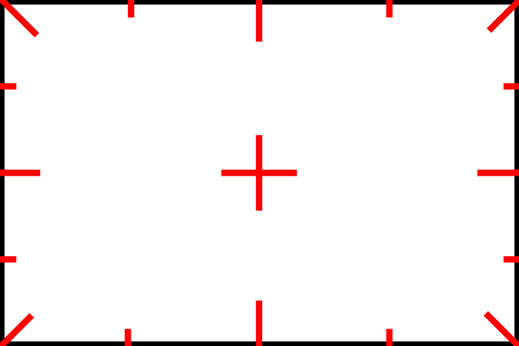
1 Structure Clarified

2 Process Detailed 

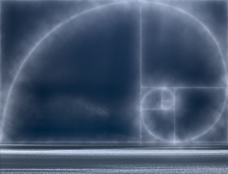
3 Concept Visualized
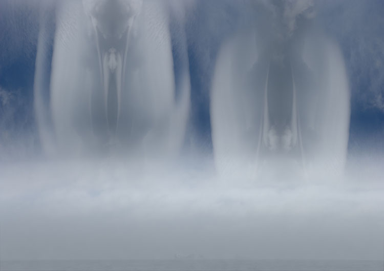
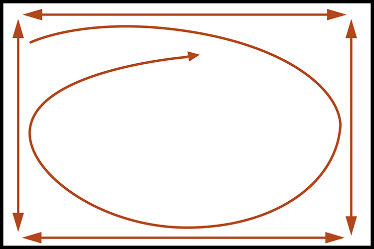
4 Pattern Created

5 Extreme Simplification


Abstraction

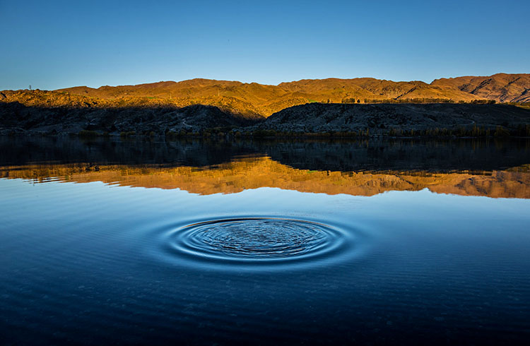
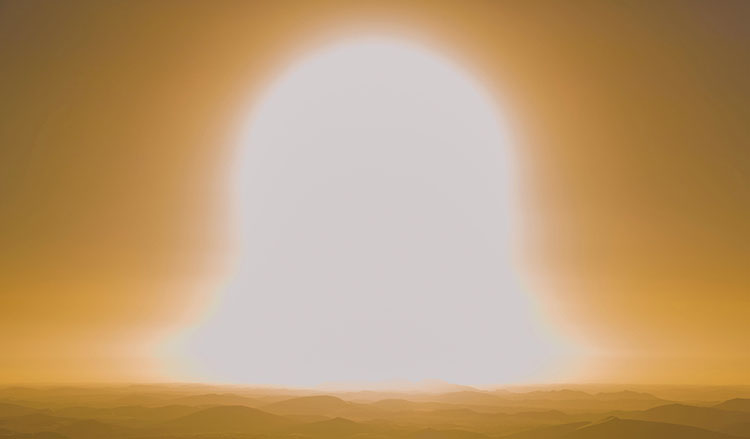
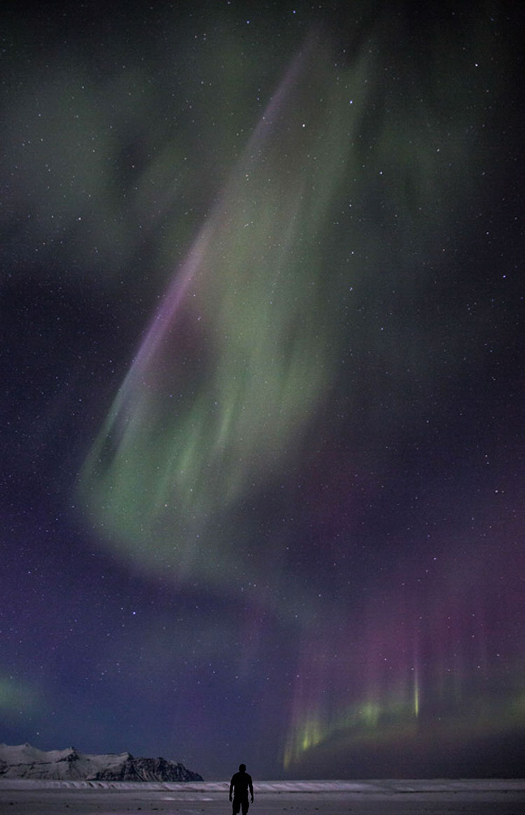
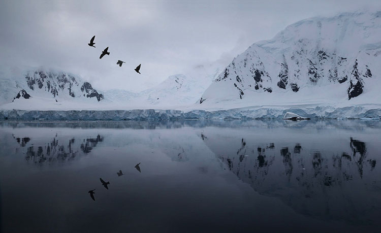
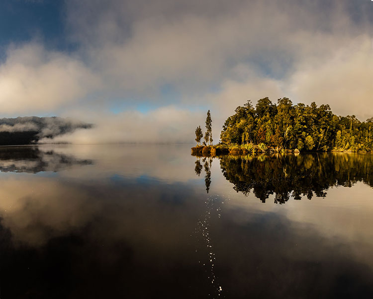
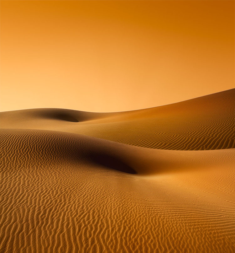
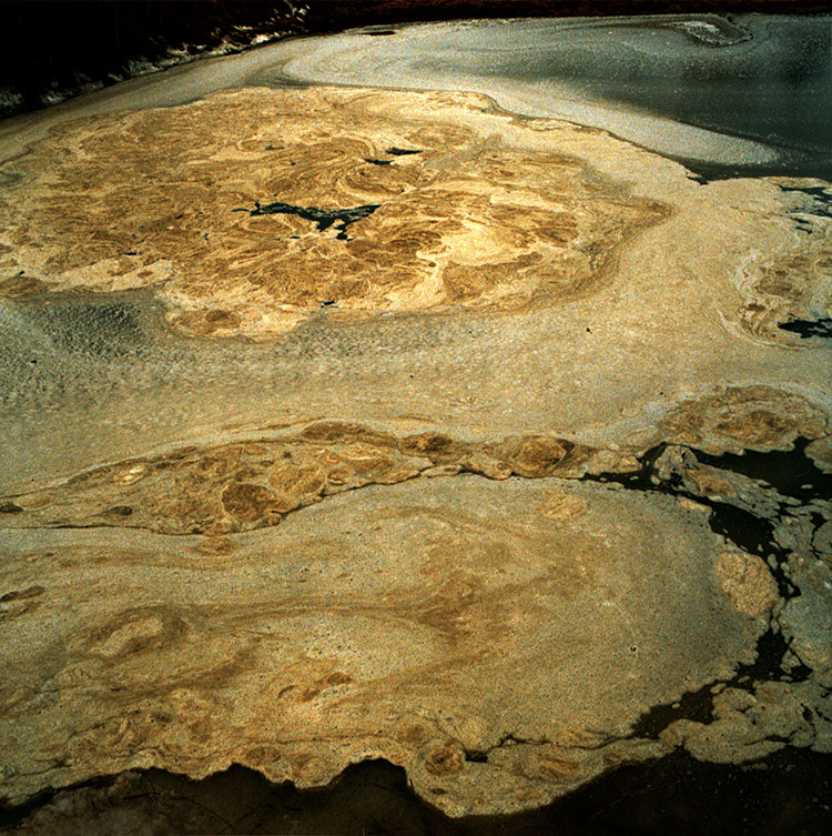
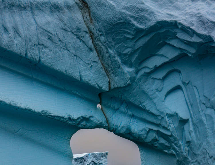
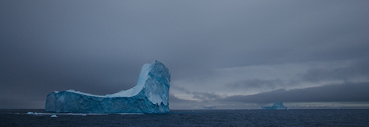
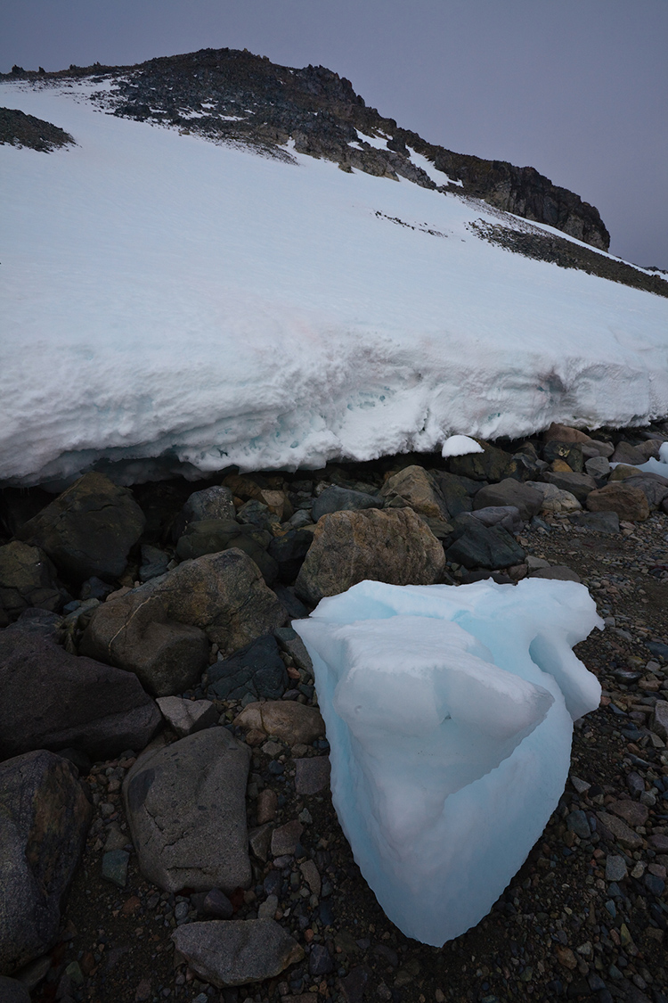
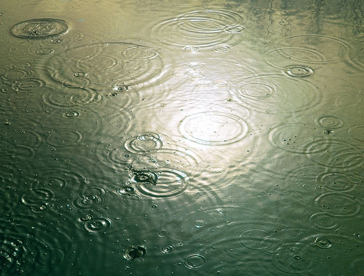
To one degree or another, every photograph is abstract. At a minimum, photographs are flat rather than three-dimensional. Some photographs are more graphic than others. And the origins of a few photographs are virtually unrecognizable. Answering to what degree a photograph is abstract, how it is abstract, and why it’s abstract will help you understand more about it and its creator’s intentions – this might be you.

Definitions

So what does abstract mean? First used in the 14th century the word abstract comes from the Latin abstrahere meaning to draw away (ab = away + trahere = to pull) and was used to mean “withdrawn or separated from materials objects or practical matters.” As a noun abstract means a condensed piece of writing. As an adjective or adverb the meanings of abstract are widely divergent; general, summarized, distilled, not specific, qualitative, disassociated, nonmaterial, theoretical, geometric, formal, non-representational, not applied, unreal, transcendent, abstruse … The list goes on until the meaning of abstract becomes diffuse to the point of being more suggestive than specific. Long used in fields as diverse as religion, philosophy, and science, surprisingly, the word abstract wasn’t widely used in the arts until the early 1900s during the modernist movement, when painters and sculptors departed from realism and even representation, which was in part a reaction to photography.

How Abstract Is It?

When looking at images it’s useful to ask a number of questions. Beginning to answer these questions will tell you a great deal about both individual images and their relationships to other images, even if the answers you arrive at are neither definitive nor complete. Sometimes the toughest questions are the most rewarding. They keep giving and giving, for a long time, perhaps even a lifetime.

Regarding abstraction, try these questions.

 “On a scale of 1-10, how abstract is it?” It may be only a little or it may be a lot.

“What’s abstract about it?” While some images are entirely abstract, in other images only certain aspects may be abstract and this may be partial or complete. What’s done and how it’s done can direct attention in specific ways, describe particular graphic qualities, and display interpretation.

“What kind of abstraction is it?” Though they may all coexist in a single image, conceptual, minimal, and non-representational, are three very different qualities, which often identify intent.

 Intent brings us to the most important and often most difficult question to answer. “What purpose does abstraction serve?” This is essential to answer before asking “Is the means appropriate for the end?” and “How well is it done?”

How long visual attention is sustained depends on whether the stylization has purpose, how well it serves the message, and how well it’s done.

The Many Uses Of Abstraction

Abstraction can serve many functions; it can stimulate, structure, inform, and express.


Insights Members can login to read the full article.
Email:
or Sign up

How To Use An Image’s Frame Effectively & Expressively

The four most important lines of any image are the ones that are often least recognized consciously – the frame. Part of learning to make successful compositions is learning to become more conscious of the frame and how to use the forces it exerts on your images for desired effects. 

Watch The Movement of the Eyes Within the Frame

Whether visible or invisible, every line creates vectors of force that encourage the eyes first to move along it and second to bounce off it. The eyes search the frame in a consistent fashion and these tendencies influence our experiences of all compositions, no matter how diverse. The general tendency is for the eyes to move within the frame from left to right and top to bottom and then to return and repeat this process. The eyes quickly scan the frame itself (determining the limits of what’s included and by extension what’s not) before they scan what’s within the frame. On their first pass, rather than scanning each line of the frame precisely, the eyes quickly average the competing forces of the four vectors in a single sweeping gesture. Afterward, given time for a more careful examination of an image, the eyes may trace and retrace each line of the frame more precisely, until their quest for information is better fulfilled by other paths.

When it comes to motion one must always consider momentum, gravity, and resistance. Some motions, like falling (within the frame think top to bottom and left to right), are easier to get started and harder to stop than others, such as climbing (within the frame think bottom to top and right to left). Once a motion is started it tends to persist until stronger forces modify it. Place one or more barriers in the path of motion and it will shift and sometimes even reverse. Individual compositions work with these tendencies, whether subtly or dramatically, reinforcing, modifying, or working against them.

The motion of the eye within the frame

Powerpoints on and in the frame


Scan the Frame Consciously

Always be conscious of the frame. Scan it. Consciously move your eyes around the entire frame. Anything that touches the frame exerts a stronger influence on a composition. (This is particularly true if it touches a power point, like a corner or the middle of a border.) If information that is not important touches the frame it becomes even more distracting. To make a composition stronger, frame it in a way that only important information touches the frame.

By emphasizing more important elements and deemphasizing less important elements (or eliminating them entirely) you make images stronger. Before exposure, you have an opportunity to make the composition stronger through reframing. After exposure, you have an opportunity to make a composition stronger through cropping (this eliminates other image information that may or may not be significant) and/or retouching (this includes the image information surrounding the flaws).

Use Proximity to the Frame

Frame loose or tight? How you place elements relative to the border of the frame can have a profound impact on any composition. 


Insights Members can login to read the full article.
Email:
or Sign up

Why Defocussing Your Images Will Help You See Them Better

It’s easy to lose sight of the forest for the trees.

We’re capable of seeing a lot of detail. Sometimes detail is distracting. Eliminating it can help us see fundamentals more clearly.

1     Frame an image.
2     Defocus your lens enough to lose sight of details.
3     Refine your composition by moving the camera or zooming.
4     Refocus.
5     Expose.

You can also do this with existing exposures to better see distracting elements that can be made less distracting or removed altogether.

Images that contain well-rendered detail without a solid compositional structure often appear cluttered and confusing. Develop the habit of slowing down and taking the time to make sure your compositions are as strong as they can be.

Find more resources on Composition here.
Learn more in my digital photography workshops.

See What You’re Missing – 2 Ways To Non-Destructive Crops

We’re responsible for everything that’s in the frame. We’re also responsible for everything that’s not in the frame. Deciding what’s in the frame and what’s out is a critical decision that can make or break an image. Framing and cropping are critical. If you miss a key element during framing you’re out of luck. However, if you overcrop you’re not, if you crop non-destructively and you remember to reconsider your crop from time to time. After you crop, you forget what you’re missing. It’s out of sight and out of mind. But it doesn’t have to be.

Lightroom and Photoshop’s crop tools allow you to see the image information you’re missing Here’s how …

In Lightroom, highlight an image and tap R. You’ll see the areas eliminated with a darker overlay. You never lose image information when you use Lightroom. It couldn’t be easier. What’s hard is remembering to do it.

Photoshop also makes almost as easy. First you have to open an image. Then press C (or click on the crop tool). Then click on the Crop tool control handles and you’ll see the missing information, again under a darker overlay. When you use Photoshop, be careful. Unlike in Lightroom, you can eliminate image areas permanently. Here are two ways. One, check the Crop tool’s option Delete Cropped Pixels. Two, flatten the file or merge other layers with the Background layer. You may think this has happened when you first look at a file that has been cropped in Photoshop as when you first click on the crop handles you won’t see the larger canvas but simply drag the right corner of the window out and you’ll see the bigger canvas.

Why would you need to reconsider your crop? To make future improvements as your vision evolves. In the analog darkroom photographers never (almost) cut their negative’s or transparencies. They masked them during printing. This means every time them made new prints they reconsidered their crops. Sometimes, after their seeing matured, they changed their minds – significantly. I’ve witnessed the greats reviewing their top images. One day, Arnold Newman adjusted his crop on his portrait of igor Stravinksy. Another day, my father reconsidered his crop for Running White Deer, making subtle but significant shifts in their final compositions.  Those two images are both dramatically influenced by the way they’re cropped. If the masters do it, you may want to consider doing it too.

Small changes can make big differences. But you won’t think to make them if you don’t see what you’re missing. So make it a habit to reconsider your crops from time to time. It only takes a few moments and if you do, perhaps even your best images will improve.

Read more in my Creative Composition resources.

Learn more in my digital photography and digital printing workshops.

4 Ways To Divide Your Images’ Frames Expressively

Dividing The Frame

The four most important lines of any image are the ones that are often least recognized consciously – the frame.  Second only to these are the lines that divide the frame, creating frames within the frame. Becoming more aware of how the frame can be used and how it can be divided will help you make more successful compositions.

There are many ways the frame can be divided. You can divide the frame horizontally, vertically, or diagonally; in each case the layers included define the virtual space presented. Different areas in an image can be divided differently. You can divide the frame (or a frame within the frame) multiple times; the more times the frame is divided the more packed and dynamic it becomes, progressively growing more design-oriented and finally being reduced to pure texture. Each operation has significant consequences.

One of the most significant results of dividing the frame is the creation of specific proportions. (The combination of the individual aspect ratios of each element creates a new unified aspect ratio.) Much has been made of the ‘rule of thirds’. Dividing the frame into three parts (left/center/right or up/middle/down) is a simple and often useful strategy for making images more directed, by prioritizing one element over another, and dynamic, through imbalance. Too little has been made of other ratios. What of fourths, fifths, sixths, sevenths, or eighths? No musician would be content to only divide an octave into halves and thirds. Every proportion produces particular effects, which are further modified by placement (high/low or left/right) and content. Rather than a rule to be adhered to, proportion is a force to be explored expressively.

When it comes to controlling the division of the frame in your images, you have more options available to you than you might think. You can crop, distort, retouch, or composite.

Before and after cropping

Crop

Cropping, either through placing the frame during exposure or by eliminating framed information during post-processing, which changes the aspect ratio, has been the most traditional way of dividing the frame.

Before and after distortion


Insights Members can login to read the full article.
Email:
or Sign up