The Fine Art of Digital Printing Workshop Returns
You can learn from two master digital print makers at the same time, fresh off their highly successful tour in the Epson Print Academy, in The Fine Art of Digital Printing workshop. It’s the chance of a lifetime.
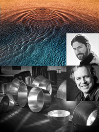
The Fine Art of Digital Printing workshop with John Paul Caponigro and Mac Holbert (supported by Epson) returns in 2009 after four highly successful events. August 31 – September 4 and October 26 – 30 at the Brooks Institute of Photography in Santa Barbara, CA. Space is limited to 24 participants and made available on a first-come-first-serve basis. The event was so popular in 2008 and 2009 it sold out within days.
Visit thefineartofdigitalprinting.com to learn more and to sign up for the workshop or waiting list.
Schedule
Seminar style sessions are run morning, afternoon, and evening with breaks only for lunch and dinner.
Topics covered include …
Color Management
Proofing
Workflow
Raw Conversion
Noise Reduction
Sharpening
Media Choices
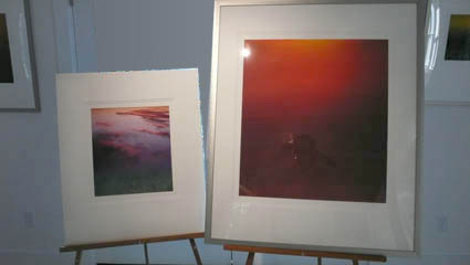
Print Presentation
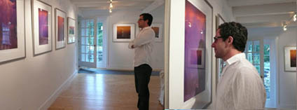
One-On-One Reviews
And much, much more!
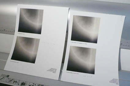
The workshop emphasizes hands on productivity. Late nights are spent in the lab producing work while Mac and JP conduct one-on-one review sessions.
Included with the workshop are John Paul’s workshop DVD (packed with exercises, reading, test files, and actions) and Mac and JPs handouts (a binder compiling the best of their years of relevant writings).
This workshop is right for those who want to master digital printmaking and take their digital imaging skills to the next level. This workshop has a strong photographic perspective but is applicable to all types of artists who want to reproduce their work in digital media. Intermediate skill levels with Photoshop are required. Lightroom is covered but not required.
Check out Mac’s website with free resources here.
Check out Mac’s book here.
Check out Mac’s DVD here.
Check out my conversation with Mac here.
Check out my DVDs here.
Check out my free printing PDFs here.
Check out my other Printing workshops here.
Read More