Ollie Treadway – Simplifying Workflow


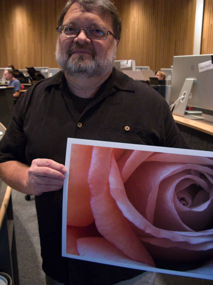
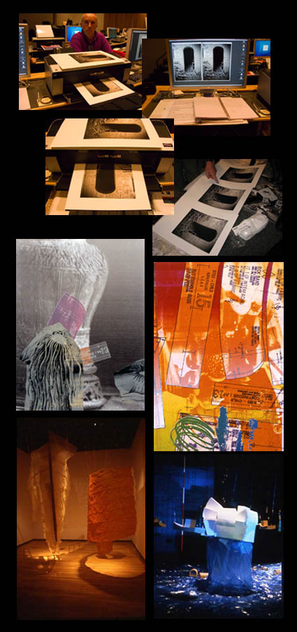
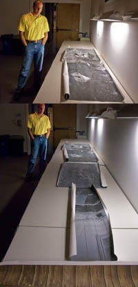
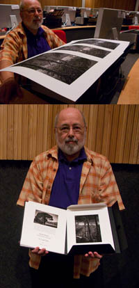
For Ollie it all came together on the final day of our workshop The Fine Art of Digital Printing (this time at the Hallmark Institute for Photography). He was able to untangle his workflow and his file structure and produce better results in less time.
Here are a few core concepts he absorbed. Keep it simple; amid multiple methods that offer equal quality, the simplest way is best. Work globally first, then regionally. Don’t fix problems created during the editing process, fix the adjustments that created the problems. Organize and label your layers.
Now that the technical issues have been answered and simplified, Ollie’s freer to direct his energies in more important areas of his creative growth – finding and developing his own authentic voice.
These are the kinds of dialogs Mac Holbert and I have every day with participants in our the Fine Art of Digital Printing workshop during our extensive One on One and Review sessions.
Look for future workflow sessions from Mac and I at PhotoPlus East and the Epson Print Academy.
Check out my workflow PDFs here.
Check out Ollie’s website here.
Find out about the Hallmark Institute of Photography here.
Find out more about The Fine Art of Digital Printing workshop here.
Find out about my The Fine Digital Print workshop series here.

Marc Siegner – Testing Sharpness


Marc creates multimedia prints and installations. He uses a wide variety of media for their material characteristics. So naturally he’s particularly sensitive to the look and feel of his images. We tested sharpness (low, medium, and high) with one of his images. Then the whole class had the opportunity to see the results side-by-side. Consensus wasn’t instant. Some like it sharp. Some like it soft.
One thing became clear, sharpness influences spatial relationships – especially when applied selectively. Typically, sharper image areas appear closer to the viewer, while softer areas appear further away.
So sharpness not only involves aesthetic choices, it can also be used to control spatial relationships within an image. Texture and contour are essential elements in visual vocabulary that you can use to further your personal expression.
Test it for yourself! On your images! Do it! While you can imagine the results, there’s nothing like experiencing it.
How important is sharpness in your images? Do you like your images sharp or soft? Comment here.
Find out about the Hallmark Institute of Photography here.
Find out more about The Fine Art of Digital Printing workshop here.
Find out about my The Fine Digital Print workshop series here.

Jay Strojnowksi – Testing Substrates


Jay took a risk. He brought in large scale photographs printed on canvas for review. They were different. This triggered a long dialog on mixed media and installations. Now he’s no longer thinking in conventional terms about making prints. In 30 minutes we listed dozens of ideas for expanding the possibilities of printmaking and presentation; multiple media – silk, mylar, metal, transfers; multiple picture languages – photographs, blueprints, text, code; and multiple installations – hung on walls, becoming the walls, drapes, projections. This is one of the things that’s so stimulating about teaching. It’s inspiring to see diverse perspectives. And it’s a privilege to be able to help others realize their visions. I highly recommend you take time to explore your options. Think of the possibilities! You might surprise yourself … and us!
How many ways can you think of enhancing your images with media? Make a list. Then rank the list and try the most promising options.
These are the kinds of dialogs Mac Holbert and I have every day with participants in our the Fine Art of Digital Printing workshop during our extensive One on One and Review sessions. This week we’re at the Hallmark Institute of Photography.
Check out Jay’s website here.
Find out about the Hallmark Institute of Photography here.
Find out more about The Fine Art of Digital Printing workshop here.
Find out about my The Fine Digital Printing workshop series here.

Cemal Ekin – Crafting a Signature Style


Cemal was fairly confident that he wanted an alternative process look so he printed a key image for a series of black and white images on Epson matte papers – UltraSmooth, Velvet, and Watercolor paper.  He like the rich black of the Velvet surface. Then Cemal made two unexpected moves that gave what at first seemed like an antique treatment a very contemporary edge. He “crunched” his shadows running the contrast high, heavily darkened regional areas, and he used heavy sharpening (both Unsharp Mask and High Pass), making them look like photographs drifting towards etchings. He confirmed that this was indeed the most compelling treatment for his images by printing renditions with more shadow detail and less sharpening. Some experiments succeed, some fail. You need to risk failure. In fact, failures aren’t failures if you learn from them – they bring confirmation and direction. This kind of experimentation is necessary to create more distinctive and expressive prints. The key is to do focused experiments that are most likely to give useful or relevant information.
What kinds of focused experiments would help you most? List a few now!
Cemal brought with him a beautiful portfolio of small prints (printed on Moab Entrada and collected in a companion folio). Comparing them to prints of larger scale revealed yet one more facet of his work.
These are the kinds of dialogs Mac Holbert and I have every day with participants in our the Fine Art of Digital Printing workshop during our extensive One on One and Review sessions. This week we’re at the Hallmark Institute of Photography.
Find out about Cemal Ekins here.
Find out about the Hallmark Institute of Photography here.
Find out more about The Fine Art of Digital Printing workshop here.
Find out about my The Fine Digital Printing workshop series here.

2880 vs 2400 – Gamut Comparisons


Today, Mac Holbert and I started teaching The Fine Art of Digital Printing at the Hallmark Institute of Photography in Turners Falls, MA. Epson shipped in new 2880 printers for this special event. Epson’s new 2880 uses UltraChrome K3 with Vivid Magenta. How much does Vivid Magenta expand the gamut? Check out these diagrams – 2D, 3D, and 3D looking at Dmax. The 2400 is in white and the 2880 is in full color. Both are graphing Epson Premium Luster Paper. The graphs indicate warm blues, magentas and greens are where it pays off. Slight increase in Dmax. It’s not a dramatic increase but in specific images (polarized skies and saturated foliage, it can be significant. There are also slight tradeoffs in other areas of the spectrum (wherever the white volume extends beyond the color volume).
Words and pictures can work together to tell a fuller story. These diagrams were made with Chromix’s ColorThink. I use it to graph ICC profiles and compare substrates and to compare inksets. Doing this more clearly illustrates the pros and cons of each.
It’s something I do in all of my color management sessions (like the whirlwind tour of color management participants in the FADP workshop got this morning and the sessions you’ll find on my DVD 6 Simple Steps to Color Management).
Check out my Review of Chromix’s ColorThink used to make these graphs.
Check out Chromix here.
Check out my earlier post on the 2880 here.
Check out the 2880 here.
Check out our workshop the Fine Art of Digital Printing here.
Check out my Fine Digital Print workshop series here.
Check out Hallmark’s post on today’s session.