Color has 3 elements – luminosity, hue, and saturation. All colors can be described as some combination of these three values. While we see all three elements simultaneously in a single color, learning to distinguish these three elements from one another is an important perceptual skill.

Luminosity, the light and dark of color, can be describe on a scale of 0-100. 0 is pure black. 100 is pure white. (It’s the zone system’s 0-10 times 10.)

Hue, the color temperature of color, can be described on a scale of 0-360. (There are 360 degrees in a circle. Every 30 degrees transitions into a new family of color – i.e. 0 is red, 30 is orange, 60 is yellow, etc.)

Saturation, the degree of neutrality of color, can be described on a scale of 0-100. 0 is absolutely neutral. 100 is maximum saturation.
LHS (luminosity, hue, saturation) is an excellent language for describing color perceptually (though not necessarily the best for editing and printing). Instead of memorizing RGB values for all the colors in all the standard color spaces, or CMYK values for all devices, or a Pantone swatchbook, you can simply observe color and translate that into 3 values.
LHS is an easy language to learn. Luminosity and Saturation are described on a 0-100 scale, essentially a 1-10 scale with more granularity. Easy. Learning numerical values for Hue is more challenging, but if you memorize a few values you can easily figure out the others. Think of the color wheel as a clock. 0 degrees, red, starts at 3 o’clock. Count back 1 hour, 2 o’clock, to the next color, orange, or 30 degrees. Keep counting back in 1 hour increments to the next color, (i.e. 1 o’clock or 60 degrees is yellow). (An easy mnemonic for remembering the progression of hues is ROYGBIV – red, orange, yellow, green, blue, indigo, violet. You’ll need twelve words to make it all the way around the clock – red, orange, yellow, warm green, green, cool green, cyan, blue, warm blue, purple, violet, magenta.)
Consider LHS a ‘zone system’ for color. It’s a simple sophisticated language that can be used to describe color with greater clarity. You’ll find learning it will lead to better communication. Once you learn it, you’ll be able to communicate more precisely with others who know it – you can even teach it to others quickly.
You’ll also find that once you learn the language of LHS, you’ll see color more clearly, remember it better, understand more about how colors work together, and find ways to adjust colors to reproduce them more accurately or enhance their capacity for expression.
Learning LHS is time well spent.
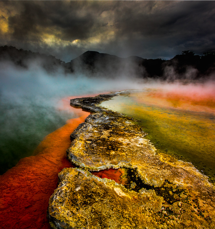
Exercise
Identify colors with LHS numbers.
Here are three examples.

50/0/0

100/0/100

50/30/50
Now, call out numbers for more of the colors you see.
Make this a habit and you’ll develop razor sharp color perception.
Read more Color Theory.
Learn more in my digital photography and digital printing workshops.