How To Decode Color In Christopher Nolan’s Amazing Movie Inception

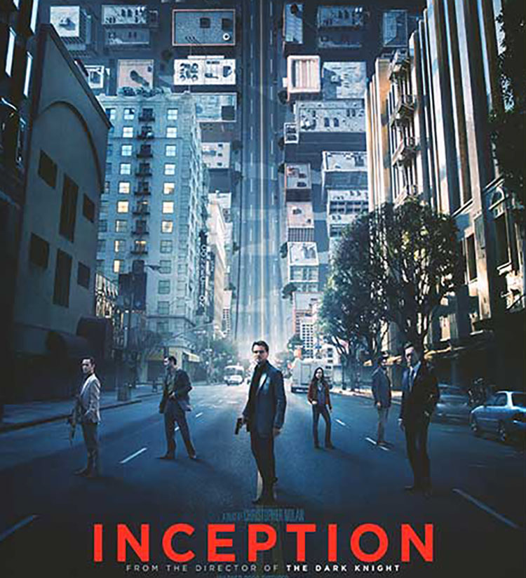
Consider how you can use color as a code to move viewers between images and/or sets of images. Christopher Nolan’s masterful use of color in his movie Inception will inspire you to new heights.

Inception moves between five levels of reality; waking, three levels of dream, and limbo, a plane of infinite subconscious that can be entered by traveling through the deepest dream level. The differences between each dream level’s color palette help viewers distinguish where characters are as they move between layers. Color becomes more than pleasing; it becomes content, a code to be decoded.

In the highest waking and lowest dreaming layers there is no consistent color palette; they have not been designed by the dream architect Ariadne. The three dream layers that have been designed have consistent palettes.

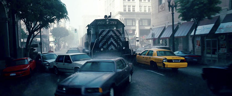
Dream layer one’s rainy exteriors are dominated by grays, dark blues, and blacks.

Dream layer two’s urban interiors are composed of warm oranges and browns.

Dream layer three’s snowy exteriors are rendered with bright whites and grays.

Understanding the use of color in Inception helps viewers orient and better understand this complex movie.

How many ways could you apply this principle in your images?

Find more Color Theory inspiration from the movies here.
Learn more in my digital photography and digital printing workshops.

How Classic Movies Use Color To Tell Compelling Stories

Whether in painting, photography, or motion pictures, color theory is one of the most important elements in art theory.  Learn what colors mean and why and investigate the power of colour as this video answers the question “How can color tell a story?”

Find more Color Theory inspiration from the movies here.
Learn more in my digital photography and digital printing workshops.

4 Movies That Showcase Zhang Yimou’s Brilliant Use Of One Color Dominance

Looking for some color inspiration? Try Zhang Yimou’s films. This director repeatedly uses one dominant color in a movie to saturate it with emotion and symbol.

Here are four of my favorites.

Raise The Red Lantern (red)

House Of Flying Daggers (green)

Hero (white)

Shadow (black)

Find more Color Theory inspiration from the movies here.
Learn more in my digital photography and digital printing workshops.

7 Movies That Mix Black & White And Color Masterfully

Black-and-white and full-color palettes present such different visual realities that it’s extremely difficult to combine them in a single project. Without a reason, it’s distracting, but when it’s used symbolically, it can work wonders. Below are 6 movies that do it masterfully.

The Wizard Of Oz

The Wizard Of Oz portrays Dorothy’s mundane life in Kansas in black-and-white and the dreamland of Oz in color.

Wings Of Desire

In Wings Of Desire, the ordinary world is depicted in color, while the spirit world inhabited by angels is portrayed in black-and-white.

Asteroid City

Colorization and black-and-white (plus varied aspect ratios) are used to represent different time periods.

The Purple Rose Of Cairo

Celia becomes entranced by Tom, the main character of a movie, who steps out of the black-and-white screen and into Cecilia’s color reality.

Pleasantville

Simplistic black-and-white Pleasantville becomes increasingly morally more complex, signified by the growing presence of color in the picture. The film also uses the idea of “color” as a metaphor for the separation of people of color during the 1950s.

JFK

Using different film stocks and shifting constantly between black-and-white and color, JFK weaves real and reimagined news footage together, making it difficult to tell fact from supposition.

Oppenheimer

Color shows Oppenheimer’s subjective point of view. Black-and-white shows an objective perspective, usually through another character’s point of view.

Find more Color Theory inspiration from the movies here.
Learn more in my digital photography and digital printing workshops.


10 Best Uses Of Color In Movies Of All Time

As this video shows, “Color is one of the most effective tools in a storyteller’s arsenal.”

When you’re choosing the colors in your still images, you can find limitless inspiration from color grading in movies. This is true for single images and for series or bodies of work. Color will not only make your images look more compelling but will also help you discover and communicate more with them.

Find more inspiration with these resources.

10 Movies With Amazing Color Schemes

50 Iconic Films and Their Color Palettes

Find more Color Theory inspiration from the movies here.
Learn more in my digital photography and digital printing workshops.

Make Movies That Matter – Jeff Knoll


“Film producer Jeff Skoll (An Inconvenient Truth) talks about his film company, Participant Productions, and the people who’ve inspired him to do good.
Jeff Skoll was eBay’s employee number 2 and president number 1. He left with a comfortable fortune and a desire to spend his money helping others.
The Skoll Foundation, established in 1999, invests in, connects and celebrates social entrepreneurs – offering grants to people who build businesses, schools and services for communities in need. Every year, it presents the Skoll World Forum on Social Entrepreneurshipat Oxford, and runs Social Edge, a networking site for social entrepreneurs.
His production company, Participant Productions, is what Skoll calls a “pro-social media company,” making features and documentaries that address social and political issues and drive real change. His film North Country, for example, is credited with influencing the signing of the 2005 Violence Against Women Act. Participant’s blockbuster doc, An Inconvenient Truth, is required viewing in classrooms around the world, and has unquestionably changed the debate around climate change. Other Participant films include The Kite Runner, The Visitor, Food Inc., The Cove, and the recent Earth Day release, Oceans.”
Find out more about Participant Media here.