What You Need To Know To Master Black & White Photography

.
In this video, I share my unique insights into what’s special about black-and-white images. I show ways to visualize black-and-white possibilities and showcase 5 classic black-and-white styles. Along the way, I discuss the vital steps of making black-and-white images; color management, color conversions, tonal adjustment, and printing.
.

How To Find The Infinite Possibilities One Image Contains

Incubation XV

Variations_Saturation_425

Any image can support an unimaginable number of color variations. So how do you find them? Systematically make many variations. Will it take a great deal of time? It will take a little time but not a lot (maybe five or ten minutes) – and it will take less time and you’ll more thoroughly explore the possibilities if you do this systematically. You’ll find this exploration will be time very well spent. Illuminating more possibilities than you imagined will help you find more creative and personally fulfilling solutions for your images. You’ll deepen your understanding of and personal relationship with color thus your images and by extension yourself. Those who view your works will feel the difference. I can tell you from many years of personal experience that it has made all the difference in the world to me. It will do the same for you.

Before you begin …

Start With Your Strongest Image(s)

When you’re processing a number of related images it’s likely that you’ll find the solutions you choose for the strongest image in the set will apply to the others, with minor modifications. It’s rare to have images in a series with widely divergent color palettes.

Plan To Make Many Copies

Don’t try and remember all of these possibilities; there will be too many to remember.

Instead make copies that you can make side-by-side comparisons with. (In Lightroom make virtual copies. Alternately, in Photoshop duplicate files.) It will help if you organize these copies into Collections in Lightroom or organize them (possibly with folders) in Bridge/Photoshop.

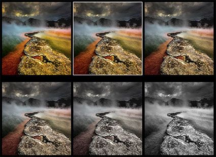
Find The Big Picture, Sweat The Details Later

Ditch your perfectionist tendencies – for now. Worry more about the moves you’re making in color that the tools you’re using to make them with. Don’t get lost in the details, instead focus on the big picture. Avoid getting distracted by one exciting possibility.  Instead of rushing to finished results and committing to the most obvious solution too quickly, spend a few minutes exploring more possibilities hoping to find better solutions. More often than not, you will.

So what’s the best way to do this?

Proceed In This Order – Saturation, Luminosity, Hue

With only three elements of color, you wouldn’t think there could be so many possibilities, but the very things that generate them also make finding them manageable. You’ll quickly find the major moves that can be made if you make changes in these three elements in this order – saturation, luminosity, and hue.

Read More

The Best Strategy For Creating Successful Color Palettes

Illumination XXX

The vast majority of resources you’ll find for creating successful color palettes, whether in print or online, will catalog a great number of compelling color combinations with some rhyme but little reason. When you look at them, not understanding the logic behind their choices, it’s tempting to think that anything goes. (And it might in certain contexts and for the specific reasons. But which ones?) Sometimes they drift into color psychology but quickly become so subjective they lose all sense of objectivity or universality. The best of them identify visual dynamics that you can use to exert some influence over the direction takes in and gives to your images.

What I’m offering you here is different. This is a strategy. Not a rule but a tool.

Use high contrast in one element of color, medium contrast in a second, and low contrast in the third.

It could be simplified to, make one element of color dominant by consistently putting more contrast in it than the other two.

With only three elements of color, this rubric offers you three main palettes that you can draw endless permutations from plus two notable exceptions.

When you reflect on your choice of palette, you’ll gain insights into the themes contained of your images.

Before I detail these five palettes …

It helps to understand some of the dynamics of color. Good things come in threes; there are three types of color, three elements of color, and three kinds of contrast.

Antarctica_2009-LXXIX1

Antarctica_2009-LXV

MosesPremonition_1998_5

3 Types Of Color

There are three types of color – ideal, ambient, and synthetic.


Insights Members can login to read the full article.
Email:
or Sign up

The Problems With Calling Them B&W Photographs

Suffusion VIII
You may not think there’s a problem. You may think you know the difference. It’s obvious right? But is it? Do you? After a lifetime spent in the arts, I find photographers’ ability to describe color woefully limited, and this is never truer than when describing “black-and-white” images.

Most antique processes are black and white, right? Certainly, silver gelatin is black and white. But what if you tone it? Is a platinum print black and white or brown and white? Is a cyanotype black and white or blue and white? What about hand-tinted photographs? They were black and white but then they became colorful again, but it’s a different kind of color, isn’t it? And if only a little color is added is it still black and white? At what point does an image become black and white?

The problem is that having only two terms – color and black and white – for a wide array of color palettes limits not only our communication but more importantly our perception and thinking.


Insights Members can login to read the full article.
Email:
or Sign up