Printing Tips
The little things can make a big difference, never more so than with printing.
Delete & Reload Printer Driver
Fragile – Packing & Shipping Prints
The little things can make a big difference, never more so than with printing.
Delete & Reload Printer Driver
Fragile – Packing & Shipping Prints
Get the best print quality possible with these proofing techniques.
Softproof
Before you proof …
Proof – The Art of Proofing
Refinine your proofing process to achieve the best print quality efficiently.
Proof – BAT
BAT (bon a tiré) it’s the final proof print.
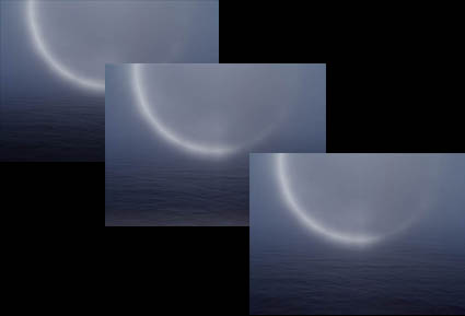
Proof – Bracket Proofing
Bracket proof and get one hundred proofs in one.
Proof – Compensate for Scale
Larger images appear lighter than smaller images. It’s an optical effect that affects your prints.
Proof – Correcting for Viewing Light
Compensate for discrepancies in profiles and viewing light temperatures.
Proof – Full Scale
Proof at full scale to check noise and sharpness.
Proof – Light Temperature
Light temperature has a significant effect on exposure, calibration, printing, and display.
Proof – Notes
Take good notes so you can retrace your steps precisely.
Proof – Prevent Overinking
Set proper ink limit for a substrate and reduce overinking.

One of the keys to making a great print is great shadow detail.
Shadow detail is something to be mindful of during exposure, processing, and printing. Curiously, even if you see shadow detail in your file on a calibrated monitor you may not see all of the details in your print. What can you do about this? Many things!
First Check Your Color Management
Before you start editing your files based on your proofs, check your color management system.
Recalibrate Your Monitor
Make sure you’ve calibrated your monitor with hardware. Set a brightness value of 90-100 lux, instead of using the default brightness target of 120 lux. If your monitor is too bright, your prints will look dark overall, especially in your shadows.
Read more on Profiling Your Monitor here.
Give Your Prints Enough Time To Dry
Inkjet prints come out of the printer almost dry, but not quite fully dry. When they’re fully dry, they’ll appear slightly lighter, especially in the shadows where there’s a lot of ink. So before you evaluate prints critically, give them a few minutes to dry. This affects absorbent matte surfaces even more than glossy surfaces.
Find my resource on Outgassing here.
Look At Your Prints In Good Light
Look at your prints in good light. You need the right amount of light (at least 500 lumens), the right color temperature light (5000K is the standard but many viewers prefer the warmer 3600K), and it helps to use full-spectrum light (a CRI of 90 or higher). (Many manufacturers now make full spectrum bulbs, like Solux and Soraa.)
Read more on Controlling Your Environment here.
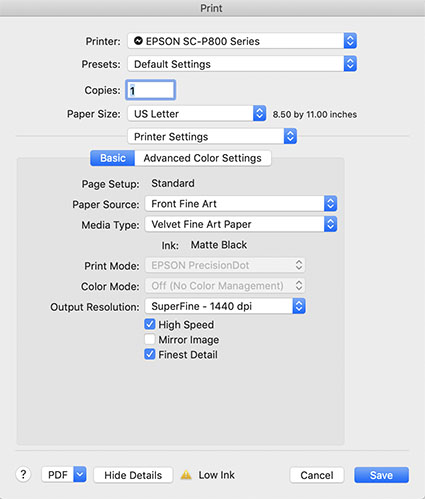
Media Type sets the amount of ink that's used.
Set Your Media Type Correctly
Your printer driver will allow you to set your media type, which controls ink the amount of ink that is sprayed on your paper. Use too much ink and you’ll lose shadow detail. Use too little and your blacks and midtones will appear weak. If you’re using a paper not made by the manufacturer, choose the nearest media type and then adjust its settings with the printer driver’s advanced utilities. (You’ll find this under Advanced Media Control with Epson printers.)
Find my resource on Ink Limit here.

Print test patches to determine when maximum black is achieved and when separation is lost.
Print A Target To Determine How Much To Lighten Shadows
Before you adjust your files for printing precisely determine how much you need to lighten your deep shadows by printing a target. While they vary a little, most media settings lose shadow detail around a value of 96% on a grayscale. If you print patches of values between 100% and 90% you’ll see exactly where you lose shadow detail. Printed results will vary slightly with each different media setting, so you’ll need to adjust files slightly differently for different media.
You can download my targets here.
Next Adjust Your File
Recently on TWIP’s (This Week In Photoshop) The Fix I spoke with Jan Kabili about the power of printing your photographs. Then I demonstrated how to get the best results possible with Softproofing & Proofing practices. Watch this and you’re sure to get better prints in less time with less waste.
Find more useful videos on TWIP’s The Fix here.
Read more with my free Color Management and Printing resources.
View more in my DVD series R/Evolution.
Learn more in my digital photography and digital printing workshops.

It’s an excellent idea to evaluate final proofs under glass (or plexiglass). This is particularly true if you’re using very thick or low grade glass. Often, when see under glass the print appears ever so slightly darker, lower contrast, and sometimes greener. There’s no ideal glass or plexiglass to evaluate proofs with. Use whatever the print will be viewed under. What you want to be able to do is adjust subsequent proofs so they look ideal in the final viewing state of the print, which is rarely bare.
Read more Printing Tips.
Learn more in my Fine Art Digital Printing Workshops.
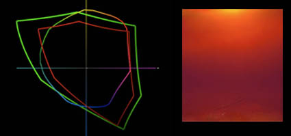
You softproof (constrain a monitor with an ICC profile) to see what colors are out of gamut of an ink and paper combination before you print. You proof (print) to see colors out of gamut of the monitor.
What? Yes! Today’s inksets exceed the gamut of of even the widest gamut monitors, in certain colors.
This graph shows ColorMatch (equivalent to most CRTs and LCDs), Adobe RGB 1998 (higher end LCDs), and Epson Ultrachrome HDR Ink on Epson Exhibition Fiber Paper. The new printers with the latest substrates can print more saturated yellows and oranges than even the best monitors can display. And, they can also print more saturated blues and greens than average LCDs can display. Evolution in printers is forcing an evolution in monitors.
Which monitor do I recommend? Check out my previous post here.
Check out my DVD 6 Simple Steps to Good Color Management.
Check out my DVD The Art of Proofing.
See me demonstrate this and more during the Epson Print Academy.
Learn these techniques in my workshops.
Extreme humidity can impact print quality. This is particularly true for but not exclusive to matte papers, which are more absorbent.
We printed for my Annual Exhibit in high humidity. The paper had absorbed a lot of moisture and so there was substantially more dot gain. The prints were coming out substantially darker and we were having trouble maintaining shadow detail. It’s made me want to store all of my paper in a climate controlled environment (using a dehumidifier or air conditioner). Or, climate control my entire studio. Rather than reprofiling for an atmospheric condition that changes unpredictably, we compensated with proofing. We lightened the files selectively before printing. With a little testing, we came up with standard adjustments that could be used on multiple images, with customized shadow masks for individual compositions. It pays to think about the impact of humidity on your printing. Control humidity when you can. Compensate for it when you can’t. You get better prints.
What do you do to compensate for excessive dot gain due to environment or overinking? Comment here.
Check out my Printing downloads here.
Check out my DVD The Art of Proofing here.
Find out about my The Fine Digital Print Workshop Series here.

–
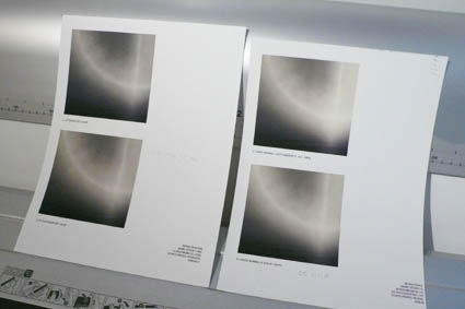
Proofing is an essential part of making the finest prints possible.
While color management and softproofing get you 90% of the way there, there are all kinds of things you still need to check in hardcopy – materials, ink limit, sharpening to name a few. Every time I print an image, I create a BAT (a final proof) that I archive for future reference. The next time I print the same image the BAT tells me how I got the best results the last time it was printed. That then becomes a starting point for future improvements. Combine advancing technology (printers, ink, substrates) and good color management / proofing practices and you’ll find your print quality will constantly evolve.
Do you proof? What kinds of things do you routinely proof?
Check out my DVD 6 Simple Steps to Good Color Management here.
Check out my DVD The Art of Proofing here.
Check out my Proofing downloads here.
Find out about my digital printing workshop series The Fine Digital Print here.

Scale changes ideal viewing distance.
To see a 4×5” print you have to get close to it. You can’t see anything but its shape and color from the end of a long hall. To see a 6×10’ print in its entirety you have to stand well away from it. If you stand very close to it, you won’t be able to see the whole image, much less anything else.
The rule of thumb for determining ideal viewing distance is to stand at three times a print’s diagonal dimension. This tends to place the entire image well within a viewer’s field of vision in such a way that overall general detail can be resolved at once, minimizing panning and scanning.
Of course, zooming happens. Both artists and viewers tend to view works of art from many different distances; examining details closely and evaluating a total composition distantly. Viewing distance changes perceived scale. Viewing distance subtly changes the quality of the viewing experience. So viewers tend to compare a variety experiences, dynamically forming a total impression of a work of art.
What do you think the ideal viewing distance for prints is? Comment here!
Check out my Printing downloads here.
Check out my DVD The Art of Proofing here.
Find out about my The Fine Digital Print Workshop Series here.
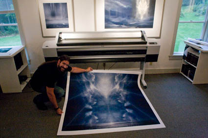
Scale can have a dramatic impact on the way images are experienced.
We’ve been printing up a storm here! All the prints are made on an Epson 11880. The prints can be very large. Up to 64″. How big do I typically print? Generally under 30×40″. Would I like to print bigger? Yes! Why don’t I print bigger more often?
Here’s the problem. How do you handle them during production? How do you present them (framed or unframed)? How will they fit in the exhibition space? How do you store them? When you get really big, all of these practical considerations become really significant.
New possibilities bring new opportunities and challenges.
How big have you printed? What did you do to overcome these considerations? Comment here!
Check out my Printing downloads here.
Check out my DVD The Art of Proofing here.
Find out about my The Fine Digital Print Workshop Series here.