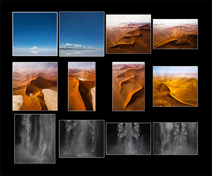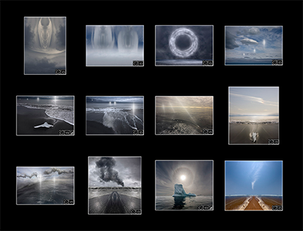
View my Annual Top 12 Selections here.
When asked, “How many good images do you make in a year?”, Ansel Adams replied, “Twelve good images in a year is a good crop.” Imogene Cunningham responded, “One in a lifetime.” Both perspectives are useful.
We all make a lot of photographs. Selecting the few that are worth developing and sharing is an essential skill. Choosing what to show and what not to show, we train our eye, connect with what’s most important to us, and develop our visual voice.
We edit our images with increasing degrees of focus; generally for all the images we make, more specifically for certain spans of time, and even more particularly for a few chosen subjects or themes. From the thousands (sometimes tens or even hundreds of thousands) of images we make, we select hundreds and finally dozens to focus our attention on.
Reviewing what we have created offers us an opportunity to revisit the events of the past and see them from a new perspective, savoring all they have to offer us and possibly what we missed. Selecting only a chosen few of our creations to collect, highlight, and often share, offers us opportunities to reflect upon and interpret our experiences and gain the strength that comes from the discipline of courageously committing to our vision.
To gain the maximum benefits from this process of selection, we can choose to be even more selective and identify even fewer of our most important images. To do this, we must ask ourselves vital questions, which become rich wellsprings of personal insight.
Take it to an extreme. Identify your top one image, two images, and twelve images. Do this for a lifetime, each year, and specific projects. Make this a habit; revisit it annually.
While the order you answer these questions and the time period you give yourself to answer them will influence your outcome, ultimately it doesn’t matter in what order you do this or how long you take, as long as you arrive at your personal answers. The vast majority of people never ask these questions, much less answer them. Be exceptional. Ask these essential questions and find your answers. In time, you will find that you will get better and more fulfilling results from all of your creative efforts.
Identify Your Best Image
Identify your best image – the one image that you feel is most successful at achieving what you want to achieve with your images. When you have finally selected this one most important image, ask yourself, “Why this image?” and, “Why not that one?” Doing this will help you identify your key core values and desired outcomes. There’s usually so much richness in this one image that it’s likely that you will need to ask this question many times over a significant span of time. Once you have begun to find your answers (Feedback from others can be helpful, just remember your answers count most.), ask a few follow up questions, “How many things can I do to make more images like this?” and “How many things can I do to make even better work?”
Finding this one image can be important for other people as well as yourself. When discussing the work of artists, people often ask “When you think of this artist, what one image do you think of?” Ask yourself, “What one image do you want to be remembered for?” “Which image is that now?” “What image would you like that to be in the future?” “If you were to create a new image that you would be most known for, what would you like that image to be?”
Your single best image for your life is a guiding light that not only reveals your highest accomplishments but also coalesces core qualities that become the keys to unlocking your future successes and ultimate fulfillment.
Your single best image for a year is a touchstone that can be used to compare and contrast current successes with past successes and identify future directions.
Your single best image for a project communicates your vision and style most successfully. Often, it is used as the lead for a post, a cover for a book, and a card or poster for an exhibit.
Find Your Two Best Images
If you were to select a second image to go with your one best image, which image would that be? How is it similar? How is it different? Both the comparisons (reinforcement or confirmation) and contrasts are important. The comparisons are useful because they help you identify core qualities. There are so many things that can be said about one image and only a few of them are truly significant. When you see what two highly successful images share you can quickly cut through the noise and find what’s essential. This provides both confirmation and reinforcement. The contrasts are useful because the unresolved tension it created can become generative. It can lead you to more ideas. How many images could connect the two? How many ways can you connect the two? What kinds of images could be created by combining their different qualities? If the two images you select are so similar that no generative tension is created, you may want to select a third that creates it.
Your best two images for a lifetime create a synergy where all that is implied between the similarities and differences becomes a fertile field of possibilities.
Your best two images for a year can display multiple directions – whether subject, theme, or style – whose tension can become generative. Caution, if the tension is never reconciled, either in whole or in part, it often produces confusion rather than richness and depth.
Your best two images for a project can show how both are multi-dimensional, telling more than one side of a story.
Select Your Twelve Best Images
Twelve images are more than enough to tell a complete story. If they’re your images, the story your images tell is not only the story of the subject and themes you select, the story they tell is also your story. The curation you perform to create collections of your work speaks (and sometimes creates) volumes.
If your top twelve images display entirely different subjects, themes, and styles it’s likely that you love your craft but have not developed significant depth in your vision. Jacks of all trades master none. Commitment is the key ingredient to achieving depth – the greater the commitment, the greater the depth. It’s not that you can’t do different things; variety can be energizing. It is that if you have a way of doing things that is your own and it informs everything you do then you are on your path. You may wander but you are not wandering aimlessly.
Ask a few key questions that will help guide you on your journey of discovery. How are the insights you gain from looking at individual images different than the insights you gain from looking at groups of images? How does your perspective shift when you create different groups from the same material? Remember that outliers can be both revealing and generative.
For professional artists, a majority of the income from the sales of their works tends to come from their top twelve images. But be careful not to use sales as the criteria for selection here; to live the most fulfilling creative life determine what success means to you.
Your best twelve images for a lifetime confirm that you’re much more than a one-hit wonder and have a depth of vision that is supported by a well-crafted style.
Your best twelve images for a year can reveal many directions, potential projects, and overall levels of performance commenting usefully on growth both present and future. Look carefully for milestones, breakthroughs, and outliers.
Your best twelve images for a project provide a strong framework that supports and guides all the other images that are added to it serving as enticing introductions, setting and maintaining a course, and creating compelling conclusions.
If you can’t see the benefits of selecting your best works by now, then trust me and just try it. Nothing teaches you more than direct experience. If you can, just do it. Talking about it will actually reveal much, but doing it will reveal more.
View my Annual Top 12 Selections here.
Learn more in my Storytelling resources.
Learn more in my creativity and digital photography workshops.