The Best Strategy For Creating Successful Color Palettes
The vast majority of resources you’ll find for creating successful color palettes, whether in print or online, will catalog a great number of compelling color combinations with some rhyme but little reason. When you look at them, not understanding the logic behind their choices, it’s tempting to think that anything goes. (And it might in certain contexts and for the specific reasons. But which ones?) Sometimes they drift into color psychology but quickly become so subjective they lose all sense of objectivity or universality. The best of them identify visual dynamics that you can use to exert some influence over the direction takes in and gives to your images.
What I’m offering you here is different. This is a strategy. Not a rule but a tool.
Use high contrast in one element of color, medium contrast in a second, and low contrast in the third.
It could be simplified to, make one element of color dominant by consistently putting more contrast in it than the other two.
With only three elements of color, this rubric offers you three main palettes that you can draw endless permutations from plus two notable exceptions.
When you reflect on your choice of palette, you’ll gain insights into the themes contained of your images.
Before I detail these five palettes …
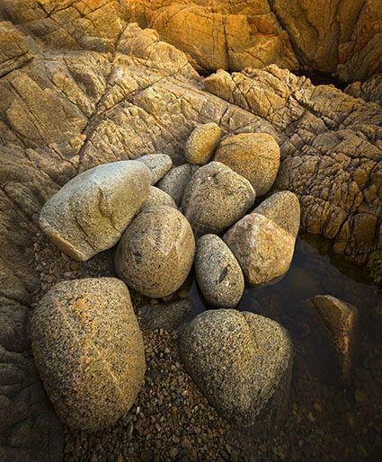
It helps to understand some of the dynamics of color. Good things come in threes; there are three types of color, three elements of color, and three kinds of contrast.


3 Types Of Color
There are three types of color – ideal, ambient, and synthetic.
brucehughw
14.09.2020 at 07:29This is wonderful. I haven’t seen anything like it before. Any chance of you assembling this material and related material that you’ve written in a PDF? I’d pay for it.
John Paul Caponigro
14.09.2020 at 09:05Yes. And a video. And a workshop. Stay tuned.
brucehughw
14.09.2020 at 09:56I had another thought after my earlier post. I think painters can get away with a much larger departure from “reality” than photographers can. For example, a painter can make a haystack violet or red, and a viewer might see it as “artistic.” If a photographer uses a similar effect, a viewer is more likely to reject it, seeing it as “fake.” So we photographers who are so inclined, can introduce effects but not so much that viewers will reject them. Thoughts?
John Paul Caponigro
14.09.2020 at 16:45I agree. If photographers choose to take more liberties with color they need to take extra steps to maintain a suspension of disbelief. If they abandon representational color they often don’t go far enough to give their final color solutions enough structure so that it hangs together or creates its own inner logic and above all is emotionally expressive rather than merely eye-catching.
brucehughw
14.09.2020 at 17:14Wow, you packed a lot in there. 🙂 . If there are any examples that you could point me to that show the structure you mention, I’d really appreciate it. Otherwise, I’ll just watch for more on this topic, as you mentioned earlier.
John Paul Caponigro
14.09.2020 at 17:26The color in Ben Thomas’ Chroma series is very evocative as he strongly reduces blacks and matches saturation values between different hues. http://benthomas.co/2019
–
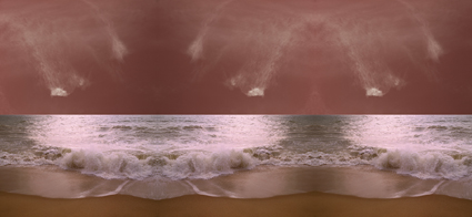
My series Wake is my first serious foray into synthetic color. At first I approached it spontaneously but had to turn to color theory to understand why certain combinations did and didn’t work – contrasting warm and cool color familes stretched as far as they could go without becoming another hue altogether – saturation ramped as high as it could go without posterizing or appearing flat. Now decades later I plan to fine-tune some and rework others to deepen the effects, as well as add other color structures that aren’t base on complements. It’s a mission that’s high on my priority list this fall so I should be ready to share the results by the first of the year, maybe sooner.
https://www.johnpaulcaponigro.art/jpcGallery/browse.php?kw%5B%5D=wake%20series&num=9
brucehughw
14.09.2020 at 17:32Thanks so much. this is a great new avenue for me. I picked up a book titled Color Theory and sort of shrugged, thinking “well this is all great, but it’s mostly for painters, who get to choose their colors.” Glad to see we photographers can do more than more or less accept what we capture with the camera.
John Paul Caponigro
14.09.2020 at 17:36You’re welcome! I’m glad you’re finding this inspiring. My resources on color theory will be helpful. These are some of the books I recommend. Read and look at them with imagination. https://www.johnpaulcaponigro.com/blog/?s=color+books
–
My Color Theory resources distill a lot of concepts drawn from many resources and tries to simplify and clarify language to make theory more practical.
https://www.johnpaulcaponigro.com/creativity/technique/color-theory/
brucehughw
14.09.2020 at 17:43Thanks so much (again). Also, I tried to find your wake series, but the link did not work and I could not find it on your website.
John Paul Caponigro
14.09.2020 at 17:49Mmm… the blog is cutting the url short because of special characters … Once you’re on .art and at works (which should be the case with the link above, click on the Series tab to filter the selection … with “wake series”
https://www.johnpaulcaponigro.art/jpcGallery/browse.php?kw%5B%5D=wake%20series&num=9
brucehughw
17.09.2020 at 07:21Thanks very much. I found them.