2880 vs 2400 – Gamut Comparisons

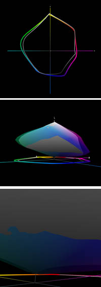
Today, Mac Holbert and I started teaching The Fine Art of Digital Printing at the Hallmark Institute of Photography in Turners Falls, MA. Epson shipped in new 2880 printers for this special event. Epson’s new 2880 uses UltraChrome K3 with Vivid Magenta. How much does Vivid Magenta expand the gamut? Check out these diagrams – 2D, 3D, and 3D looking at Dmax. The 2400 is in white and the 2880 is in full color. Both are graphing Epson Premium Luster Paper. The graphs indicate warm blues, magentas and greens are where it pays off. Slight increase in Dmax. It’s not a dramatic increase but in specific images (polarized skies and saturated foliage, it can be significant. There are also slight tradeoffs in other areas of the spectrum (wherever the white volume extends beyond the color volume).
Words and pictures can work together to tell a fuller story. These diagrams were made with Chromix’s ColorThink. I use it to graph ICC profiles and compare substrates and to compare inksets. Doing this more clearly illustrates the pros and cons of each.
It’s something I do in all of my color management sessions (like the whirlwind tour of color management participants in the FADP workshop got this morning and the sessions you’ll find on my DVD 6 Simple Steps to Color Management).
Check out my Review of Chromix’s ColorThink used to make these graphs.
Check out Chromix here.
Check out my earlier post on the 2880 here.
Check out the 2880 here.
Check out our workshop the Fine Art of Digital Printing here.
Check out my Fine Digital Print workshop series here.
Check out Hallmark’s post on today’s session.