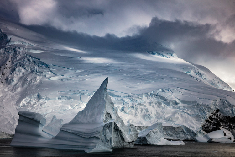
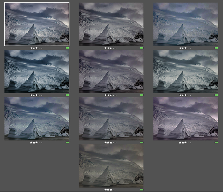
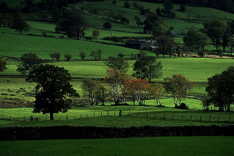
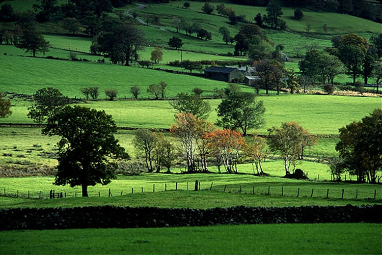
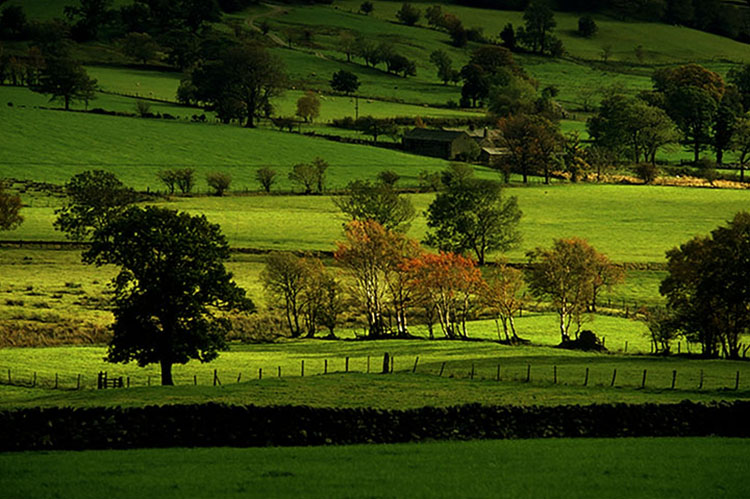
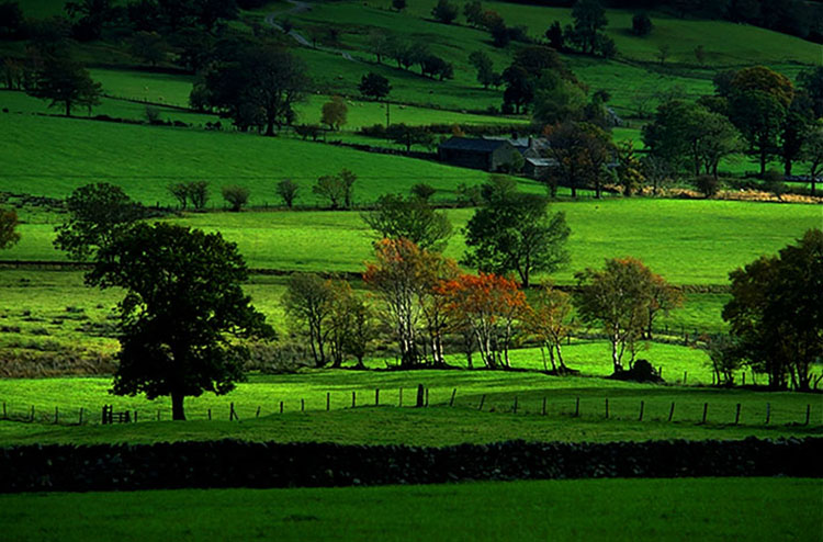
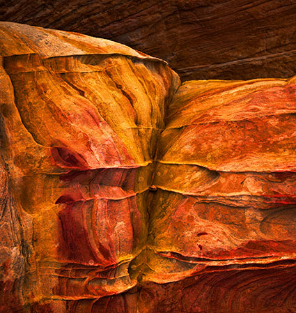
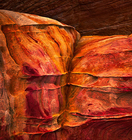
How To Choose An Optimal Setting For Photoshop’s High Pass Filter
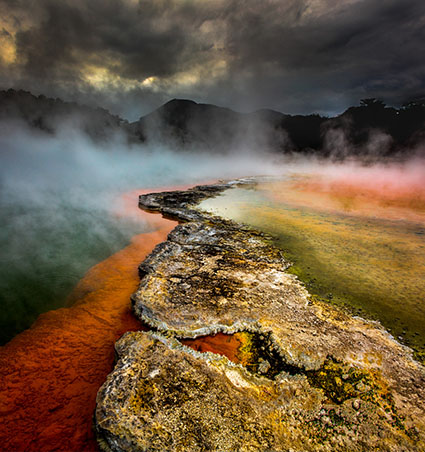
Photoshop’s filter High Pass is one every user should know. It can be either an edge sharpener or a unique luminosity contrast enhancer that produces a three-dimensional effect, unlike any other tool.
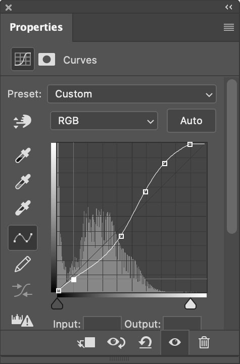
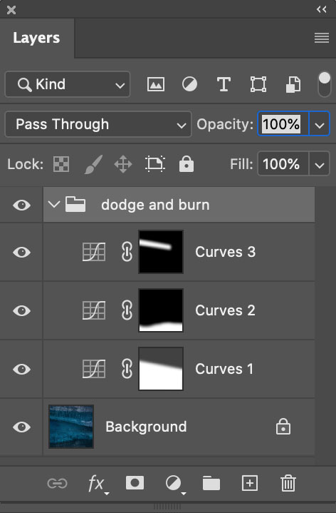
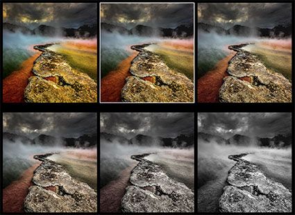
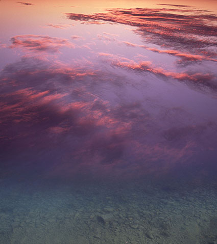
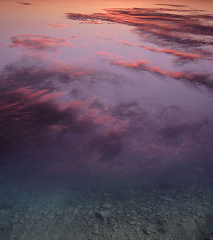
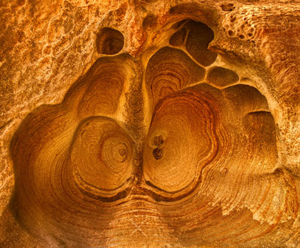
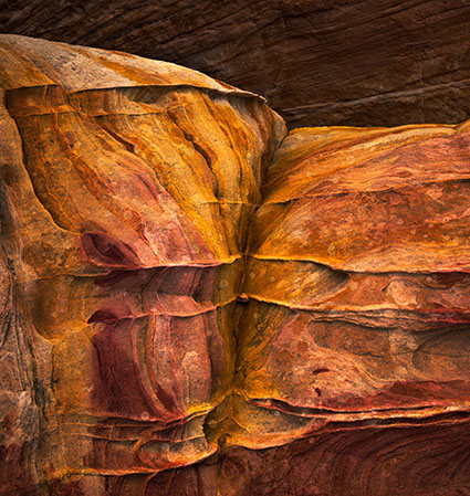
With only one slider, Radius, the differences between low and high settings can be found in the way they handle frequencies of detail: low (smooth spaces and planes), medium (broad lines and moderate texture), and high (fine lines and texture).
When you use low Radius settings, the High Pass filter adds contrast to the edges of lines. As the setting rises it brings out first coarse and then medium texture, accentuating fine texture, often confused with noise, much less.
When you use high Radius settings, the High Pass filter moves beyond sharpening and becomes tonal enhancement. The halos (light lines) and lines (dark lines) it produces become so broad and feathered that rather than only contour contrast (Think edges and thin lines.) they instead accentuate broader image contrast (Think planes chiseled by a sculptor.). In short, images filtered with high High Pass settings look contrastier and more three-dimensional, as if all the planes in an image are dodged and burned.
Low or high, how do you choose?