The Importance Of Viewing Masterworks


I highly recommend you look at original masterworks – frequently.

While looking at works in reproduction often provide many wonderful insights, nothing but the original provides the full experience. Looking at masterworks helps you understand what’s possible, demonstrates how materials enhance expression, and provides a fuller, clearer, deeper window into the intentions of artists’ works.

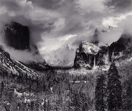
Without looking at original, you might understand that Ansel Adams had unparalleled technical mastery of black-and-white silver gelatin printing, but would you also understand that he was a transcendentalist of light and that his use of light was quite different than Edward Steichen’s?

Without looking at originals, you might understand that Richard Avedon’s work was clearly seen and sharply focused, but would you also understand that the detail in his portraits become a statement about human relationships / human nature and that his use of detail is quite different than William Henry Jackson’s?
Without looking at originals, you might understand that size is often connected with price in Andreas Gursky’s work, but would you also understand how important it is for you to experience the field of view filling spaces in his work as immersive and that his use of scale is quite different than Andy Warhol’s?
If you don’t look at original works of art, you may miss a lot.

Keith Carter thinks of his graduate studies as being comprised of long sessions looking at original master works. As a young man, he saved enough money to make the trip to New York City and spend days in the collections of the finest museums in the world looking at some of the finest photographs in the history of the medium. He called ahead to make an appointment with each of the museums to see specific prints in their private viewing rooms. (Many people don’t know they can do that.)

Looking at original masterworks is both inspiring and enlightening. I’ve been very fortunate to be able to look at masterworks in my home all my life and I seek out opportunities to see more whenever possible. I recommend you do too.

(There’s a lot to be learned from looking at originals, which is why we look at masterworks from my collection in all of my  digital printing workshops.)

Find my comments on other Masterworks In My Collection here.
Learn more in my digital printing workshops.

Masterworks In My Collection – Paul Caponigro – Apple, New York City, 1964


While this image is officially titled Apple, New York City, 1964 it’s often referred to in my father’s studio as ‘The Galaxy Apple’. Countless people’s first impression of this image is that they’re looking at a galaxy.  Even after you see the apple, the impression of a galaxy persists.

This is one of the photographs that got me into photography. I love that a literal transcription can also describe something more than itself. The power of metaphor is more powerfully expressed in this photograph than in any other I can think of. What’s more, the way the metaphor unites both the terrestrial and the celestial – the macrocosm and the microcosm are seen as one. (I don’t think it’s an accident that my father’s first retrospective was titled The Wise Silence, a line borrowed from Ralph Waldo Emerson.)

The printing of this image reinforces the metaphor. It’s dark. So dark, in fact, that in some places you can’t visually separate the contour of the apple from the dark background. Dad found the solution while printing the image; one of the proofs came out darker than anticipated. Other printers might have held all the detail there was to hold in this negative. Unexpectedly, and wisely, dad didn’t. I have always appreciated my father’s consummate ability to transcend his technique and follow the call of his intuition. Rather than offering expected results he consistently delivers unexpected solutions, not for the sake of novelty or surprise, but because he was called to serve a more powerful inner poetry.

(There’s a lot to be learned from looking at originals, which is why we look at masterworks from my collection in all of my digital printing workshops.)

Find my comments on other Masterworks In My Collection here.
Learn more in my digital printing workshops.

Masterworks In My Collection – Ansel Adams – Clearing Winter Storm, 1944

adams_clearingwinterstorm425

Ansel Adams’ Clearing Winter Storm, 1944 is a particularly interesting photograph to me because of its complexity. It’s a specific kind of complexity. Like many other complex images, it’s made of a lot of separate elements but is still unified. Unlike many other complex images, it can be broken into many separate images, each complete compositions in themselves; four peaks in clouds, one vertical monolith in clouds, shadowed valley between monolith and peak, waterfall and peak, waterfall and two trees, etc. (Try finding as many separate compositions in this single image like this as you can.)

When you look at prints of Ansel Adams’ Clearing Winter Storm many assumptions about the medium, the man, and his work are confirmed and challenged. It’s neutral, perhaps even slightly cold in tone, which is appropriate for the subject. The tonal scale is high contrast and full scale, perhaps heavier than expected with very full highlights and it may be surprising that some shadow detail is not preserved. The large format original renders detail well, though there are traces of visible grain in light smooth areas. There’s detail throughout the image (deep depth of field, sharp focus, full scale printing); when it was printed this may have been the sharpest image quality possible while today it looks classically smooth in comparison to new high resolution digitally sharpened images. At 16×20” it’s a medium scale enlargement, not a contact, and could have been printed larger; that it wasn’t is an interesting reflection on both the man and his times. Print quality becomes not only a window into the past of the subject but also into the medium, which this man above all others epitomized for his time.

(There’s a lot to be learned from looking at originals, which is why we look at masterworks from my collection in all of my  digital printing workshops.)

Find my comments on other Masterworks In My Collection here.
Learn more in my digital printing workshops.


Masterworks In My Collection – Joyce Tenneson – Kristin, Hands In The Air


Artist’s often use consistent palettes for separate bodies of work, some use a consistent palette for a lifetime. This not only makes their work more readily identifiable, it also clarifies the nature of the statements they make. When an artist does this color becomes more than attractive, it becomes a message.

Joyce Tenneson has done this masterfully. Her typically airy palette both light and desaturated give her nude or near nude portraits a distinctive look. The delicacy of her palette not only makes a statement about the more sensitive nature of her subjects but also reveals her own sensitive approach and relationships with her subjects. Her high key palette suggests a concern with spirituality, perhaps more strongly than her occasional inclusions of painted light.

Tenneson often portrays figures in ways that defy conventional representations of the body, selecting alternate body types or ages, posing them in uncharacteristic ways that create expressively complex distortions, and including unusual props.

In Kristin Hands In The Air, the woman’s lack of hair gives this image an edgy undercurrent. Viewers would not be wrong to guess that the woman is struggling with illness. As with so many of Tenneson’s portraits, this image strips away the daily concerns of persona and fashion to show a deeper character in her subjects, tenderly but unflinchingly revealing both their fragility and an uncommon strength in these fleeting moments of grace made more durable by the act of photographing them.

(There’s a lot to be learned from looking at originals, which is why we look at masterworks from my collection in all of my  digital printing workshops.)

Find my comments on other Masterworks In My Collection here.
Learn more in my digital printing workshops.


Masterworks In My Collection – Jerry Uelsmann, Nude, 1983


Jerry Uelsmann’s 1983 nude is a very influential photograph for me. It makes direct what is typically only implied in some ‘straight’ photographs – that mankind is not separate from nature. The transparent merger of figure and ground is poetically rich in so many ways and on so many levels.

No matter how subtle, traces of color change both visual and psychological dynamics in an image. Choice of paper (the color of the white) and toning (the color of highlights, midtones and shadows) can offer both technical and expressive opportunities. The warm toning of the print in my collection seems particularly appropriate. It’s not a heavy toning, but the print is definitely not neutral. The red of the warm tone seems appropriate for flesh. It gives the image a more approachable feeling, perhaps even a touch of romanticism. It makes the subject seem nearer to the viewer; a cooler color would seem more distant. It changes the impression of ambient temperature and time of day; a cooler color would seem closer to winter and twilight or dawn.

The image is also clarifies the differences between analog and digital processes. The substantial burning/darkening at the top of the print hold the eye in the image longer and minimizes what could be distracting area of contrast if it were brighter, but the way the burning reduces midtone and shadow detail in the region calls attention to technique, where it could be minimized or eliminated in a digital process. I wonder if this image were remastered digitally if the artist would decide to reveal traces of grass in the face, perhaps not as much as is revealed in the body or if an attempt would be made to maintain the volumetric aspects of the body where it is? Neither of these technical considerations diminish the work. We know the artist is working within the limits of a particular medium – masterfully. Still, asking these questions and making comparisons and contrasts with other possibilities offer us more insight into the artist’s vision at large and what he his trying to communicate more specifically in this visual statement. This is only one of so many other reasons why media matters.

(There’s a lot to be learned from looking at originals, which is why we look at masterworks from my collection in all of my  digital printing workshops.)

Find my comments on other Masterworks In My Collection here.
Learn more in my digital printing workshops.