The Art of Proofing

Proofed and printed with an Epson 900 Ultrachrome Ink on Legacy Fibre paper.
Proofing. Some think it’s a lost art. It’s not. Some aren’t aware that they’re doing it. You probably are. If you’re not doing it, it’s highly likely that you can make even better prints than you already are. If you are doing it, you’ll probably find that structuring and refining your proofing process will have many beneficial effects on the print quality you achieve.
What’s proofing? Evaluating an image printed on a particular substrate, making adjustments to the file, reprinting, reevaluating the image on a subsequent print, and repeating until optimum results are achieved.
Proofing is not a Substitute for Color Management
The fact that we still make proofs doesn’t mean color management doesn’t work. It’s amazing it works as well as it does. And, it’s getting better all the time. There are limits. It helps to know the limits. Proofing is not a substitute for good color management practices. Good color management will save you time, materials, money, and improve print quality. There are certain things you cannot solve with proofing if color management is poor. Good color management will get you the best first proof possible. Good color management policies will allow you to trade in subtleties when proofing. Properly implemented, color management will get you 90% of the way there. To get the last 10%, you need to proof. And, it’s the last 10% that separates good prints from great prints.
The Limits of Softproofing
Softproofing. Simulating the appearance of an image printed on a specific substrate, with a specific printer, driver, output profile, and rendering intent – before it’s printed (View: Proof Setup: Custom). For some, it’s the missing component of color management. Others who have mastered softproofing may have been misled into thinking that a perfect match is attainable. If close is close enough, softproofing is all you’ll need. When it comes to making the very finest prints, some proofing is required, but it has limitations.
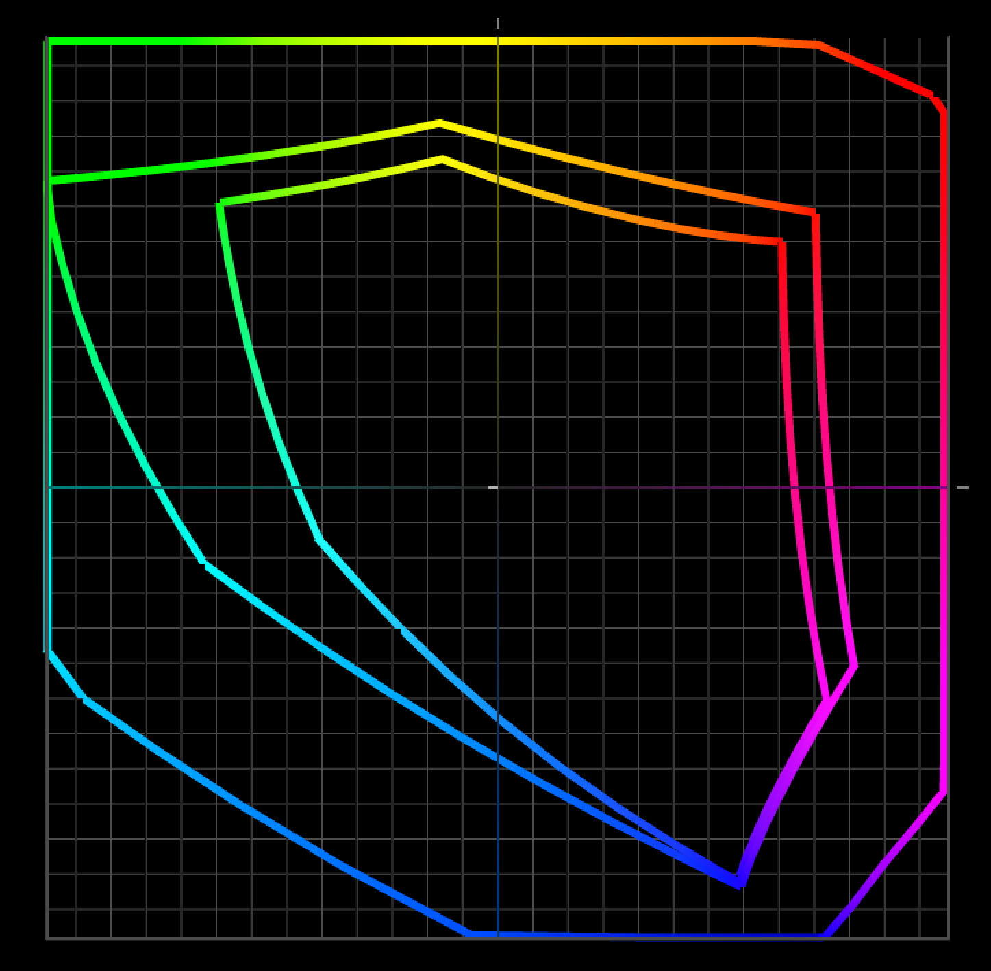
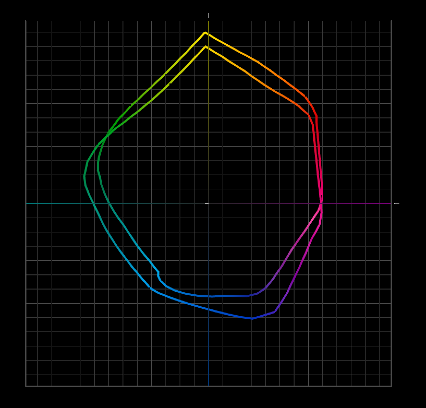
Softproofing’s preview of the difference between transmissive and reflective color spaces is not absolutely precise. Even with today’s technological advances, we have a limited ability to display the profound translation between glass or plastic emitting light (transmissive) and paper absorbing light (reflective). While you can match the two closely enough to make very sophisticated predictions about inevitable changes to color, some differences between the two persist, chiefly in brightness (the white and black of the paper and ink).
Softproofing can’t simulate different viewing light temperatures. Profiles are light temperature-specific. With rare exception (ImagePrint RIP), output profiles are created for a standard viewing light of 5000K. Some compensation will be required if prints are to be viewed under a different light temperature. A majority of prints are viewed under very different light temperatures, typically warmer.
Softproofing can’t display the differences between color management routes. Use the same profile using two different color management methods, and you will get slightly different results. Test this by comparing proofs made using Let Printer Determine Colors and proofs made using Let Photoshop Determine Colors.
Softproofing can’t display inaccuracies in profiles. If a profile is inaccurate, the softproof will be inaccurate too. While some profiles are vastly superior to others, I’ve never seen a perfect profile. Even with the finest profiles, you will need to compensate for small inaccuracies by proofing.
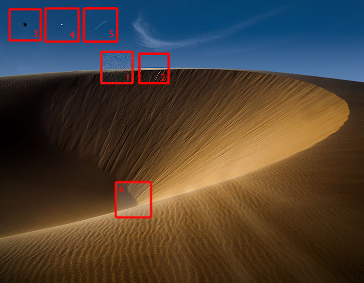
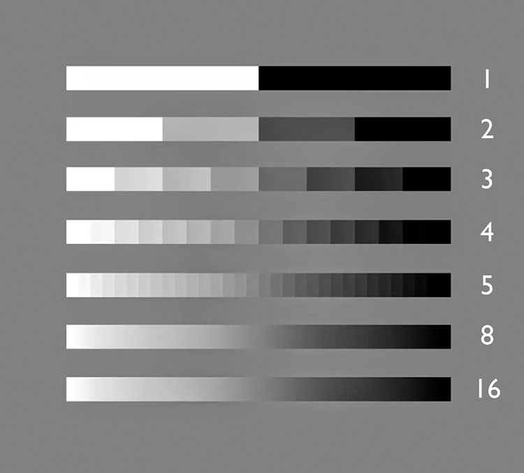
Softproofing can’t fully represent the impact of scale. Monitors have one size. Prints can be made in sizes much smaller or much larger than the monitor used to view a digital image. There are optical effects linked to scale – larger images appear to be lighter and contain less contrast, while smaller prints appear to be darker and contain more contrast.
Softproofing can’t precisely preview detail and sharpness. A monitor’s resolution rarely matches a print’s resolution, so distortions in scale are required in order to assess detail, sharpness, contours, and noise. Softproofing also can’t preview the softening effects of dot gain.
Softproofing can’t show the sensual characteristics of the substrate surface. A monitor has only one surface, but you can print on a marvelous range of substrates from super glossy film to fibrous watercolor paper. Each substrate adds a unique aesthetic dimension to the final print.
In the end, in order to achieve the best quality possible, it’s highly likely that you will want to adjust an image after you see it printed out or proofed. You may need to do this multiple times to achieve optimum results. Here are twelve things that will improve your proofing.