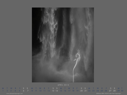
Free April Desktop Calendar

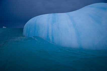
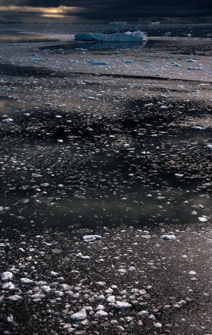
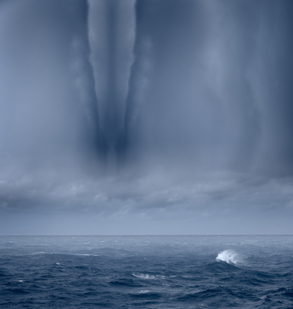
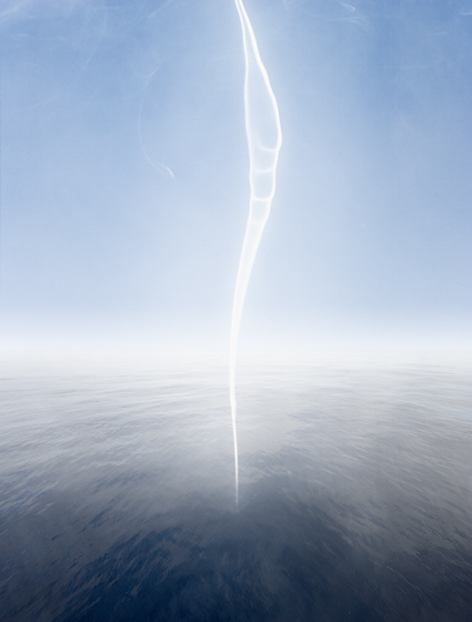
My free April desktop calendar features an image in my series Suffusion from Iceland.
Download it here now.
Find out about upcoming events here.
My free April desktop calendar features an image in my series Suffusion from Iceland.
Download it here now.
Find out about upcoming events here.

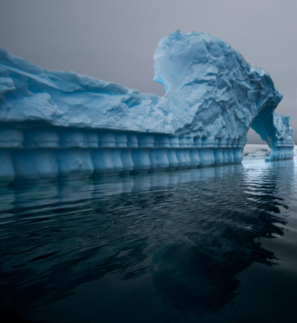
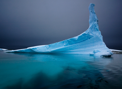
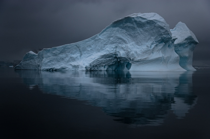
I’m having a great time printing this series of images!
At first glance, they look like classic black and white images. In reality, they’re full color captures of a near neutral subject, processed and printed as color images. The trace amounts of color from the original subject make a very subtle but meaningful addition to the final image and print.
The trace amounts of color in the image are so subtle, I wasn’t sure which color management options would yield the best printed results; shadow detail, gradation, neutrality and graybalance all play major roles.
To get the final prints today, I tested multiple printer color management routes (Photoshop, Printer, Printer Adv B&W)(my ImagePrint tests are pending). Using Printer color management for color offered the results I was looking for – not Photoshop, which clipped deep shadow detail and not Printer Adv B&W which rendered warm grays by default and cool toning solutions added more cool toning to the highlights than the shadows making the prints look like they carried a faint color cross).
They’re really touchy images. I found out how touchy when I went from 4×6 proofs to 11×14 prints, which when enlarged looked slightly lighter and lower contrast. A contrast curve for enlargement solved this.
At larger scale the noise became an issue, which I’m sleeping on. On the one hand, the subject is made of particles of water, which you can see when you are there. On the other hand it looks distracting to people who don’t know this. Water blurs with motion but the motion is frozen in these very fast exposures. I polled other people around me (including my father). Then I settled on an unexpected solution. I let some of the noise come through only in the areas of greatest focus, drawing slightly more attention to them. (Some noise can makes images appear sharper.)
There was a another surprise. I tested the images on glossy paper (Epson Exhibition Fine Art Paper). The extra depth in the blacks made another improvement in the image, so much so that it was worth the trade off for the soft surface of the matte paper. I made a similar test with a related series, Fumo, and didn’t make this choice. But here it was clear. This is the first time I’ve made my final prints on glossy paper.
I made these images while scouting my 2011 Focus On Nature workshop with Ragnar Th Sigurdsson and Arthur Meyerson. Arthur and I, two colorists who love the colors black gray and white and talk about them as colors.
I’m looking forward to returning to Iceland (and this waterfall) this August to lead a workshops again for Focus On Nature with +Einar Erlendsson , +Ragnar Th. Sigurdsson and +seth resnick . +Arthur Meyerson Arthur Meyerson will join us at the end of our Iceland workshop for our Arctic Voyage workshop/cruise from Longyearben to Greenland and finally back to Iceland.
We have a few more spaces left our Iceland workshop.
There’s one space left in our Greenland workshop.
There are a two more spaces in my Fine Digital Print Advanced workshop.
Learn more in my digital photography and digital printing workshops.


These images came together quickly – after a lot of gestation. I sketched the idea several years ago during a workshop with Focus On Nature. I made the shots last summer, scouting for another workshop with Ragnar th Sigurdsson and Arthur Meyerson. The first time I visited this location, (Skogafoss, Iceland) I took a few shots in less than half an hour, looking for major compositional variations. After looked at those shots and identified this idea, I shot very differently the next time, standing still for the better part of an hour and watching the water for significant variations within just a few compositions.
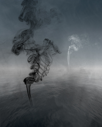
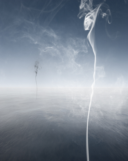
I wasn’t certain, but I suspected I’d want to add an accent to the abstract composition, deciding on smoke during processing. While I processed the files, I also sketched out a number of significant variations to test location of symmetry/assymetry, positive/negative space, light/dark, and location/angle/value of smoke. Doing this revealed more options than I had initially pre-visualized. And that means there are more related images to make. It also clarified a few outstanding ideas and connections to other images, some made and some still in development. That means I have some ideas about how they’ll can be integrated into existing projects and new things that will come out of them. I find the seeds of future work are usually planted in current work and if tended will yield more fruit.
I think about and plan series of images, often for quite some time before and over an extended period of time during their development. While I’m focussed, I look for surprises and modify my plans based on the new insights they introduce at every creative stage – planning, exposure, development, reflection, redevelopment, metamorphosis.
Find more images here.
Find out about my Iceland workshops here.


I often find the same compositional strategies, patterns, subjects and themes resurface in our work. Sometimes the ideas from two different images merge into a new one. I pay close attention to these visual bridges as they help me understand the both the similarities and differences between individual images and series.
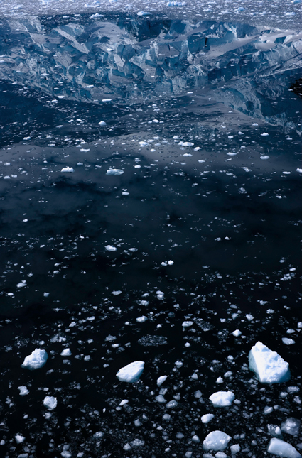
In Inhalation 29 two series (Inhalation and Suffusion) cross-pollinate.
For more on this read my ebook Combination.
The exposures for this image were made in Iceland.
Learn about my Iceland digital photography workshops here.