How To Make a Gorgeous Photo Book – Audio Excerpts

JPBlurb-300x212
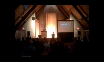
I sat down and discussed many issues involving print on demand bookmaking with Brenda Hipsher of X-Rite before my recent Toronto Blurb Seminar – How to Make a Gorgeous Photo Book.
You can listen to three audio excerpts here on X-Rites blog.
Color Management and Bookmaking
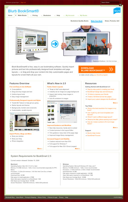
Reproducing Black and White & Using BookSmart
Practical Uses for Blurb Books
Find books on bookmaking here.
Learn more about books with these online resources.
Learn more in my Fine Art Digital Printing Workshops.

Books With Topical Themes Enjoy Wider Appeal

twobooktypes
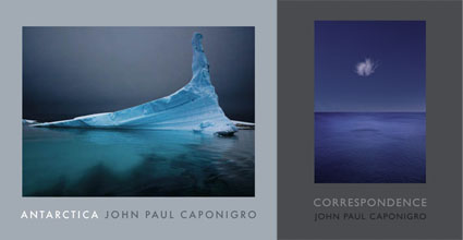
One of the ways you can create a book that has wider appeal is to give it a topical focus. Books on well-known subjects (people, places, things, events, etc) have a built in audience – anyone interested in the subject. Comparatively few people know about and are interested in individual artists and so monographs focussed exclusively on an artist’s vision draw smaller audiences. Even books on a particular media process enjoy wider appeal.
It may be challenging to convince a major publisher interested in mass distribution to produce an artist’s monograph without a topical focus. This shouldn’t stop you from producing one yourself. Many artist’s self-publish their own books. In the age of print-on-demand services (like Blurb) the cost, time and expertise required to produce these kinds of books has been reduced dramatically. These types of books tend to be targeted to niche markets. Nobody knows your audience better than you. Nobody will give your work as much sustained attention as you will. Producing your own artist’s book can be extremely fulfilling, you’ll come to understand your work better and learn to make it more effective. The few people who enjoy the fruits of your labor will savor it all the more knowing that it’s a rare experience.
Find books on bookmaking here.
Learn more about books with these online resources.
Learn more in my bookmaking workshop.

Covers – People Do Judge Books By Them

book_covers
One of the most important decisions you can make when you create a photo book is choosing an image for the cover. Choose cover images wisely. People do judge books by their covers. Images that tend to work best for covers share one or more common traits. They have strong graphic appeal. Bold color is a plus; it attracts a lot of attention. Images that tell a story draw people in; the more pieces of the puzzle they fill in the better. The format of the image fits easily within the proportion of the book; extreme panoramas (vertical or horizontal) rarely work well, unless the book’s format is also panoramic.
You don’t have to use the full image on a cover. Sometimes, cropping a cover image works well. This works best with full bleeds.
Usually, the cover image is repeated inside the book. It’s not uncommon for it to be the first or last image in the book, as these are the most prominent an memorable positions – except, of course, the cover.
The image you select for the cover of a book should be one of the strongest and most memorable images included in the book.
The cover of a book makes a first impression. Everything else is compared to it. And when the book is closed, you return to the cover. When is put down, what you see is the cover. Covers make a lasting impression.
Find books on bookmaking here.
Learn more about books with these online resources.
Learn more in my Blurb seminar.
Learn more in my Fine Art Digital Printing Workshops.

Use Text To Enhance Your Photo Book

typesoftext
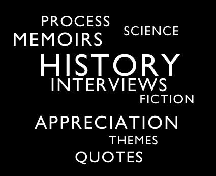
Photography books are often greatly enhanced when text is included. There are many types of text that can complement your images. Here are a few classic examples.
– facts about a subject
– history of a subject
– placing the images in an art historical perspective
– tracing influences
– appreciation expressed by an authority
– process descriptions
– project development
– thematic essay
– interviews of authorities
– interviews with the artist
– personal memoir
– excerpted texts with relevant themes
Include more than one of these types of text and you’ll offer a reader a more diverse perspective.
Whether it’s a little or a lot text complements photographs, making a presentation more powerful.
Next time you make a book of your images, ask yourself, “What kind of text would enhance this book?”
Find recommended reading on bookmaking here.
Learn more about books with these online resources.
Learn more in my upcoming Blurb seminar.
Learn more in my Fine Art Digital Printing Workshops.
Many Uses For Books

typesofbooks
There are many different kinds of books because people use books to do many different things.
– Share content
– Make a durable record (whether history or memento)
– Support an inquiry
– Produce a catalog to facilitate and create orders
– Enhance a proposition with added value
– Give away a leave behind
– Make an impression
– Gratify an ego
Can you think of other uses? Comment here!
Identifying your goals for your next book project will affect the choices you make at every stage in its creation and ultimately make it more effective.
When you produce your next book, ask yourself what function you want your book to serve?
Find recommended reading on bookmaking here.
Learn more about books with these online resources.
Learn more in my upcoming Blurb seminar.
Learn more in my Fine Art Digital Printing Workshops.
Share, Promote, Sell Your Blurb Books

sharepromotesellblurb
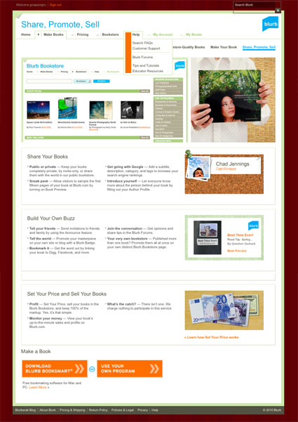
Blurb offers a number of ways you can share, promote, and sell your books.
Once you print your book you can invite others to preview and purchase it, either with Blurb’s announce feature or with your own mailing list.
Blurb’s new widget allows visitors to preview your book online. You can show as much or as little as you like. You can install it on any webpage by copying the HTML code. The widget has one click social network sharing and purchase functions.
Keyword your book to make it easier to find your book on the Blurb store and on Google. All the text in your previews is Google searchable!
You can sell your book in the Blurb store. Anyone can find your books marked public. Only people you invite can find books you mark private. Blurb’s online service will track how many books are sold. You can even make a profit on your books by marking up the price and Blurb’s website will give you reports on your progress. Checks are sent to you monthly.
Blurb takes and fulfills orders for you. Alternately, you can order any quantity from them and take and fulfill orders yourself, which you’ll need to do if you want to sign or enhance (emboss, slipcase, include a print) your books, but you’ll have to pay for shipping twice (once to you and once to your customer).
Blurb’s combination of easy to use software and order fulfillment creates a combination of capabilities that’s unique among print-on-demand services.
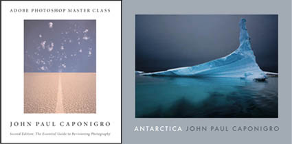
Find my Blurb book Antarctica here.
Find out about my Blurb seminar May 15 in Toronto.
Learn more in my Fine Art Digital Printing Workshops.

Use Space – Tracking & Leading

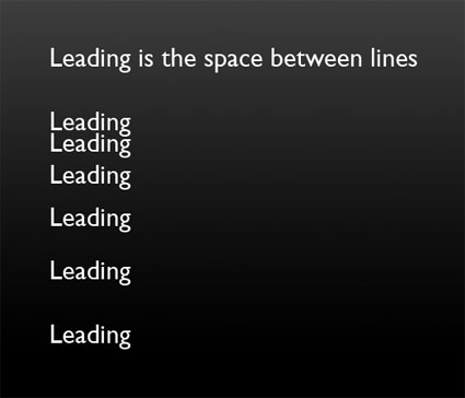
Use space to improve your design. There’s the space around blocks of text – margins. And there’s the space between elements of text – tracking and leading. Tracking is the space between letters. Leading is the space between lines. If tracking and leading are too tight, words appear cramped and are harder to distinguish from one another. If tracking and leading are too loose, units of text fall apart into separate units. Use enough space to help text rest gracefully on the page and breathe, but not so much space that it weakens the relationships between separate pieces and they drift apart.
tracking3
leading
Find books on design I recommend here.
Learn more in my Fine Art Digital Printing Workshops.
13 Go To Fonts, 7 Fonts to Avoid

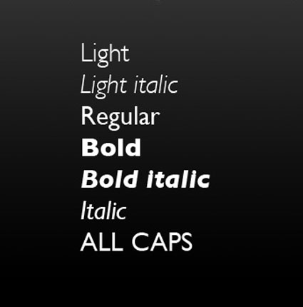
Whether you’re designing for a book or a presentation choosing the right type face is important. The font you choose helps shape the tone of what you create. As with any endeavor, it helps to have a trusted resources you can always turn to.
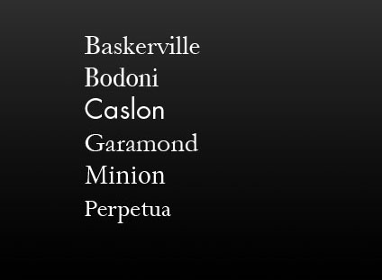
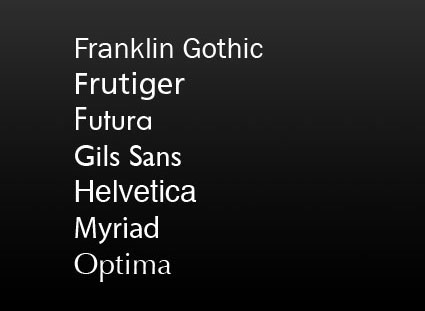
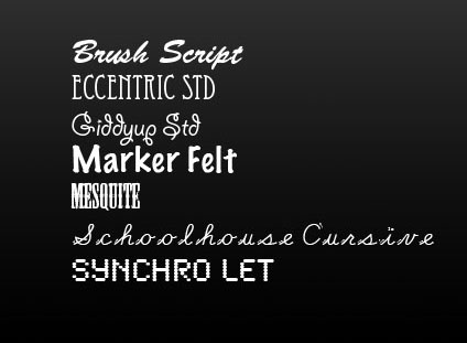
Here are my go to serif and sans serif fonts … and a few I steer clear of.
serif
sanserif
stylized
Serif and san serif and the most common kinds of fonts. Serif fonts have a classic feel. Sans serif fonts set a contemporary tone. Decorative or display fonts have a great deal more flair and are generally best used for signage; it takes the right project and a great designer to use them well in other applications. Design is typically best used as a support for content, not a distraction from it or a substitute for it.
Find books on design I recommend here.
Learn more in my Fine Art Digital Printing Workshops.