Epson Print Academy – New Dates
The Epson Print Academy is gearing up for another tour. There are two tracks.
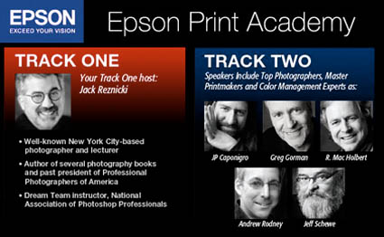
Track I programming includes …
Jack Reznicki seminars and hosts.
Video presentations by top industry experts.
Track II programming includes …
Andrew Rodney Color Management
Jeff Schewe Raw Conversion
Greg Gorman Black and White
Mac Holbert Fine Art Workflow
J P Caponigro 21st Century Dodging & Burning and The Art of Proofing
Video presentations with Michael Reichmann, Henry Wilhelm, and Epson Professional Product Managers.
Which track should you attend? Find out here.
Nov 8, 2008 Atlanta
Nov 16, 2008 Washington DC
Dec 6 , 2008 New York
Dec 13, 2008 Dallas
Jan 31, 2009 Seattle
Feb 7, 2009 San Francisco
Feb 21, 2009 Los Angeles
Feb 28, 2009 Boston
Mar 14, 2009 Chicago
Mar 21, 2009 Toronto
April 4, 2009 Minneapolis
April 25, 2009 Denver
May 3, 2009 New York
May 9, 2009 Los Angeles/Orange County
May 16, 2009 San Francisco
May 23, 2009 Vancouver
Get more details on dates and locations here.
Track 1 costs $79.95. Track 2 costs $149.95. This is one of the best deals around. Sign up now!
Check out Schewe and Reichmann’s video tutorial here.
Check out Holbert’s DVD The Dirty Dozen here.
Check out my DVDs here.
Check out my Fine Digital Print workshop series here.
If you attended the Epson Print Academy tell us what you liked and what you’re looking forward to. Comment here!