 .
.
Eric Meola
View 12 Great Photographs by Eric Meola
Read 14 Great Quotes By Photographer Eric Meola.
Read our extended conversation.
Showcasing a portfolio of his color images in its October 2008 issue, Rangefinder magazine referred to Eric as one of a “handful of color photographers who are true innovators.”
Eric Meola’s graphic use of color has informed his photographs and his distinguished career for more than four decades. His prints are in several private collections and museums, including the A.S.M.P. archive, the National Portrait Gallery in Washington, D.C., the International Center of Photography in New York, and the Museum of Modern Art in Munich. He has won numerous awards including the “Advertising Photographer of the Year” award from the American Society of Media Photographers.
In 1972 he photographed Haiti for Time magazine, resulting in one of his most famous images, “Coca Kid,” which was included in Life magazine’s special 1997 issue “100 Magnificent Images.” In 1980 he had his first major exhibit in New York at the “Space” gallery in Carnegie Hall and his signature red, white and blue image “Promised Land,” was chosen for inclusion in the permanent collection of the George Eastman House. In 1989 he was the only photographer named to Adweek magazine’s national “Creative All-Star Team”; and that same year he received a “Clio” for a series of images he made in Scotland for a breakthrough campaign featuring the outerwear clothing of the Timberland company. “Fire Eater,” his iconic image of the spotlit lips of a woman submerged in a tank of water, and commissioned by Almay cosmetics, was included in Robert Sobieszek’s 1993 book on advertising The Art of Persuasion.
As an undergraduate at Syracuse University, he studied color printing and color theory at the Newhouse School of Journalism before graduating in 1968 with a B.A. in English Literature and then moving to NYC in 1969 to work with Pete Turner as his studio manager. A Canon “Explorer of Light,” he has lectured extensively, including at Syracuse University, Rochester Institute of Technology, Brooks (Santa Barbara), the Art Center at Pasadena, Parsons, the Academy of Art College (San Francisco), the George Eastman House, and venues including PPA., WPPI, and A.S.M.P.
In 2004, GRAPHIS published his first book The Last Places on Earth, a look at disappearing tribes and cultures throughout the world. An exhibition in England of his photographs of Bruce Springsteen, which coincided with the publication of his second book Born to Run: The Unseen Photos (Insight Editions, 2006), was followed in 2008 by INDIA: In Word & Image (Welcome Books, NY), and an exhibit in 2009 at the Art Directors Club of New York. Eric’s fourth book of photographs, Streets of Fire, will be published in September 2012.
JPC
I’ve found that an artist’s first significant memory of the medium they choose makes a lasting impression on them. Often this goes back to very early childhood. What was your first significant memory of photography?
EM
I was almost literally hit by a bolt of lightning when I saw a print come up in the developer. My dad was a doctor, and one of his patients was an engineer whose hobby was photography. I was 12 years old at the time, and my father asked him to teach me about photography. My own hobby was “magic”- magic tricks. As soon as I saw the grays and blacks materialize under red light, I made an immediate, intense association and realized instantly that I wanted to be a photographer.
JPC
So is photography still a magic trick for you today?
EM
Well, it’s still magic…of course it is…and even more so. The ability to make our own archival prints and have completely control over the color is magic…and seeing new talent emerge is magic…and having more time now to shoot my own images is magic. We make the magic, or we don’t. And right now I’m having more fun than I’ve ever had, working on my own projects and books.
JPC
We look at images to learn to see. We make images to learn to see even better. Can you briefly sketch out three of the most important moments in your life where you learned to see?
EM
Most recently, in Las Vegas, I saw some reflections in a restaurant’s glass windows, and intuitively I realized there was something “there,” even though it didn’t look like much. It turned out that by adjusting the camera’s color temperature I was able to bring out an entire spectrum of colors – it’s the most colorful image I’ve ever made, yet it came about because of intuition, and the link between the mind and what my eyes were seeing.
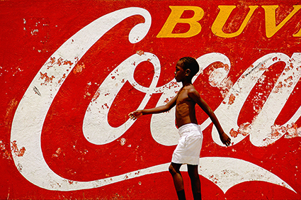
My first assignment was to document life in Haiti for Time magazine back in 1972. I kept passing this huge Coca Cola sign and it attracted me because I realized that it was a symbol of one culture’s influence on another. On a hunch I put my camera on a tripod across the street and shot passersby for an hour. Finally a young boy wearing white shorts walked by, completing the image. It needed that connection with Haiti, and because of his long arms and white shorts, the image came together. It’s become one of my most famous shots.
In 1978 I had an assignment to photograph storage garages for a moving company. When I got there, they had just been painted bright red, and with the blue sky and white stucco building, I recognized there was an image there, but what…? And then I decided that the garage itself was the key, so I found the biggest American car I could – a 1959 Cadillac, and had it sticking out of the door. Of course it didn’t fit, but that was the point, and as a symbol of American excess and pop culture it became the most important image in my career.
JPC
In all of these comments I hear an interest in American identity and influence. Is this something you continue explore?
EM
I’d love to do a book on America, but I wouldn’t want it to be beautiful landscapes. It would have to be Pop America,
where the streets are paved with gold, and…er, trash. America as a book project would be much more consuming than India,
and yet it’s in my own backyard, so it’s been lingering there as a thought for some time. Maybe book #5 ? But the natural thing to do is take a black-and-white documentary approach. I think Avedon, next to Robert Frank, did the best book on America, “In the American West.”
JPC
Artist’s become known for doing certain things in certain ways. How would you describe “Meola-ness”?
EM
Looking for the color, the light, or the moment that sets the image apart immediately. The last thing I am is subtle, and whether it’s photographing Bruce Springsteen in black-and-white in the Nevada desert, or photographing a street scene in India, I want people to gasp, and say “Wow!” I think some of that comes from my advertising background where I was taught to make images that immediately telegraphed a message. So “Meola-ness” is not about shock, but about making people realize that photography is one of the most powerful mediums of art that there is.
JPC
Why do you think photography is one of the most powerful mediums?
EM
Because it’s immediate, it’s in front of your eyes, and if the image connects the visceral rush is very strong. Light, shadow, color and form are far more powerful than notes of music, or the smell of a field of flowers. If you were given a choice of losing all your senses except one–sight, sound, touch, smell, taste– sight is the one no one would choose to lose. And it’s something we can all relate to, that we’re all adept at…holding a box, pushing a button, and seeing an image appear.
JPC
I often think photography is so powerful because it confirms what we know and holds our understanding in a fixed form when we and our understanding are mutable. At the same time, photography shows us many windows that show us a world that is very different from our own perceptions – other people’s perceptions of the same thing, other people’s experiences we’ve never had, images that see faster than the human eye or over a longer expanse of time or into portions of the spectrum not visible to the human eye.
JPC
Are there subjects you find yourself returning to again and again? Are there themes you find resurfacing frequently? Are there compositional structures that you rely on more than others? Is there a range (close, medium, far) you tend to approach your subjects from? Is there a speed you prefer to work in – fast and action oriented or slow and contemplative? Is there a particular quality of light or a color palette you find creates the atmosphere you look for above all others?
EM
The speed with which I react is dependent on the subject, and often by where I’m shooting. In Asia or India I shoot – with exaggeration – 50 times faster than I do in New York, It’s all new, and I’m seeing it for the first time. I prefer shooting with
one lens, and it’s usually a tele zoom, such as a 100-400mm, or 70-300mm. I like the “compression,” and being able to throw the background out-of-focus. And I love to work in shadow and shade, as opposed to bright light; and often I shoot
my subjects with backlight, so they separate from their surroundings. As my work has become more abstract, I find I’m drawn to a macro view of the world…small areas of just a few inches suddenly become entire universes filled with shapes and abstractions I never paid attention to before.
JPC
It’s obvious you love color. You can tell a lot about an artist by the palette they select. How would you describe your use of color? What does it tell you and us about your vision?
EM
People like to categorize you no matter what you do or try not to do, so yes, I’m known for bright colors. But I love subtle colors, as well. Most photographers today shoot in color, but their images are not about color – mine are about color as the subject. And that’s a lot more unusual than it sounds. Just about every image of mine starts with the subject itself – a person, a scene, a wall, a landscape, but my images quickly become about color because at some point in my life I became entranced with color itself as a subject.
JPC
Color becomes a subject when it’s seen particularly well. To do this you have to discover a heartfelt relationship with it. Where do your passions for color run deepest?
My understanding of my own interests in color weren’t apparent to me instantly. It took a sustained dialog with color and with my reactions to it for me to become more conscious of my deepest passions for color. I discovered that my color interests center on color as a code for change, the changes time and atmosphere bring, which is one of the reasons why I use gradation so frequently. I know I have a lot more to learn about my relationship to black and white as colors.
JPC
Do you have a favorite and a least favorite color?
While I use blue more than any other color, because I photograph blue subjects (sky and water) most frequently and I’m interested in creating images that can sustain a suspension of disbelief, my favorite color is red. Red to me is life – blood and fire. I love to use red as an accent color. This may have something to do with my long-standing desire to photograph fire – though maybe that’s just my inner pyromaniac resurfacing. Sam Abell would understand. My least favorite color is magenta, which I tend to avoid in color adjustment. I associate it with manipulation and I’m actively working to make it a friend. So far I’ve learned to love it only when it’s mixed with white or black but not in it’s purest form.
EM
I have a friend who used to tell me that everything I photographed was dominated by the color red, and it was true. Then one day he said “What happened? Everything now is blue !” And of course, I think there’s a truth to our pursuing a certain color or colors at a certain period in our lives, but right now my interest is, actually, in all colors. And in the past year I’ve managed to make three images which mirror the entire palette from “hot” to “cold,” as if I had gone out and photographed rainbows all day long. So I think my days of concentrating on a particular color are long over, and now one of the things that interests me the most are images which are predominantly grey or black, yet with a patch of color somewhere in the image. Iceland is a great place for that !
JPC
My father sensitized me to the colors of black and white. Eliot Porter and Richard Misrach are both influential to me photographically. Yet, a majority of my color influences are drawn from painting – Sassetta, Claude Monet, Mark Rothko.
Who are the other colorists you look to for inspiration?
EM
Robert Fresson was a photographer in the Sixties who had a wonderful sense of romantic color. And, of course, Jay Maisel, Ernst Haas and Pete Turner. Even Penn’s color work, mostly in Ektachrome. But lately it’s not colorists as much as photographers whose work is very abstract, such as Harry Callahan, Carl Chiarenza or Aaron Siskind.
JPC
You’ve had a long successful career. You know what works for you and what doesn’t. You know your voice and style. You don’t impress me as the kind of artist who stops pushing your own envelope. What are the areas for growth you’re focussed on right now? And are there any areas for growth that you’re looking towards in the longer term?
EM
My work in the last two years doesn’t look like conventional photography, and it isn’t. I’m interested in starting a conversation that asks why it is that a photograph has to look like a photograph. You know, a composition we see every day in stock photography. And maybe this is my reaction to things like Flickr. So my recent work looks more like something Mark Rothko might paint, or Jackson Pollack or Franz Kline. I also think part of this is because we live in a Photoshopped world and I say “So what?” What does it matter? I’m headed increasingly towards abstract imagery, whether I find it in nature, or a junkyard, or in the glass superstructures of a modern city.
JPC
You’re still doing this. What get’s you up first thing in the morning or keep you up late at night? What inspires and energizes you?
EM
Hah! Other people’s work! There are some great photographers “out there,” and we all have our eyes opened every day. And accidents. I went to a small carnival recently and on a whim I set the camera to f/22, and aperture priority and literally just started waving it and spinning it in front of all the lights. Wow ! Some of the best shots I’ve ever made…and it’s truly exciting to work this way, without any preconceptions.
JPC
I find the natural world, and some of the people in it, truly inspiring! Photography is one way I can celebrate this. I feel I’ve been given a gift, the privilege of being involved in and having the opportunity to serve something higher than myself. My involvement helps me become a better person. With every passing day, I ask myself how I can become more deeply involved, achieve more depth, and be more effective with my life’s work.
JPC
What are your thoughts on the relationships between photography and words?
EM
That old adage about “One photo is worth a thousand words” doesn’t cut it for me. What’s fascinating to me is how visceral people get about images…and there’s always an attempt to describe images with – of course – words. Which is more powerful, or does that matter? Which cuts to your emotions more directly? An image of Martin Luther King in the thick of it? Or his words, “I have a Dream.”? I’ll bet most people would still choose the words, and I’m one of them. Photographs are incredibly powerful whether there documentary images of war and struggle or brilliant statements about the majesty of a landscape. But words hold their own quite well, and as an English major and someone who loves words, I’d like to explore that further.
JPC
Dr King is a great example. Perhaps his words are more powerful because he was a more powerful orator than a visual artist. At the same time, the images of him, both still and moving, reinforce his contribution and for many become iconic. I don’t know whether Thoreau’s celebrations of nature influence our lives and understanding of our place in the universe more than that first iconic image of the earth seen from space. It’s interesting to note that words can be duplicated (or translated) and reused instantly by all of us so they’re constantly resurrected and sustained in ways photographs rarely are, though icons sometimes are – consider the red struck circle of the don’t icon. I wonder if this could shift with the world wide web and portable computer technology, specifically smart phones.
JPC
I’ve found writing to be extremely rewarding. I’ve come to understand both art and craft better through it and helped others to do the same. I’ve met and come to know better many dear friends through an exchange of words, and sometimes their subsequent publication, like this. My writing so far has taken a number shapes books on technique, columns on craft and vision both in print and online, artist’s statements and prefaces to my own books. There’s even a writer within me that still entertains the ideas of someday publishing poetry and fiction; whether I even publish these types of writing or not doesn’t seem essential right now as they still remain a vital part of my creative process and life.
Do you write? What have you written in the past? What are you writing now?
EM
I’ve only written introductions to my own books, short reviews and blog pieces. When I was younger I used to write short, haiku-like poems. Writing a book of essays on photography has always intrigued me, and the essays and non-fiction work of writers such as John McPhee, and Barry Lopez has always interested me from the standpoint of their astounding ability to see and detail everything in front of them in a way that is photographic, ephemeral, and mystical at the s
JPC
What’s next?
EM
My new Springsteen book—Streets of Fire—is out next September, and there will be a major exhibit that I can’t talk about right now. And I’m continuing with my abstract series of architectural details, rusted cars and glass. And I’ll probably go back to India next spring. And, of course, there’s our upcoming workshop in December to Antarctica !