The Art of Proofing
Proofed and printed with an Epson 900 Ultrachrome Ink on Legacy Fibre paper.
Proofing. Some think it’s a lost art. It’s not. Some aren’t aware that they’re doing it. You probably are. If you’re not doing it, it’s highly likely that you can make even better prints than you already are. If you are doing it, you’ll probably find that structuring and refining your proofing process will have many beneficial effects on the print quality you achieve.
What’s proofing? Evaluating an image printed on a particular substrate, making adjustments to the file, reprinting, reevaluating the image on a subsequent print, and repeating until optimum results are achieved.
Proofing is not a Substitute for Color Management
The fact that we still make proofs doesn’t mean color management doesn’t work. It’s amazing it works as well as it does. And, it’s getting better all the time. There are limits. It helps to know the limits. Proofing is not a substitute for good color management practices. Good color management will save you time, materials, money, and improve print quality. There are certain things you cannot solve with proofing if color management is poor. Good color management will get you the best first proof possible. Good color management policies will allow you to trade in subtleties when proofing. Properly implemented, color management will get you 90% of the way there. To get the last 10%, you need to proof. And, it’s the last 10% that separates good prints from great prints.
The Limits of Softproofing
Softproofing. Simulating the appearance of an image printed on a specific substrate, with a specific printer, driver, output profile, and rendering intent – before it’s printed (View: Proof Setup: Custom). For some, it’s the missing component of color management. Others who have mastered softproofing may have been misled into thinking that a perfect match is attainable. If close is close enough, softproofing is all you’ll need. When it comes to making the very finest prints, some proofing is required, but it has limitations.
Softproofing’s preview of the difference between transmissive and reflective color spaces is not absolutely precise. Even with today’s technological advances, we have a limited ability to display the profound translation between glass or plastic emitting light (transmissive) and paper absorbing light (reflective). While you can match the two closely enough to make very sophisticated predictions about inevitable changes to color, some differences between the two persist, chiefly in brightness (the white and black of the paper and ink).
Softproofing can’t simulate different viewing light temperatures. Profiles are light temperature-specific. With rare exception (ImagePrint RIP), output profiles are created for a standard viewing light of 5000K. Some compensation will be required if prints are to be viewed under a different light temperature. A majority of prints are viewed under very different light temperatures, typically warmer.
Softproofing can’t display the differences between color management routes. Use the same profile using two different color management methods, and you will get slightly different results. Test this by comparing proofs made using Let Printer Determine Colors and proofs made using Let Photoshop Determine Colors.
Softproofing can’t display inaccuracies in profiles. If a profile is inaccurate, the softproof will be inaccurate too. While some profiles are vastly superior to others, I’ve never seen a perfect profile. Even with the finest profiles, you will need to compensate for small inaccuracies by proofing.
Softproofing can’t fully represent the impact of scale. Monitors have one size. Prints can be made in sizes much smaller or much larger than the monitor used to view a digital image. There are optical effects linked to scale – larger images appear to be lighter and contain less contrast, while smaller prints appear to be darker and contain more contrast.
Softproofing can’t precisely preview detail and sharpness. A monitor’s resolution rarely matches a print’s resolution, so distortions in scale are required in order to assess detail, sharpness, contours, and noise. Softproofing also can’t preview the softening effects of dot gain.
Softproofing can’t show the sensual characteristics of the substrate surface. A monitor has only one surface, but you can print on a marvelous range of substrates from super glossy film to fibrous watercolor paper. Each substrate adds a unique aesthetic dimension to the final print.
In the end, in order to achieve the best quality possible, it’s highly likely that you will want to adjust an image after you see it printed out or proofed. You may need to do this multiple times to achieve optimum results. Here are twelve things that will improve your proofing.
Take Notes
It’s a good idea to make notes of the kinds of adjustments you make while proofing. This will help you make sense of a number of similar pieces of paper. Working with appropriately labeled adjustment layers filed in layer sets (turned on only when printing under specific output conditions) will not only provide you flexibility it will also keep a record of the type of adjustments you make and the order you make them in. You may wish to take screenshots of your printer driver settings and nest these images as layers in the appropriate set. You can also use the Text tool in Photoshop to make print notes on the proofs. The Notes tool in Photoshop can also be used for notations you don’t wish to print.
Survey and Select Substrates
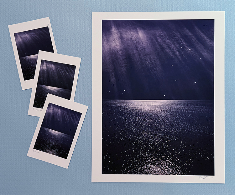
Print the same image or images on a wide variety of substrates and evaluate the proofs side-by-side. You’ll need a unique profile for each substrate you test. Once you’ve done this testing, you’ll be able to make informed decisions about your choice of substrate for future images and bodies of work. As new materials become available, test the same image or images on them and make comparisons to your previous proofs.
Compensate for Viewing Light
Evaluate proofs under the light temperature that the final prints will be viewed under. Compensate for any discrepancies between the viewing light and the color temperature the profile was designed for, typically 5000K.
Proof for Fine Adjustment
Some level of fine adjustment is typically required. When making fine adjustments to an image during the proofing process, structure your approach. Solve the biggest challenges first. Favor addressing luminosity, hue, and saturation, in this order. Address them separately. If you tackle too many variables at once, you may not be able to assess each one accurately.
Proof at Reduced Scale
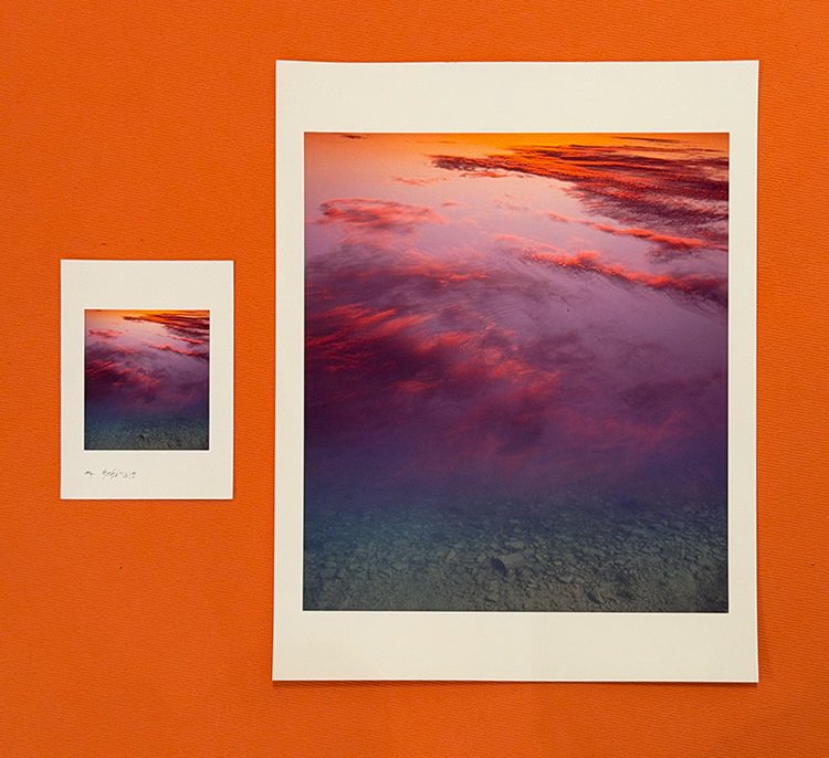
You can save considerable time and materials by proofing images at a reduced scale. It’s even possible to use paper scraps, damaged paper, or proof on both sides of double-sided paper. For proofing to be precise, you have to proof on the same printer, on the same substrate, and under the same conditions in which you will make the final print.
Proof at Full Scale
There are some things that you must proof at full scale to evaluate. Fine detail, edge quality, noise, and banding. You may proof either the entire image or a slice of an image containing areas that will enable you to evaluate these characteristics.
Compensate for Changes in Scale
If you proof at a scale that differs significantly from the scale of the final print, you’ll want to make adjustments for the effects of scale on lightness. Darken an image 1 point every time the total image area is doubled – and vice versa. (Use a midtone point on a curve to drive 128 to 127.)
Customize Ink Limit and Print Speed
The amount of ink applied to a substrate has a significant impact on print quality. More ink yields higher dmax and greater gamut, but excessive dot gain can subdue detail and even create spattering. One way to allow for more ink layout without excessive dot gain is to allow more time for the ink to dry by slowing the print speed. The key is to get an optimum balance. Many printer drivers will allow you to customize these settings. Watch for loss of shadow detail. Watch for spattering in highlights and midtones. Raise the amount of ink laid out to a maximum without encountering these adverse side effects.
Compensate for Loss of Shadow Detail
Classically, inkjet prints are over-inked to produce dense blacks and rich midtones, but this often sacrifices deep shadow detail. Some printer drivers enable you to adjust the ink limit. If this solution is not available or does not deliver the desired results, mask the deep shadows and lighten them to compensate. As inkjet prints emerge from the printer almost dry and the majority of drying occurs in the first twenty minutes, it’s rare that drying time has a significant impact on the appearance of a print. Inkjet prints dry slightly lighter.
Address Banding
If you encounter banding in a proof, first check the digital file. If the banding is in the digital file, adjust the file. If the banding is not in the file but is in the proof, improve data transfer to the printer with a faster connection or by minimizing the use of the computer during printing. Use the printer driver to adjust print speed to eliminate microbanding.
Keep a BAT
For centuries, it has been a time-honored tradition to keep a final proof, a BAT (Bon A Tirer is French for “good to pull”, something to refer to when you evaluate prints over a large run or decide to print an image again. Replace old BATs with new BATs after each new proofing session.
Reproof
If a significant amount of time has passed since you initially proofed an image, make a new proof using all previous proofing conditions to confirm that conditions have not changed. If slight shifts have occurred, continue proofing from that point until you get the results you want.
In a few cases, the final proof may be more pleasing to you than the image on the monitor. In this event, consider adjusting your master file to reflect these changes. Make the file look like the proof.
Ansel Adams remarked, “The negative is the score. The print is the performance.” Today, we may need to shift terms. “The digital file is the score. The print is the performance,” but the principle remains the same. Think of proofing as the practice that perfects a final performance.
Find more Proofing resources here.
Learn more in my digital photography and digital printing workshops.
With luck, one proof may be all you’ll need.
Sorry, the comment form is closed at this time.