How To Master Your Final Proof Before You Make Your Final Exhibition Print | BAT

BAT

BAT, bon a tire, it’s French for good pull”. Classically, it refers to a final proof print. For centuries, it has been a time-honored tradition to keep a final proof on file, a reference for evaluating prints over a large print run or when reprinting an image. BATs are also useful for small runs, ensuring that subsequent prints will be of equal quality – or better.

To be definitive, a BAT must be printed as the final print will be printed using the same image file, printer, ink, paper, software, profile, and driver settings.

There are several practices that make creating a BAT particularly easy when printing digitally.

Make Notes

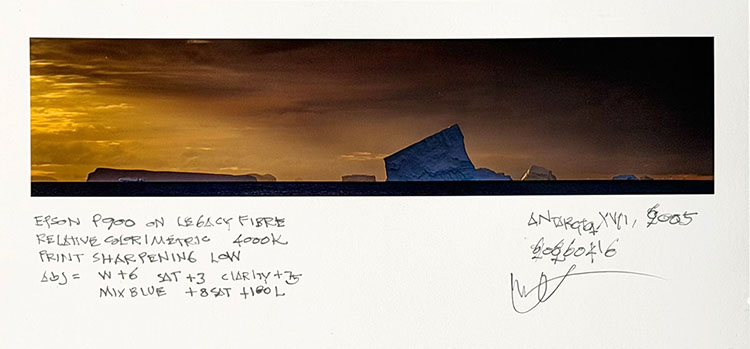
Make notes of any choices and adjustments you make as you proof. Annotate every proof with enough information to retrace your steps. It’s easy for proofs to get shuffled, and then you may have to start over.

Make more comprehensive notes on the final proof (the BAT). Include printer, ink, substrate, profile, rendering intent, the light temperature the proof is intended to be viewed under (5000K or 3600K), output-specific adjustments including output sharpening, and the date the proof was created.

Sign only the final BAT, not the intermediary proofs. This is particularly important when a proof is made for someone other than yourself. Their signature confirms they have reviewed and approved the proof. The BAT becomes a visual contract with your client.

With these items recorded, you can read the proof to help you identify relevant factors that contribute to print quality (for a specific image or for general purposes), and you can efficiently retrace your steps in subsequent printing sessions. If at any time a future proof does not match the original proof, you will be able to quickly identify the variables in the printing conditions that have changed.

Don’t make BAT notes on the final print(s). You may want to annotate your finished prints with information relevant to collectors; on the back – title, materials, date printed; on the front – edition number and signature. Use a pencil for matte surfaces. Use a pigmented ink for photo surfaces.

Think About Scale

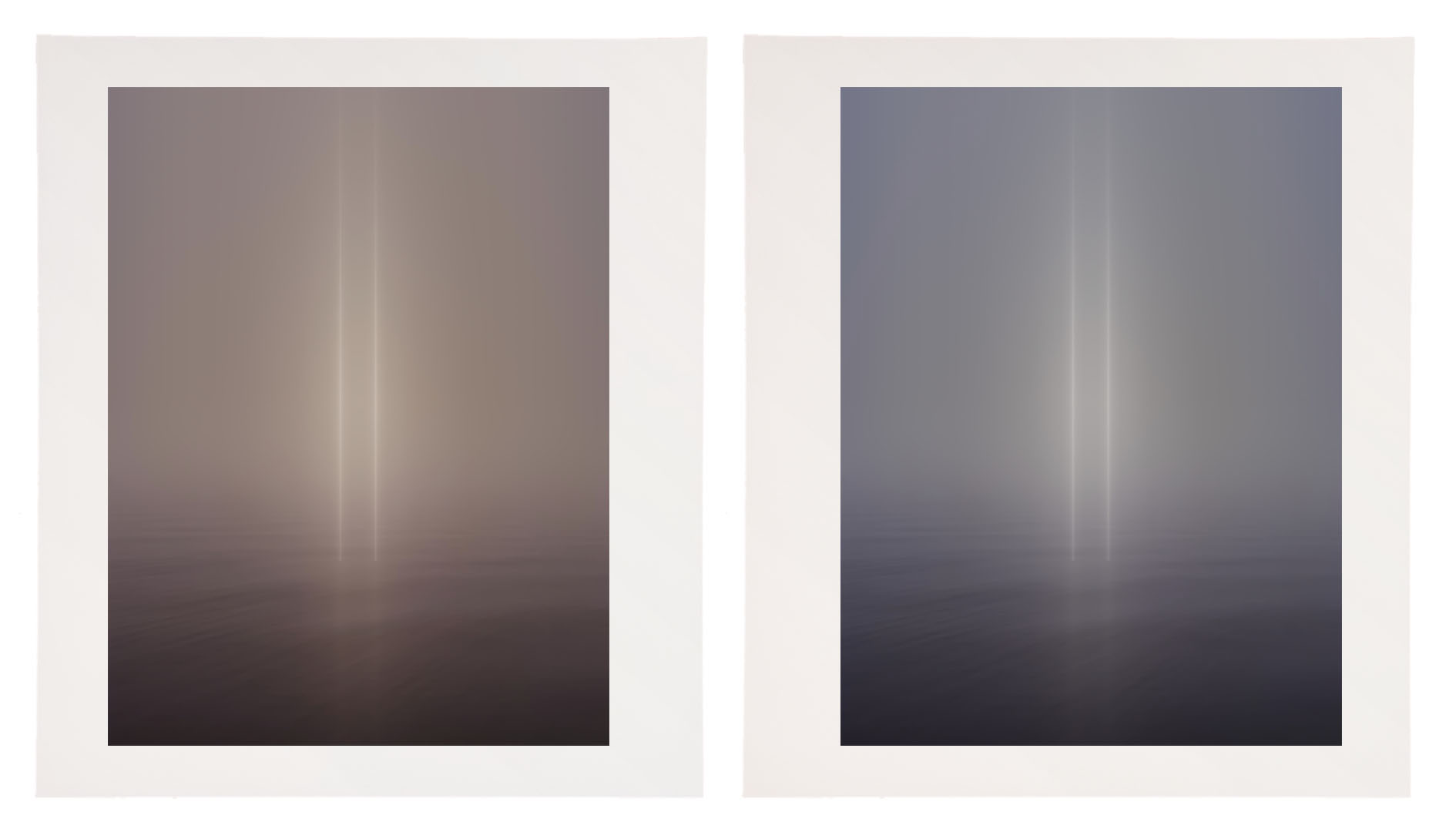
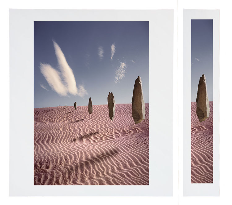
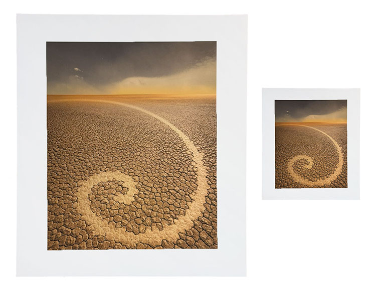
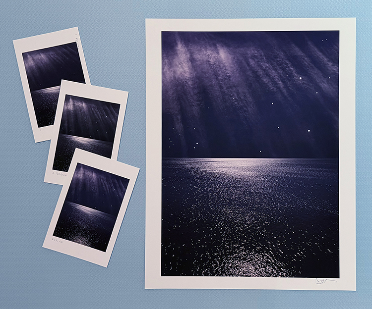
Though not all proofs made during a printing session are at full scale (proofing at a reduced scale can save time, materials, and money), a BAT is typically made at or near full scale, allowing accurate assessment of detail, sharpness, edge quality, and noise. Adjustments for the subtle shift in an image’s appearance across scales can also be accurately assessed: larger images appear lighter and contain less contrast. That said, while slightly less accurate, even BATs made at reduced scales are still extremely useful references for future printing.

Organize BATs For Easy Future Retrieval

File all your BATs in an organized manner so you can retrieve them quickly. Though you may wish to, it’s not necessary to keep all the proofs from a proofing session. Consider keeping the very first proof pulled without additional adjustments, as it can be used to compare previous printing conditions with current ones, separate from session-specific adjustments. Always keep the BAT.

Reproof When Necessary

If a significant amount of time has passed since you initially proofed an image, make a new proof using all previous proofing conditions to confirm that conditions have not changed. If slight shifts have occurred, continue proofing from that point until you get the results you want. More significant changes may occur when you change materials (inks, papers, profiles), and you may need to remove old adjustments and make new ones. If enough time has passed, your technique and/or sensibility may change, a little or a lot. BATs don’t limit you; they simply ensure quality control. It can be illuminating to see the evolution of an image’s print quality and your interpretation of it. Replace old BATs with new BATs after each new proofing session. If you choose not to discard old BATs, be sure to refer to the most recent BAT as your mark to meet.

Remember, when reprinting, don’t slavishly follow BATs. They simply set a standard to meet. Hopefully, you can exceed it as your media, technique, and vision evolve.


Explore more Printing resources here.

Learn more in my digital photography and digital printing workshops.

How To Adjust Your Prints For The Light They Will Be Viewed In

A print printed with a 5000K profile viewed under a warmer light temperature (left)
and a print with a compensating cooling adjustment (right).


The vast majority of printing profiles are optimized for a viewing light temperature of 5000K. Yet, the final viewing light temperature for most prints is rarely 5000K.

What light temperature are most prints viewed under? In galleries and museums, the standard tends to be halogen or LED with a similar temperature (3800K). In most homes, you’ll typically find a mix of tungsten (2900K) and daylight (5000K); the mix depends on placement and the time of day.

If you proof under 5000K light, the color of the final print will shift when viewed under a different light temperature. If you use a printing profile optimized for 5000K and your prints are viewed under a different light, the final viewing light, they will appear to shift color. If you proof under a light temperature similar to a final viewing temperature other than 5000K then the softproof on your monitor will appear less accurate.

What can you do?

You could edit the printing profile you’re using, but this requires special software and the expertise to use it. It’s more practical to use an existing profile optimized for 5000K and compensate during the printing process for the discrepancy in viewing light temperature. This requires some initial proofing. To do this, use an image that contains a variety of colors; include neutrals that make color shifts very apparent. Proof the image. Evaluate the proof under the light temperature that the final print will be viewed in. Next, apply a color adjustment to compensate for the apparent shift in color caused by your chosen viewing light temperature. For instance, if you’re printing for a typical viewing light, between 3500K and 4000K, warmer than 5000K, you’ll most likely be adding a little cyan and a touch of blue (I’ve had more success using Curves than White Balance) to compensate for the warming influence of the lower light temperature. It may take a few proofs to get it right. But once you compensate for this color shift precisely, you can use that correction for all of the other prints you make, regardless of inkset or substrate. Use a preset, an action, or an adjustment layer, as you like.  This adjustment will work every time,  as long as your standard viewing light temperature doesn’t shift,

Then, take the extra step of recommending a viewing light temperature to venues that display your prints and customers who purchase them.


Explore more Printing resources here.

Learn more in my digital photography and digital printing workshops.

Why You Should Proof Print Detail at Full Size

Sharpness, noise, and edge quality can be precisely evaluated only in a full-scale proof.

A full-scale slice will increase proofing efficiency and economy.


Noise, sharpness, and edge quality can be precisely evaluated only in a full-scale proof.

A full-scale slice will increase proofing efficiency and economy.

To see it accurately, while color can be proofed at reduced scale, detail in prints needs to be proofed at full scale. That doesn’t mean you have to proof the full image. You can save time and materials by printing a cropped version. Select areas of an image that contain the widest variety of textures, particularly sections that show the information you’re most concerned with. Check three things – noise (smooth areas), sharpness (textured areas), and edges (contours).

Output sharpening is something that needs to be proofed to be seen. Because of mismatched resolutions (images on 72 dpi monitors appear much larger than they do on 1440 dpi printers) and variances in substrates (matte and glossy surfaces differ substantially in their ability to reproduce detail), the image on screen can only approximate final print sharpness. Proof images to view sharpness precisely.

If you’re using Lightroom, once you get a sense of the three settings –  Low, Standard, and High – you can choose one based on the image content. (I very rarely use High; too crunchy. I choose Standard for textured content and Low for smooth subjects. For very smooth images with little to no texture, I uncheck Output Sharpening.

There’s another reason to proof at full scale that’s perhaps even more important. Our experience of images can be profoundly changed by size.

Explore more Printing resources here.

Learn more in my digital photography and digital printing workshops.

Two Ways To Adjust Your Prints’ Lightness For Size

Larger images appear lighter than smaller images. It’s an optical effect, not a physical effect. It can’t be objectively measured with an instrument such as a densitometer. The effect is in the eye and the brain. Nonetheless, it affects the way we see images.

How does this impact printing? To compensate for this effect, darken larger prints and lighten smaller prints.

When do you do this? When you proof an image and when you make prints at different sizes. Often, proofing is done at a reduced size to save time and materials. Once an image has been resolved at the proof size, make an appropriate compensation to the image for the final print size. Make an additional correction when you make prints at other sizes.

How much? I recommend making a one-point shift in the midtones (using Curves) whenever the total area (height x width) is doubled (darken the print) or halved (lighten the print).

Test this yourself and see if you agree, but use an image that applies to as many cases as possible (full dynamic range with a variety of colors) and be as objective as you can. Don’t make the proofs look good; make them accurately match each other. The testing you need to do to determine these adjustments only needs to be done once, not every time you print.

As these are optical corrections, they can be applied to all substrates, inksets, and images.

Save these corrections. Then, you’ll be able to apply them quickly whenever you need to. Use a preset, an action, or an adjustment layer.

If you want to go further, consider contrast. Smaller images appear to contain more contrast, while larger images appear to have less contrast.  This shift in contrast is less pronounced than the shift in brightness. Watch for it; you may or may not wish to compensate for it.


Here’s a list of typical print sizes, followed by the total area listed in inches.

4×5” = 20” sq

5×7” = 35” sq

8×10” = 80” sq

8.5×11” = 93.5” sq

11×14” = 154” sq

13×19” = 247” sq

20×24” = 480” sq


Explore more Printing resources here.

Learn more in my digital photography and digital printing workshops.

The Art of Proofing

Proofed and printed with an Epson 900 Ultrachrome Ink on Legacy Fibre paper.

Proofing. Some think it’s a lost art. It’s not. Some aren’t aware that they’re doing it. You probably are. If you’re not doing it, it’s highly likely that you can make even better prints than you already are. If you are doing it, you’ll probably find that structuring and refining your proofing process will have many beneficial effects on the print quality you achieve.

What’s proofing? Evaluating an image printed on a particular substrate, making adjustments to the file, reprinting, reevaluating the image on a subsequent print, and repeating until optimum results are achieved.

Proofing is not a Substitute for Color Management

The fact that we still make proofs doesn’t mean color management doesn’t work. It’s amazing it works as well as it does. And, it’s getting better all the time. There are limits. It helps to know the limits. Proofing is not a substitute for good color management practices. Good color management will save you time, materials, money, and improve print quality. There are certain things you cannot solve with proofing if color management is poor. Good color management will get you the best first proof possible. Good color management policies will allow you to trade in subtleties when proofing. Properly implemented, color management will get you 90% of the way there.  To get the last 10%, you need to proof. And, it’s the last 10% that separates good prints from great prints.

The Limits of Softproofing

Softproofing. Simulating the appearance of an image printed on a specific substrate, with a specific printer, driver, output profile, and rendering intent – before it’s printed (View: Proof Setup: Custom). For some, it’s the missing component of color management. Others who have mastered softproofing may have been misled into thinking that a perfect match is attainable. If close is close enough, softproofing is all you’ll need. When it comes to making the very finest prints, some proofing is required, but it has limitations.

Softproofing’s preview of the difference between transmissive and reflective color spaces is not absolutely precise. Even with today’s technological advances, we have a limited ability to display the profound translation between glass or plastic emitting light (transmissive) and paper absorbing light (reflective). While you can match the two closely enough to make very sophisticated predictions about inevitable changes to color, some differences between the two persist, chiefly in brightness (the white and black of the paper and ink).

Softproofing can’t simulate different viewing light temperatures. Profiles are light temperature-specific. With rare exception (ImagePrint RIP), output profiles are created for a standard viewing light of 5000K. Some compensation will be required if prints are to be viewed under a different light temperature. A majority of prints are viewed under very different light temperatures, typically warmer.

Softproofing can’t display the differences between color management routes. Use the same profile using two different color management methods, and you will get slightly different results. Test this by comparing proofs made using Let Printer Determine Colors and proofs made using Let Photoshop Determine Colors.

Softproofing can’t display inaccuracies in profiles. If a profile is inaccurate, the softproof will be inaccurate too. While some profiles are vastly superior to others, I’ve never seen a perfect profile. Even with the finest profiles, you will need to compensate for small inaccuracies by proofing.

Softproofing can’t fully represent the impact of scale. Monitors have one size. Prints can be made in sizes much smaller or much larger than the monitor used to view a digital image. There are optical effects linked to scale – larger images appear to be lighter and contain less contrast, while smaller prints appear to be darker and contain more contrast.

Softproofing can’t precisely preview detail and sharpness. A monitor’s resolution rarely matches a print’s resolution, so distortions in scale are required in order to assess detail, sharpness, contours, and noise. Softproofing also can’t preview the softening effects of dot gain.

Softproofing can’t show the sensual characteristics of the substrate surface. A monitor has only one surface, but you can print on a marvelous range of substrates from super glossy film to fibrous watercolor paper. Each substrate adds a unique aesthetic dimension to the final print.

In the end, in order to achieve the best quality possible, it’s highly likely that you will want to adjust an image after you see it printed out or proofed. You may need to do this multiple times to achieve optimum results. Here are twelve things that will improve your proofing.

Read More

Printing Tips

Download your free copy now!


The little things can make a big difference, never more so than with printing.


Banding

Colored Micro-Banding

Dark Micro-Banding

Ink Drips or Smears

Ink Spattering and Pooling

Light Micro-Banding

Maintenance Tank is Full

Paper Won’t Feed

Printing Borders Aren’t Equal

Printing Off Paper

Delete & Reload Printer Driver

Locating Printer Utilities

Printer Power Cleaning Cycles

Evaluate Proofs Under Glass

Fragile – Packing & Shipping Prints

Signing Prints


Sign up for Insights for news of new content!

The Art Of Proofing

Download your free copy now!


Get the best print quality possible with these proofing techniques.


Proof – The Art of Proofing
Refine your proofing process to achieve the best print quality efficiently.

Proof – BAT
BAT (bon a tiré) is the final proof print.

Proof – Notes
Take good notes so you can retrace your steps precisely.

Proof – Bracket Proofing
Bracket proof and get one hundred proofs in one.

Proof – Prevent Overinking
Set proper ink limit for a substrate and reduce overinking.

Proof – Correcting for Viewing Light
Compensate for discrepancies in profiles and viewing light temperatures.

Proof – Light Temperature
Light temperature has a significant effect on exposure, calibration, printing, and display.

Proof – Compensate for Scale
Larger images appear lighter than smaller images. It’s an optical effect that affects your prints.

Proof – Full Scale
Proof at full scale to check noise and sharpness.


Sign up for Insights for full access and new content!

How To Preserve Lively Shadows In Your Prints

Constellation_XXVI_Shadows
One of the keys to making a great print is great shadow detail.

Shadow detail is something to be mindful of during exposure, processing, and printing. Curiously, even if you see shadow detail in your file on a calibrated monitor you may not see all of the details in your print. What can you do about this? Many things!

First Check Your Color Management
Before you start editing your files based on your proofs, check your color management system.

Recalibrate Your Monitor
Make sure you’ve calibrated your monitor with hardware. Set a brightness value of 90-100 lux, instead of using the default brightness target of 120 lux. If your monitor is too bright, your prints will look dark overall, especially in your shadows.

Read more on Profiling Your Monitor here.

Give Your Prints Enough Time To Dry
Inkjet prints come out of the printer almost dry, but not quite fully dry. When they’re fully dry, they’ll appear slightly lighter, especially in the shadows where there’s a lot of ink. So before you evaluate prints critically, give them a few minutes to dry. This affects absorbent matte surfaces even more than glossy surfaces.

Find my resource on Outgassing here.

Look At Your Prints In Good Light
Look at your prints in good light. You need the right amount of light (at least 500 lumens), the right color temperature light (5000K is the standard but many viewers prefer the warmer 3600K), and it helps to use full-spectrum light (a CRI of 90 or higher). (Many manufacturers now make full spectrum bulbs, like Solux and Soraa.)

Read more on Controlling Your Environment here.

MediaType_P800

Media Type sets the amount of ink that's used.

Set Your Media Type Correctly
Your printer driver will allow you to set your media type, which controls ink the amount of ink that is sprayed on your paper. Use too much ink and you’ll lose shadow detail. Use too little and your blacks and midtones will appear weak. If you’re using a paper not made by the manufacturer, choose the nearest media type and then adjust its settings with the printer driver’s advanced utilities. (You’ll find this under Advanced Media Control with Epson printers.)

Find my resource on Ink Limit here.

testfile_shadows

Print test patches to determine when maximum black is achieved and when separation is lost.

Print A Target To Determine How Much To Lighten Shadows
Before you adjust your files for printing precisely determine how much you need to lighten your deep shadows by printing a target. While they vary a little, most media settings lose shadow detail around a value of 96% on a grayscale. If you print patches of values between 100% and 90% you’ll see exactly where you lose shadow detail. Printed results will vary slightly with each different media setting, so you’ll need to adjust files slightly differently for different media.

You can download my targets here.

Next Adjust Your File


Insights Members can login to read the full article.
Email:
or Sign up

Watch Me Demo Softproofing & Proofing


Recently on TWIP’s (This Week In Photoshop) The Fix I spoke with Jan Kabili about the power of printing your photographs. Then I demonstrated how to get the best results possible with Softproofing & Proofing practices. Watch this and you’re sure to get better prints in less time with less waste.
Find more useful videos on TWIP’s The Fix here.
Read more with my free Color Management and Printing resources.
View more in my DVD series R/Evolution.
Learn more in my digital photography and digital printing workshops.

Evaluate Proofs Under Glass

proofunderglass

It’s an excellent idea to evaluate final proofs under glass (or plexiglass). This is particularly true if you’re using very thick or low grade glass. Often, when see under glass the print appears ever so slightly darker, lower contrast, and sometimes greener. There’s no ideal glass or plexiglass to evaluate proofs with. Use whatever the print will be viewed under. What you want to be able to do is adjust subsequent proofs so they look ideal in the final viewing state of the print, which is rarely bare.

Read more Printing Tips.
Learn more in my Fine Art Digital Printing Workshops.