Good Enough – The Story Behind The Image
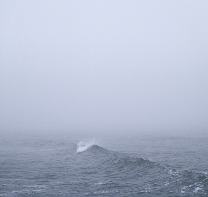
It’s not the most dramatic wave; it’s rather small in comparison to the enormous waves you find in the Pacific ocean. The ocean waters aren’t glassy smooth; the wave line isn’t fully continuous; the surrounding waves aren’t perfectly scalloped; and the foam in the foreground serves only as accents, indicating a previous passage, rather than forming a clear and present pattern. It’s not illuminated by the clearest light nor does it glow from within. Still, there’s an intensely quiet presence about this image (Condensation X), deceptively calm on the surface but potentially turbulent below, with an air of mystery (Where is it coming from and going to? What surrounds it?) that makes it powerfully expressive in a complex and unique way. It’s not obvious but it is rewarding. You might say it’s a sleeper, something you might not pay close attention to at first but the more you look at it the more it grows on you.
Being sensitive to times when less is more and more is less will help you get it just right. In today’s constantly competitive culture, it’s hard not to over achieve. But sometimes, that’s exactly what you need to do. Sometimes what you really need is to get it just right – and nothing more.
I like to do my very best. I like to try to do it better every time. Sometimes I try too hard and do too much. I’ve wasted hours, days even, trying to perfect something only to find out that along the way the life had gone out of it. I’ve found that things that I thought were distractions were really things that made something richer and more complex, after removing them. I’ve come to the realization that what I thought were flaws made something perfectly imperfect. This is not to say that I don’t still try to make things as good as I can and even to up my game. It is to say that the answers I’m looking for transcend technical perfection and sometimes are better for less of it.
In the world of photography it’s easy to lose sight of the big picture for all of the details. We have an extensive list of physical characteristics to evaluate the quality of photographs – focus, depth of field, frozen motion (or extreme motion blur, but nothing in between), low noise, detail in highlights and shadows, contrast, credible color casts, believable levels of saturation, no lens artifacts, the list goes on – yet we are much more challenged to describe the quality of photographs on the levels of perception and content, which are more important. There are times when technical perfection can be distracting or worse a cover up for what’s lacking. Photographer Ansel Adams remarked that, “There’s nothing worse than a sharp image of a fuzzy concept.”
It’s a matter of appropriate means. You don’t want to create dynamic images to portray quiet, tender moments. You don’t want to retouch portraits of victims of war, famine, or pestilence. You don’t want to reenact the truth to make it picture perfect.
There are many times when things seem more authentic if they’re not perfect.
Besides, the more perfect your presentation becomes the more attention you call to the delivery. When you want to call more attention to the content perfect presentation may not be perfect for the purpose. Make your delivery effective. Sometimes it’s more effective to deliver just enough, not more, not less. It’s part of getting it just right.
Questions
What isn’t good enough? How do you know?
What is good enough? How do you know?
What is too much?
What is perfectly imperfect?
Find out more about this image here.
View more related images here.
Read more The Stories Behind The Photographs here.
No Comments