Enjoy Sandra Chandler’s New Project Salt – Website, Book, Exhibits
SALT
February 4th – March 31st, 2022
Artist Reception: TBD
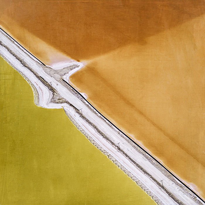
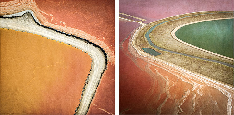
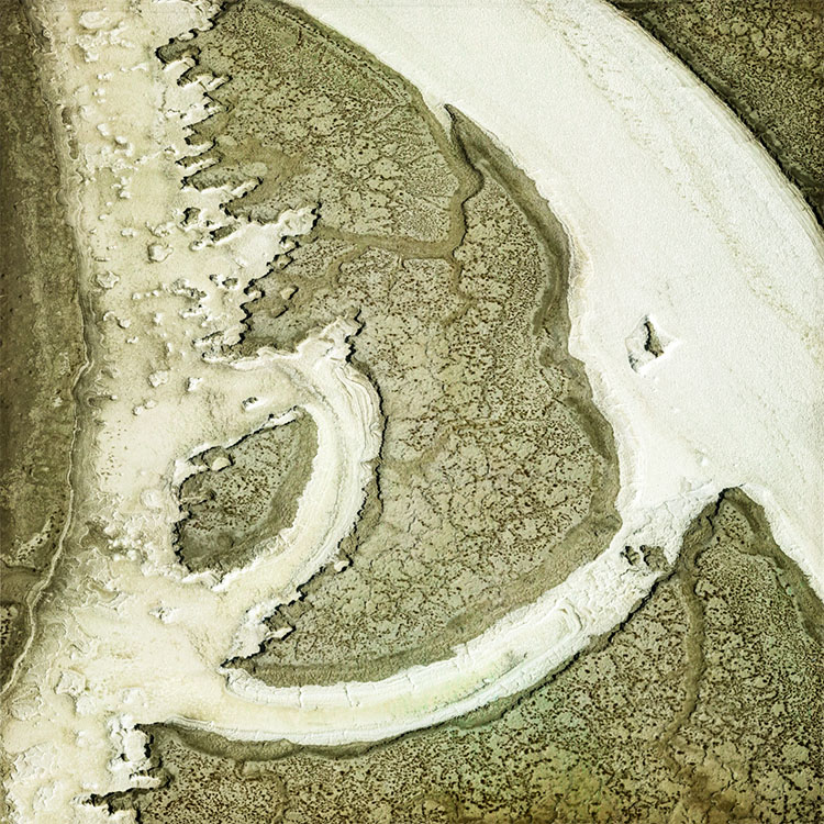
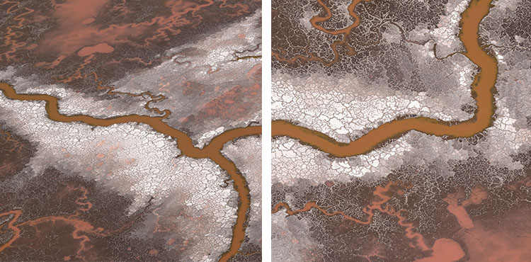
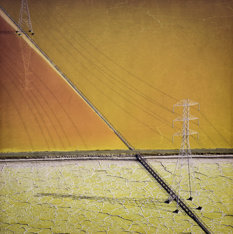
Sandra Marill Chandler’s new body of work juggles abstraction and realism. Her aerial interpretation of unexpected color patterns is based upon the salt evaporation basins of the San Francisco South Bay. It illustrates the brilliant hued pockets and tactile textures that are ever-changing.
Chandler grew up in San Francisco traveling frequently via the San Francisco International Airport. “I have always been captivated by the South Bay salt pond’s vibrant colors, captivating textural shapes and intriguing graphics as seen from airplane windows. As I have grown as a photographer, I have become attracted to aerial landscape photography and have come to appreciate a fresh perspective of our earth.”
“I strive to make photographs balanced between abstraction and realism aspiring to create colorful explosive images with noteworthy details. These photographic moments prompt a sense of space, a moment of drama and new ways of perception – for us all.”
Conversation
It’s been a pleasure to travel and work for many years with friend and mentee Sandy Chandler. Recently we had a conversation about her newest body of work.
JPC
You have a strong background in interior design. Here you’re turning your gaze to a landscape designed by someone else and redesigning it within your frames. How many ways does your background in one inform your activity in another?
SC
As a photographer, I love the same elements I do as an interior designer: color, texture, scale, composition, line and balance. Making photographic images has made me rethink my own design preferences and incorporate style refinement. What captures my eye has remained remarkably consistent throughout my design career.
The design process is all about seeing the big picture and then fine-tuning the details. This is true of Interior Design, my profession as well as my enthusiastic love for photography. I begin every project with overall concept; then narrow it down, fine-tuning as I go, space by space, layer by layer.
Components of the interior design process: sorting, editing and deleting unessential elements require critical, analytical and emotional discernment…this also applies to my photography capture and workflow process.
JPC
What do you think happens to you and your viewers when you direct attention aware from literal detail and towards form within the frame?
SC
I see the world through a design filter that encompasses my photography and interior design practices. Color and composition are integral parts of my design vocabulary. They encapsulate the beauty and significance of my photographic images.
I am conscious of balancing creativity, imagination and aesthetics within my canvass. I easily shift the image boundaries within the square frame. Imagination, an unrestrained flow of creativity, requires concentration. I aim to solidify my conceptual ideas together into a coherent abstraction.
My intention is to depict a photographic image that abbreviates a larger overview
and expresses the essence of the specific subject. I attempt to isolate details rather than incorporate everything in the scene. I hope my images create a spacious yet intimate opportunity for inquiry…and the indulgence to momentarily escape reality.
JPC
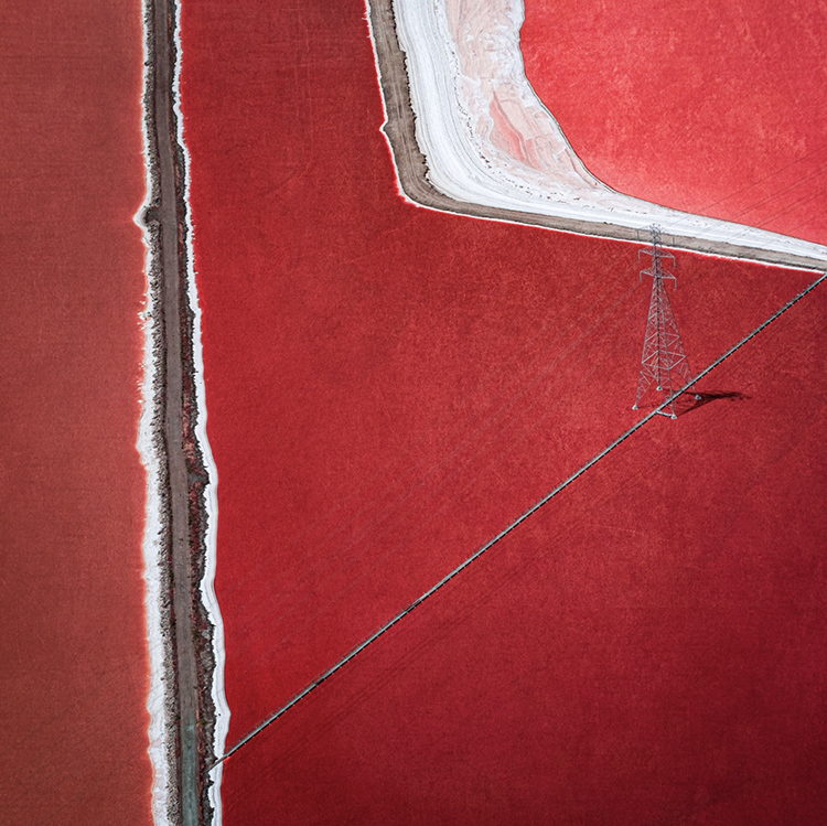
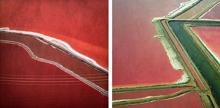
For the images with power lines and towers, do you see these elements as contrasting with or subsumed into the flatter geometries made by the frame and does that suggest a specific way of looking at the entire picture plane as tilted deeper or flatter?
SC
I do not discern a ‘tilted deeper or flatter perspective’ to the Salt photographs. I am curiously driven by the images harmonizing natural landscapes with manmade industrial manufacturing tools and equipment.
This balance blending and integration between visual abstraction and realism is a key component to me. Certain images require the visual texture of lines and equipment to add emphasis to their tactility. These manmade elements contribute to the depth of otherwise featureless images. I think these photographs would feel lacking without these additions. The square format acts as my canvass stage for color, textures and graphic design to interplay.
The aerial photography provides a profoundly divergent interpretative perspective to these landscape images. My curiosity probes the relationship between the natural landscape with and without man’s presence.
JPC
There’s a palpable sense of texture within your images. Why is this way of knowing things so important to you even in images of subjects you don’t actually touch?
SC
I am intrigued with image color and texture. Initially, I see the color…then I notice the visual texture. Texture adds depth and visual complexity to my images. In some cases, I have added additional texture to enhance the photographic visual.
As an interior designer, I am fully aware of the valuable characteristic properties of texture: appearance, finish, surface, grain, quality, consistency, weave and nap. Using a selection of textures in my three-dimensional work has taught me the value of textural variety. A richer dimensional palette is achieved. This has motivated me to utilize textures in my two-dimensional photography. The difference is a pronounced perceptible touch versus a fabricated visual illusion.
JPC
These frames are clearly divided, mostly once, sometimes more but often in very different ways. Can you share some of your thoughts about what it might serve and why it’s so compelling to you?
SC
I am attracted to sequential arrangement and variation that dissects the square canvass space.
The flow from one partitioned space to another is relevant with styling and color scheme.
The intensity of powerful and uncomplicated design composition is offset by surprising details of various colors, textures, lines and scale objects that supply playful unexpected elements. This simplicity does not suggest a lack of sophistication. Rather, the simpler the composition, the more sophisticated it can become. As with any type of master plan, simplicity is critical; restrained control is paramount. ‘Less is more’! I hope this is appreciated as a contemplative and engaging balance.
JPC
Celebrate the square for me.
SC
I have had an affinity for squares shapes throughout my design career. My interior design business card and collateral material incorporated the square motif. When I became interested in photography, I was intrigued with a Hasselblad medium 6 x6 medium format which provides an awe-inspiring square photographic presentation.
The square in Buddhism symbolizes the earth, with each of the four corners relating to the four points on a compass. When placed inside a circle (which symbolizes eternal whole), they represent the connection between the human and the divine.
To the contrary, the square is very common and can sometimes be seen as monotonous. Rectangles are the default shape for the majority of photographs. This familiar shape creates a sense of equality, conformity and stability. ‘Artists consider the square image to be a more intellectual composition compared to the ordinary rectangle.’ I am not sure I would go quite that far. However, I have always loved the square format…I am attracted to its regularity and balance as a stage for imagery.
I am challenged to use the square as an integral part to my finished image. With this in mind, I want to create a balanced canvass space filled with asymmetrical geometry.
JPC
These images are made close to home, but they look otherworldly. Was that a useful tension for you?
The tension was actually focusing beyond the apparently obvious. Looking deeper into the inconspicuous elements piques my interest. My attention is drawn to: What is the selective character of the overall photographic view? Why must I look deeper? What will I find if I delve beyond the clearly visible?
I am drawn to abstract and unexpected color arrangements that often hide in plain sight. I find beauty and intelligence in the minimal stand-alone essence of the original perspective. My goal is to create a vibrant imaginative likeness that invites the viewer to contemplate ‘what am I looking at and why does it matter’?
JPC
These images are intimate. And yet when you made them you were quite distant from your subject. Would you share some of your thoughts on how intimacy is achieved?
SC
“As above so below.”
I am attracted to images that are intriguing and compelling. These photographs inspire my examination and inquiry. ‘What am I seeing’. ‘How do I identify this?’
Our Iceland photography jaunt was a tremendous opportunity for me to experience ‘close up and personal’ ‘landscape within a landscape’ imagery. It piqued my curiosity and required that I explore further. This understanding has led me to delve deeper into my photography practice.
My minimalist sensibility requires that I eliminate unnecessary details…in all design venues.
The simple elegance of a design is created by reducing elements to the least common denominator. The dominant concept will dictate the path. My task as a designer and photographer is to determine the approach to this essence.
JPC
Intimate abstraction. Is this a sensibility you take with you everywhere? (Or to put another way, what does OCD stand for – obsessive-compulsive disorder or obsessive-compulsive devotion?)
SC
I would propose “obsessive-compulsive devotion” is a well impressive interpretation of OCD. I opt for a minimalistic design approach free of dissonance that combines historical elements with contemporary design.
I strive to make intimate abstractions that create a harmoniously flowing impact. And balance is a significant part of my OCD. Balance, in my mind, does not identify exclusively with symmetrical or asymmetrical design. My balance can be either. Critical to my sensibility is a blending of composition, color, scale and balance. Harmony with proportion is essential.
I strive to make photographs balanced between abstraction and realism aspiring to create colorful explosive images with noteworthy details. These photographic moments prompt a sense of space, a moment of drama and new ways of perception. My creative goal is to create balance between reality and design abstraction with graphic intrigue.
I had to move to Portland in order to create ‘Salt’. Living at home in San Francisco and bay area was too easy; I had to get farther away to appreciate the color and graphic explosion of salt ponds.
View more images by Sandra Chandler …
No Comments