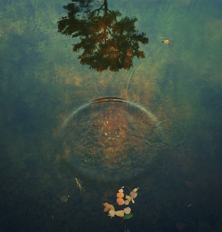
Deciding what’s in the frame and what’s out is a critical decision that can make or break an image. You can look at it very simply. What is an image of? What is an image not of? And how does what’s left over support or distract from the essence of an image?
In the past we had two simple options; one, use the frame to crop; two, crop when printing or post-processing. Now we have two more options to think about; three, distort; four, retouch. Each of these offers different possibilities and becoming familiar with them all will help you choose.
It’s a new mindset. Once you learn to see in these new ways, you’ll find you’ll make images that you previously passed by, leaving them unmade or even unnoticed. As a result, you’ll make many more successful images.

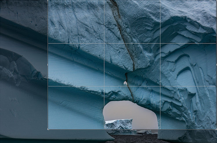
Classic crops eliminate the most information
Crop
You’ve got choices. Choose wisely.
One – Crop Before Exposure
Use the frame to eliminate distracting information around a subject(s). Take extra care with image information that touches the frame, as it will draw extra attention. If part of an object is eliminated by the frame make sure what’s left looks deliberate - just a sliver lopped off or a sliver left over seems careless. Once you’ve made your exposure, you’re committed. You can crop more but you can’t uncrop. When in doubt, shoot both tight and loose.
Two – Crop After Exposure
Shoot loose (more than you need) and you’ll preserve your ability to refine a composition during post-processing, testing, and comparing many variations, even over extended periods of time, before settling on a final solution. Doing this will take more time but you will gain precision.

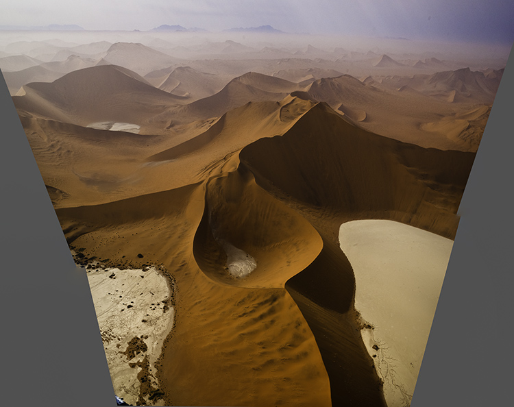
Distorted to fill the frame
Distort
Distorting photographs is widely practiced. But most photographers tend to think of their limited use of distortion as having produced no distortion. In fact, every lens distorts in its own way, some more than others, like wide-angle lenses. Lens profiles are designed to correct for lens distortion during post-processing by ‘undistorting’.
Many people think they aren’t distorting their photographs when in fact they are doing it on most of their images in multiple ways, first by using a lens, second by using a lens profile, and sometimes third by creating panoramas. Why are these practices more acceptable than using distortion and retouching as a part of your cropping practices? In the end, it’s your choice.
You can push one or more sides of an image outside its frame and achieve similar results to cropping. What’s different here is that the proportions of the objects and spaces left within the frame will change, typically getting taller or wider, usually only a little but potentially a lot.
You’ve got options. Test them before you settle on your final solution.
One - Transform
Use Photoshop’s Edit > Transform to distort an image uniformly. To move an entire side, hold the Shift key to move one side without moving the others. And/or, to move one corner independently, press the Command key before moving a corner point.
(To do this an image’s Background Layer needs to be a Smart Object or a duplicate layer.)
Two - Content-Aware Scale
Use Photoshop’s Edit > Content-Aware Scale to distort an image non-uniformly – smooth areas will expand or contract more than textured areas. Pull the areas you wish to crop outside the frame. Hold the Shift key while you’re doing this if you wish to change one side more than another and the image’s aspect ratio with it.
(Do this on a duplicate layer. Content-Aware Scale doesn’t work on a Smart Object.)
Three - Warp
Want more localized control? Try Warp. (Edit>Transform>Warp) Warp gives you a grid to adjust more points with. It adds the ability to modify the position of elements not just with the edges but also the insides of the frame. Do this on a duplicate layer or duplicate Smart Object. Warp works on Smart Objects but since it is not a filter so you can’t get the future flexibility of a Smart Filter.
Four - Liquify
You can use the Liquify filter to distort small portions of an image. For instance, moving something in the middle of the edge of a frame off frame without moving the corners. To do this, go to Filter>Liquify, start with the first tool Forward Warp and use the brush to get the effect you desire. It’s worth exploring the other brushes too as Liquify is a powerful distortion tool.

Distorted to fill the frame
Distorted version with aspect ratio changed afterward

Preserve Or Adjust Aspect Ratio
Both cropping and distortion may or may not change an image’s aspect ratio (the proportions of the frame). Cropping can be set to preserve a set aspect ratio but this puts limits on what’s possible as at least two edges, if not all, are adjusted together. if you adjust one edge separately from the others you’ll change the aspect ratio, for better or worse. But if a specific aspect ratio is important to you (either because the original creates consistency between images or because a new ratio is more expressive), after cropping you can distort the entire frame to the aspect ratio of your choice.