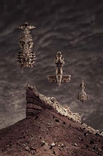
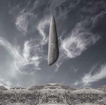
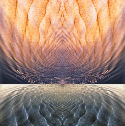
Oriens I


“Oriens represents a new line of inquiry for me. Take the most compelling passages of changing light throughout an extended duration of time and weave them into a single composition … Neither method, resynchronization or recontextualization, yields a classically objective document. But the results of either application may yield artifacts that are truer to our experience of events. In one respect these represent the events more faithfully — they encompass the passage of time.”
Read the rest of this Statement here.

Antarctica 2009


“There is a profound sense of privilege that comes from being in the presence of such rare beauty. It touches you deeply. Witness to the extraordinary, you leave changed – for the better. It’s a blessing born of grace and giving birth to more grace. It’s as if you’ve been given a gift and you feel compelled to keep giving it.”
Read about the highlights from three voyages to Antarctica.
Each voyage was very different from the other, even though we returned to some of the same locations.
Get priority status in my Antarctica 2011 workshop.
Email info@johnpaulcaponigro.com.

Survivor


“How much do you sacrifice? What’s best left included? What’s better left out? That sums up the whole photographic process for me. It’s about what survives and what doesn’t.

This image is like a poem. There’s a lyrical quality to it. There are echoes and rhymes within it. Though one is dark and one is light, the shape of the cloud is similar to the shape of the tree. The darkest and lightest values are linked through shape. The eye travels back and forth between the two. The common language found in their contours sets up a visual dialogue between the two. The image is bathed in a warm light, almost red, an appropriate color for both the earth and a heart. The limbs of the tree branch out contained within the body of stone, like veins. The image breathes. While there may be only a few visible signs at first, still, life persists, even in wastelands …”

Read the rest of this Statement here.

Read more Statements here.

Posse


“The stunning presences, within the series Allies, reminiscent of Native American totem poles, African sculpture, or Hindu figurines, had been pursuing me for months. There were, and still are, dozens waiting to find homes. While the majority of the images I had created featured solitary figures, I was drawn to explore the effects of many within a single image — group dynamics …  Most leading actors need supporting actors, all save the soloist need accompaniment. But, when supporting actors compete with main actors, the thrust of the drama is confused …”
Read the rest of this statement here.
Read more statements here.

Triple Goddess


Edge was critical throughout the entire process of composing Triple Goddess. First there was contour. What shape would the stone finally take? The original had been buried in sand. The stone was far too large to dig out, so I cut away the background that threatened to envelop it. This made certain determinations of shape. It may even have been the shape the sand made out of the stone that first attracted me to it. Had I seen the entire stone I might not have been so drawn to it. To date I have no idea what the full stone looks like, as I was only able to see a portion of it …
Read the rest here.
Read more statements and see more images here.

Oriental I


“I have always been particularly attracted to Asian calligraphy and painting. Ancient oriental paintings rely on overlap and atmospheric perspective rather than linear perspective to depict the recession of space on a flat plane. I particularly like the way they treat morning or evening mist over mountains. One abstract shape precedes another, successively growing paler, and each is paler at the bottom and darker at the top. You can see the atmosphere …”
Read the rest of this statement here.
Read my other Artist’s Statements here.

Resonance in Red and Gold

July 18, 2003

“Many meditation practices suggest gazing at the flow of water, in some cases watching or visualizing a drop of water hit the still surface of a greater body of water. Like many mandalas, Resonance in Red and Gold has a rhythmic centering quality.

The methods of both photographer and painter are married here. The color is an invention. The composition, both representational and abstract, offers a fluid structure to explore the power of color, physically and psychologically.

Red, the warmest color. Is its presence here the reflected glory of the heavens, a display of bodily fluid, or an omen of toxic waste? The power of this image can be found, in part, in tantalizing ambiguity. When looking at this image, I’ve asked myself why red, time and time again. I can’t answer the question. But by asking the questions that surround it I learn to more fully appreciate the presence and power of red.”

Read other artist’s statements here.

Find out more about my workshop The Power of Color here.

Dangerous Passage – Distilled in Black & White


Some images are better in black and white. This is one.
“Dangerous Passage was a compelling image. But something wasn’t working. The thorns were red. The stalks were green. The water was blue. They were not subtle. The color was garish. In many ways, the color was too literal. The drama of the composition was competing with the drama of color. The two were at odds. Their moods were incompatible. One was harsh and edgy. The other was bright and cheery. Color was the problem. So I removed it … The message was clarified. The image carried a much greater weight. Less became more. The image was somber in black and white. That much suited the mood. But it was ashen, cold, and remote. I missed the emotional power of color. So I put it back. I converted the image back to a color mode and introduced new color into the image.”
Read the rest of my artist’s statement here.
Read other artist’s statements here.
Find out more about black and white in my DVD Black & White Mastery.
Find out more about black and white in my Workshop Black & White Mastery.
Special discounts are available until January.

Nocturne XII – Color At Night


“They say we can’t see color at night. By comparison to day, I suppose that’s true. However, if there’s a significant amount of light, there are wonderful colors to be found at night.”
I wrote this many years ago. Since then I’ve come across recent scientific research that overturns the notion that we don’t see color at night. While our sensitivity to hue in low levels of light does diminish, we very definitely see it. We see color at night, even in the darkest hours.
Time and time again, throughout the history of art, I’ve seen examples of people calling it like they see it and expressing an underlying truth that science has yet to catch up with. My advice? Look closely. Trust your direct perception over the way you’ve been taught to see or think about seeing. Hold the questions of how it all works answered but open. With an open mind we learn more every day, There’s always more to learn.
See the rest of the statement here.
Read more statements here.

Artist's Statement – Mandala in Silver & Gold


Like any art form, writing reveals new things every time you engage the process. You can use writing to explore dimensions in images that aren’t immediately obvious.
Here’s an excerpt from the first statement I wrote on Mandala in Silver & Gold. I later wrote a second. I think a third may be useful.
“Surprises often become the start of something new. I find they contain the seeds for a new series or a new subset of an existing series. A latent theme is suddenly made visible. Rosa Celestia is one of those images for me …
I’ve come to know more and more about this image the longer I have lived with it. Yet it still remains a mystery. The fact that I can’t explain it, yet it still moves me, tells me the work is alive. I continue to look and be fascinated by it. I see more every time I return to it. It has become a well to draw from.”
Read two statements on one image here and here.