Dangerous Passage – Distilled in Black & White

–
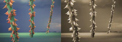
Some images are better in black and white. This is one.
“Dangerous Passage was a compelling image. But something wasn’t working. The thorns were red. The stalks were green. The water was blue. They were not subtle. The color was garish. In many ways, the color was too literal. The drama of the composition was competing with the drama of color. The two were at odds. Their moods were incompatible. One was harsh and edgy. The other was bright and cheery. Color was the problem. So I removed it … The message was clarified. The image carried a much greater weight. Less became more. The image was somber in black and white. That much suited the mood. But it was ashen, cold, and remote. I missed the emotional power of color. So I put it back. I converted the image back to a color mode and introduced new color into the image.”
Read the rest of my artist’s statement here.
Read other artist’s statements here.
Find out more about black and white in my DVD Black & White Mastery.
Find out more about black and white in my Workshop Black & White Mastery.
Special discounts are available until January.
No Comments