The Difference Between Painters’ and Photographers’ Color Wheels
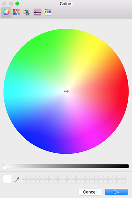
The photographers’ color wheel rendered by Apple.
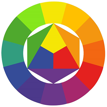
The painters’ color wheel painted by Johannes Itten.
In color theory, one of the primary uses of color wheels is to plot complementary colors.
Painters and photographers use this information to create neutral colors. Painters mix complementary colors to get more neutral hues. Photographers add complementary colors to remove color casts, making neutral colors appear more neutral.
But photographers and painters apply different complements. Photographers identify three primaries and complements; red and cyan, green and magenta, blue and yellow. Painters identify three primaries and complements; red and green, blue and orange, yellow and purple. Why do they use different complements? Painters have to address the impurities in the pigments they’re mixing.
Photographers deal with pure light.
From a practical standpoint, both types of artists learn to achieve the effects they want to achieve. From a conceptual or theoretical standpoint, the difference is significant – and they share the same theories but their application of those theories differs. Photographers and painters should talk to each other more.
Photographers can enrich their understanding of color if they become familiar with the longer richer history painters have had with color, and at the same time painters can refine their theories and produce stronger effects by using photographic complements.
Physically and biologically our eyes do specific things. By using maximum hue contrast, complementary colors in close proximity to one another create optical effects: they make each other look more intense; any lines between them becomes more pronounced, often producing a light line, which can appear to flash if the eye moves back and forth across it; if made very small (like scanned pixels or printed halftone dots) they average to a neutral color. Artists use these effects to make more powerful visual statements.
Optically photographic complements are correct. You can test and prove this yourself. To do this, take advantage of the retinal after images your eyes produce. Simply stare at a solid patch of color for more than twenty seconds and then shift your gaze to a neutral field of color, like a white wall. The color you’ll see will be the photographic complement. So, if you want to take maximum advantage of the optical effects generated by complementary colors, choose photographic complements.
Finally, color theory can be very useful. Artists frequently create consistent color structures (some call them color harmonies), much like the tonal structures or scales musicians. They often use color wheels to plot these relationships (not unlike a musician plots a circle of fifths to identify musical harmonies). They draw geometric figures inside a circle of color to identify regular intervals between the colors chosen; straight lines for pairs, triangles for trios, rectangles for quartets, etc. There’s no ideal structure. Different structures generate different effects, both optical and psychological – and it’s useful to know what those are. What matters most is that a color structure is created, rather than color chaos. The colors identified as complements define a color wheel. Once again, because of the impurities in pigments, painters distort their color wheels (expanding the oranges and reducing the cool blues) to help them identify which colors to mix to make neutral or more neutral colors, but the unintended consequence of doing this is that they plot color structures on a distorted color wheel. Their ideal theories are skewed by physical imperfections.
Long after his death, it was noted that pointillist painter Seurat, who started a whole school of painters who used broken bits of complementary colors rather than blended less intense colors, could have achieved even richer visual effects if he had adjusted his color choices. Viewers experience visual effects with their eyes. And the photographer’s color wheel is aligned with our eyes.
Learn more about Color Theory here.
Learn more in my digital printing and digital photography workshops.
 3500 K
 5000 K