8 Questions Answered As I Celebrate Color For Calibrite
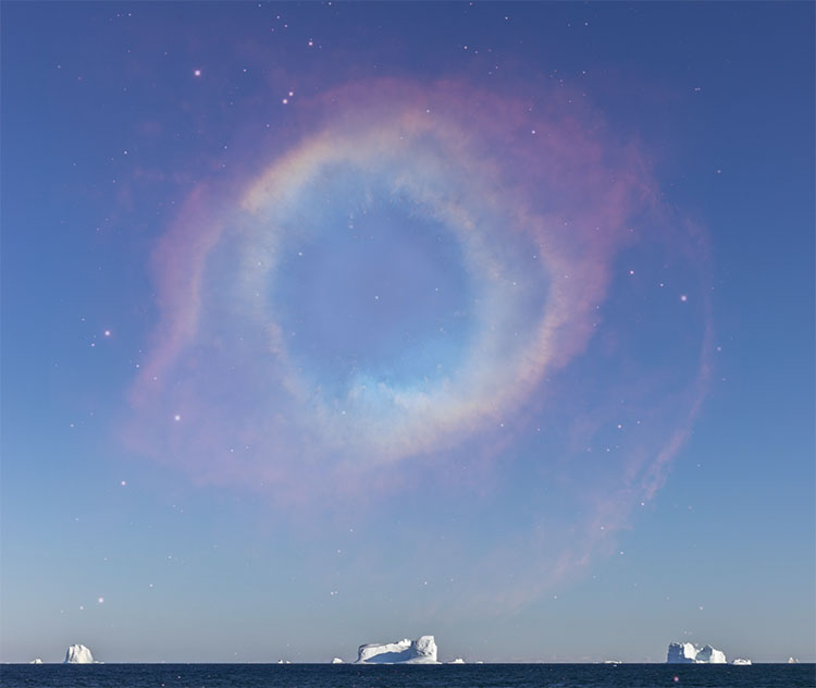

Enjoy a portfolio of my images while I celebrate color and answer eight questions for Calibrite.
Enjoy a portfolio of my images while I celebrate color and answer eight questions for Calibrite.
Use color management to make better files and insure others see them in their best light.
How To Do It
7 Simple Steps to Good Color Management
Take these simple steps to get consistent high-quality color.
Step 1 – Use ICC Profiles
Assign ICC profiles to make color consistent and predictable.
Step 2 – Profile Your Monitor
Calibrate your monitor with hardware.
Step 3 – Set Adobe Color Settings
Set good Photoshop Color Settings in seconds.
Step 4 – Profile Your Printer
Better printer profiles help make better prints.
Step 5 – Softproof Before You Proof
Preview how your print will look before printing it.
Step 6 – Check The Correct Boxes In Your Printer Driver
Set good color management policies in your printer driver.
Step 7 – Control Your Viewing Environment
Use good quality light in neutral environments to evaluate your images.
Things To Watch For
16-Bit
Thousands of shades of gray reduce posterization.
Choose A Wide-Gamut Editing Space
Choose a wide-gamut editing space to make the best prints possible.
Editing Spaces Compared
From small to large, standard RGB editing spaces including sRGB, Adobe RGB (1998), and ProPhoto.
Rendering Intents Compared
Perceptual, Relative Colorimetric, Absolute Colorimetric, Saturation.
What to Do with Color Management Dialogs
Know what to do with the color management dialog boxes you encounter.
The Difference Between Converting Versus Assigning With Color Profiles
Understand the difference between assigning and converting to a profile.
Where to Put ICC Profiles
ICC profiles need to be filed in the correct location on your computer.
Tools
When And Why To Print Test Files
Find out more about what to test.
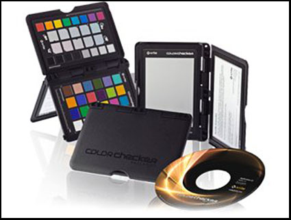
Make Camera Profiles With X-Rite’s Color Checker Passport
X-Rites’ Color Checker Passport can be used to quickly deliver more accurate color in a variety of ways.
Managing Camera Profiles
If you make camera profiles customized for your camera, sooner or later you’re going to want to rename or delete a few.
Graph Profiles With Chromix Colorthink
Colorthink graphs ICC profiles for visual comparison and contrast.
Use Full Spectrum Or HIgh CRI Viewing Light
Choose full-spectrum lighting with appropriate brightness and temperature.
In this video, I share some of my feelings about photography and thoughts on color.
Find out more about X-Rite here.
Read more about color management here.
Learn more in my photography and printing workshops.
Get my free Gear Guide here.
You can significantly improve the clarity and saturation of the color you digital camera creates by creating a custom profile for it. The defaults manufacturer's provide and most people use are fine, but a custom profile built for your camera is better.
X-Rites’ Color Checker Passport can be used to quickly deliver more accurate color in a variety of ways.


Understanding the difference between assigning and converting to a profile is one of the most conceptually challenging things about color management in digital imaging. It’s counterintuitive to think that by changing numbers the appearance of colors will stay the same or that if you don’t they won’t. But, once you understand why this is happening, how to set up your color management environment and what to do when you encounter color management dialog boxes will become much clearer.
In color management you “change to stay the same”. Why? Take the values for the most saturated red in any RGB color space – 255/0/0. If you graph this in sRGB (a small color space) and ProPhoto RGB (a large color space), you can quickly see that one will produce a much less saturated red than the other. Similarly, all the other numerical combinations produce different appearances in different color spaces too, with the exception of absolutely neutral colors whose values are equal – i.e. 128/128/128. To maintain the appearance of colors when you move them from one color space to another (for instance from a monitor to a printer), you have to change the numbers very precisely, using ICC profiles or maps for each color space and recipes for mixing colors in them.

The parenthetical remarks in Photoshop’s Paste Profile Mismatch dialog box say it clearly.
If you Don’t Convert but “preserve color numbers”, the appearance of a file will change, sometimes dramatically, because the numbers in the file have not been converted but a new color profile has been assigned, changing the meaning of the numbers.
If you Convert you “preserve color appearance”; Photoshop does this by referencing the ICC profiles of the source and destination color spaces and precisely changing the numbers in the file so that they produce the closest possible match to the original appearance; only the appearance of very saturated colors will change if you convert a file to a smaller gamut color space.
Note that information converted from sRGB into ProPhoto RGB does not get more saturated. The editing space becomes wider gamut, but the potential for increased saturation can’t be accessed unless values in the file are further enhanced with software. The best way to get the most saturated color possible is to convert the source file (Raw) into ProPhoto RGB.
If you adopt a consistent workflow and always convert into and create new files in the same color space, you’ll encounter these dialog boxes infrequently. You’ll quickly find you won’t have to think about it anymore. And when you do, you’ll simply take appropriate action with confidence when you need to, confident that the images you’re creating are the very best that can be created.
Remember, color management isn’t about ensuring that color doesn’t change, it’s about ensuring it changes as little as possible and is changed as precisely as possible.
Read more on Color Management here.
Learn more in my digital photography and digital printing workshops.
In this video, I share my thoughts and feelings on photography and color.
Find out more about color management here.
Read other interviews here.
Read my artists statements here.

Prints made with default (left) and custom (right) profiles compared.
Good printer profiles help make good prints. Better printer profiles help make better prints. So, logically, you’ll want to use the best printer profiles to help you make the best prints.
How do high-quality printer profiles contribute to print quality? A good printer profile helps render optimum shadow and highlight detail, gradation, neutrality and graybalance, as well as color rendition and saturation. (Remember, printer profiles characterize the combination of a printer’s hardware, ink, media setting, and the substrate you choose. You’ll need different profiles for different substrates on the same printer.)
How can you get good printer profiles? Look to three primary sources. One, use profiles provided by printer manufacturers; they’re free. Two, hire a printer profiling service; profiles cost approximately $100 each. Three, make printer profiles yourself; printer profiling systems run between $400 and $1000. (Profiles supplied by substrate manufacturers are of uneven quality; a few are good, many are bad.)
Which solution is right for you? It depends on both your printing conditions and needs.
If you’re using substrates supported by the manufacturer of your printer, try using the profiles they provide first; they’re often quite good. Years ago, Epson raised the bar on the quality of printer profiles provided by manufacturers. The highly sophisticated routines they use to produce their printer profiles processed by supercomputers are truly state-of-the-art. It’s arguable that you can produce better profiles, even with the most sophisticated profiling solutions available. Their profiling routines factor in subtleties like dot structure or screening frequency. One of the reasons a solution like this works is because the technologies and manufacturing standards they use are so consistent that the unit-to-unit variation between individual printers of the same model is extremely low. (It’s less than a Delta E of 1 or the minimum variation the human eye can detect.) Some, printer manufacturers, like Canon, provide a large number of profiles for substrates made by other companies; their quality is generally quite high with only a few exceptions. Other printer manufacturers, like HP, produce self-profiling printers. They need to be self-profiling, as the state of the printer is constantly changing; when nozzles clog, new nozzles come on line; when ink cartridges are swapped nozzles are replaced. One advantage to a system like this is you can quickly profile a new substrate on a printer with no additional equipment. The quality of the profiles is often good, but there will be times where you’ll want to improve upon it.
No manufacturer provides a comprehensive set of profiles that will cover the entire spectrum of fast-evolving substrate industry. A little experimentation with new media is advised, sometimes a lot. If you experiment with many medias or use more exotic substrates, you’d be well advised to have someone make custom profiles for you or do it yourself.
Read More

One critical aspect of color management has nothing to do with either hardware or software. It’s the environment you work in. Control your environment and you’ll control the color you see. Desktop, walls, decorations, fashion, viewing light, secondary light sources, ambient light – it all matters.
Keep It Neutral
Color influences color. This is sometime physical, when filtered or reflected color alters the appearance of another. This is always perceptual, when our eyes adapt to the presence of multiple colors. That’s right. Surround one color with another color and you’ll experience the color differently. You can’t measure this change in the physical world because the change takes place inside your eye/brain. Simultaneous contrast is a perceptual adaptation that you can’t turn off, but you can be aware that it’s happening, understand how it’s influencing you, and minimize it’s effects.
How? Surround yourself with neutral colors; they influence our experience of other colors least. Neutral colors produce the least contamination and the least adaptation. And, medium gray values produce the least brightness compensations of all neutral colors.
You may be tempted to make the appearance of your computer desktop colorful and lively. That’s fine for many non-color-critical tasks. However, when you’re adjusting color, make your desktop neutral. You won’t be able to see the color you’re adjusting accurately unless you do. If you don’t want to change your desktop use Full Screen mode, to hide the desktop and surround your image with a neutral color. (One downside to this is you’ll only be able to view one image at a time.)
Walls and decorations of any significant area should be neutral in appearance too. Make walls and decorations neutral. For the purposes of controlling your environment, any neutral color is better than a saturated color. You could opt for white, gray, or black. Don’t opt for designer whites, grays, or blacks, which contain trace amounts of hue and saturation that can still influence your perception enough to be significant. Choose neutrals. (If you’ve got a favorite image (poster, photograph, painting, etc) that’s colorful, position it out of your field of vision while you’re adjusting color.)
Don’t forget fashion. Wear neutral colors. If you wear bright colors, they’ll influence your perception too, especially if light reflects off of them and onto your surroundings or images.

Light It Well
The most important thing to control in your environment is light.
After all, light is what produces your sensation of color.
Viewing light, secondary light sources, ambient light
It stands to reason, for viewing color accurately, you want white light not filtered or colored light. (Don’t wear sunglasses or tinted glasses when adjusting color.) But what many people don’t consider is that not all white lights are created equally.
You’ll want to consider the amount of light – measured lux. It’s better to have too much light than too little light; colors will appear dull if you don’t use enough light; just don’t produce glare or make viewers squint. A CRI of 90 or higher is recommended.
Next, consider the color temperature of light – measured in Kelvin degrees. While 5000K is the industry standard (most viewing boxes and printer profiles are built for the 5000 K standard), in real world situations very few people view printed color under 5000K light. More typically, prints are viewed in galleries and museums in some form of halogen (3300K – 3800K) or in homes under tungsten (2800K) with a mix of daylight which varies with time of day, weather, and season. Viewing light for the end user is often highly variable. So, what do you do? Make prints for a specific lighting condition if practical. Otherwise, standardize on a viewing light temperature that can be least adversely affected in as many real world situations as possible. More people prefer the taste of 3600K than any other light temperature.
Finally, consider a light’s spectral distribution – smooth or spiky when graphed. White light can be mixed with different combinations of colored lights. This rarely affects the appearance of neutral colors, but it may have a significant effect on saturated colors. Light sources that contain only a few spectral frequencies (spiky or limited) will increase the apparent saturation of the colors they contain and decrease the apparent saturation of the colors they don’t. Light sources that contain all spectral frequencies (smooth or full) will render all colors without bias and won’t produce relative saturation distortions. Full spectrum light (sunshine, tungsten, some halogen) makes colors appear clearer and more saturated. (See my free ebook review on Solux lighting at www.johnpaulcaponigro.com.)


Secondary light sources should also be considered. Avoid backlighting; don’t position your monitor or proofs/prints with bright light sources behind them. Eliminate reflections; use blinds for windows and reposition lights that reflect off monitors. Reduce glare and flare as much as possible. New colorimeters (like Ax-Rite’s i1Display Pro and ColorMunki Display) compensate for these factors during monitor calibration and constantly measure and adapt to changes in these factors over time. Make your viewing experience as easy as possible. If you’re serious about color, you’ll plan to look a lot.
With a few careful choices you can make sure your environment supports your efforts to see and adjust color precisely every day. It’s time well spent. Without this attention to detail, even the most sophisticated color-management systems may be compromised. With this attention to detail, you can rest assured that you’ve done everything physically possible to control color. In a controlled environment, your color will truly shine.
Read more on Color Management here.
Learn more in my digital photography and digital printing workshops.

As a rule, always softproof an image to determine a rendering intent and make printer/substrate specific adjustments to a image file before printing it.
You can get Photoshop to display an image the way it will appear when it’s printed, before you print it, by softproofing an image. If you softproof before you print, you’ll get your best first proof or maybe even a finished print. Not to be confused with a hard proof or physically printed piece, a softproof uses an ICC profile to create an onscreen simulation of an image as it will appear when printed.
Wait. Haven’t you already done this by calibrating and characterizing your monitor with a colorimeter, choosing an editing space along with color management policies in Photoshop, and specifying the right profile for a printer/paper combination with your printer driver? Almost. Doing these things ensures that all of the different color behaviors of the devices you’re using are accurately described and that color conversions are handled precisely, but it doesn’t ensure that you will see exactly how an image will look when printed. Without softproofing, you see how an image looks on a monitor. To see an image on a monitor with the appearance of how it will look when printed, before you print it, you need to take the final step of softproofing the image. This simulation won’t change your file, just it’s appearance. Once softproofed, if you choose to, you can make output specific adjustments to your file before printing to get a better first print. Read More


If you want to display your images accurately and make sophisticated decisions about how they will or could look, calibrate your monitor with hardware. Monitor calibration is a must. It’s not optional. It is easy. You need a device to do it well.
The visual comparator method (using your eyes to approximate an appearance on-screen) is too fraught with inaccuracies and inconsistencies to be relied on. Instead, use consistent, accurate, objective hardware and software. Colorimeters don’t have favorite and least favorite colors, don’t have color deficiencies, don’t get fatigued, don’t drink caffeine or eat sugar, don’t change over time or adapt to their environments, and don’t have emotions. You do. All of these can affect your perception of color at one time or another. Colorimeters are in a stable state. You’re not. So when it comes to making sure that your monitor displays color as accurately as possible, use a colorimeter.
While some colorimeters, and the software packages that ship with them, are better than others, most colorimeters are good. Unless it’s defective, any colorimeter is better than none.
Spectrophotometers can also be used to calibrate monitors. What’s the difference between the two? Unlike a colorimeter, a spectrophotometer has it’s own light source that can be used to make printer profiles. Spectrophotometers can do more. They also cost more.
There is a difference between calibrating and characterizing devices. Calibrating a device is changing its state, like setting the brightness of a monitor. Characterizing a device is measuring and mapping the color capacity of a device or building an ICC profile to describe it. Most of the process of monitor ‘calibration’ is actually ‘characterization’.
Calibrating and characterizing your monitor is a simple process. Use the profiling device and software of your choice.(I personally use X-Rite products.)
Take these steps. Read More