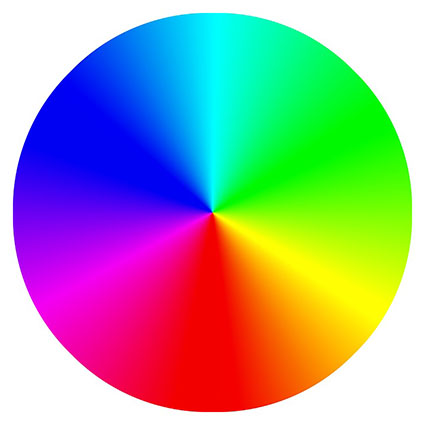
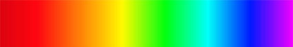
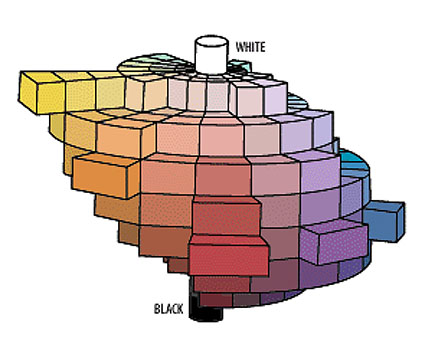
The language used to describe color has a long storied history; sometimes tied to its method of manufacture and sometimes tied to mental or emotional associations. What language lacks in precision it makes up for in expression. It’s great for poetry and marketing.
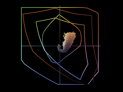
Contrast this with the numerical language of HSL (i.e. 13/48/76), which is better for precise identifying and communicating color.
Read more on HSL here.
Enjoy exploring this collection if you’re trying to find out what color a word refers to or if you’re looking for the right word to describe a color.
Red
apple, beet, blooming, brick, blood, blush, burgundy, burning, carmine, cerise, cinnabar, claret, cherry, cochineal, coral, crimson, damask, fire engine, fire hydrant, flame, florid, fox, garnet, glowing, gules, lipstick, madder, maroon, pink, poppy, rose, rouge, rubicund, ruby, rufous, rust, russet, sanguine, scarlet, strawberry, tomato, vermillion, wine
Pink
amaranth, blush, bubblegum, carnation, champagne, coral, crepe, flamingo, flesh, fuscia, hot, lemonade, lipstick, mary kay, neon, peach, powder, puce, punch, rose, salmon, taffy, tickle me, watermelon
Orange
apricot, basketball, burnt, cantaloupe, carrot, chanterelle, chestnut, citrus, copper, coral, creamsicle, flaming, fiery, ginger, gold, marmalade, merigold, minium, monarch, neopolitan, orangatan, papaya, peach, pumpkin, salmon, salamander, sandstone, sherbert, soda, starfish, straw, sunflower, sunrise, squash, tangerine, tiger, yam
Yellow
amber, banana, blonde, ash blonde, bottle blonde, strawberry blonde, bumblebee, butter, buttermilk, butterscotch, canary, corn, cream, daffodil, dijon, egg nog, flaxen, gamboge, golden, goldenrod, honey, imperial, indian, lemon, macaroon, medallion, mustard, naples, neon, ocher, orpiment, parmesan, pineapple, pollen, sandy, saffron, straw, topaz, tow-colored, tuscan, wheaten
Green
absinthe, acid, apple, army, artichoke, avocado, aquamarine, basil, bosky, bottle, celadon, chartreuse, clover, copper, crocodile, fern, grass, emerald, evergreen, fir, forest, grass, jade, jungle, juniper, kale, kelly, leaf, lime, lincoln, lush, malachite, mint, moss, neon, olive, parakeet, pea, pear, pickle, pine, sage, sap, sea, seafoam, seaweed, shamrock, spinach, spring, terre verte, verdant, verdigris, vert, viridian
Blue
admiral, agean, arctic, antarctic, aquamarine, azure, baby, berry, beryl, bice, bright, beryl, cambridge, cerulean, cobalt, copenhagen, cornflower, cupreous, cyan, cyanotype, deep, denim, egyptian, electrix, erubescent, frost, ice, incarnadine, indigo, kyanite, lapis lazuli, midnight, navy, opal, oxford, peacock, persian, prussian, robin’s egg, royal, sapphire, saxe, sea, slate, sky, spruce, steel, teal, titian, turkish, turquoise, ultramarine, vivid
Indigo
azure, blueberry, deep, glastum, indigotin, midnight, navy, prussian, ultramarine, woad, zaffre
Violet
amaranthine, amethyst, archil, berry, boysenberry, eggplant, grape, heather, heliotrope, iris, jam, lavender, lilac, mauve, magenta, mulberry, orchid, periwinkle, perse, plum, pomegranite, purple, raisin, royal, sangria, violet, violaceous, wine
Brown
allspice, auburn, bay, bran, beige, biscuit, bister, bottle, brick, brindle, bronze, brunette, buff, burnt sienna, burnt umber, cafe au lait, camel, caramel, carob, cayenne, cedar, chestnut, chocolate, cider, cinnamon, cocoa, coffee, copper, drab, dun, dust, ecru, espresso, fallow, fawn, ginger, gingerbread, granola, greige, hazel, henna, hickory, kasha, khaki, leather, liver, madiera, mahogany, mocha, mousy, mud, mushroom, nut, nutmeg, oak, oatmeal, ochre, peanut, pecan, penny, puce, russet, rust, saddle, sallow, sand, sepia, sorrel, spice, tan, taupe, tawny, terra-cotta, toast, tortilla, umber, wheaten, whey, wood
White
alabaster, albino, allysum, antique, ash, bone, bleach, bright, brilliant, chalk, chantilly, chiffon, cloud, coconut, cotton, daisy, dove, eggshell, gesso, ghost, putty, hoary, isabelline, ivory, lead, lace, lily, linen, lucent, milk, mother of pearl, parchment, pearl, porcelain, powder, pure, rice, salt, snow, swan, star, titanium, vanilla, whisper, winter
Gray
aluminum, argentine, ash, cinereal, charcoal, cloud, coin, cool, cove, clam, dolphin, dove, dusky, elephant, fog, fossil, frost, graphite, grizzled, gunmetal, gunpowder, harbor, hippopotamus, hoary, lead, iron, metal, mouse, neutral, nickle, oyster, payne’s, pearl, pebble, peppery, pewter, platinum, pigeon, powder, rhino, rice, sere, silver, tin, sidewalk, slate, smoke, squirrel, steel, stone, thunder, warm
Black
atramentous, calciginous, charcoal, coal, crepuscular, crow, dusky, ebony, flint, grease, ink, kohl, lamp, lava, jet, leather, mars, melanoid, metal, midnight, obsidian, oil, onyx, piceous, pitch, raven, sable, slate, soot, spider, stygian, tartarean, tenebrous
Read more in my Color Theory resources.
Learn more in my digital photography and digital printing workshops.
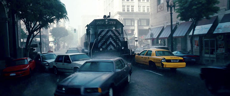 Dream layer one’s rainy exteriors are dominated by grays, dark blues, and blacks.
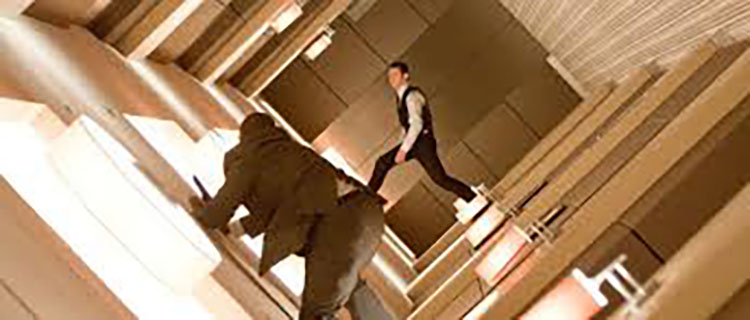 Dream layer two’s urban interiors are composed of warm oranges and browns.
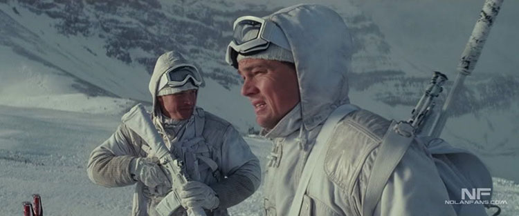 Dream layer three’s snowy exteriors are rendered with bright whites and grays.
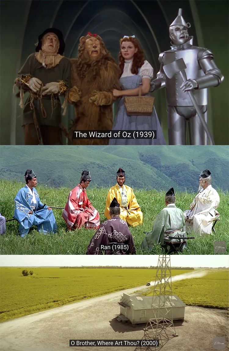
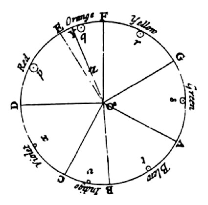 Newton
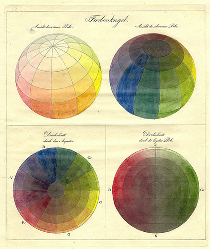