9 Ways To Tell If Your Photographs Are Over Cooked

9 Ways To Tell If Your Photographs Are Over Cooked

Have you ever taken an image so far it gets completely out of control? I know that feeling well.  It happens to all of us. It’s not all bad. We have to step over the line to find it. It is better to work hot and then to cool down than play it so safe we never get where we really want to go. 

If you find yourself in so deep that you’re not sure where you got off track and you don’t know what to do, use this check list to identify the issue. Then fix it. Even one thing can make a big difference.

Here are some common pitfalls to avoid. (Most of these moves help images; this is just a matter of taking them too far.)
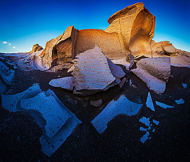
Highlights clipped

You want your highlights to glow, right? But you want them to have detail too. That’s the limit. Paper white is for poets not photographers.

Too Bright

Have you ever felt like viewing an image would be easier with sunglasses on? It’s common to make images brighter while trying to get them to glow. The key lies in midtone contrast. Place it in the most important image areas and darken and/or reduce the contrast of surrounding areas to support it further.

Shadows Clipped

Unless you’re going for gothic or graphic, hold that shadow detail. Areas of dark do make midtones and highlights appear brighter. Better still, handled sensitively these dark areas can hold a unique light at the same time.

Too Much Contrast

Contrast glows, until it makes you squint. More’s not always better.  Think of Goldilocks; one of them was just right.

Over-Sharpened

Yes, we tend to think of focussed sharp images as signs of good equipment and good technique. Blurry photographs are a real drag unless the blur in them is intentional. Nevertheless, it’s easy to overcompensate and make images too sharp, completely forgetting about the sensual possibilities of texture. Let those be your guide as to how far to go and not go. (Remember, angels have halos, not horizons.)

Noise 

A little bit of noise is not the end of the world. But try not to add more during processing. Guard against it when applying extreme contrast like Clarity and Dehaze as well as when sharpening. It’s not hard to reduce during post-processing but here again don’t overdo it; don’t make your subjects look like they’re made out of plastic wrap.

Posterization

Posterization is nobody’s friend except Andy Warhol. Not working in high-bit color modes and applying strong contrast and/or saturation adjustments quickly causes posterization. Use extra care when you’re working on JPEGs. (Don’t confuse this with a graphics card being challenged to display an image when zoomed in or out; if you don’t see posterization at 100% screen magnification it’s not in your file and won’t print.)

Unnatural Saturation

Don’t fool yourself. If you don’t believe it, neither will anyone else. Often just one or two colors will seem off. When this happens adjust them separately from the others. There’s no reason to limit one color because of another.

Vignetting

Vignetting can be a great way to strengthen the frame and to direct and keep attention in it. As with all things, it can be overdone, calling attention to itself and reducing the contrast of the areas it affects adversely. Monitor lens corrections as the ant-vignetting they apply often goes too far and you end up with corners that are so light they become distracting.

Using preflight checklists is a standard practice for pilots and doctors. Though the stakes aren’t as high, they’re a good idea for photographers too. Use this checklist before you share or print images and you’ll completely eliminate Homer Simpson moments. (Doh!) Checking these things will quickly become second nature for you, but don’t let that lead to sloppiness; be thorough. There are enough items to check that it’s easy to forget one or two. But there are so few that you can count them off with your fingers. It’s probably taken you longer to read this than it will to do it on your next image or print. Just scan the bullet points.

7 Things To Look For In Great Prints & Great Artists Who Make Exceptions

Get The Digital Printing Quick Start Guide here.

7 HDR Artifacts And How To Avoid Or Cure Them

hdr_artifacts_425

Different HDR renderings accentuate different artifacts

HDR (high dynamic range) imaging captures extreme contrast ratios and subsequently renders them for LDR (low dynamic range) devices, monitors and / or prints. The very things that make HDR renderings appear natural can make them appear unnatural if taken too far.

Midtone compression
You can’t avoid midtone compression, they get caught in the middle when the relationships between highlights and shadows are compressed. But you can take steps to minimize it by being sensitive to this when choosing compression settings and amounts and by taking subsequent steps to expand it.

Tonal inversions
Some compression routines and settings can be so aggressive that they create inversions or solarizations of specific tonal relationships. Avoid this, there is no subsequent cure. If you like the overall effect of an aggressive setting and the inversion is contained to one area of an image you can render an image twice, once for the overall effect and once for a specific area, and then blend the two together using Photoshop’s layers and masks. 

Saturation Distortions
Saturation changes when lightness shifts but color stays the same. Because HDR produces effects that can be aggressive and localized to specific set of tones, the saturation shifts that accompany tonal compression often appear unnatural. Selectively adjusting the saturation of specific hues, with tools like the HSL panel in Lightroom or Camera Raw, can often convincingly cure a majority of these side effects and hide the rest.

Halos
HDR softwares help restore midtone contrast by accentuating contours. When used aggressively this edge contrast can produce halos.
Over the years, these algorithms have dramatically improved their ability to treat the halo (light line) separately from the line (dark line), suppressing the first more than the second. Sometimes, to avoid distracting halos at the border of skies, you may want to make a second rendering for the sky and blend it with another rendering using Photoshop’s layers.


Insights Members can login to read the full article.
Email:
or Sign up

How To Avoid Common Over-Sharpening Artifacts

over sharpened

You can easily see the artifacts digital sharpening produces by intentionally overdoing it.

Here are the seven most common digital sharpening artifacts.

1         Noise
2         Exaggerated Texture
3         Visible Light Halos
4         Visible Dark Lines
5         Loss of Highlight Detail
6         Loss of Shadow Detail
7         Increased Saturation

These artifacts can be reduced in one or more ways. Here’s a list of options for each.

1         Noise
Raise Unsharp Mask’s Threshold.
Use High Pass sharpening.
Blur High Pass layers.
Mask select image areas.

2        Exaggerated Texture
Reduce Unsharp Mask’s Amount.
Use High Pass sharpening.
Blur High Pass layers.
Mask select image areas.

3       Visible Light Halos
Reduce Unsharp Mask’s Radius to make halos thinner.
Reduce Unsharp Mask’s Amount to make halos darker.
Set the Blend Mode of the Unsharp Mask filter or layer it is applied to Darken.
Use High Pass sharpening for softer more feathered contour accentuation.

4        Visible Dark Lines
Reduce Unsharp Mask’s Radius to make halos thinner.
Reduce Unsharp Mask’s Amount to make halos darker.
Set the Blend Mode of the Unsharp Mask filter or layer it is applied to Lighten.
Use High Pass sharpening for softer more feathered contour accentuation.

5         Loss of Highlight Detail
Use a sharpened layer’s Layer Styles / Blend If sliders to recover it.
Mask the highlights.

6        Loss of Shadow Detail
Use the Blend If sliders in Layer Styles to recover it.
Mask the shadows.

7         Increased Saturation
Change the blend mode of the filter or sharpened layer to Luminosity.
Desaturate High Pass layers.


Insights Members can login to read the full article.
Email:
or Sign up

How To Avoid Over Sharpening

Antarctica CLXXI
Identifying and developing a sensitivity for the artifacts digital sharpening produces will help you choose a sharpening method and what settings to use during any stage of your sharpening workflow. You can easily see the artifacts digital sharpening produces by overdoing it. Apply a filter like Unsharp Mask at maximum strength and look closely at what happens.
Following are the seven most common digital sharpening artifacts.
1. Noise
2. Exaggerated Texture
3. Visible Light Halos

4. Visible Dark Lines
5. Loss of Highlight Detail
6. Loss of Shadow Detail
7. Increased Saturation
These artifacts can be reduced in one or more ways.
Read more on Digital Photo Pro.
If you know what to look for, you’ll know what path to choose and how far down it to go. Training your eye for what to look for and understanding the upper limits of what other people find to be naturalistic, or at least not distracting, is the first step to developing your unique sharpening style. The second step is learning how to produce certain effects and avoid others with the tools at your disposal. Once you’ve taken these steps, you can take the third and final step, knowledgeably putting craft in the service of your vision to make compelling visual statements. Enhancing detail is one area of expertise that’s well worth mastering for all photographers.
Learn more in my digital photography and digital printing workshops.

7 Sharpening Artifacts To Avoid


If you know what to look for, you’ll know what path to choose and how far down it to go.
Identifying and developing a sensitivity for the artifacts digital sharpening produces will help you choose a sharpening method and what settings to use during any stage of your sharpening workflow.
You can easily see the artifacts digital sharpening produces by overdoing it.
Here are the seven most common digital sharpening artifacts.
1         Noise
2         Exaggerated Texture
3         Visible Light Halos
4         Visible Dark Lines
5         Loss of Highlight Detail
6         Loss of Shadow Detail
7         Increased Saturation
Each of these artifacts can be reduced in one or more ways.
Here’s a list of options.


Insights Members can login to read the full article.
Email:
or Sign up

Setting Camera File Format


Here are some commonly asked questions that, once answered, will demystify setting camera file format.

"Should I set my camera to JPEG, Raw, or JPEG and Raw?"

If you want to create files with the highest quality, set your camera to create Raw files. Raw files contain the widest color gamut, highest big depth, have flexible white point, can have highlight and shadow detail recovered, can be reprocessed infinitely, and are free of compression artifacts. Raw files are larger and require post-processing before presentation. They take up more room and they take longer to use.
If you want files to create files to share immediately without (or with minimal) post-processing, set you camera to create JPEG files. JPEGs are excellent for transmission, posting to the web, and print on demand. (Remember, the highest quality JPEGs are the ones created by post-processing Raw files, not the ones created by your camera.)
If you want both Raw and JPEG, set your camera to create both.
A camera creates a Raw file every time it makes an exposure. Setting a camera to create a JPEG file requires it to make a conversion to JPEG, which it does with incredible speed. If a camera is set to JPEG, it will replace the Raw file. If a camera is set to Raw, only a Raw file will be created. If a camera is set to Raw + JPEG it will create a JPEG copy in addition to the Raw file.


Insights Members can login to read the full article.
Email:
or Sign up