What In The World Is Color Grading – Why & How To Do It
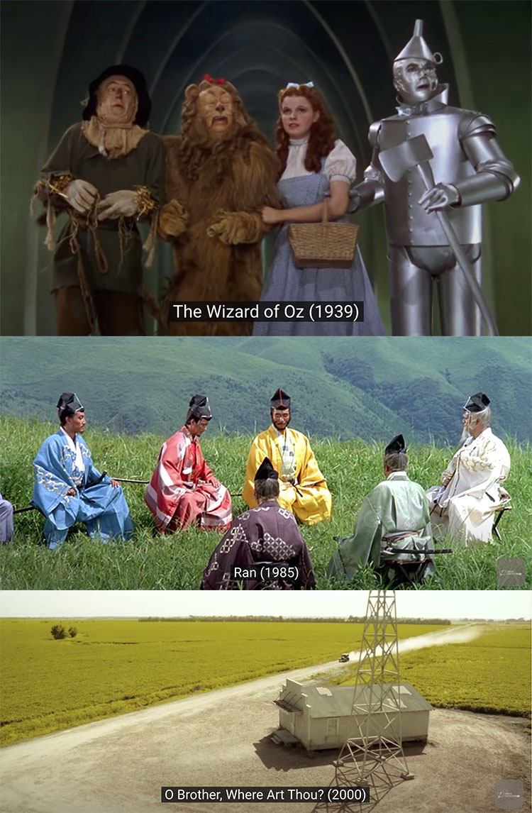
Color grading can unify images of different subjects shot at different times and locations.
Correction Versus Grading
Many people use color correction and color grading interchangeably, but their intents are quite different, while both are post-production processes and often use the same tools. Color correction is an objective technical process where colors are adjusted to appear natural; color grading is a subjective artistic process where colors are enhanced to evoke time, atmosphere, physical sensations (like temperature), and/or emotions. Correction convinces minds (avoiding personal biases); grading provokes feelings (celebrating personal preferences).
Correct Before You Grade
For some (scientists, journalists, product photographers, and art reproduction), color correction is the first and last step. For others (artists, many fashion and portrait photographers), color correction is a necessary prelude to color grading. Producing a neutral base gets images ready for artistic effects. Clipped highlights and shadows, color casts, and too much or too little saturation can all get in the way of successfully color-grading images. Correction also produces consistency between multiple shots. You won’t need to customize the color grading for different images if they are first color-corrected. This can save a lot of time and confusion if you’re processing many images.
Things To Look For During Color Correction
1 Preserve shadow and highlight detail.
2 Remove color casts. Make neutrals truly neutral.
3 Set saturation neither too low nor too high.
Monitor memory colors: skin, blue sky, green grass, etc.
Read more on 4 Ways To Achieve Neutrality.
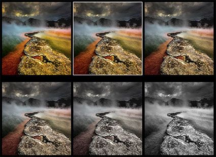
Tools To Create Color Grades With

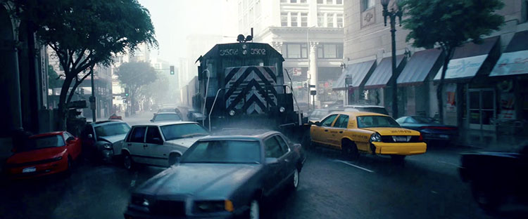 Dream layer one’s rainy exteriors are dominated by grays, dark blues, and blacks.
 Dream layer two’s urban interiors are composed of warm oranges and browns.
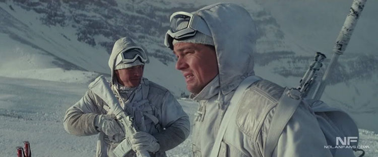 Dream layer three’s snowy exteriors are rendered with bright whites and grays.