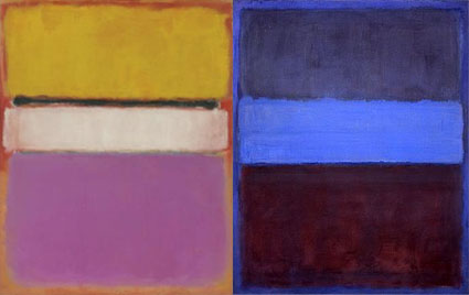
Mark Rothko – Color As A Universal Language

Sometimes the things we resist influence us the most. For me, this was certainly the case with the paintings of Mark Rothko.
As a young man, I found myself alienated from many modernist works. I felt they were overly intellectual; you needed a degree to begin to approach them much less understand them. They didn’t meet the audience halfway. Some of them even needed critical interpretation to be fully resolved.
Nonetheless, my intensely emotional reactions to Mark Rothko’s paintings were undeniable. Standing before these fields of color produced a physical sensation, much like listening to music. Rothko was able to communicate powerful emotions with the simplest means. Often his canvases were composed no more than two rectangles inside the larger rectangular field of the canvas or as few as three colors. Unlike DeKooning, gesture isn’t what communicates emotion – Rothko’s canvases are stained. Rothko’s use of scale, quite different than Albers’, also impressed me; the large fields immerse you in the sensation of color, further intensifying it.
Rothko’s painting was more than an exploration of optics, it was also a spiritual quest. It’s not just color for color’s sake; it’s color placed in the service of the human spirit. Upon further study, I found that many early modernists shared a similar spiritual impulse and used abstraction in a quest for a universal language that reached beyond time and culture. For me this was the link between the modernists I appreciated and the ones that left me cold. It was a quest I resonated with. It started a chain reaction within my thinking about and appreciation of art. I continue to search for similar qualities in my own work.


No Comments