Enjoy these quotes by photographer Eric Meola.
“Photography for me is a passion, not a job. Once it becomes just a job you’ve lost sight of why you originally became a photographer.”
“Very early in your career you need to shoot things that you believe in, things that you really want to shoot. You need to take risks. Don’t wait for the phone to ring. Success is only going to happen if you are out there really working to make it happen.”
“I believe strongly that a photograph should stand on its own with a story, and without a caption.”
“I had to see what it looked like. I had to shoot whether there was light or whether there wasn’t light.”
There are literally hundreds of songs, poems, paintings, books, that influence us. Edward Hopper’s “Nighthawks” comes to mind, and Ernst Haas’s photograph “Route 66, Albuquerque.” It’s impossible to delineate how they have influenced me, other than to state they have been imprinted in my mind — the light, the sound, the composition, the color. Out of this “soup” comes something new that may not be directly related to a particular influence, but certainly contains the ingredients of many different influences.
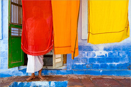
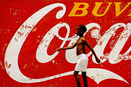
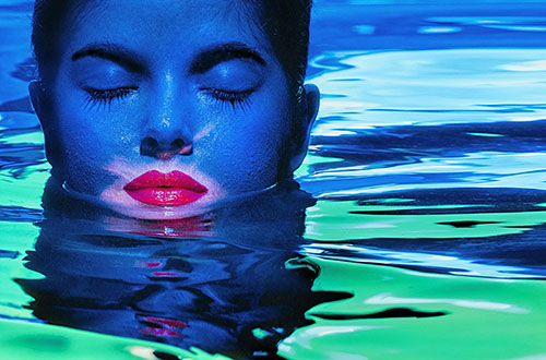
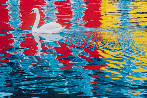
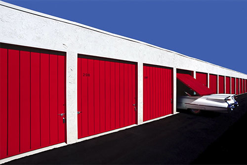
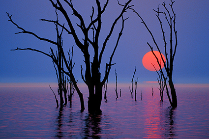
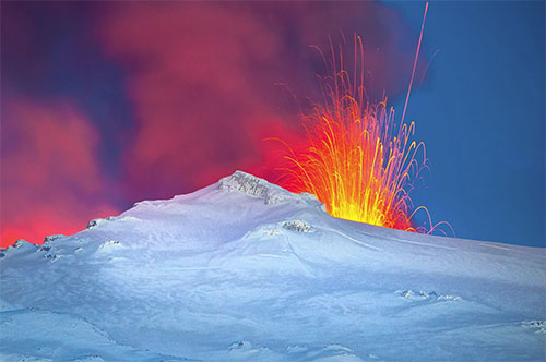
“I’m not out to make photographs in color; my photographs are about the color.”
“Color is my subject as much as the apparent subject.”
“Playing with color is my way to escape the chaos of the world, and to express it.”
“I have no favorite color, but if I did, it would be gray – the perfect neutral that acts in contrast to the colors around it and lets them stand on their own.”
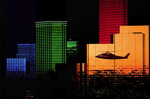
“My work with color and light has become more and more abstract over the past five decades. I’ve explored the way light is used in architecture, and how artists, such as Rothko, use color, both contrasting and complementary, to elicit strong emotional responses; they create a deeply spiritual resonance on a two-dimensional canvas.”
“When I stare at Mark Rothko’s color field paintings, I am transformed as well as transfixed.”
“We ‘see red,’ but how we see it is subjective. We see it in our mind’s eye, as I did this morning, when I heard a cardinal.”
“What is important to me is not what my eye sees but what my mind’s eye sees; it’s that third eye that has blessed me with intention and demanded invention.”
“A print is the photographer’s statement about the light, the mood, the space, the spirit and being of the image, and that interpretation may change with time, with technology, and with the photographer’s own interpretation of the image. A print is the completion of a photograph; without it, the image is suspended in time, without interpretation.” – Eric Meola
View 12 Great Photographs by Eric Meola
Read 14 Great Quotes By Photographer Eric Meola.
Read our short Q&A
Read our extended conversation.
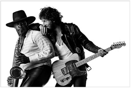
Discover more by Eric Meola.


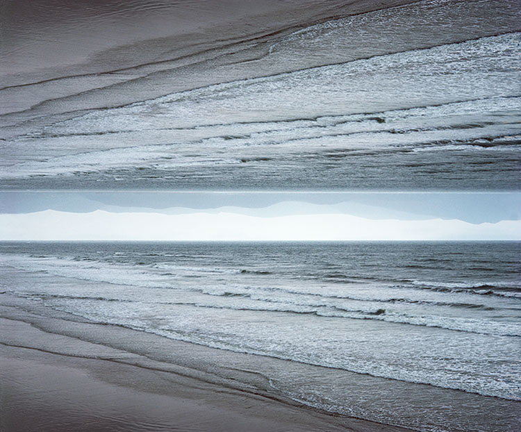
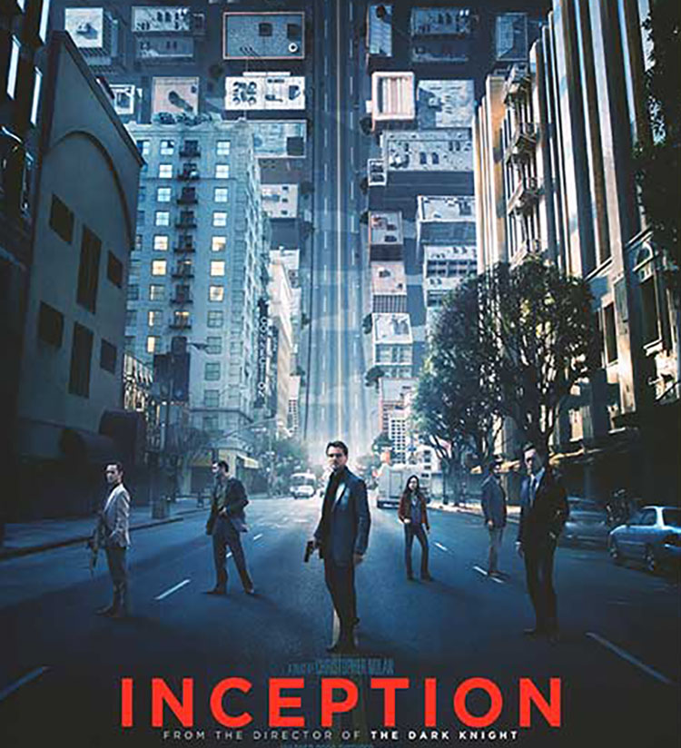
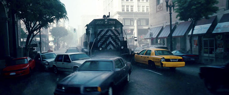 Dream layer one’s rainy exteriors are dominated by grays, dark blues, and blacks.
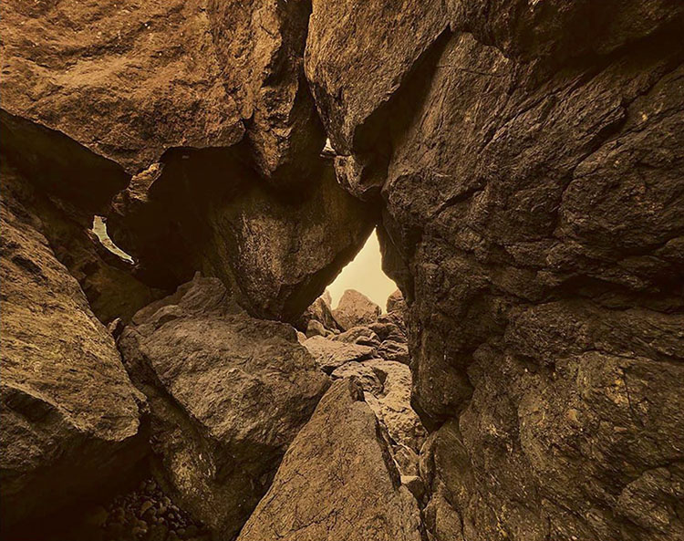
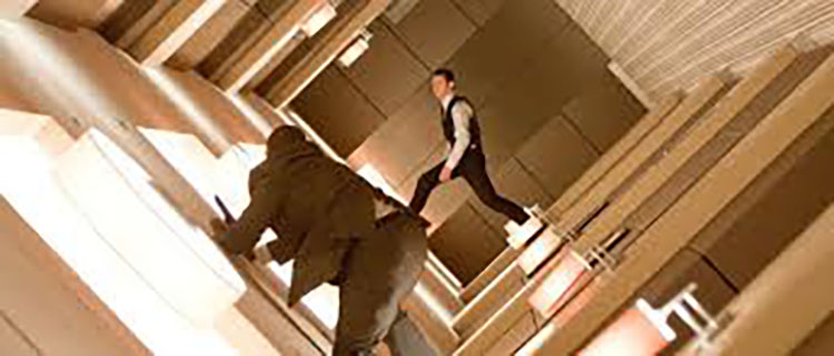 Dream layer two’s urban interiors are composed of warm oranges and browns.
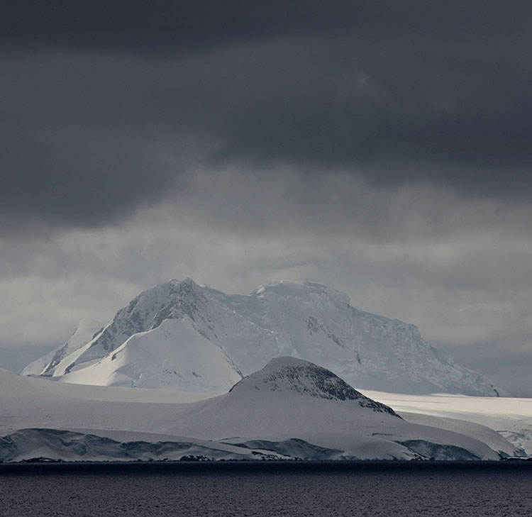
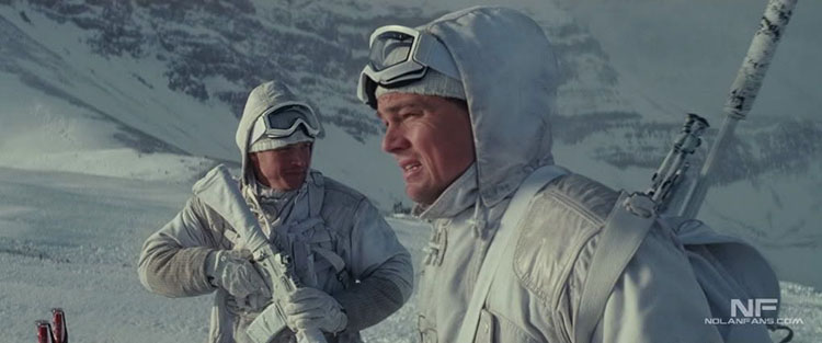 Dream layer three’s snowy exteriors are rendered with bright whites and grays.