8 Questions Answered As I Celebrate Color For Calibrite
Enjoy a portfolio of my images while I celebrate color and answer eight questions for Calibrite.
Enjoy a portfolio of my images while I celebrate color and answer eight questions for Calibrite.
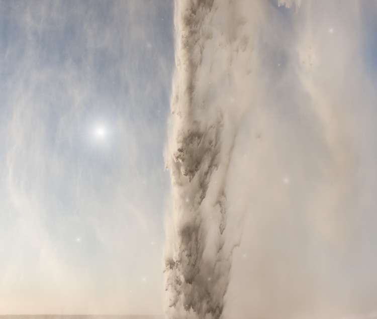
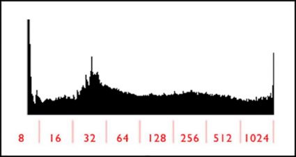
Want more mood in your photographs? One way to do this is to limit images to a single tonal range and focus more on the emotional associations it offers.
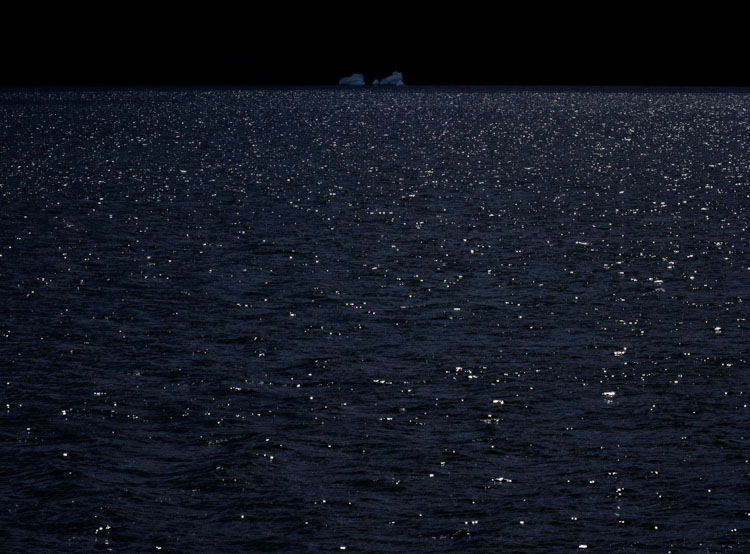
Luminosity is often divided into three broad ranges; shadows, midtones, and highlights. If the tonalities in images are predominantly from one of these ranges, they are often described as low-key or high-key. (Curiously, the words medium or mid-key are less frequently used, but it is useful to make this distinction.) By constraining an image to one of these three, you can set a specific mood.
High keys are light and airy.
Medium keys are moderate and balanced.
Low-key images are dark and heavy.
Pursue this a little further by listing as many specific emotions that you feel are related to each of these, and you’ll get a sense of how many shades of expression you’ll be able to explore when you identify them. Read More
.
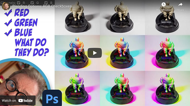
Learn a bunch of creative effects you can apply using three simple checkboxes. My favorite use is to light an object from three different angles and then combine the three images into a colorful result.
Check out more of Ben Wilmore’s Digital Mastery here.
Learn more in my digital photography and digital printing workshops.
.
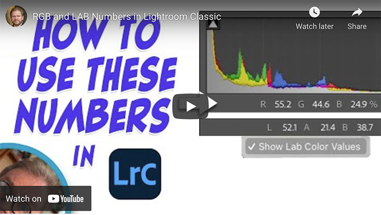
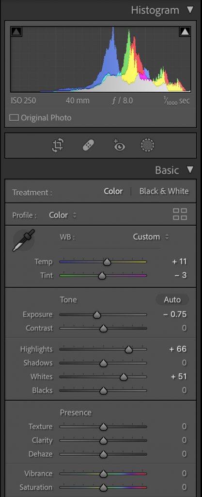
How To Use RGB and LAB Numbers in Adobe Lightroom Classic
Just below the histogram in Lightroom Classic’s Develop module are a set of three numbers that can be useful when optimizing your images. Let’s explore how I use those numbers when evaluating images before processing, when color correcting images and when I need to match the color between two areas. I’ll also attempt to explain the difference between RGB and LAB settings, how to switch between them, and when one option is more useful than the other.
.
.
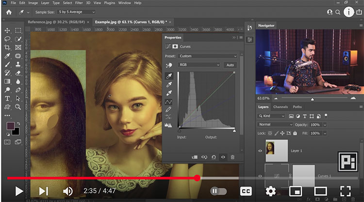
Learn to take the guesswork out of matching colors by using the numbers that appear below the histogram in Lightroom Classic. In this case, I’ll match two different colored bricks on a building, but you could just as easily use this for all sorts of other purposes.
.
Check out more of Ben Wilmore’s Digital Mastery here.
Learn more in my digital photography and digital printing workshops.
Highlights are crucial to most images, with a few notable exceptions. If highlights are too dull, the whole image feels flat and suppressed. So, many people try to make them as bright as possible without losing detail. (This is a classic practice that’s part of a style, but some photographers prefer even fuller highlights. Edward Weston and Minor White were two such photographers.) In an attempt to make their images glow more, some people go so far as to make images overly bright, washing out midtone contrast, saturation, and clipping highlights, removing detail at the very top of the tonal scale and producing flat white areas. This is a graphic style more than a photographic style – or at best lo-fi rather than hi-fi solution that often requires additional compromises to image quality to feel convincing. Plus, it renders the frame no longer rectangular.
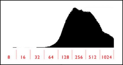
Don't take ETTR to an extreme.
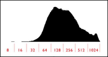
Do make your exposures light without clipping.
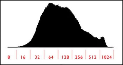
Process your files darker.
If you've got clipping in both shadows and highlights, use HDR bracketing.
Exposure
Good highlight detail starts with exposure. Get it. You have to have it to optimize it. This is one of the two reasons to monitor your histograms during exposure; the other is shadow detail. As long as you don’t “hit the wall” on the right-hand side of the histogram, your file will be fine. Remember, the histogram on your camera is based on the JPEG your camera would produce, while the as yet unrendered Raw file has even more data in the highlights. Don’t take ETTR (expose to the right) to an extreme. At some point, data will be clipped, and just before the point data starts to clip, it will start to lose gradation and shift in color.
Basic Panel
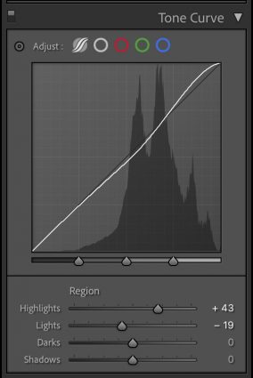
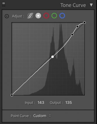
Parametric Curve and Point Curve
Processing
You’ll get more contrast by having something to contrast with; in this case, highlights contrast with shadows. Set them first. The darker shadows are, the more contrast you’ll get. (Losing shadow detail is avoided in a classic style but may be done intentionally for more graphic, gothic, or grunge styles.) Similarly, if you weigh midtones lower, highlights will appear brighter. Every range of tones (shadows, midtones, and highlights) can have its own kind of contrast. To produce more separation in highlights, focus on setting the point where they transition into midtones as low as possible without making the image look too dark. What’s too dark? Subjective. Trust your gut and do it your way.
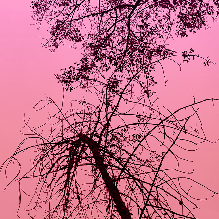
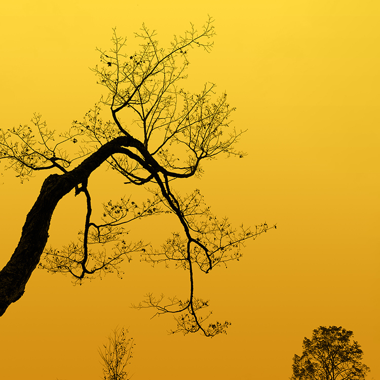
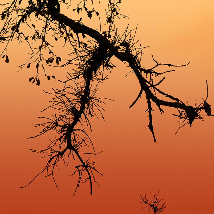
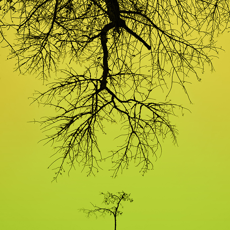
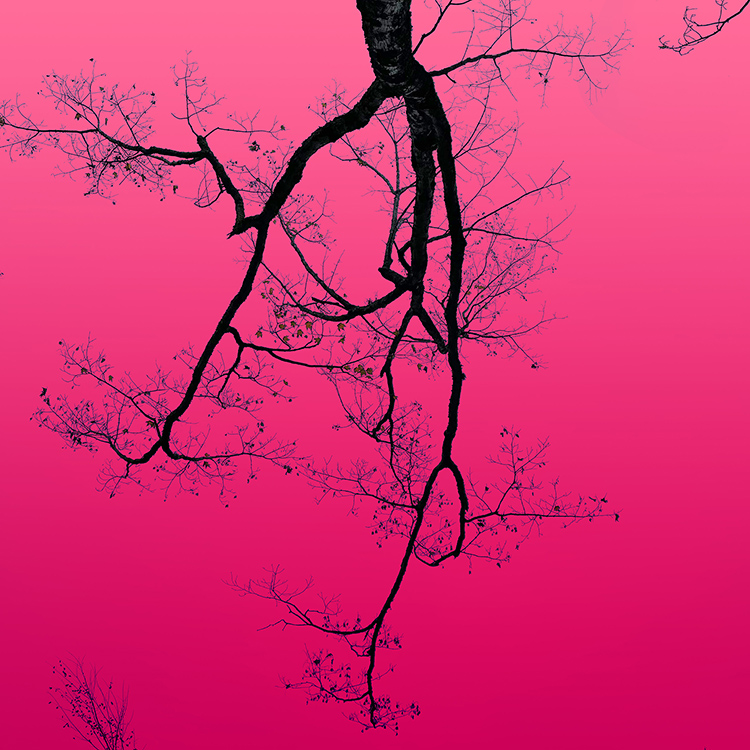
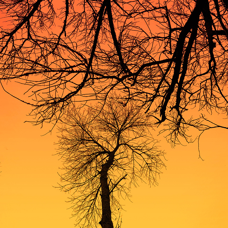
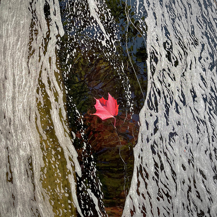
I’ve been chasing the calligraphy of trees.
What stories they tell.
Then I lifted up the colors of the leaves and gave them to the sky.
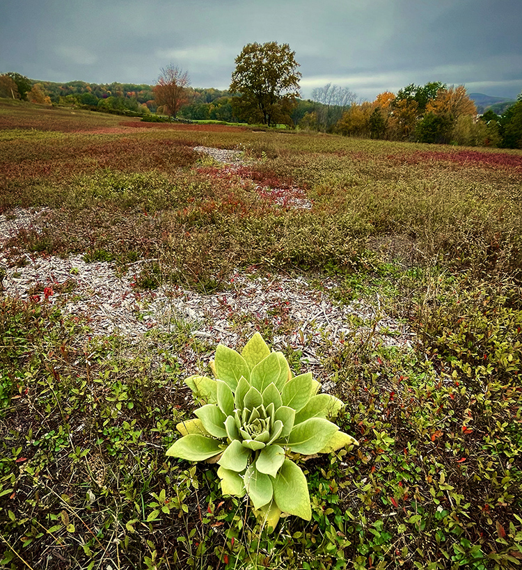
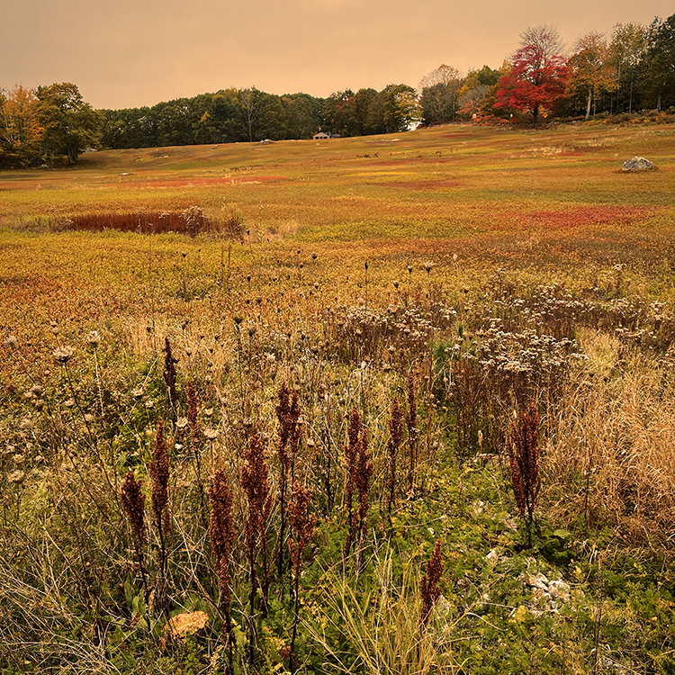
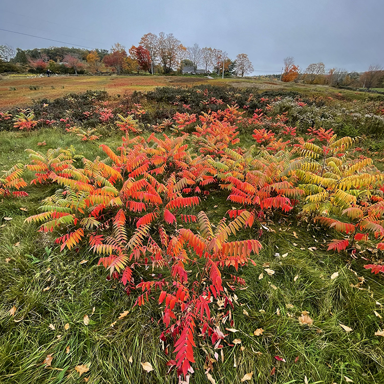
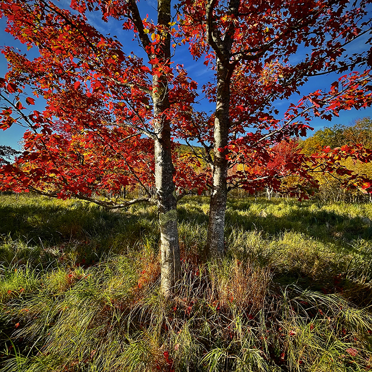
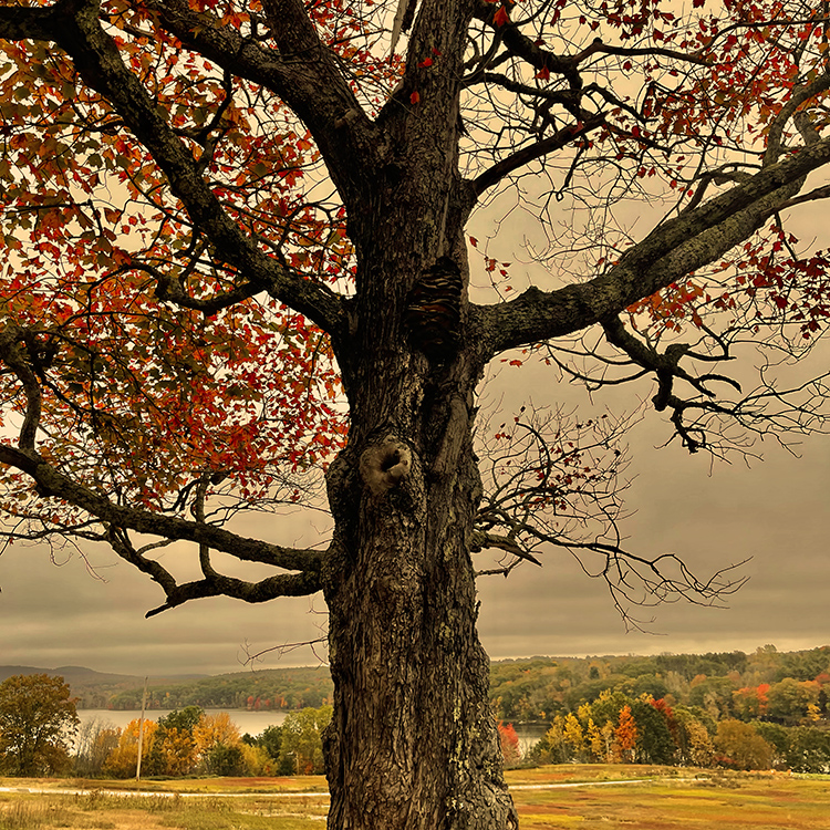
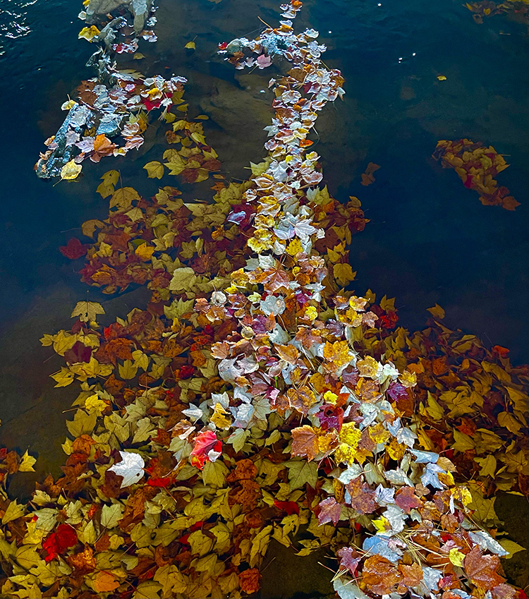
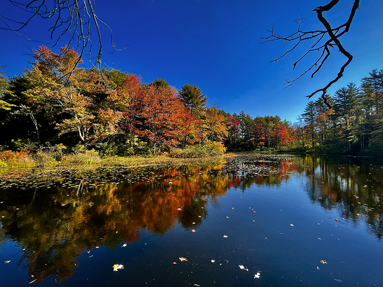
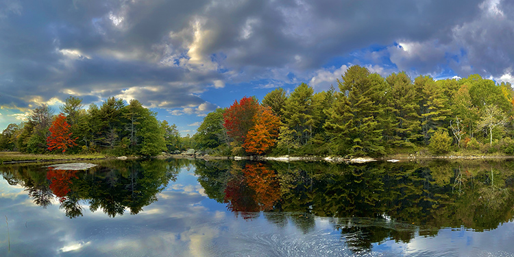
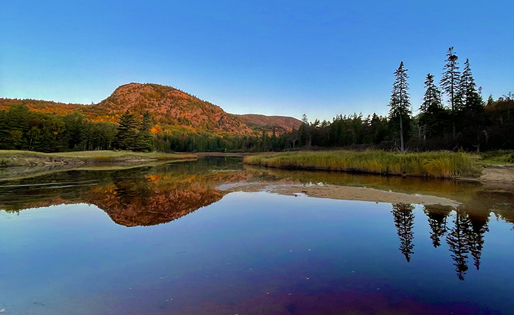
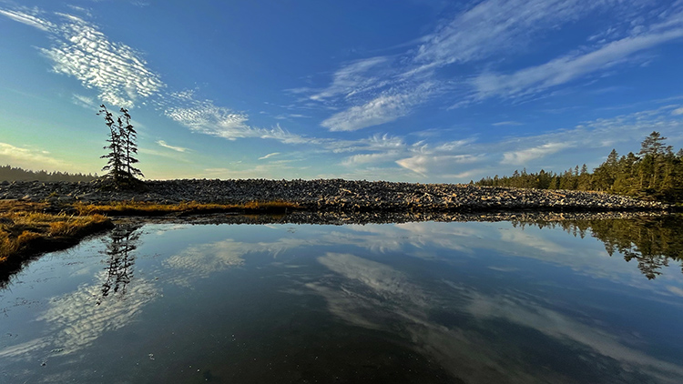
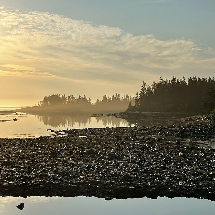
Every year I spend a week savoring sweet color during my favorite season in Maine, the autumn harvest.
I hope you enjoy these highlights from 2021.
Find out about my Maine Fall Foliage Photography Workshop here.