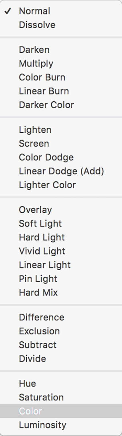
Saturation – The Essential Key To Color Palettes
One of the most distinctive features of a visual artist’s use of color is their use of saturation.
Many photographers are often asked, “Are you a black and white or color photographer?” (Curiously other visual artists are rarely asked this question.) While many people who ask it don’t mean it to be, it’s a loaded question. There’s often a latent assumption that you can’t do both well. In fact, working with one can strengthen work with another. Moreover, the question suggests that black and white (and shades of gray) are not colors, when in fact they are very specific colors – neutral colors. And, the question does not address with any specificity how a photographer uses more saturated color. Curiously, this question is rarely asked of painters and filmmakers. A more useful question might be, “How saturated is your palette?”
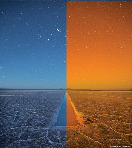
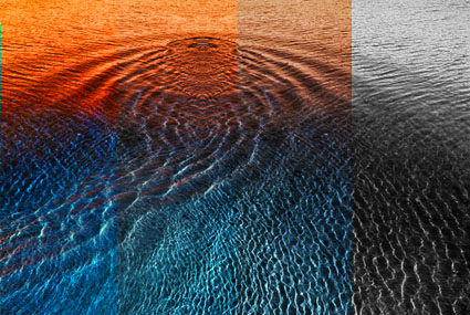
There are essentially six distinct levels of saturation – neutral, semi-neutral, reduced saturation, fully saturated, highly saturated, and super-saturated.
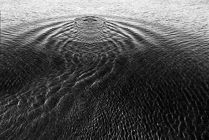
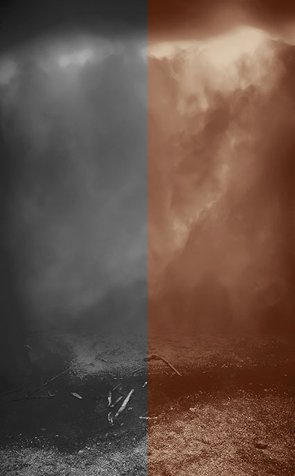
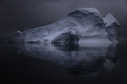
Neutral colors are characterized by a lack of saturation. Neutral lie along the luminosity spine that unites all hues. (Equal parts of complementary colors mix to create neutral colors.) At any one luminosity value there is only one truly neutral color. Using neutrals is comparatively simple, as two other variables (hue and saturation) in color are reduced to the same values (zero); it’s an economy of means. To appear luminous neutral images typically employ significant contrast in luminosity to compensate for its lack of hue and saturation. With a few exceptions, neutral images generally present a radical transformation of the way we see. Many people associate it with dream states, whether they dream in black and white or not. It is often thought of as elegant, if not conservative and restrained. The luminosity component of color aids in judging levels of illumination, spatial relationships, and volume. Formal qualities and qualities of illumination become a particularly significant concern in neutral images. Neutral images are often associated with antiquity or of timelessness.
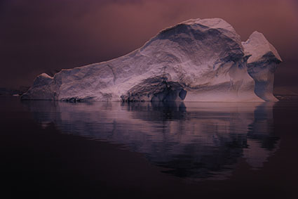
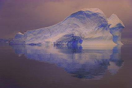
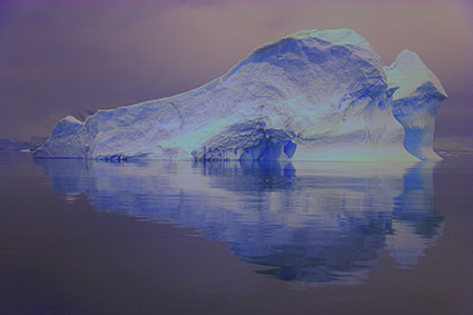
Semi-neutral colors contain trace amounts of saturation. Values cluster around the luminosity spine within a small radius. Semi-neutrals do not include truly neutral colors. Semi-neutrals function very similarly to neutrals with additional complexity. Spatial relationships may be subtly accentuated by the slight addition of hue. Iridescent and lustrous color effects can also be achieved.
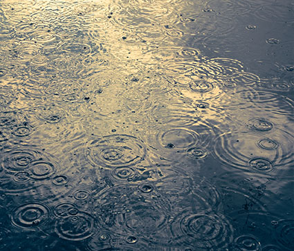
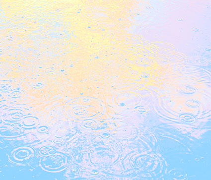
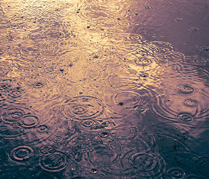
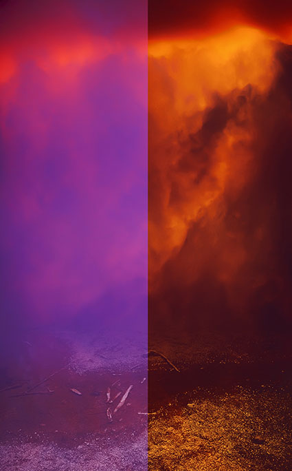
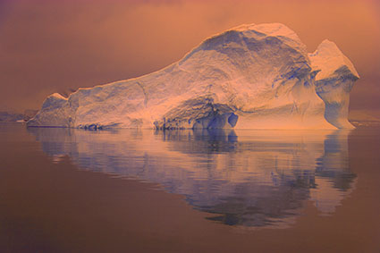
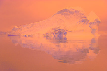
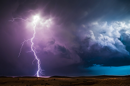
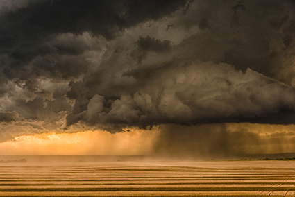
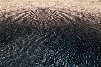
Images with reduced saturation use low levels of saturation. Values cluster around the luminosity spine within a larger radius but do not achieve full naturalistic saturation. Though not fully presented, the hue of elements within a composition becomes apparent. Similarly the ambient color temperature can be suggested. Spatial relationships can be more clearly delineated through hue. Hue becomes a significant concern in compositions, though it may or may not be a primary concern, depending on how it’s deliberate reduction is handled. Images with reduced saturation often do not appear realistic. They appear somewhat restrained, limnal, neither here nor there, but somewhere in between. Many people associate reduced saturation with the past, particularly the recent past.
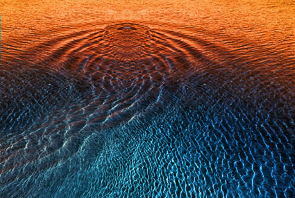
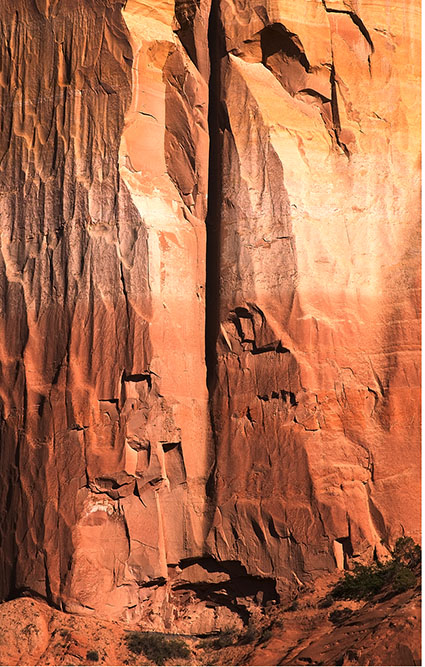
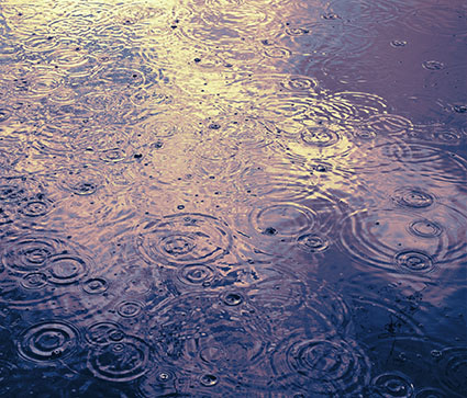
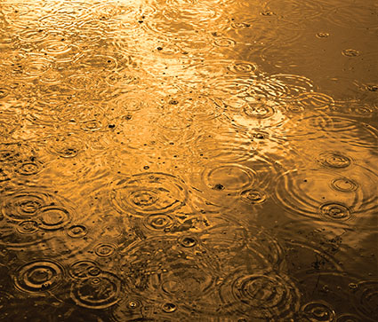
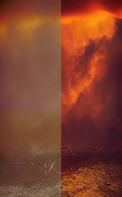
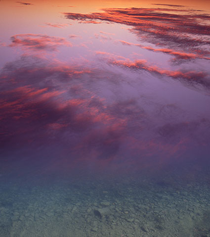
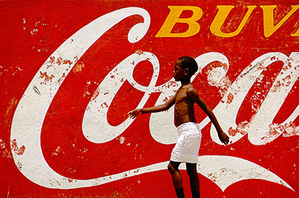
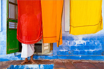
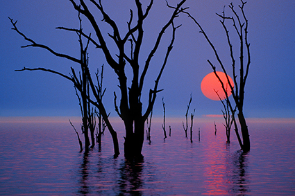
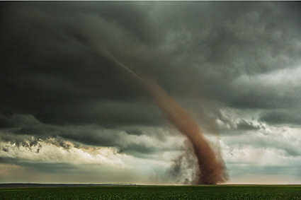
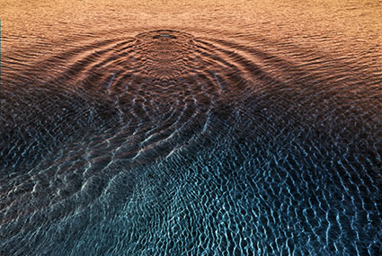
Fully saturated images are the most representational images. Color can be used to make elements in a composition seem similar or different depending on the degree of contrast of one or more of its elements – hue, saturation, or brightness. All three elements of color can be used to describe qualities of form, space, and light. Often, to preserve a realistic appearance, luminosity contrast is lower than in neutral and semi-neutral palettes. Fully saturated palettes are relatively energetic. They have decidedly contemporary connotations.
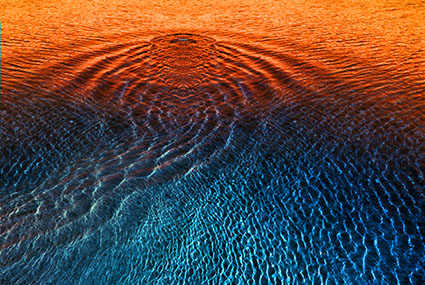
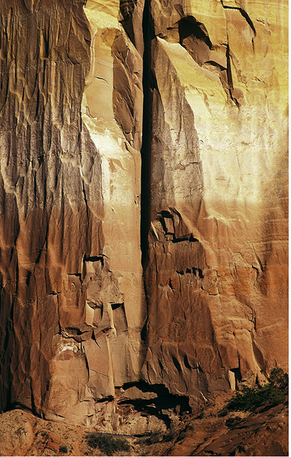
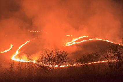
Highly saturated images use a generous amount of saturation, without becoming unrealistically saturated. Hue becomes a dominant preoccupation. It may vie for becoming the primary focus of attention with subject, spatial relationships, or qualities of light. Highly saturated images are energetic. They have contemporary, generally expressive, and sometimes youthful connotations.
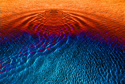
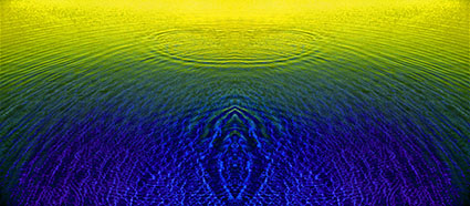
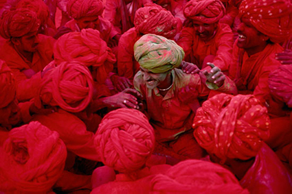
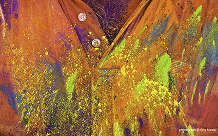
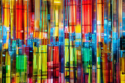
Super-saturated images use extreme levels of saturation. Realistic representation is generally not a concern. Colors often appear unrealistic. Additionally, there is a tendency for colors to posterize, with abrupt transitions between different hues. Hue becomes the dominant concern, over subject or spatial relationships. Super-saturated images tend towards flatness. They are highly energetic, expressive, and sometimes associated with altered states of consciousness.
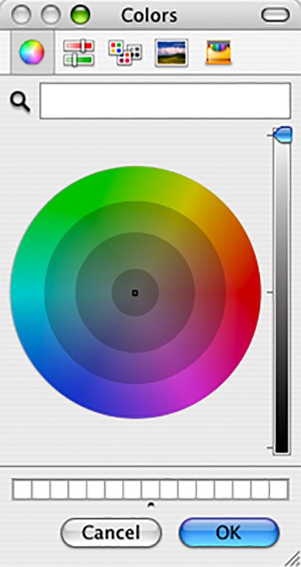
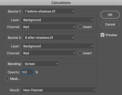
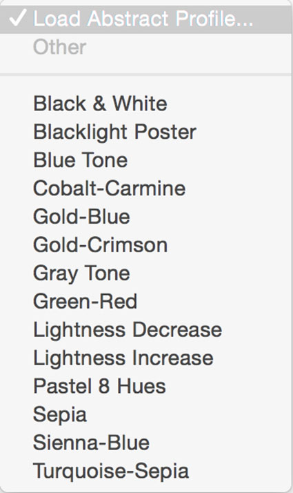
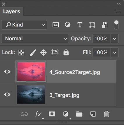
You can use the Color Sampler Tool in Photoshop in combination with the Apple color picker to graph color and identify the level of saturation of one or more images, either yours or someone else’s. See (list url for graphing color article) to find out how.
To lend unity to images within a single body of work it can be helpful, and in some cases necessary, to limit your use of saturation. Many artists will use just one level of saturation. While it is extremely difficult to present a wide array of saturation levels within a single body of work (though not a single image), for instance both neutral and saturated images, it is possible to present images that employ more than one level of saturation if they are closely related, such as reduced saturation and fully saturated or fully saturated and highly saturated palettes. As variety in saturation level rises it becomes more difficult to have separate images be seen as related.
When you think of Ansel Adams’ photographs you think of neutral images rather than highly saturated ones. When you think of Matisse’s paintings you think of supersaturated images rather than neutral ones. Think of your use of saturation as an essential component to defining your own signature style.
Read more Color Theory.
Learn more in my digital photography and digital printing workshops.