Namibia – Let Color Carry The Day

Sometimes color, pure and simple, is all you need.
Catch it while you can.
Find out about my 2010 Namibia workshop here.
Sometimes color, pure and simple, is all you need.
Catch it while you can.
Find out about my 2010 Namibia workshop here.
We learn to see. Brilliant demonstrations. Implications far beyond color.
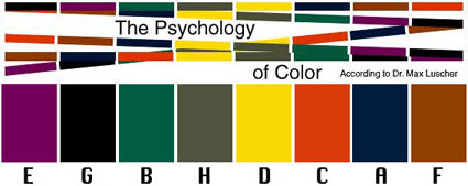
The Luscher Color Test was devised by psychologict Max Luscher in 1969. It’s effectiveness has been known in advertising and industry (automotive and fashion) for years. Now you can gain some pracitalc insight into color psychology with this well-known color test – online.
It’s uncanny what this test can reveal (consistently), but remember it’s just a starting point. What’s far more revealing is your unique living relationship with color, which is revealed over time and in a variety of contexts under many influences. Awareness is the key. Use this as food for thought for developing insight into your relationship with color.
Take the test here.
What did the test reveal for you?
Comment here!
Read more on Color Psychology here.
Learn more in my digital printing and digital photography workshops.


