

Blue

What’s the first thing that comes to mind when you see blue?
Comment here!
Then read more and find other viewer’s responses.

The Elements of Color – Color Equilibrium
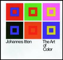
Josef Albers’s Theory and Interaction of Colors is considered the definitive classic on color theory from a painter’s perspective. I actually prefer his colleague Johannes Itten’s The Elements of Color. Itten’s language is exceptionally clear. How important is language? Very! Itten does something brilliant. He avoids the whole mess of discussing color ‘harmony’, which is subjective (influenced by culture, region, individual, and time), and describes color relationships in terms of ‘equilibrium’. Complementary colors produce equilibrium; red and cyan mix to produce gray. ‘Color balance’ is produced by an equal mix of the two colors. An ideal color structure is produced by an equal mix of all colors. Equilibrium produced a perfect balance. There’s lots more where that came from. I highly recommend the book.
Find this and other books on color here.
Learn more about color in my DVDs.
Learn more about color in my workshop The Power of Color.
Kathy Beal – Alumni – Antarctica

Kathy Beal has a thoroughly unique approach to making images, capturing out of focus fields of color on location and using them as a jumping off point for creating unique compositions in Photoshop. Though still inspired by specific places and their palettes, her images take you to entirely new places with a palette all her own.
Kathy’s one of my long standing alumni who has come so far so fast it’s thrilling to watch! It took a combination of many things to make breathroughts – commitment, research, persistence, risk, courage, feedback, sensitivity, passion, and the most important of all hard work. But she enjoys what she’s doing so much, it doesn’t seem like hard work. She’s become incredibly productive, producing thoroughly unique work. Her growth can only be described as an explosion of creativity.
Check out more of Kathy’s work from Antarctica here.
Check out my workshops here.
Resonance in Red and Gold

July 18, 2003
“Many meditation practices suggest gazing at the flow of water, in some cases watching or visualizing a drop of water hit the still surface of a greater body of water. Like many mandalas, Resonance in Red and Gold has a rhythmic centering quality.
The methods of both photographer and painter are married here. The color is an invention. The composition, both representational and abstract, offers a fluid structure to explore the power of color, physically and psychologically.
Red, the warmest color. Is its presence here the reflected glory of the heavens, a display of bodily fluid, or an omen of toxic waste? The power of this image can be found, in part, in tantalizing ambiguity. When looking at this image, I’ve asked myself why red, time and time again. I can’t answer the question. But by asking the questions that surround it I learn to more fully appreciate the presence and power of red.”
Pete Turner – Empowered By Color

“Legendary photographer Pete Turner still knows how to punch up the color and get people’s attention. The master colorist, who broke all the rules in the pre-computer era, is taking his creativity to an entirely new ground with the unprecedented control of digital technology. His photographs are best known for their blazing hues, atmospheric effects, daring perspectives and surreal landscapes.
Turner personally printed 50 of his most loved images, with colorful names like “Lifesaver, USA” and “Hot Lips,” for the recent retrospective, Pete Turner: Empowered by Color. The photographs were on view in his hometown of Rochester, N.Y. at the renowned George Eastman House International Museum of Photography and Film.”
See the short 6:33 video on Turner from Epson Focal Points here.
The Luscher Color Test – Online
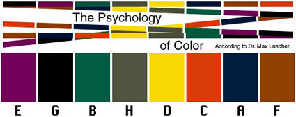
The Luscher Color Test was devised by psychologict Max Luscher in 1969. It’s effectiveness has been known in advertising and industry (automotive and fashion) for years. Now you can gain some pracitalc insight into color psychology with this well-known color test – online.
It’s uncanny what this test can reveal (consistently), but remember it’s just a starting point. What’s far more revealing is your unique living relationship with color, which is revealed over time and in a variety of contexts under many influences. Awareness is the key. Use this as food for thought for developing insight into your relationship with color.
Take the test here.
What did the test reveal for you?
Comment here!
Read more on Color Psychology here.
Learn more in my digital printing and digital photography workshops.
Farnsworth-Munsell ColorIQ Challenge at X-Rite
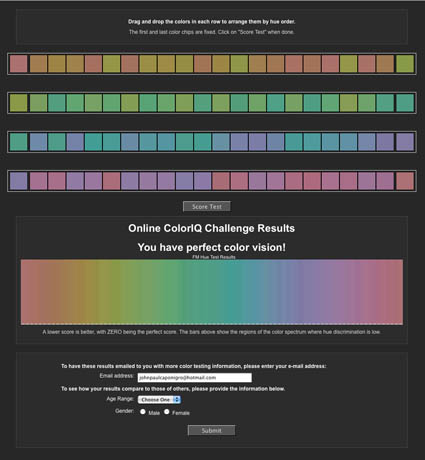
1 out of 255 women and 1 out of 12 men have some form of color vision deficiency.
How well do you see color?
Find out!
X-Rite has taken the Farnsworth-Munsell color test online.
It’s quick and free!
Find more color theory resources here.
Find more color adjustment resources here.
Learn more in my digital photography and digital printing workshops.