10 Quotes By Photographer Christopher Burkett

Enjoy this collection of quotes by photographer Christopher Burkett.

“I would come out of the chapel after communion and occasionally I would see the world transformed, filled with light.” – Christopher Burkett

“I knew that if it was real, which it was that there must be some way to photograph that.” – Christopher Burkett

“The things that I’m trying to present in my photography are things that are absolutely real in the world, subtle qualities that many people don’t see.” – Christopher Burkett

“I’m working within a very limited box, in terms of possibilities. But, by working within that box to the maximum amount … it’s like a form of discipline, it is a form of discipline, and there is a strength and a depth that is possible within that discipline that doesn’t happen in any other way.” – Christopher Burkett

“Traditionally, art was not meant to be a worship of the ego of the artist, it was meant to be an expression of God’s grace, of divine things.” – Christopher Burkett

“I’m concerned about myself, what I’m doing, what my spiritual answer is rather than what I think other people should be doing. If my religion has any value it’s in my life and what I do. That’s its power and that should be evident. If it isn’t then it won’t be obvious. You know what I mean?” – Christopher Burkett

“This crystal clarity is part of the experience of trying to see the world as it truly is. The world is full of an infinite number of details. It’s only our blindness, in one form or another, that doesn’t allow us to see that.” – Christopher Burkett

“The truth is that if we lived .. I was trying to find a word for it earlier, all terms are limiting … in a state of divine grace everything would be even more real. That’s exactly what I’m trying to portray in my photography, that moment of … I don’t like to put a word on it because it’s too limiting. As soon as you put a word on it, it becomes a concept rather than a reality. And what I’m trying to present with my photography is that almost super real quality, not fake real, but super real. I’m trying to show something that is precious and real, that most people do not see.” – Christopher Burkett

“I have terrible vision without glasses. I didn’t know that until I was in first grade. Most of your visual processing mechanism is formed by the age of six. I couldn’t see the features on someone’s face unless I was about a foot and a half away from them. I learned to identify people by their shape and the way they walked. I had no idea. I had no idea at all. Then I got glasses. It was quite a revelation. All of a sudden the world was transformed with these details. I’ve tried not to lose that sense of astonishment and wonder. I never knew there were leaves on trees, I could only see if they had fallen. I’d never seen clouds before. The moon in the sky had been a fuzzy blob. I could never see stars, some of the brightest ones were a very faint globule, out of focus, about the size the moon would normally be. That whole sense of incredible wonder, of miraculousness has stayed with me. The whole world is full of marvelous details.” – Christopher Burkett

“I don’t try to justify what I do. I think the work is strong enough to speak for itself. I don’t mean that to sound arrogant, but to me it’s not an issue, because I know what I’m doing is unique and I feel comfortable about that. When I’m out there, I’m not trying to look for a picture that looks like a picture I’ve seen before. I’m trying to see the world fresh and clean, and yet with a knowledge of the history of photography. I don’t think of working within a tradition, I think of working within the world, within life.” – Christopher Burkett

Read our conversation here.
Find out more about Christopher Burkett here.
Read Great Quotes By Photographers collections here.
View 12 Great Photographs collections here.

60 Great Quotes On Color

0_Quotes_Color

Enjoy this collection of quotes on color.

Which is your favorite? Have one to add? Share it in the comments.


“Of all God's gifts to the sighted man, color is holiest, the most divine, the most solemn.”
- John Ruskin

“In nature, light creates the color. In the picture, color creates the light.”
- Hans Hofmann

“Light is a thing that cannot be reproduced, but must be represented by something else – by color.”
- Paul Cezanne

“Color helps to express light, not the physical phenomenon, but the only light that really exists, that in the artist's brain.”
- Henri Matisse

“Color is the place where our brain and the universe meet.”
- Paul Klee

“Everything that you can see in the world around you presents itself to your eyes only as an arrangement of patches of different colors.”
- John Ruskin

“The fact that the colors in the flower have evolved in order to attract insects to pollinate it is interesting; that means insects can see the colors. That adds a question: does this aesthetic sense we have also exist in lower forms of life?”
- Richard P. Feynman

“The painter has to unlearn the habit of thinking that things seem to have the color which common sense says they 'really' have, and to learn the habit of seeing things as they appear.”
- Bertrand Russell

“Color creates, enhances, changes, reveals and establishes the mood of the painting.”
- Kiff Holland

“Color is a power which directly influences the soul.”
― Wassily Kandinsky

“The chief function of color should be to serve expression.”
- Henri Matisse

“Mere color, unspoiled by meaning, and unallied with definite form, can speak to the soul in a thousand different ways.”
- Oscar Wilde

“Colors, like features, follow the changes of the emotions.”
- Pablo Picasso

“All colors arouse specific associative ideas…”
- Yves Klein

“Color provokes a psychic vibration. Color hides a power still unknown but real, which acts on every part of the human body.”
- Wassily Kandinsky

“Colors produce a corresponding spiritual vibration, and it is only as a step towards this spiritual vibration that the elementary physical impression is of importance.”
- Wassily Kandinsky

“Colors express the main psychic functions of man.”
- Carl Gustav Jung

“Color! What a deep and mysterious language, the language of dreams.”
- Paul Gauguin


Insights Members can login to read the full article.
Email:
or Sign up

How To Evaluate All Photoshop Color Adjustment Tools

PS_Curves_Full
1_LuminosityGraph
2_HueGraph
3_SaturationGraph

.

The Photoshop Color Adjustment Tool Survey – The Go To, The Exotic, And The Redundant

.

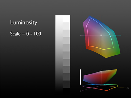
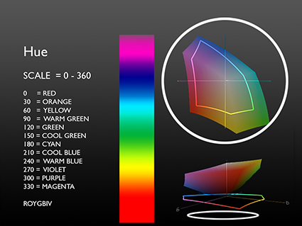
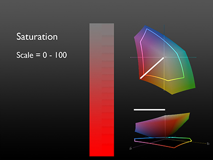
You can evaluate any color adjustment tool, in any software ­– past, current, or future –based on the control it offers over one or more of the three elements of color – Luminosity, Hue, and Saturation.
Use this as a strategy for quickly mastering the intricacies of color adjustment in Photoshop: own the six go to tools; familiarize yourself with the eight exotic tools; forget about the eleven redundant tools.

.

Go To Color Adjustments

.

There are a six color adjustment tools I shudder to think of living without; Curves, Hue/Saturation, Vibrance, Selective Color, Photo Filter, and Black & White

.
5a_Curves

.

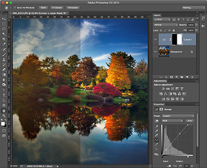
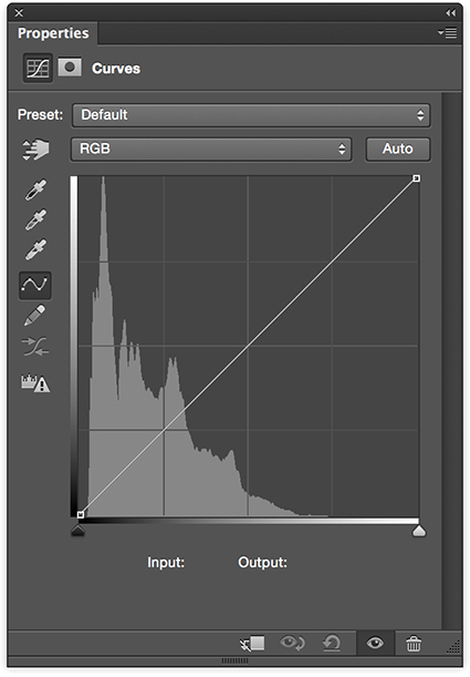
Curves offers the ultimate control over luminosity; no other adjustment offers such precision over the relative darkness and lightness of shadows and highlights. Using the separate channels, Curves offers the same kind of precision when adjusting hue.

.
5b_HueSaturation
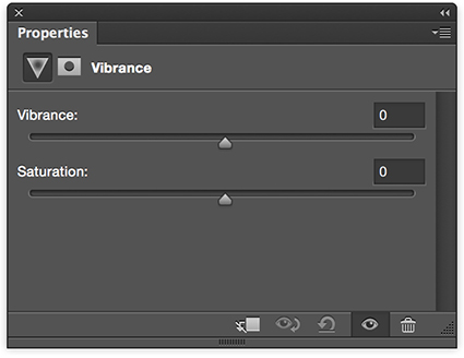
5c_Vibrance

.

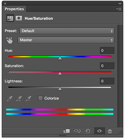
Hue/Saturation and Vibrance are the two essential tools for adjusting saturation.

.
What’s the difference? Vibrance saturates less saturated colors more and prevents clipping in very saturated values, producing a heavier appearance. Hue/Saturation produces a lighter more intense effect, so use it cautiously; you can quickly clip values, producing an overly smooth, overly saturated synthetic appearance if used aggressively. Similarly, handle its Hue slider with care; it’s really more useful for color transformation than it is color enhancement. Unlike Vibrance, Hue/Saturation offers the ability to adjust individual hues without the need for masking. Neither has the ability to selectively adjust the saturation of highlights, midtones, and shadows; for this you’ll need a luminosity mask. Vibrance provides only a very limited ability to selectively adjust colors with different levels of saturation while Hue/Saturation provides none. (For a way to do this read my article Saturation Masking on DigitalPhotoPro.com.)

.
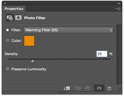
5d_PhotoFilter

.

Photo Filter offers the ability to adjust the hue and to a more limited degree saturation of an image much like an analog lens filter would do, only much more precisely and flexibly. Though less intense, it preserves hue variety better that a Color Fill layer set to a blend mode of Color.

.
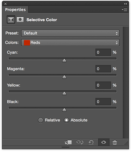
5e_SelectiveColor

.

Selective Color trades in subtlety, referencing CMYK adjustments without leaving RGB working spaces. Its ability to adjust the hue of whites, neutrals, and blacks and its ability to mix white and black into other hues, producing reduced saturation tints and shades, makes it unique.

.
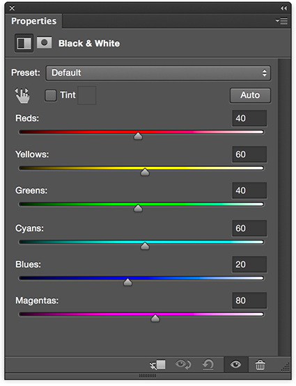
5f_BlackWhite

.

Black & White is the simplest and most powerful tool for converting color to black and white, first reducing saturation to zero and then adjusting luminosity based on original hues. It shines brightest when used in combination with Hue/Saturation and when applied selectively with masks in multiple passes.

.

Exotic Color Adjustments

.

You’ll see and think about color differently once you use Photoshop’s three most exotic color adjustment tools; Color Lookup Tables, Gradient Map, and Match Color. (For more detail on each of these adjustments read my previous articles on DigitalPhotoPro.com.) They affect luminosity, hue, and saturation in complex non-uniform ways.

.
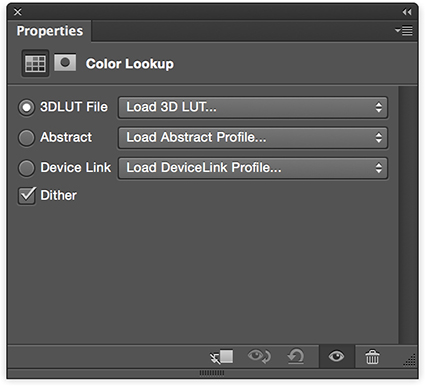
6a_ColorLookUp

.

Color Lookup Tables combines multiple color routines or recipes into a single adjustment, making it easy to create consistent effects across multiple images; it’s most frequently but not exclusively used for color grading the many stills in a video.

.
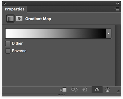
6b_GradientMap

.

Gradient Map uses the luminosity values of an original to selectively distribute new colors into an image.

.
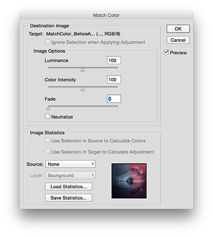
6c_MatchColor

.

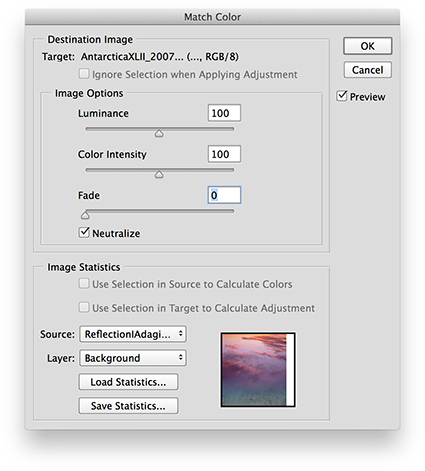
Match Color applies the color values of one image to another, based on a complex statistical analysis of the color relationships in both; it has an added benefit of being able to neutralize strong color casts, such as those found in underwater exposures, without the use of a second image.

.

Five other exotic color adjustment tools are worth noting.

.

While preserving shadow and highlight detail is best done during exposure and Raw conversion, and while you can mask a Curves adjustment to the shadows or highlight, both the adjustment Shadows/Highlights and HDR Toning offer occasionally useful sharpening options that Curves doesn’t, in the form of Radius sliders, which potentially makes them more related to detail enhancement than color adjustment.
Cast Equalize (resets dynamic range), Posterize (reduces gradation), and Threshold (reduces all values to pure black or white) into the really exotic category. They have real uses for very graphic images and for analysis but offer little that is useful for photorealistic images.

.

Redundant Color Adjustments

.

Part of mastering a tool is learning what not to use. Many of Photoshop’s color adjustment tools are redundant, offering similar control over the same elements of color – with less power and precision. You can simplify your toolset by eliminating these eleven adjustment types from your workflow. Instead, use the tools that give you more control.

.

Brightness/Contrast (Use Curves instead.), Exposure (Use Curves instead.) Levels (Use Curves instead.), Color Balance, (Use Curves instead.), Invert (Use Curves instead.), Equalize (Use Curves instead.), Desaturate (Use Hue/Saturation instead.), Replace Color (Instead, use Select By Color Range and then Hue/Saturation.), and Channel Mixer, Apply Image, and Calculations (Instead, use Layer Styles to blend channels, with or without a mask. (For more on this technique see my previous article Blending Channels on DigitalPhotoPro.com.)

.

See the pattern(s)? Two adjustments, Curves and Hue/Saturation, and one layer technique can outperform all of these eleven adjustments.

.

Blend Modes

.

You can make any color adjustment in Photoshop more precisely target an element of color by using one of four Blend Modes – Luminosity, Hue, Saturation, and Color (a combination of Hue and Saturation). Simply change an adjustment layer’s blend mode from its default Normal. If, instead, you apply an adjustment directly to an image, immediately after applying it, select Edit: Fade (Command / Shift / F) to change the Mode. As a general guideline for all color adjustments, I recommend you make a standard practice of using the blend mode of the element of color you are adjusting, making exceptions when desired.

.

Lightroom & Camera Raw

.

Can the separate but related programs Lightroom and Camera Raw do things that Photoshop can’t? Yes. While the majority of these two interfaces, which differ in appearance but not in function, provide controls that are quite similar to but sometimes more limited than what you find in Photoshop, they can do three things that can’t be done in the same way in Photoshop: first, White Balance (Curves and Photo Filter are similar but different.); second, Clarity (High Pass filtration is similar but different); and third, the HSL panel is able to produce luminosity adjustments of individual hues without adverse side-effects on dynamic range.
While the precision of the adjustments provided in Lightroom and Camera Raw is often more limited, it’s usually best to do the basic heavy lifting during Raw conversion – it’s less destructive – and then either dramatic transformations and/or fine-tuning in Photoshop.

.

In the future, if we discover a single interface that allows us to precisely and without side-effects control the luminosity, hue and saturation of any range of brightness (L), colors (H), and intensities (S), then we’ll have found the Holy Grail of color adjustment. For now, the Photoshop interface, a product of more than 25 years of continual expansion, is more complicated than it needs to be, but it’s capable of producing magic – so much magic. When you clarify your thinking about color, you’ll find it becomes much easier to navigate interfaces and master color adjustment. Keep it simple. Remember, color only has three elements – Luminosity, Hue, and Saturation – so color adjustment is all about controlling the relationships between them … nothing more and nothing less.

.

Read more color theory resources here.

Read more color adjustment resources here.

Learn more in my digital photography and digital printing workshops.

How Gray is Gray?

howgraygray_425

In the vernacular the phrase “black and white” can be used to describe definitive answers, while the use of the phrase “gray areas” often means an area defies easy definition making it difficult to draw hard and fast lines.

While there is a general consensus as to what constitutes the colors black, white and gray, opinions vary significantly when it comes to identifying absolute blacks, whites, and grays.

Which of these colors is absolutely neutral? Which are warmer than neutral? Which are cooler than neutral? All of them are nearly neutral when compared to fully saturated colors. More importantly, which colors do you prefer? Which colors would most enhance the images you are producing?

It‘s helpful to sensitize yourself to these many possibilities and to identify your personal preferences.

Read more in my Black & White lessons.
Learn more in my digital photography and digital printing workshops.

Tips & Strategies For Mastering Color In Photoshop

9_4Blended copy

OPTIC 2015 featured dynamic presentations by the world’s top outdoor photographers and gear from the premier manufacturers over three days in New York City brought to you by B&H and Lindblad Expeditions.

Couldn’t attend in person or want to review at your own pace? Now you can view all the presentations of your favorite speakers from the conference.

I presented tips and strategies For Mastering Color In Photoshop. Watch it and you’ll get a taste for the artistic perspective and advanced color adjustment strategies I offer in my digital photography and digital printing workshops. You’ll see in new ways.
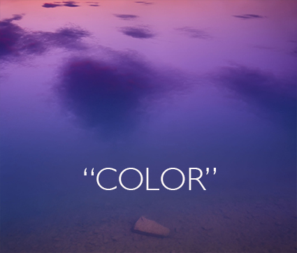
View Mastering Color In Photoshop here.

Using Color Management For Color Adjustment – Synthetic Profiles

SyntheticProfiles_425

How can you change the appearance of a digital image without changing the numbers that assign the color values? Change what those numbers mean by changing the image’s ICC profile. Using abstract or synthetic profiles, you can make massive changes to an image with little to no cost, changes that ordinarily would cause big problems using standard methods, such as posterization and noise. It’s a practice known to color geeks and few others. When you’ve got a big job to do, it can get you out of a pinch in a hurry.

In most cases, we think of using color management to accurately match colors when moving between different color spaces; ICC profiles are used to describe different color spaces and to make precise transformations to values moved from one to another to maintain consistent appearances. In very rare cases, when profiles are assigned to image files without a color conversion, the appearance of the image changes; values stay the same, but their meaning changes, so the image looks different. So when you use this unorthodox method of color adjustment, you get a change in appearance without changing the values in the file, and this is particularly useful when you want to pay a very small price for making very big changes.

Am I saying that ICC profiles are used to change values so the appearance stays the same? Yes. Am I saying that a color space is just a recipe for color, and that there are many different RGB recipes? Yes, but while they’re the standards, sRGB, ColorMatch RGB, Adobe RGB (1998) and ProPhoto RGB are just a few among many.

With just a little experimentation, you’ll find you, too, can make big changes to your images and pay a small price using synthetic profiles. Using synthetic profiles is color adjustment without editing values; they change no values, but they do change the meaning of those values—and thus their appearance. Don’t believe it? Check your histogram when you assign a profile. You won’t even see it move! It’s kind of unbelievable. Try it. See it with your own eyes. You’ll quickly become a believer, too.
Learn the steps you need to take to make your own synthetic profiles …
Read more on Digital Photo Pro.
Learn more in my digital photography and digital printing workshops.

Photoshop’s Color Lookup Makes Complex Color Effects Easy

Resonance in Blue and Gold IA
Originally designed for color grading film and video, Photoshop’s Color Lookup feature offers novel ways to adjust color that will quickly reveal new possibilities in your images. Capable of performing extremely complex calculations extraordinarily efficiently, color lookup tables (LUTs) work by looking up a source color in a table and using the replacement color specified in the grid to transform it for the final destination.
Like Match Color and Gradient Map adjustments (See my last two articles for Digital Photo Pro.) the color effects Color Lookup generates are so complex they are not easy to previsualize. Like anything new, this takes practice. And these are new! Experiment and you’ll find many rich possibilities. Unlike Match Color, Color Lookup is loaded with presets that will allow you to quickly explore many different effects, ones that are far more sophisticated than Gradient Map presets. In this way, using them can be as easy as using many smartphone app effects.
You can also generate your own Color Lookup presets. To do this create a color effect you like with any with any combination of adjustments layers, Opacity and Fill, Blend If sliders, blend modes. (Layer masking and transparency will not be included, because alpha channel information in alpha channels is not included in the recipe.) Then go to File: Export: Color Lookup Table, name the file, and click OK. (I recommend the titles you give your presets include the color space you created them in.) These files are stored in Photoshop’s Presets folder or if they’re saved as ICC profiles in your operating systems Profiles folder. You can now use your custom preset at any time on almost any file by making a Color Lookup adjustment layer and choosing your preset. You can share your custom Color Lookups with others by giving them these exported files. Color LUTs created in Photoshop can even be used in other programs such as After Effects, Premiere, SpeedGrade and other applications that use color LUTs.
Using Photoshop’s Color Lookup you can choose to create color effects as subtle or dramatic as you like. This game-changing color adjustment tool may seem exotic at first because it offers a new way of thinking about and seeing in color. Once you become more familiar with this mindset you’ll truly begin to see with new eyes. Isn’t that what it’s all about?
Read more on Digital Photo Pro.
Learn more in my digital photography and digital printing workshops.

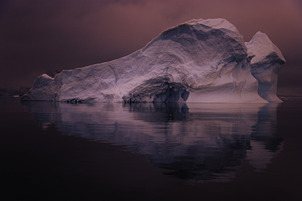
Photoshop’s Match Color May Change The Way You Think & See

1_Blended

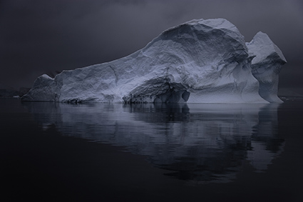
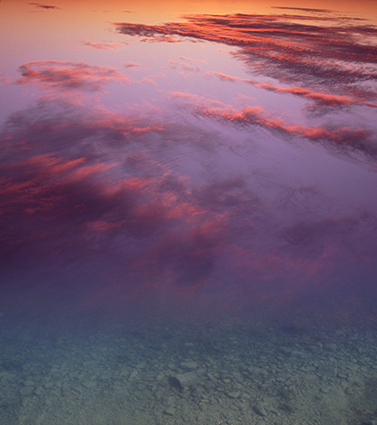
 How was this effect created? See the illustrations below.

Little explored and capable of opening up whole new frontiers in color adjustment, Photoshop’s Match Color is a tool every user should be aware of, even if it’s only to know what’s possible.
There are three primary reasons to consider using Match Color.
1  – Match two colors exactly.  
(Match the color of one object to another.)
2  – Remove strong color casts.    
(It’s great for neutralizing underwater casts.)
3  – Creatively apply the color in one image to another.
(This will blow your mind!)
A few tips will help you make the most of this fascinating tool …
Read the rest of this post on Digital Photo Pro.
Learn more in my digital photography and digital printing workshops.
2_Original_1

Original

3_Source

 New colors

4_MatchColor

Tool used

9 New Awesome Mobile Apps From Adobe

AdobeApps2
“Bring the power of desktop apps like Photoshop CC and Illustrator CC to your phone or tablet with all-new connected mobile apps. Capture colors and other inspiration, sketch and draw, and edit photos and videos — all on the go. Your Creative Profile lets you bring those assets into companion desktop and mobile apps, so you have everything you need to do your best work anywhere.”
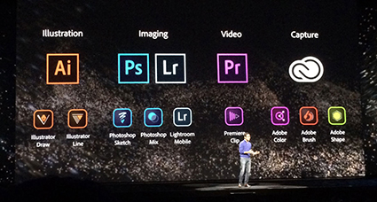
Adobe just released 9 new mobile apps. Six of them are extensions of its major desktop apps. Photoshop Mix and Photoshop Sketch and Lightroom Mobile are for photographers; Illustrator Draw and Illustrator Line are for graphic artists; and Premiere Clip is for videographers. The other three allow you to capture content from the real world and quickly turn it into assets for use within the Creative Cloud; Adobe Brush and Adobe Color (formerly Kuler) and Adobe Shape.
My favorite? Adobe Illustrator Draw (formerly Ideas). I use it all the time!
Find out about these new Adobe Apps here.
Watch the demo for Adobe Photoshop Mix here.
Watch the demo for Adobe Lightroom Mobile here.
Find out about Adobe Photoshop Sketch here.
Watch the demo for Adobe Brush here.
Watch the demo for Adobe Illustrator Draw here.
Watch the demo for Adobe Illustrator Line here.
Watch the demo for Adobe Shape here.
Watch the demo for Adobe Color here.
Watch the demo for Adobe Voice here.
Watch the demo for Adobe Clip here.
Find out about Adobe Ink & Slide drawing tools.