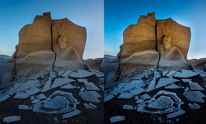
Create Amazing Distortion With Photoshop’s Liquify Filter

1
Awareness of the distortions produced by angle of view and lens choice is the beginning of using them creatively. Curiously, permission is the beginning of using distortion in post-processing creatively. Many people have been told that it’s inappropriate to do so. Why? Why accept an unintended mechanical by-product, but not a consciously intended effect? Why take such a powerful tool for expression off the table? Even the subtlest applications of distortion can produce powerful results. Once you understand what kinds of distortions are possible during post-processing, you may even find yourself changing your angle of view during exposure.

There are many reasons why you might want to distort an image. Here are four:

1. Correct Optical Distortion
It can be produced by many things, including lens choice, angle of view, motion, panoramic stitches, etc. You can choose to make the selection of a wide-angle lens less about distortion and more about including more.

2. Modify Proportion
Adjust the height and/or width of objects and/or areas. Just for starters, take off the 10 pounds that the camera adds on.

3. Change Proximity
Reduce or increase the spaces between objects. Make things feel more or less related.

4. Enhance Or Change Gesture
Make a leaning object more tilted or straighten it out. Think of this as adding the words “very” or “less” into a sentence.

When exploring the many distortion tools in Photoshop, you’ll find that the Liquify filter is one of the most powerful. The Liquify filter is so powerful that, when in use, it offers its own toolbar and menus, somewhat like Camera Raw. To get the most of the Liquify filter, it’s worth taking the full tour …

Read all the details on Digital Photo Pro.

Photoshop’s sophisticated distortion capabilities are relatively new to photography, and so is the mindset of using them to photographers. Both are worth acquiring. Everyone can find a use for them at one time or another, if not on every image. As every photographer uses distortion to one degree or another, ultimately, what separates photographers is not whether they use distortion but when, how, and why they use it. The same tools can be used to achieve entirely different effects. There’s a world of difference between using distortion to remove process artifacts for more accurate representations, using distortion to aesthetically refine the formal qualities of images, and using distortion to interpret subjects expressively. Intent is everything. Practice is a reflection of intent. Simply asking yourself how far you are and aren’t willing to go and, finally, why will help clarify yours. Consider these questions seriously, and you’ll find your vision will grow stronger and clearer.

Learn more in my digital photography and digital printing workshops.

Making Saturation Masks

Incubation X
6_SaturationMask
Wouldn’t it be great if you could selectively adjust colors based on how saturated they are in Photoshop? You can! How? With a free plug-in Adobe provides called Multiplugin; it hasn’t been updated since Photoshop CS5, but it still works with current versions.
Why Would You Want To Do This?
Do you have images where semi-neutrals aren’t saturated enough, but you don’t want other colors to get too saturated? Select the less saturated colors before adjusting them. Do you have images where you’d like to reduce the saturation of very saturated colors without affecting other levels of saturation? Select the more saturated colors before adjusting them. You even can select colors with medium saturation, separating them from both the high and low range of saturation. Using this technique, you can produce subtle color effects that aren’t possible with any other method.
Saturation masks aren’t for saturation adjustments only. This simple selection/mask can be used with any color adjustment tool in Photoshop, greatly expanding your ability to adjust color. Imagine adjusting the lightness and/or hue of high, medium or low ranges of saturation independently of one another.
Read more here.
Download Adobe’s free Multiplugin here. Mac or PC.
Learn more in my digital photography and digital printing workshops.

Using Color Management For Color Adjustment – Synthetic Profiles

SyntheticProfiles_425

How can you change the appearance of a digital image without changing the numbers that assign the color values? Change what those numbers mean by changing the image’s ICC profile. Using abstract or synthetic profiles, you can make massive changes to an image with little to no cost, changes that ordinarily would cause big problems using standard methods, such as posterization and noise. It’s a practice known to color geeks and few others. When you’ve got a big job to do, it can get you out of a pinch in a hurry.

In most cases, we think of using color management to accurately match colors when moving between different color spaces; ICC profiles are used to describe different color spaces and to make precise transformations to values moved from one to another to maintain consistent appearances. In very rare cases, when profiles are assigned to image files without a color conversion, the appearance of the image changes; values stay the same, but their meaning changes, so the image looks different. So when you use this unorthodox method of color adjustment, you get a change in appearance without changing the values in the file, and this is particularly useful when you want to pay a very small price for making very big changes.

Am I saying that ICC profiles are used to change values so the appearance stays the same? Yes. Am I saying that a color space is just a recipe for color, and that there are many different RGB recipes? Yes, but while they’re the standards, sRGB, ColorMatch RGB, Adobe RGB (1998) and ProPhoto RGB are just a few among many.

With just a little experimentation, you’ll find you, too, can make big changes to your images and pay a small price using synthetic profiles. Using synthetic profiles is color adjustment without editing values; they change no values, but they do change the meaning of those values—and thus their appearance. Don’t believe it? Check your histogram when you assign a profile. You won’t even see it move! It’s kind of unbelievable. Try it. See it with your own eyes. You’ll quickly become a believer, too.
Learn the steps you need to take to make your own synthetic profiles …
Read more on Digital Photo Pro.
Learn more in my digital photography and digital printing workshops.

Photoshop’s Color Lookup Makes Complex Color Effects Easy

Resonance in Blue and Gold IA
Originally designed for color grading film and video, Photoshop’s Color Lookup feature offers novel ways to adjust color that will quickly reveal new possibilities in your images. Capable of performing extremely complex calculations extraordinarily efficiently, color lookup tables (LUTs) work by looking up a source color in a table and using the replacement color specified in the grid to transform it for the final destination.
Like Match Color and Gradient Map adjustments (See my last two articles for Digital Photo Pro.) the color effects Color Lookup generates are so complex they are not easy to previsualize. Like anything new, this takes practice. And these are new! Experiment and you’ll find many rich possibilities. Unlike Match Color, Color Lookup is loaded with presets that will allow you to quickly explore many different effects, ones that are far more sophisticated than Gradient Map presets. In this way, using them can be as easy as using many smartphone app effects.
You can also generate your own Color Lookup presets. To do this create a color effect you like with any with any combination of adjustments layers, Opacity and Fill, Blend If sliders, blend modes. (Layer masking and transparency will not be included, because alpha channel information in alpha channels is not included in the recipe.) Then go to File: Export: Color Lookup Table, name the file, and click OK. (I recommend the titles you give your presets include the color space you created them in.) These files are stored in Photoshop’s Presets folder or if they’re saved as ICC profiles in your operating systems Profiles folder. You can now use your custom preset at any time on almost any file by making a Color Lookup adjustment layer and choosing your preset. You can share your custom Color Lookups with others by giving them these exported files. Color LUTs created in Photoshop can even be used in other programs such as After Effects, Premiere, SpeedGrade and other applications that use color LUTs.
Using Photoshop’s Color Lookup you can choose to create color effects as subtle or dramatic as you like. This game-changing color adjustment tool may seem exotic at first because it offers a new way of thinking about and seeing in color. Once you become more familiar with this mindset you’ll truly begin to see with new eyes. Isn’t that what it’s all about?
Read more on Digital Photo Pro.
Learn more in my digital photography and digital printing workshops.

See Color In New Ways With Photoshop’s Gradient Maps

1_BeforeAfter
2_GradientMap

Whether used subtly or dramatically, Photoshop’s Gradient Map color adjustment tool can open up new ways of seeing and working with color for any artist. Photoshop’s Gradient Map assigns new colors to existing brightness values. With it, you can enhance existing colors, transfer colors from one image to another or create entirely new color relationships. It can be wild!
The Gradient Map interface looks difficult to use, but with a few pointers, you’ll find it surprisingly easy to use. While you can apply a Gradient Map directly to a layer (Images > Adjustments > Gradient Map), I recommend you apply Gradient Maps as adjustment layers (Layer > New Adjustment Layer > Gradient Map) to take advantage of both the greater flexibility and control you’ll gain over the final effect.
Once activated, there are a number of default presets you can experiment with, but it’s most likely that you’ll want to create your own. Simply click on an existing gradient in the Properties panel to activate the Gradient Editor. Click New. Click at the bottom of the gradient to add new colors. A pointer will appear; double-click it or the Color box to choose a color. You can move the pointer to direct the color into different tonal values. (Move left to target darker values and right to target lighter values. Alternately, enter a new number in the Location field.) The diamonds left and right of it will control how each color fades into surrounding colors. You can add dozens of different pointers/colors, but for most applications, I recommend you restrain yourself to as few as possible. You can delete a pointer/color by clicking on it and clicking Delete or by pressing the Delete key. When you create an effect you’d like to use more than once, type a Name and click Save; you can easily store, retrieve and share these GRD files.
The color effects you can generate with the Gradient Map are so powerful and so varied, you simply must spend a little time experimenting with it to truly understand both how far you can go and how subtle you can get. Consider this kind of visual research time well spent.
After you’re done experimenting, then it’s time to deliver. Working with the Gradient Map often takes a little finessing. You’re likely to be a little disappointed if you try and get the perfect colors with the Gradient Map alone. You can spend a great deal of time picking and re-picking colors until you get it just right. Instead, try working more broadly, getting close to a desired effect and then fine-tuning the results.
Read details on how to do this on Digital Photo Pro.
Once you’ve mastered the interface, the real challenge begins—visualizing color possibilities. Previsualization can only go so far; instead, use software as a tool for visualization. Instead of rushing to a single finished result, I prefer to work on multiple copies of an image to make side-by-side comparisons of a set of variations. The possibilities are seemingly so limitless that you must perform experiments to find the best solution. If your experiments are both targeted and iterative, you’ll generate many solutions that are more likely to be optimum.
Here, a little color theory can be useful. Use dark colors in shadows and light colors in highlights; otherwise, you may posterize or solarize. Use analogous colors (similar color families) to create transitions; transitions between complementary colors tend to get muddy. Variations on earth tones work well for both realistic and antique effects. Variations on warm colors can add intensity, even fire. Variations on cool colors can generate nocturnal and even aquatic effects.
Photoshop’s Gradient Map is an exotic color adjustment tool that can be a real game changer. If you truly understand the possibilities this tool opens up, you’ll have learned to see in new ways. What could be more valuable?
Read more at Digital Photo Pro.
Learn more in my digital photography and digital printing workshops.

Photoshop’s Match Color May Change The Way You Think & See

1_Blended

 How was this effect created? See the illustrations below.

Little explored and capable of opening up whole new frontiers in color adjustment, Photoshop’s Match Color is a tool every user should be aware of, even if it’s only to know what’s possible.
There are three primary reasons to consider using Match Color.
1  – Match two colors exactly.  
(Match the color of one object to another.)
2  – Remove strong color casts.    
(It’s great for neutralizing underwater casts.)
3  – Creatively apply the color in one image to another.
(This will blow your mind!)
A few tips will help you make the most of this fascinating tool …
Read the rest of this post on Digital Photo Pro.
Learn more in my digital photography and digital printing workshops.
2_Original_1

Original

3_Source

 New colors

4_MatchColor

Tool used

14 Essential Tips For Night Photography

lead

The high ISO capability of today's new camera models is a true game changer. It opens up a range of light previously unexplored in the history of photography. Fearing noise, many people unnecessarily limit themselves to the lowest ISO setting and never explore this incredible range of light with all of its unique qualities—and surprises. (Don't fear noise. Instead, read my series of articles.) Try night photography, and you'll quickly realize the camera eye now can show you more than the eye can see. There have been many times now when I make exposures just to see what's out there. Practice the art of night photography, and you'll learn to see in new ways.

What settings should you use when making exposures in low light or at night? Use a tripod and cable release, set ISO to 800 (or higher), open up to ƒ/5.6 or wider, focus at infinity, and keep exposures below 20 seconds. While this is a good starting point, that's all it is, as you'll need to modify settings based on the specific light(s) in a location, the equipment you're using and the effect you want to produce. Instead, ask yourself what concerns do you need to be mindful of, and what points of control do you have when making low-light or night photographs? Develop your sensitivity to these factors, and you'll know why and when to improvise and even what more you can explore. These tips will give you a solid foundation from which to begin your explorations in low-light and night photography.


Insights Members can login to read the full article.
Email:
or Sign up

Adobe's Upright Is All Right

Upright_425
A little perspective correction can make a big difference in your images. While this is particularly evident in architectural images, it’s true of all images. If you think of it as perspective adjustment or controlled distortion, the visual possibilities open to you will grow dramatically.

Perspective adjustment has never been easier with the new feature Upright, introduced in Lightroom 5 and Photoshop CC. It’s virtually automated. The results are often magic. How Upright knows what it knows and how and when it decides to work are somewhat predictable, but sometimes mysterious. 

Found in the Lens Corrections panel, Upright also uses lens profile metadata and works in conjunction with the Enable Profile Corrections. If you activate Enable Profile Corrections after using Upright, for best results click Reanalyze. You can also use Upright without lens profile metadata or corrections.
Upright has four settings: Level, Vertical, Full and Auto. Level straightens horizontal lines. Vertical straightens vertical lines. Full straightens both horizontal and vertical lines. Auto attempts to find a pleasing balance between both horizontal and vertical distortions, often aligning neither perfectly, but still delivering impressive improvements. Upright offers buttons, not sliders. In other words, it’s all or nothing—there are no in-between settings. Nonetheless, there are many ways to finesse the results you get with Upright, in Lightroom, Adobe Camera Raw and Photoshop …
Read more on Digital Photo Pro.
Learn more in my digital photography and digital printing workshops.

4 Reasons You Should Use Photoshop's Smart Objects

SmartObjects425
Smart Objects are smart layers, and they have been in Photoshop for years. They have been evolving, but few people truly understand them and fewer still take full advantage of them. There are major benefits to learning what Smart Objects offer you and how they can change your workflow. Here are four things Smart Objects can do for you.
1. Change Or Update RAW Conversion Settings.
2. Apply Filters Nondestructively.
3. Apply Nondestructive Scaling And Distortion To Layers.
4. Blend Multiple Exposures Or Layers With Stack Modes. 
The first benefit, Change Or Update RAW Conversion Settings, is the most essential; something every Photoshop user should know how to use. Here’s how to use it.
Whether you’re using Lightroom or Bridge/Photoshop, if, and only if, you acquire a RAW file as a Smart Object, by double-clicking it, you’ll be able to change conversion settings and even update the RAW-processing algorithms to the latest version. Forgot to adjust a setting? Found better settings? Want to take advantage of advances made in the latest process version of ACR? All of these are reasons to use Smart Objects.
To acquire a RAW file as a Smart Object in Lightroom, go to Photo > Edit In > Open As Smart Object In Photoshop. With Adobe Camera Raw, click the blue underlined line at the bottom of the window to access Workflow Options and check Open In Photoshop As Smart Objects, which will set this as a default for opening files. The Open Image button will change to Open Objects. Notice that in Photoshop the bottom layer uses the file name instead of Background, and it contains a small rectangular icon that indicates it’s a Smart Object.
But wait, there are three more reasons to use Smart Objects. You’ll find the steps for the other three benefits detailed in my column on Digital Photo Pro.
There’s more than one kind of Smart Object; those that reaccess Raw file data and those that don’t. Smart Objects have limits; the list is steadily diminishing. Smart Objects come at a price; larger file sizes. While Smart Objects aren’t simple, but they’re extremely powerful and flexible. For this reason, I consider them essential components of an optimum Photoshop workflow. Exactly how and when you implement Smart Objects will depend on the specific challenges you face with a given image. While everyone needs to be aware of the possibilities Smart Objects offer, make your use of Smart Objects as simple as possible, but not simpler. You’ll find that even the most minimal implementation of Smart Objects will be extremely helpful.
Read more on Digital Photo Pro
Learn more in my digital photography and digital printing workshops.

Using Adobe Camera Raw As A Filter

ACRFilter
Photoshop CC introduced a long-awaited feature that will change how you adjust your images, when you adjust your images and what you adjust your images with—the ability to use Camera Raw as a filter.
Since it was introduced, Adobe Camera Raw (ACR) has been the industry-standard tool for processing RAW files—the beginning of a digital photographer’s workflow before moving into Photoshop. Sometime later, ACR extended its functionality to other file types like JPEGs. Today, you can use its full power at any point in your workflow while working in Photoshop. This opens up many new possibilities.
Using the Adobe Camera Raw Filter is useful for noise reduction, detail enhancement, color adjustment, localized lens correction, creative distortion and even tone-mapping 32-bit HDR images. Go beyond the maximum setting of Clarity, with two ACR Filters. Set different white balances for different regions of an image. Apply Lens Correction distortions locally. Global, local, double and crossprocessing—the ACR Filter can do it all.
While the ACR Filter revises workflow, it doesn’t rewrite it completely. It’s still better to do the lion’s share of image adjustment during RAW conversion with ACR or Lightroom (both offer the same RAW conversion engine)—preferably as a Smart Object so you can easily change the settings or update the process version. For instance, you’ll get better shadow and highlight detail using ACR during conversion than you will using the ACR Filter after conversion.
So when would you use the Adobe Camera Raw Filter? When the ACR toolset does something Photoshop’s toolset doesn’t. Or, when the ACR Filter does a task more quickly and easily, without sacrificing quality or flexibility. To decide this, compare the two toolsets …
Read more at Digital Photo Pro.
Learn more in my digital photography and digital printing workshops.