How To Evaluate All Photoshop Color Adjustment Tools
.
The Photoshop Color Adjustment Tool Survey – The Go To, The Exotic, And The Redundant
.
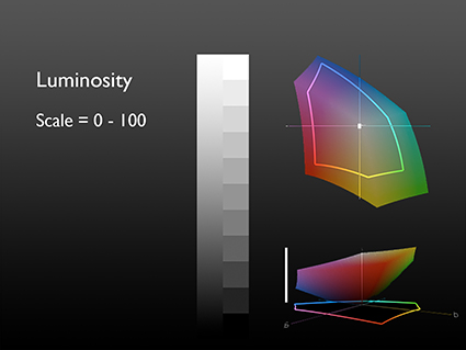
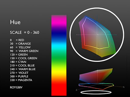
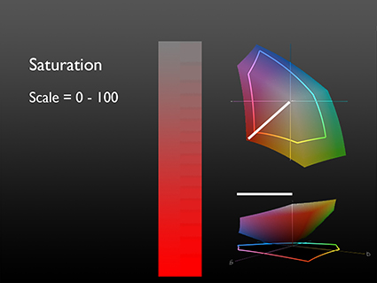
You can evaluate any color adjustment tool, in any software – past, current, or future –based on the control it offers over one or more of the three elements of color – Luminosity, Hue, and Saturation.
Use this as a strategy for quickly mastering the intricacies of color adjustment in Photoshop: own the six go to tools; familiarize yourself with the eight exotic tools; forget about the eleven redundant tools.
.
Go To Color Adjustments
.
There are a six color adjustment tools I shudder to think of living without; Curves, Hue/Saturation, Vibrance, Selective Color, Photo Filter, and Black & White
.
.
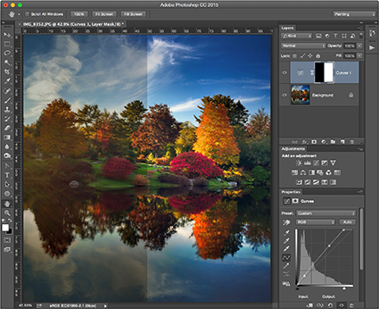
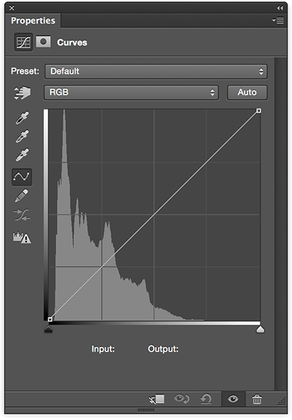
Curves offers the ultimate control over luminosity; no other adjustment offers such precision over the relative darkness and lightness of shadows and highlights. Using the separate channels, Curves offers the same kind of precision when adjusting hue.
.
.
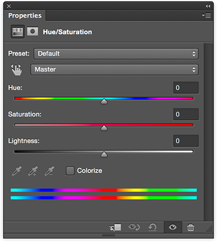
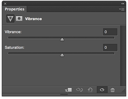
Hue/Saturation and Vibrance are the two essential tools for adjusting saturation.
.
What’s the difference? Vibrance saturates less saturated colors more and prevents clipping in very saturated values, producing a heavier appearance. Hue/Saturation produces a lighter more intense effect, so use it cautiously; you can quickly clip values, producing an overly smooth, overly saturated synthetic appearance if used aggressively. Similarly, handle its Hue slider with care; it’s really more useful for color transformation than it is color enhancement. Unlike Vibrance, Hue/Saturation offers the ability to adjust individual hues without the need for masking. Neither has the ability to selectively adjust the saturation of highlights, midtones, and shadows; for this you’ll need a luminosity mask. Vibrance provides only a very limited ability to selectively adjust colors with different levels of saturation while Hue/Saturation provides none. (For a way to do this read my article Saturation Masking on DigitalPhotoPro.com.)
.
.
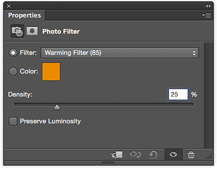
Photo Filter offers the ability to adjust the hue and to a more limited degree saturation of an image much like an analog lens filter would do, only much more precisely and flexibly. Though less intense, it preserves hue variety better that a Color Fill layer set to a blend mode of Color.
.
.
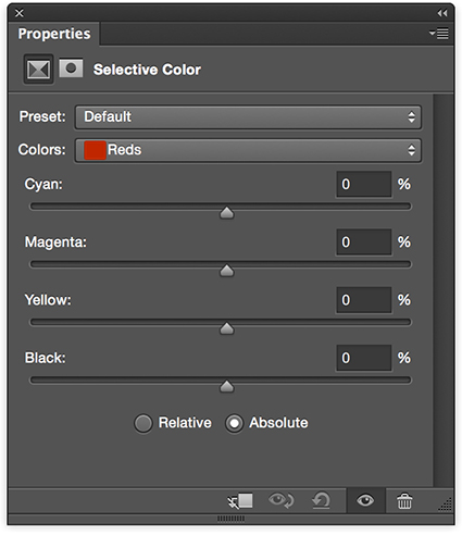
Selective Color trades in subtlety, referencing CMYK adjustments without leaving RGB working spaces. Its ability to adjust the hue of whites, neutrals, and blacks and its ability to mix white and black into other hues, producing reduced saturation tints and shades, makes it unique.
.
.
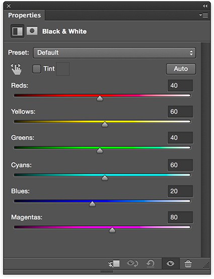
Black & White is the simplest and most powerful tool for converting color to black and white, first reducing saturation to zero and then adjusting luminosity based on original hues. It shines brightest when used in combination with Hue/Saturation and when applied selectively with masks in multiple passes.
.
Exotic Color Adjustments
.
You’ll see and think about color differently once you use Photoshop’s three most exotic color adjustment tools; Color Lookup Tables, Gradient Map, and Match Color. (For more detail on each of these adjustments read my previous articles on DigitalPhotoPro.com.) They affect luminosity, hue, and saturation in complex non-uniform ways.
.
.
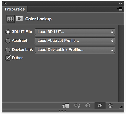
Color Lookup Tables combines multiple color routines or recipes into a single adjustment, making it easy to create consistent effects across multiple images; it’s most frequently but not exclusively used for color grading the many stills in a video.
.
.
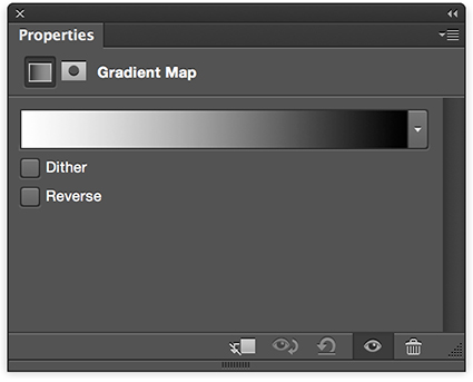
Gradient Map uses the luminosity values of an original to selectively distribute new colors into an image.
.
.
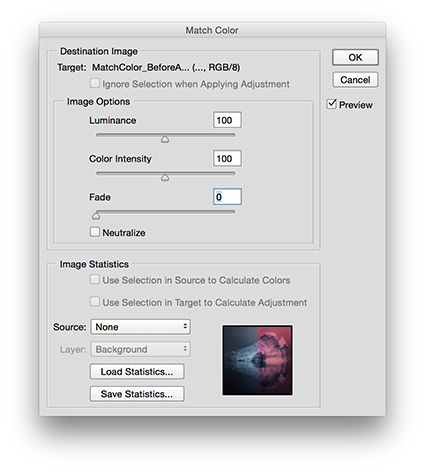
Match Color applies the color values of one image to another, based on a complex statistical analysis of the color relationships in both; it has an added benefit of being able to neutralize strong color casts, such as those found in underwater exposures, without the use of a second image.
.
Five other exotic color adjustment tools are worth noting.
.
While preserving shadow and highlight detail is best done during exposure and Raw conversion, and while you can mask a Curves adjustment to the shadows or highlight, both the adjustment Shadows/Highlights and HDR Toning offer occasionally useful sharpening options that Curves doesn’t, in the form of Radius sliders, which potentially makes them more related to detail enhancement than color adjustment.
Cast Equalize (resets dynamic range), Posterize (reduces gradation), and Threshold (reduces all values to pure black or white) into the really exotic category. They have real uses for very graphic images and for analysis but offer little that is useful for photorealistic images.
.
Redundant Color Adjustments
.
Part of mastering a tool is learning what not to use. Many of Photoshop’s color adjustment tools are redundant, offering similar control over the same elements of color – with less power and precision. You can simplify your toolset by eliminating these eleven adjustment types from your workflow. Instead, use the tools that give you more control.
.
Brightness/Contrast (Use Curves instead.), Exposure (Use Curves instead.) Levels (Use Curves instead.), Color Balance, (Use Curves instead.), Invert (Use Curves instead.), Equalize (Use Curves instead.), Desaturate (Use Hue/Saturation instead.), Replace Color (Instead, use Select By Color Range and then Hue/Saturation.), and Channel Mixer, Apply Image, and Calculations (Instead, use Layer Styles to blend channels, with or without a mask. (For more on this technique see my previous article Blending Channels on DigitalPhotoPro.com.)
.
See the pattern(s)? Two adjustments, Curves and Hue/Saturation, and one layer technique can outperform all of these eleven adjustments.
.
Blend Modes
.
You can make any color adjustment in Photoshop more precisely target an element of color by using one of four Blend Modes – Luminosity, Hue, Saturation, and Color (a combination of Hue and Saturation). Simply change an adjustment layer’s blend mode from its default Normal. If, instead, you apply an adjustment directly to an image, immediately after applying it, select Edit: Fade (Command / Shift / F) to change the Mode. As a general guideline for all color adjustments, I recommend you make a standard practice of using the blend mode of the element of color you are adjusting, making exceptions when desired.
.
Lightroom & Camera Raw
.
Can the separate but related programs Lightroom and Camera Raw do things that Photoshop can’t? Yes. While the majority of these two interfaces, which differ in appearance but not in function, provide controls that are quite similar to but sometimes more limited than what you find in Photoshop, they can do three things that can’t be done in the same way in Photoshop: first, White Balance (Curves and Photo Filter are similar but different.); second, Clarity (High Pass filtration is similar but different); and third, the HSL panel is able to produce luminosity adjustments of individual hues without adverse side-effects on dynamic range.
While the precision of the adjustments provided in Lightroom and Camera Raw is often more limited, it’s usually best to do the basic heavy lifting during Raw conversion – it’s less destructive – and then either dramatic transformations and/or fine-tuning in Photoshop.
.
In the future, if we discover a single interface that allows us to precisely and without side-effects control the luminosity, hue and saturation of any range of brightness (L), colors (H), and intensities (S), then we’ll have found the Holy Grail of color adjustment. For now, the Photoshop interface, a product of more than 25 years of continual expansion, is more complicated than it needs to be, but it’s capable of producing magic – so much magic. When you clarify your thinking about color, you’ll find it becomes much easier to navigate interfaces and master color adjustment. Keep it simple. Remember, color only has three elements – Luminosity, Hue, and Saturation – so color adjustment is all about controlling the relationships between them … nothing more and nothing less.
.
Read more color theory resources here.
Read more color adjustment resources here.
Learn more in my digital photography and digital printing workshops.
No Comments