Why Black & White And Color Images Don’t Mix

Revelation XXVI


Can you effectively present a project or body of work that contains both black-and-white and color images? It rarely works, but in rare cases it can.

The problem is that color and black-and-white images appear to be from different times or even different worlds and sometimes both. They’re so different from one another that presenting them together breaks the continuity of the larger story being told (Even a collection of separate poems creates a larger story, albeit with a much looser narrative and context than an essay.) and it undermines the suspension of disbelief required to imagine that a small two-dimensional image accurately represents our much larger three-dimensional world. Viewers end up paying more attention to the way the images are presented and our attention is deflected away from their content. We spend time and effort trying to figure out a pattern between images that are color and images that are black-and-white and the reasons why they’re different from one another, which is wasted if there aren’t any. “It looks better.” isn’t a strong enough reason to break continuity and suspension of disbelief. If there is no reason that contributes to the content of the series, then it’s a few small wins for individuals but a big loss for the team, and we leave the work feeling confused and frustrated. (“I don’t get. Is it me?”) For these reasons it’s best not to mix color and black-and-white images. Instead, present them separately.


Insights Members can login to read the full article.
Email:
or Sign up

15 Colorful Things To Look For During Maine’s Fall Season

01_IMG_8628

Maine is beautiful! And it’s never more beautiful than in the autumn during harvest season. The air is crisp and the place comes alive with color. It’s extraordinarily picturesque. Here are a few highlights to look for this fall.

02_IMG_4816-Pano-Edit-Edit

Mountains of color

03_IMG_9881

Color on the water

04_IMG_3522

Color in the air

05_IMG_9730

Color on the ground

06_IMG_7793

Fields of late season wildflowers

07_IMG_4219-Pano

Blueberry fields so red they look like they’re on fire.

08_IMG_5312

Sometimes they actually set the fields on fire.

09_20120515__iphone_1055

Rocky quarries

10_IMG_4296

Tumbled beach stones

11_IMG_5016

Playful cairns

12_20121021__iphone_1024

Quaint lighthouses

13_20120622__iphone_0178

Working harbors

14_20120623__iphone_0287

Rugged island life

15_IMG_0134

Mysterious misty mornings

16_IMG_3327-Edit

Rich evening afterglow

And this is just the beginning. There are so many more reasons to visit Maine in autumn! Who knows what you’ll find.

Find out more about my Acadia Maine Fall Foliage Photography Workshop here.

The Difference Between Painters’ and Photographers’ Color Wheels

ColorWheel_Apple_425

The photographers’ color wheel rendered by Apple.

ColorWheel_Itten_425

The painters’ color wheel painted by Johannes Itten.


In color theory, one of the primary uses of color wheels is to plot complementary colors.

Painters and photographers use this information to create neutral colors. Painters mix complementary colors to get more neutral hues. Photographers add complementary colors to remove color casts, making neutral colors appear more neutral.

But photographers and painters apply different complements. Photographers identify three primaries and complements; red and cyan, green and magenta, blue and yellow. Painters identify three primaries and complements; red and green, blue and orange, yellow and purple. Why do they use different complements? Painters have to address the impurities in the pigments they’re mixing.

Photographers deal with pure light.

From a practical standpoint, both types of artists learn to achieve the effects they want to achieve. From a conceptual or theoretical standpoint, the difference is significant – and they share the same theories but their application of those theories differs. Photographers and painters should talk to each other more.

Photographers can enrich their understanding of color if they become familiar with the longer richer history painters have had with color, and at the same time painters can refine their theories and produce stronger effects by using photographic complements.
Physically and biologically our eyes do specific things. By using maximum hue contrast, complementary colors in close proximity to one another create optical effects: they make each other look more intense; any lines between them becomes more pronounced, often producing a light line, which can appear to flash if the eye moves back and forth across it; if made very small (like scanned pixels or printed halftone dots) they average to a neutral color. Artists use these effects to make more powerful visual statements.

Optically photographic complements are correct. You can test and prove this yourself. To do this, take advantage of the retinal after images your eyes produce. Simply stare at a solid patch of color for more than twenty seconds and then shift your gaze to a neutral field of color, like a white wall. The color you’ll see will be the photographic complement. So, if you want to take maximum advantage of the optical effects generated by complementary colors, choose photographic complements.

Finally, color theory can be very useful. Artists frequently create consistent color structures (some call them color harmonies), much like the tonal structures or scales musicians. They often use color wheels to plot these relationships (not unlike a musician plots a circle of fifths to identify musical harmonies). They draw geometric figures inside a circle of color to identify regular intervals between the colors chosen; straight lines for pairs, triangles for trios, rectangles for quartets, etc. There’s no ideal structure. Different structures generate different effects, both optical and psychological – and it’s useful to know what those are. What matters most is that a color structure is created, rather than color chaos. The colors identified as complements define a color wheel. Once again, because of the impurities in pigments, painters distort their color wheels (expanding the oranges and reducing the cool blues) to help them identify which colors to mix to make neutral or more neutral colors, but the unintended consequence of doing this is that they plot color structures on a distorted color wheel. Their ideal theories are skewed by physical imperfections.

Long after his death, it was noted that pointillist painter Seurat, who started a whole school of painters who used broken bits of complementary colors rather than blended less intense colors, could have achieved even richer visual effects if he had adjusted his color choices. Viewers experience visual effects with their eyes. And the photographer’s color wheel is aligned with our eyes.


Learn more about Color Theory here.

Learn more in my digital printing and digital photography workshops.

Seeing Color & Enhancing Creativity – Seth Resnick


“At B&H’s Optic 2018, photographer Seth Resnick discusses color, enhancing creativity, and processes you can employ to make better images and improve your photography. He stresses the importance of being aware of the details in your environment and mentally taking note of what you see BEFORE you start shooting with your camera.”
Learn more about Seth Resnick here.
Find out more about our Digital Photo Destinations Workshops here.

Select And Mask Hue With Photoshop’s Color Range

IMG_5175_425

When you want to make a selection based on hue, start with Photoshop’s Color Range. (It’s located in the Select menu.) It’s an invaluable selection tool that’s easy to master.

The heart of this tool is the default setting for the Select drop-down menu – Sampled Color. Once you learn to use it, you’ll find you’ll use it often. For Sampled Colors, it’s an oversight to activate the slider for Fuzziness (the number of related hues included) and not Range (targeting specific lightnesses). Hope, no request, that Adobe activates both Fuzziness and Range sliders for all drop-down settings. For now, you can overcome this limitation to some extent and customize any range of color with surprising precision by using the icons on the right of the dialog box Eyedropper Tool, Add to Sample, and Subtract from Sample icons as well as the Invert checkbox. It is also the only setting that activates the Localized Color Clusters check box, which essentially adds a radial gradient around the point you sample a color from. You can master this tool in a few minutes.

SampledColors_425
SelectDropDown_425

You’ll probably find that you’ll use the other settings in Color Range’s Select drop-down menu sparingly, some not at all.

Skip them. The color choices in the Color Range drop-down menu – Reds, Yellows, Greens, Cyans, Blues, Magentas – are almost useless. They’re not as accurate as you’d like them to be and they don’t offer Fuzziness or Range sliders to control them with. It’s all or nothing, usually nothing.

Use them occasionally. The Highlights, Midtones, and Shadows options have improved by activating both Fuzziness and Range sliders. Curiously, if you Invert the Highlights setting you get a slightly different result than simply choosing Shadows setting and vice versa. But don’t worry, the Fuzziness and Range sliders will give you all the control you need to compensate and much, much more. Color Range’s selections of luminance yield different results than making luminance selections by loading channels as selections (See my article Masking Luminosity.); for better or for worse, they tend to produce fewer gray values and so they yield more generous selections with quicker less smooth transitions into surrounding values, as if you added contrast to a channel selection.

Consider it. While it offers only the control of the Fuzziness slider and not the Range slider but adds a Detect Faces feature, Skin Tones can be quite useful – at times. It is clearly biased towards Caucasian skin tones as it picks up whites before darker browns but it does a good job of avoiding very saturated warm hues. If Skin Tones fails, use the default Sampled Colors instead and choose a custom base color you’d like to start with.

Forget about it. Be careful about the Out Of Gamut feature. It works based on the profile loaded for an output device, usually an offset press. It’s designed to help you prepare files for printing by selecting and subsequently desaturating colors that are too saturated to be printed accurately. Using color management and good output profiles is a better way to control gamut compression.

Finally, if you want a larger preview of the selection/mask being generated, the Selection Preview drop-down menu offers four settings that will change the appearance of the image window Grayscale, Black Matte, White Matte, and Quick Mask. In most cases, the generously sized icon in the Color Range window will be all you need.

Photoshop’s Color Range is an indispensable selection tool that continues to improve. When you want to make a selection based on hue, start here.

Read more about Selections & Masks.
Learn more in my digital photography and digital printing workshops.

A Quick Cure For Dehaze Color Shifts With Photoshop

Dehaze_Color_Off

Without Dehaze

Dehaze_Color_Artifacts

Dehaze may create color artifacts

Dehaze_Color_Final

Color artifacts removed

Color without Dehaze blended with luminosity with Dehaze

Dehaze_Color_Layers

The top layer is set to a blend mode of Color

When you’re using Lightroom or Camera Raw, you’ll quickly find the Dehaze slider can produce marvelous contrast effects. Dehaze can dramatically exceed the contrast that can be produced with either Curves or Clarity. Sometimes it will reveal detail you couldn’t see with your eyes!

.
Often, there’s a price to pay for these great effects – color shifts. Neutral areas may turn magenta. Shadows may pick up strong blue or green casts. To make matters worse, these unwanted artifacts are rarely uniform, which makes them harder to fix.

.
If you’re lucky you can compensate by reducing Saturation after using Dehaze. When you do this, it’s likely that you’ll end up choosing the least objectionable version or making a compromise you’d prefer not to. Frequently, to avoid these side effects, you’ll be tempted to not to push Dehaze as far as you’d like to.
There is a cure that will help you go as far as you’d like, without producing color shifts. Render your image twice. First, render it with as much Dehaze as you’d like. Second, render it without Dehaze.

.
Then place the version without Dehaze in a layer on top of the version with Dehaze. Change the Blend Mode of the top layer to Color. This will give you a combination of the color of the top layer (without Dehaze’s color artifacts) and the luminosity of the bottom layer (with Dehaze’s contrast).

.
How do you make two layers from one Raw file?

.
If you’re using Lightroom, make a virtual copy and then double click on the Dehaze slider. Highlight the original file and the virtual copy and select Photo > Edit In > Open as Layers in Photoshop. Now in Photoshop, make sure to change the top layer’s blend mode from Normal to Color.

.
If you’re using Camera Raw, open your Raw file as a smart object, then select New Smart Object via Copy in the Layer menu, and finally double click on the top layer to return the Dehaze slider to 0. Remember, change the top layer’s blend mode from Normal to Color.

.
The technique of using the color of one layer to overlay another layer can be used for many applications. Here, it makes Dehaze even more useful.

.

Read more color adjustment resources here.

Learn more in my digital photography and digital printing workshops.

The Best Books On Color Theory

lessons_reading2-1

What is color theory? It’s a language and set of concepts that’s useful for describing and creating color relationships.

Color management helps you get consistent colors. Color adjustment helps you change colors. Color theory helps you choose colors.

I’ve studied color all of my life – and it’s always rewarding.

Here’s a roundup of the best books I’ve found on color theory.

Reid

Lori Reid’s The Color Box is a great place to start with color theory. It’s neither definitive nor deep but it does a great job of surveying many approaches to understanding color.

Albers

Josef Albers’s Theory and Interaction of Color is the definitive work for creating a hands-on understanding of essential optical effects.

Itten

Johannes Itten’s Art Of Color (an expansion of his The Elements Of Color) is clearer and wider-ranging than Albers’ similar book.

Birren

Faber Birren’s Creative Color discusses ways of creating effects (like iridescence and pearlescence) that few other resources touch on.

Wong

Wucius Wong’s Principles Of Color Design shows the links between color and other compositional devices.

Livingstone

Margaret Livingstone’s Vision And Art details the biology behind the effects artists create.

Find more recommended Color Reading here.

Learn more with these Color Theory here.

Learn more in my digital printing and digital photography workshops.

The Temperature Of Color – Warm Or Cool ?

2_wake4

An essential quality of color is temperature. Temperature can be used to attain a color balance. Temperature can be used to enhance spatial relationships within an image. Temperature can be used to elicit psychological responses within the viewer. Understanding and exploring the dynamics of temperature in color can benefit any visual artist.

There are physical characteristics of color linked to temperature. The color temperature of light (Kelvin degrees) is determined by measuring a black body radiator (an object heated so that it emits light). As the physical temperature of the object rises, color transitions from red (long wavelengths – low energy) to blue (short wavelengths – high energy) through ROYGBIV (red, orange, yellow, green, blue, indigo, violet). When it comes to light sources, physically, blue is warmer than red.

There are also psychological qualities of color linked to temperature. Psychologically, blue is cooler than red. These associative qualities of color with regard to temperature are almost universally accepted. This is due in large part to our physical environment – water is blue, plants are green, sunshine is yellow, fire is red.

Using the qualities of one sense (touch) to describe the qualities of another (sight) can be a tenuous affair and may lead to ambiguity and confusion. The more precise a language is the more useful it is. The language of HSL (hue, saturation, luminosity) is a very precise language. When using the language of HSL, hue values mark a position measured in degrees on a color wheel. A circle has 360 degrees, so the scale is 0 – 359.

While every degree represents a new hue, you can use broader terms to describe a color family; red, orange, yellow, etc. Think of the color wheel as a clock where every hour marks a new color family.

hue_clock

0          red
30        orange
60        yellow
90        yellow green
120      green
150      blue green
180      cyan
210      green blue
240      blue
270      purple
300      magenta
330      blue red

hue_degrees
warmcoolsamples

Absolutely warm and cool colors can be found at 0 (red – the warmest color) and 180 (cyan – the coolest color) degrees. Determining whether one color is warmer or cooler than another can be measured by their proximities to these poles. A line between 90 (green yellow) and 270 degrees can be used to broadly demarcate warm colors from cool colors; colors on the right (towards red) are warm while colors on the left (towards cyan) are cool. The association of yellow with the sun, a warm light source, subtly skews the associative quality of warmth towards yellow (60) and away from blue; as a result, colors above the line between 0 and 180 tend to seem warmer than colors below it. (i.e. while both are equally distant from red (0), orange (30) seems warmer than blue red (330).) While one color can be seen as warmer or cooler than another color, each color also has warm and cool components; there are warm yellows and cool yellows, warm blues and cool blues, etc. (Where numerical classifications of colors define hues very specifically (1 degree per hue, 30 degree spread per linguistic color), linguistic specifications of colors (red, orange, yellow, etc) define broad ranges of hues.) Defining the warm and cool endpoints of any linguistic color is useful at a coarse level of granularity but becomes increasingly subjective at a fine degree of granularity. At what point does blue become purple? At what point does blue become green?

It’s possible to describe the adjustment of hue simply in terms of warming and cooling.

Photographic color adjustment strategies rely on adjusting a balance in each of three complements.

Red – Cyan
Green – Magenta
Blue – Yellow

colorbalance

Most hue adjustment tools, like Photoshop’s Color Balance, have these complements built into their interface. You can’t increase one hue without decreasing its complement.

Each set of complements has a warm and cool dynamic.

R (warm) –  C (cool)
G (cool) –  M (warm)
B (cool)   – Y (warm)

These three complementary axes have different warm/cool dynamics with respect to the three color primaries – RGB.

red (warm red)      –   cyan (cool blue)           warm/cool
green (cool green) –   magenta (cool red)       cool/cool
blue (warm blue)   –   yellow (warm green)    warm/warm

1_warmcoolaxis

You can analyze the color temperature dynamics at work in any image by sampling it and graphing it. Doing this will not only help you understand how it works but also how you might improve it.

You can make a field of color appear more dynamic, complex, and three-dimensional by preserving or introducing a variety of warm and cool components in it.

The temperature of color carries spatial associations with it. Warm colors tend to appear to be nearer than cool colors. Again this is universal. It can be overturned by many factors; some factors are related to color, such as saturated colors appear nearer than desaturated colors or a progression from light to dark may be the primary element that establishes spatial hierarchy; some factors are not related to color, for instance, placement and overlap in the composition may be primary spatially, overriding color relationships.

Color balance, spatial proximity, association – these are just three of the uses of warm and cool color dynamics in images.

Whether you are adjusting preexisting color relationships or creating new ones, having thoroughly explored the warm and cool dynamics of hue, you can apply that knowledge towards the realization and enhancement of your images.

Learn more in my digital printing and digital photography workshops.
Learn more with my DVDs on Color here.
Learn more with my free color resources here.

The Many Benefits Of Graphing Color

colorgraphed

Graphing color can help you identify colors more specifically and understand relationships between color better. One way to graph color is to use the Color Sampler Tool in Photoshop in combination with the Apple color picker.

Using The Apple Color Picker

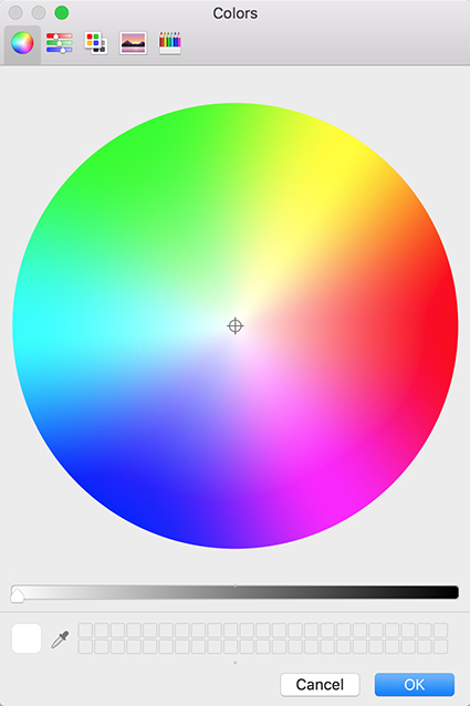
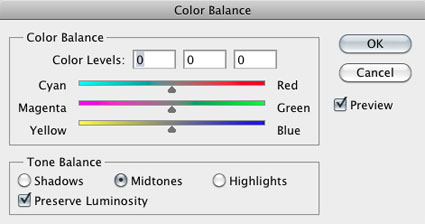
To access the Apple color picker choose Photoshop: General Preferences and change Color Picker from Adobe to Apple and click OK. To see the new the color picker click on Set Foreground Color or Set Background  Color icon in the Tool bar.

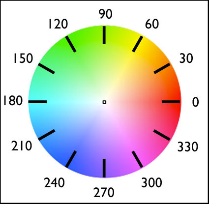
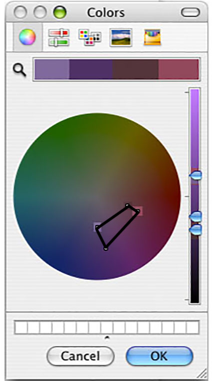
Unlike the Adobe color picker, the Apple color picker is a color wheel. Creating and using color wheels to describe color and plot color relationships is a time honored tradition dating back to Leonardo DaVinci. Some of the most famous color wheels were created by Newton, Goethe, and Munsell. The Apple color picker is an additive color wheel where complements are defined as red and cyan, green and magenta, and blue and yellow.

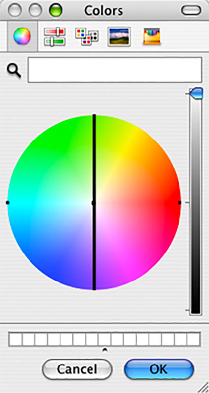
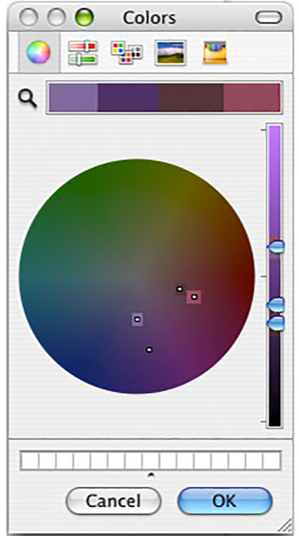
You can sample any color in an image and find its position on the Apple color wheel.  Using the Eyedropper Tool, sample a color in a composition. Then click on the Set Foreground Color icon. The Apple color wheel will appear and a small circle will plot the sampled color. You can make a record of this chart by taking a screenshot of the color wheel (caps lock, Shift, Command, 4). This will create a document on your desktop, which can be opened in Photoshop.

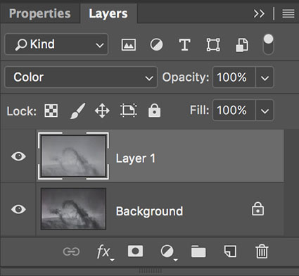
Combining Multiple Samples

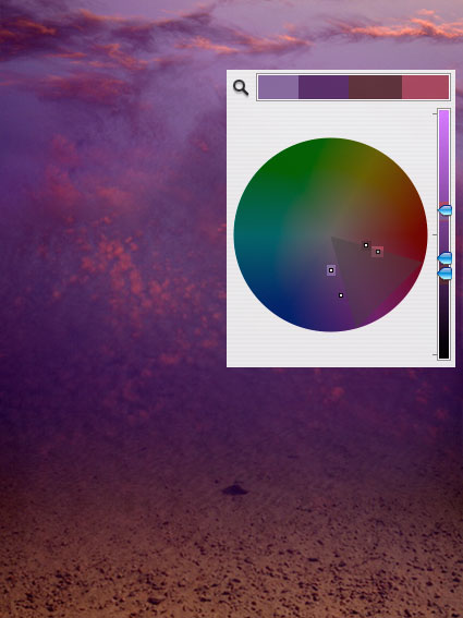
You can combine multiple sample points into a single chart by taking multiple screenshots, opening them in Photoshop, and combining them. Drag the Background layer from one document into another and give it a meaningful title.  Make sure the two layers are registered with one another. Then, mask off everything on the top layer except the circle identifying the color on the color wheel, the triangle identifying its luminosity on the slider to the right of the color wheel, and a portion of the color bar above the color wheel. You’ve just graphed the two colors on the Apple color wheel. You can do this with as many colors as you desire.

Once colors have been graphed you will be able to identify a variety of relationships between colors, both colors that exist in a composition and colors that do not.

luminosityanalysis

Sidebar For Luminosity

You can identify luminosity values with the slider to the right of the wheel. By sampling colors from an image and noting their position on the slider you can determine whether an image is light (high key), medium, or dark (low key) and whether it contains low, medium, or high contrast, by  comparing the  distance between sampled points (the greater the distance the greater the contrast).

05

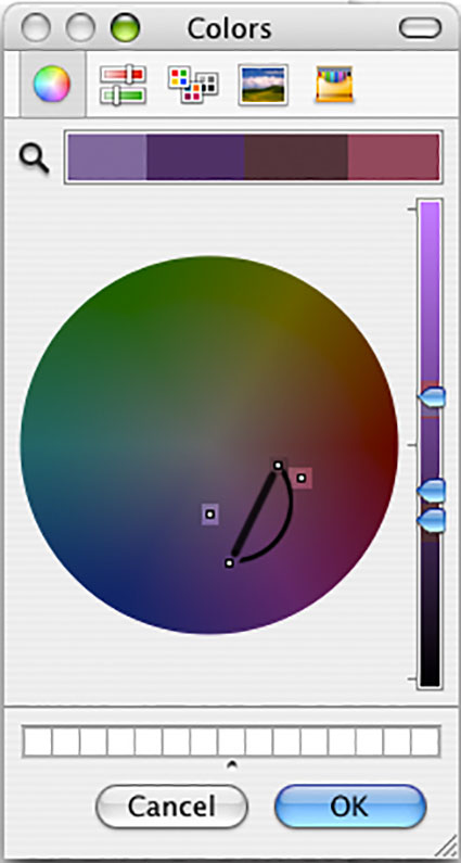
Lines For Differences In Hue

You can draw a straight and/or a curved line between two hues. This will help identify all the other hues between the two, useful in creating gradations or smoother transitions between two colors.

02

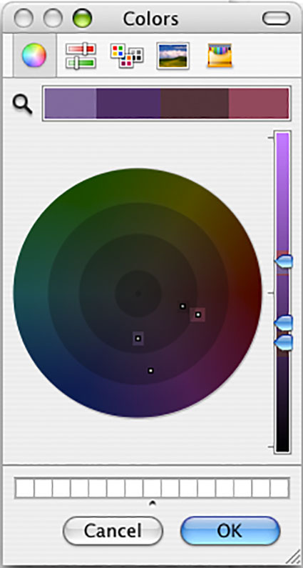
Concentric Circles For Saturation

You can draw concentric circles with varying radii on the wheel. This will help define the saturation level of an image – neutral, semi-neutral, saturated, or supersaturated.

colorgraphed.r7

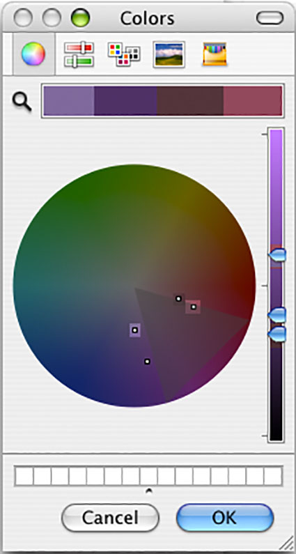
Triangles For Color Families

You can divide the color wheel into triangular slices of varying widths. This will help define hue relationships within an image – monochromatic (single family hues)(within 30 degrees), analogous (closely related hues)(within 60 degrees), complementary (opposite hues)(separated by 180 degrees), or split complementary colors (three colors where two are found between 150 – 210 degrees from the third).

shapeanalysis

Shapes Show Relationships

You can draw geometric shapes inside the color wheel – triangles, squares, rectangles, pentagons, hexagons, octagons. This will help identify hues that may be used to create a logical color structure – diads, triads, quadrads, etc.

A little exploration and mapping of color will help you make many new discoveries about the color dynamics in any image, both of how they work and how they can be improved.

00 reflection7

Revealing Relationships

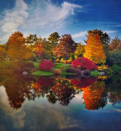
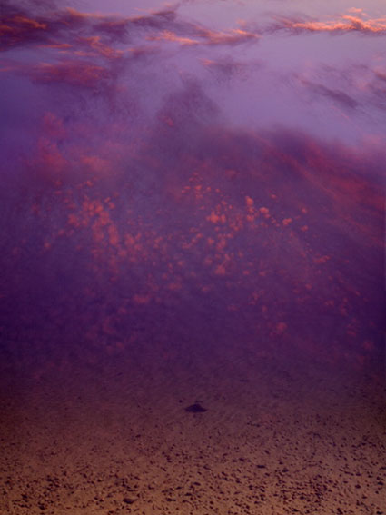
Here are a few observations about the color dynamic revealed by graphing it.

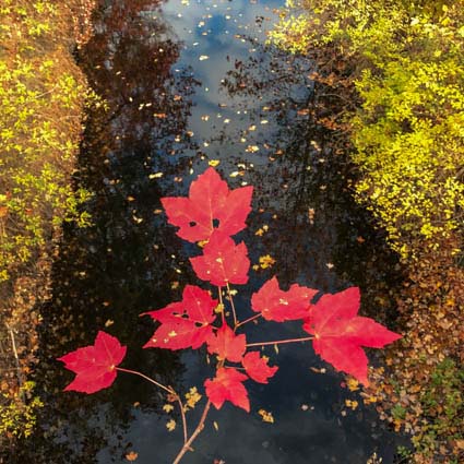
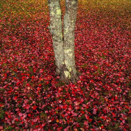
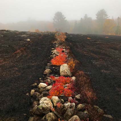
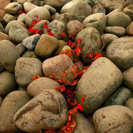
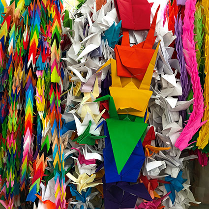
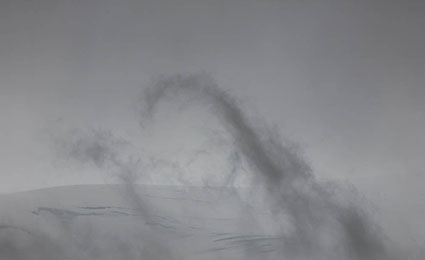
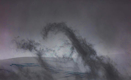
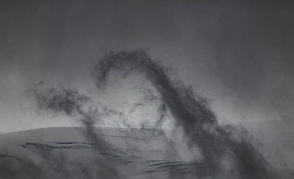
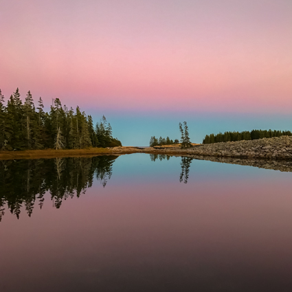
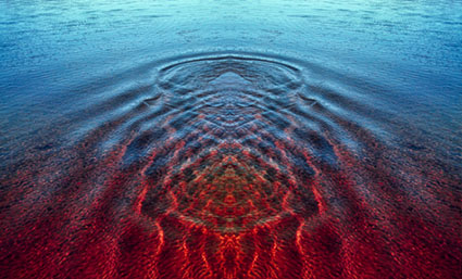
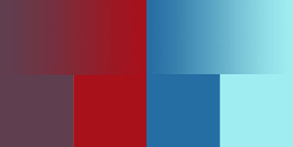
1 The composition has four significant colors.

2 The luminosity has only moderate contrast, constrained to the mid-tones, weighted low.

3 The palette is reasonably saturated, but not supersaturated. The most saturated hue is dark purple, the second most saturated color is pink.

4 A 60 degree slice reveals that there are two reds and two purples – analogous (closely related) hues. The brown is actually a dark red with relatively low saturation. The reds are closely related in hue; so are the purples. There is a light set and a dark set of reds and purples. The hues are at the boundaries of analogous relationships, providing maximum variety within that color dynamic. Contrast is derived based on luminosity first, hue second, and saturation third.

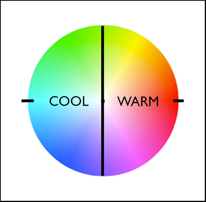
5 While one hue, red, is the warmest color, the other hue, purple, lies close to the boundary between warm and cool colors. There isn’t a strong contrast between warm and cool, but there is a great deal of variety within a predominantly warm composition.

6 Gradation (smooth transitions) can be accentuated by including hues in between the sampled points either along a straight or curved line. The background color for the sky seems continuous and smooth because it contains many small steps between the lighter hue at the top and the darker hue at the bottom; this has a calm effect. The pink accents in the highlights appear warmer and lighter because they are surrounded by cool dark colors, without substantial gradation between them; this has an energetic effect.

Learn more in my digital printing and digital photography workshops.
Learn more with my DVDs on Color here.
Learn more with my free color resources here.