See Color In New Ways With Photoshop’s Gradient Maps
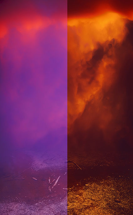
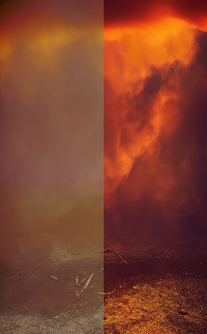
Before and after the Gradient Map
Whether used subtly or dramatically, Photoshop’s Gradient Map color adjustment tool can open up new ways of seeing and working with color for any artist. Photoshop’s Gradient Map assigns new colors to existing brightness values. With it, you can enhance existing colors, transfer colors from one image to another, or create entirely new color relationships. It can be wild!
The Gradient Map
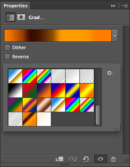
The Gradient Map interface looks difficult to use but with a few pointers you’ll find it surprisingly easy to use. While you can apply a Gradient Map directly to a layer (Images: Adjustments: Gradient Map), I recommend you apply Gradient Maps as adjustment layers (Layer: New Adjustment Layer: Gradient Map), to take advantage of both the greater flexibility and control you’ll gain over the final effect. Once activated, there are a number of default presets you can experiment with but it’s most likely that you will want to create your own. Simply click on an existing gradient in the Properties panel to activate the Gradient Editor. Click New. Click at the bottom of the gradient to add new colors. A pointer will appear, double click it or the Color box to choose a color. You can move the pointer to direct the color into different tonal values (Move left to target darker values and right to target lighter values. Alternately, enter a new number in the Location field.) while the diamonds left and right of it will control how each color fades into surrounding colors. You can add dozens of different pointers/colors, but for most applications I recommend you restrain yourself to as few as possible. You can delete a pointer/color by clicking on it and clicking Delete or by pressing the Delete key. When you create an effect you’d like to use more than once, type a Name and click Save; you can easily store, retrieve, and share these “grd” files.
The color effects you can generate with the Gradient Map are so powerful and so varied you simply must spend a little time experimenting with it to truly understand both how far you can go and how subtle you can get. Consider this kind of visual research time well spent.
After you’re done experimenting, then it’s time to deliver.
Working with the Gradient Map often takes a little finessing. You’re likely to be a little disappointed if you try and get the perfect colors with the Gradient Map alone. You can spend a great deal of time picking and repicking colors until you get it just right. Instead, try working more broadly, getting close to a desired effect and then fine-tuning the results.
Layer Blend Modes give more control
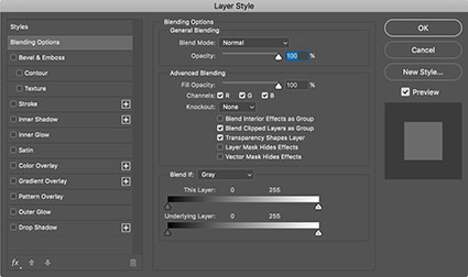
Layer Style removes effects from shadows and/or highlights
Here are the go to tools for fine-tuning the results of Gradient Map adjustment layers. Use the Opacity slider to reduce effects that are too strong. For selective opacity, add a layer mask. Use Blend If sliders (double click on a layer to activate them) to reduce or remove effect from shadows or highlights or both. If transitions created by Blend If sliders aren’t smooth enough, use a luminance mask.
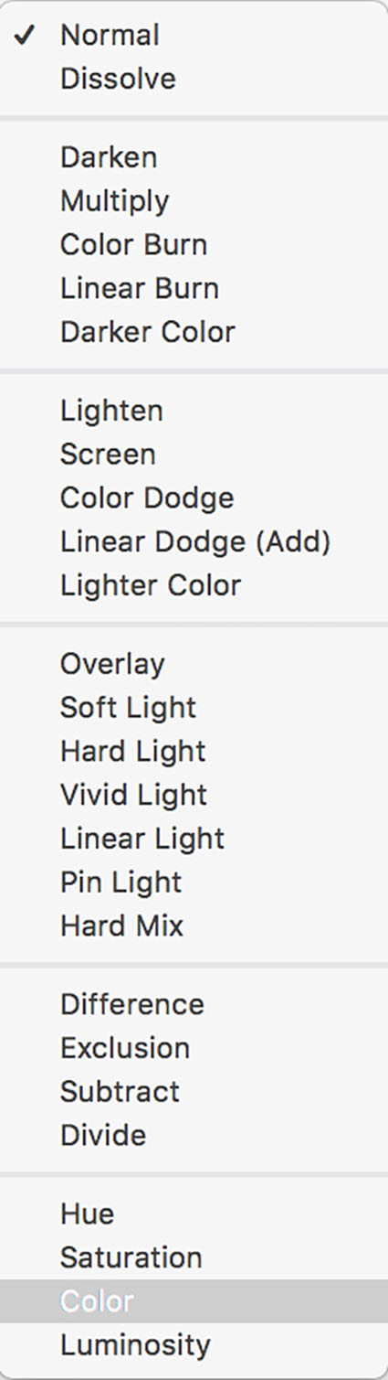
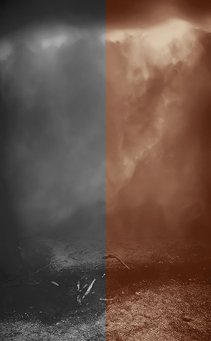
Normal and Hard Light blend modes compared
Blend Modes can be used to add more control over the way colors mix. In particular, focus on the color blend modes (Hue and Color) and the contrast blend modes (Overlay, Soft Light, and Hard Light). Hue restrains the effect to that element of color only. Color restrains the effect to both hue and saturation, removing any effect on luminosity. In order of increasing intensity, Soft Light, Overlay, and Hard Light boost contrast and gradient colors will have a more transparent appearance.
Even with all of this control, it’s likely that you’ll find the best results are most often achieved by using this tool to create an interesting color foundation and then refining it with additional color adjustment tools like Curves and Hue/Saturation.
Once you’ve mastered the interface the real challenge begins – visualizing color possibilities. Pre-visualization can only go so far; instead use software as a tool for visualization. Instead of rushing to a single finished result, I prefer to work on multiple copies of an image to make side-by-side comparisons of a set of variations. The possibilities are seemingly so limitless that you must perform some experiments to find the best solution. If your experiments are both targeted and iterative, then you’ll generate many solutions that are more likely to be optimum.
Here a little color theory can be useful. Use dark colors in shadows and light colors in highlights; otherwise you may posterize or solarize. Use analogous colors (similar color families) to create transitions; transitions between complimentary colors tend to get muddy. Variations on earth tones work well for both realistic and antique effects. Variations on warm colors can add intensity, even fire. Variations on cool colors can generate nocturnal and even aquatic effects.
Remember, you can sample colors from one image and apply them to another. Gradient Map effects are distributed based on lightness values so keep this in mind when selecting and transferring colors.
Black and white conversion plus toning created with Gradient Map
Amazingly, you can even make successful color to black and white conversions with Gradient Maps – just use neutral colors. Again, for naturalistic effects, you’ll want to create progressions that move from dark to light, but the steps and the transitions in between can be varied substantially. Guard against posterization and excessive noise. You can even create black and white toning solutions with the Gradient Map; it’s excellent for split tone effects that target different hues into different tonal values.
Photoshop’s Gradient Map is an exotic color adjustment tool that can be a real game changer. If you truly understand the possibilities this tool opens up you will have learned to see in new ways. What could be more valuable?
Read more on Color Adjustment here.
Learn more in my digital printing and digital photography workshops.
No Comments