Insights Is Coming! Sign Up Today!
My free newsletter Insights is coming Monday, March 1st.
Don’t miss it!
Sign up today!
The next issue features great resources on Color Grading.
My free newsletter Insights is coming Monday, March 1st.
Don’t miss it!
Sign up today!
The next issue features great resources on Color Grading.
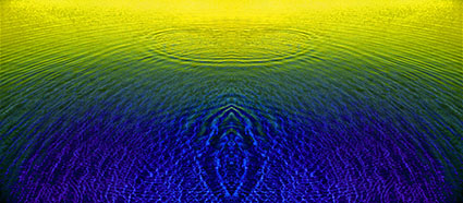
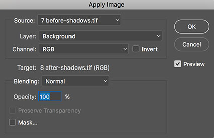
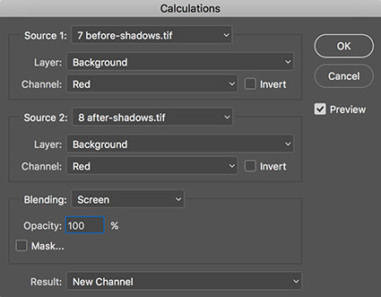
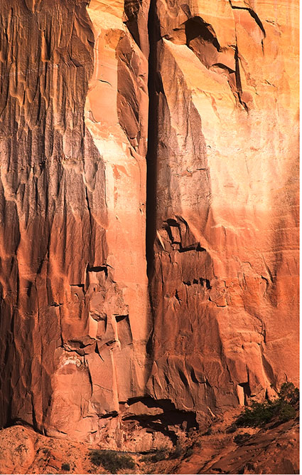
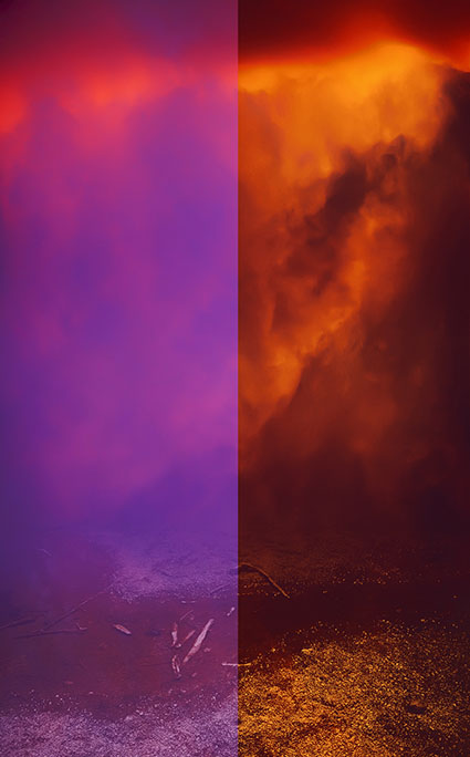
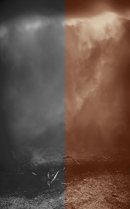
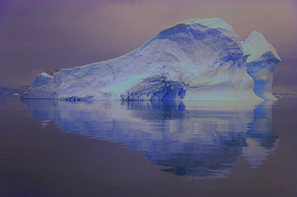
Before channel blending
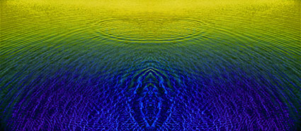
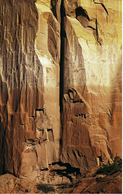
After channel blending
Big problems call for big solutions. Blending channels is a powerful color adjustment strategy that can handle even the biggest challenges.
Color adjustment occurs by modifying the tonal structure of individual grayscale channels. Typically, the information within them is adjusted. Less typically, the information within them is replaced.
Blending channels is one way of replacing them. Blending channels takes information from one channel and combines it with information from another. Rather than simply enhancing existing tonal values, blending channels reshapes one channel’s tonal structure with another’s. Consequently, in a most cases, blending channels calls for a substitution of information by percentage not a wholesale replacement of the deficient channel. You usually blend channels from different versions of the same image because blending channels from different compositions produces a highly altered effect.
Blending channels is complex. It often produces additional unintended color affects that may require further correction, such as shifts in hue that aren’t uniform across the tonal scale. Blending channels is neither the simplest nor the most direct path to color adjustment, but in certain situations (files that are exceptionally problematic) it may be the best path. The resulting benefits can be dramatic.
When is blending channels appropriate? In extreme cases. Blending channels is designed to correct major color deficiencies. It’s recommended if a channel is severely deficient, either globally or in select areas. For example, by being extremely light or dark or having very low contrast, a channel may be lacking desired detail. That detail can be found in another channel. Fine-tuning color is best left to more traditional methods of color adjustment.
Many Methods
There are several ways to blend channels; Channel Mixer, Apply Image, Calculations, and using channels as layers. Let’s review the options in detail.
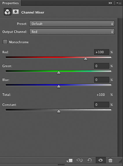
The Channel Mixer (Layer: New Adjustment Layer: Channel Mixer) blends percentages of channels within a single document. It can be applied as an adjustment layer and so corrections made this way can be changed or masked indefinitely. It cannot be used to blend channels from two documents. The Channel Mixer is an excellent choice for making global (the same percentage of channels for the whole image) color to black-and-white conversions. If you want to control black-and-white conversions locally (different percentages of channels for different image areas), use channels as layers instead.
The commands Calculations (Image: Calculations) and Apply Image (Image: Apply Image) can also be used to blend channels. With these two commands you can combine any two channels, from different documents, from any layer, at any opacity, with most blend modes. With Apply Image you target the channel you wish to change. With Calculations you blend to create a new document, a new channel, or a new selection. Neither Calculations nor Apply Image can be used as adjustment layers or layers, consequently corrections you make with either of these features are made permanently to an image. With Apply Image and Calculations you can take advantage of two less frequently used blending modes not found with other tools (Add and Subtract) but you cannot take advantage of four frequently used blending modes (Hue, Saturation, Color, and Luminosity) – even if you use the Fade command.
For the greatest control and flexibility use channels as layers. How do you do this? Copy any channel and paste it into any destination as a layer. (Target a channel (click on it); copy it (Select: All; Edit: Copy); then target the master channel (RGB) and paste (Edit: Paste).) You can activate, deactivate, mask, change, or replace this new layer indefinitely. Use Layer Styles (double click on the layer icon in the Layers palette) to determine Blend Mode, Opacity, Advanced Blending (to select which channel is affected) and Blend If options (to determine how This Layer affects the Underlying Layer or which values of the overlying layer affect the values of the underlying layer). What’s more, you get a dynamic preview of any changes you make while you make them. The adjustments you make are flexible, so you can remove them or fine-tune any of the settings future editing sessions. You can even blend two or more channels first, as layers, and then use the resulting new layer to blend with the Background layer. By turning channels into layers, you can achieve everything that the other methods achieve and more.
One File, Many Channels
You may be surprised to find that every file has at least ten channels to choose from. How do you get so many? Consider the file in different color spaces – RGB, CMYK, and LAB. Convert a duplicate file into another color space and you can use any and all of the resulting channels. In fact, you can choose between many, many more channels when you consider that when converting to CMYK there are five different options for generating a Black Plate (None, Light, Medium, Heavy, and Maximum) with two styles for each with two Separation Types (UCR and GCR). But, for the vast majority of situations, I recommend you try to keep things as simple as possible and stick with the standard three.
Be cautious with older files and lower end scanners when blending with the blue channel as it often contains significant amounts of noise. In fact, in some instances, blending channels can be used to replace some or all of the blue channel and thereby remove unwanted noise. Unlike blurring or despeckling, this method of removing noise will not compromise sharpness, but it may produce unwanted color shifts that will require subsequent correction.
A Good Preview
The possibilities are staggering. Is there anything that can help with the decision making process? Yes. A good preview. You’ll want to have multiple documents of the same image in different color modes (RGB, CMYK, LAB) visible at one time to simultaneously see the blended and the blendee. You may even want to make a side-by-side comparison of the component channels of a single document. To do this, use the Split Channels option in the Channels palette submenu. This command will break a single multi-channel document into multiple single-channel documents. (If a file has layers it must be flattened first to use Split Channels.) While doing this with several documents will quickly fill a screen, having the channels separated makes evaluating their relative merits infinitely easier.
Classic Strategies
With so many possibilities, how do you choose one channel as the best candidate to blend with another and how do you use it?
First, identify the channel causing the problem. Then, find the channel with the best contrast in the areas you wish to enhance (at a low opacity) or replace (at 100% opacity). (Stronger adjustments require higher opacities.) Finally, deal with any unintended side effects.
There are several tried and true strategies for dealing with classic problems. First, create detail where there was none before. Second, create contrast that wasn’t there before. Third, add more contrast to existing tonal relationships, if the values can’t be adequately enhanced using Curves.
Look to the Luminosity channel in LAB. Look to the black plate in CMYK. Look to complementary colors. Complementary colors often contain the best possibilities for increasing contrast (Red and Cyan, Green and Magenta, Yellow and Blue), in highly saturated values.
What are you looking for? Better detail in shadows or highlights, better contrast, and a similar tonal distribution. If you change the relative distribution of tones in a channel, you’ll create a non-uniform color shift where some colors will shift more dramatically than others.
Sometimes channel blending produces unintended side effects.
In most cases, these side effects can be cured.
Blending channels can produce unintended side effects. There are times when it’s better to achieve the necessary effect with this technique and accept its side effects, if the side effects are easier to cure than the initial problem. Typically, all that’s required is a little dose of additional tonal enhancement, either to the master channel (tone and contrast) or a single channel (color). If you find this is not the case, take this as a sign that this is not the right technique for the problem you face.
Layers offer many Blend Modes
Control The Mix With Blend Modes
As well as controlling the amount channels are blended you can control the way they are blended, by using blending modes. Blend modes determine how new values are mixed with old values. There are dozens of blend modes to choose from.
As color adjustment is achieved by altering the luminance (light and dark) values of select channels (Channels create but don’t contain color or saturation.), when it comes to blending channels, you can limit the number of blend modes you use to those that affect tone; five are particularly useful – Lighten, Screen, Darken, Multiply, and Luminosity.
Lighten displays the lightest values of both This Layer and the Underlying Layer; its neutral color is black (you can’t lighten with black).
Screen multiplies the inverse values of the pixels lightness or darkness. It’s like registering same image in the same location from two projectors. Think of it as industrial strength lightening. Its neutral color is black (you can’t lighten with black). Screen can do wonders for opening up deep shadows. It has a tendency to blow out highlights. Use a contrast mask to remove the effect from highlights.
Darken displays the darkest values of both This Layer and the Underlying Layer; its neutral color is white (you can’t darken with white).
Multiply multiplies the values of the pixels on both layers and then divides by 255. It’s like registering two identical transparencies on a light table. Think of it as industrial strength darkening. Its neutral color is white (you can’t darken with white). Multiply can do wonders for reclaiming subtle highlight detail. It has a tendency to block up shadows. Use a contrast mask to remove the effect from shadows.
Luminosity combines the luminance values of This Layer with the hue and saturation of the Underlying Layer; it has no neutral color.

Enhance The Blend
You can enhance a channel before (or if you use channels as layers after) blending it with another. Use any adjustment method that makes the data better to blend with. As you’re blending with black-and-white images, Curves is usually all you need for it offers the most precise control of tone. For instance, you might increase the contrast of an image before using it to blend with. If you’re using the channels as layers method, all you have to do is group a Curves adjustment layer to the new layer being used to blend with. The contrast of overlying layer can then be fine-tuned as the blend with the underlying layer is occurring. This way you don’t have to guess how much contrast needs to be added before blending, instead you see how much contrast to add while the blend is occurring.
Constraining The Effect
While blending channels may solve problems that other adjustment methods can’t, they may also produce new problems.
In a great many cases, if the tonal distribution of a single channel is substantially altered using another channel, color may shift in an unintended manner. If this happens simply make an additional adjustment to eliminate any side effects. There are times when the color shifts you encounter will be non-uniform (more in some areas than others), which may lead you to making more complex corrections than you had anticipated.
If the problem solved with channel blending and the resulting side effects lie in different areas of the image, consider masking away the side effects rather than correcting them. There are several ways of masking the side effects of channel blending from selected areas. One, simply brush them away by painting with a black brush on a layer mask. Two, use a contrast mask to hold back the effect from highlights or shadows. Three, use the Blend If function in Layer Styles; by sliding the black arrow to the right or the white arrow to the left you drop out the effects from values below or above them – by holding the Option key (Command on PC) you can split the sliders to fade the effect more smoothly.
If you think you’re not used to blending channels, think again. Every time you turn a color image into a black-and-white image you blend channels. In a grayscale conversion three channels are blended to create a single channel while when using either Hue/Saturation or Channel Mixer three channels are blended to equal RGB values. But, when it comes to color adjustment, blending channels is used infrequently, perhaps because it’s so little known. Blending channels is a sophisticated adjustment method. In a majority of cases you don’t need a method that’s this complex. Blending channels is best used in exceptional situations for enhancing originals with substantial problems. If you find that you use this technique frequently, you’re probably not addressing the real problem, the quality of your originals. Nevertheless, when you run into files with severe problems, blending channels will often save the day.
Read more on Color Adjustment here.
Learn more in my digital printing and digital photography workshops.
Enjoy this collection of quotes on Technique.
“You can practice shooting eight hours a day, but if your technique is wrong, then all you become is very good at shooting the wrong way. Get the fundamentals down and the level of everything you do will rise.” – Michael Jordan
“Technique is communication: the two words are synonymous in conductors.” Leonard Bernstein
“I’m really very concerned with helping to create an attitude of freedom and daring toward the craft of photography.” – Jerry Uelsmann
“With practice the craft will come almost of itself, in spite of you and all the more easily if you think of something besides technique.” – Paul Gauguin
“The value of music is not dazzling yourself and others with technique.” – Herbie Hancock
“Great dancers are not great because of their technique, they are great because of their passion.” – Martha Graham
“You can’t learn techniques and then try to become a painter. Techniques are a result.” – Jackson Pollock
“It doesn’t make much difference how the paint is put on as long as something has been said. Technique is just a means of arriving at a statement.” – Jackson Pollock
“Technique is really personality. That is the reason why the artist cannot teach it, why the pupil cannot learn it, and why the aesthetic critic can understand it.” Oscar Wilde
“Tools and techniques ought to be an extension of consciousness, but they can just as easily be a protection from consciousness. Then the tools become defence mechanisms… against the unconscious.” – Rollo May
“Some of my photographs have always been a mystery to me in terms of how I arrived at them. Even with the technical ability to produce fine prints, I am hard put to know how it happens, yet unless technique and materials are seriously investigated and experienced, I see that moving statements are seldom made. The process of photography ever invites me. I hope never to lose this feeling. At times I make photographs for the sheer magic of its process, and the good feeling about the very stuff needed: light, chemical combinations, some imperceptible forces at work behind the scene. I am part of the drama which takes the guise of photography.” – Paul Caponigro
“I do not object to retouching, dodging. or accentuation as long as they do not interfere with the natural qualities of photographic technique.” – Alfred Stieglitz
“It is rather amusing, this tendency of the wise to regard a print which has been locally manipulated as irrational photography – this tendency which finds an esthetic tone of expression in the word faked. A MANIPULATED print may be not a photograph. The personal intervention between the action of the light and the print itself may be a blemish on the purity of photography. But, whether this intervention consists merely of marking, shading and tinting in a direct print, or of stippling, painting and scratching on the negative, or of using glycerine, brush and mop on a print, faking has set in, and the results must always depend upon the photographer, upon his personality, his technical ability and his feeling. BUT long before this stage of conscious manipulation has been begun, faking has already set in. In the very beginning, when the operator controls and regulates his time of exposure, when in dark-room the developer is mixed for detail, breadth, flatness or contrast, faking has been resorted to. In fact, every photograph is a fake from start to finish, a purely impersonal, unmanipulated photograph being practically impossible. When all is said, it still remains entirely a matter of degree and ability.” – Edward Steichen
“Photography is a medium of formidable contradictions. It is both ridiculously easy and almost impossibly difficult. It is easy because its technical rudiments can readily be mastered by anyone with a few simple instructions. It is difficult because, while while the artist working in any other medium begins with a blank surface and gradually brings his conception into being, the photographer is the only image maker who begins with the picture completed. His emotions, his knowledge, and his native talent are brought into focus and fixed beyond recall the moment the shutter of his camera has closed.” – Edward Steichen
“Let us first say what photography is not. A photograph is not a painting, a poem, a symphony, a dance. It is not just a pretty picture, not an exercise in contortionist techniques and sheer print quality. It is or should be a significant document, a penetrating statement, which can be described in a very simple term-selectivity.’ – Berenice Abbott
“All the technique in the world doesn’t compensate for the inability to notice.” – Elliott Erwitt
“Of course, there will always be those who look only at technique, who ask ‘how’, while others of a more curious nature will ask ‘why’. Personally, I have always preferred inspiration to information.” – Man Ray
“Technique is noticed most markedly in the case of those who have not mastered it.” – Leon Trotsky
“The most perfect technique is that which is not noticed at all.” – Pablo Casals
“The more technique you have, the less you have to worry about it. The more technique there is, the less there is.” –
Pablo Picasso
“Technique is what you fall back on when you run out of inspiration.” – Rudolf Nureyev
“Remember… you are expressing the technique, not doing the technique.” – Bruce Lee
“And there is a time where you can be beyond yourself. You can be better than your technique. You can be better than most of your usual ideas. And this is a whole other category that you can get into.” – Dave Brubeck
“Art is technique: a means by which to materialize the invisible realm of the mind.” — Hiroshi Sugimoto
“Method is much, technique is much, but inspiration is even more.” – Benjamin Cardozo
Explore The Essential Collection Of Creativity Quotes here.
View The Essential Collection Of Creativity Videos here
Discover more quotes in my social networks.
Synthetic Profiles – Big Change Small Price
How can you change the appearance of a digital image without changing the numbers that assign the colors in it? Change what those numbers mean, by changing image’s ICC profile. Using abstract or synthetic profiles, you can make massive changes to an image with little to no cost, changes that would ordinarily cause big problems using standard methods, such a posterization and noise. It’s a practice known to color geeks and few others. When you’ve got a big job to do, it can get you out of a pinch in a hurry.
In most cases we think of using color management to accurately match colors when moving between different color spaces; ICC profiles are used to describe different color spaces and to make precise transformations to values moved from one to another to maintain consistent appearances. In very rare cases, when profiles are assigned to image files without a color conversion, the appearance of the image changes; values stay the same, but their meaning changes so the image looks different. So when you use this unorthodox method of color adjustment, you get a change in appearance without changing the values in the file and this is particularly useful when you want to pay a very small price for making very big changes.
This is worth restating. What exactly is the difference between assigning an ICC profile and using an ICC profile to perform a color conversion? Using an ICC profile to convert color changes values to maintain the appearance of an image. Assigning an ICC profile changes the recipe for colors without changing the values in an image, so its appearance changes.
Real / Abstract / Synthetic Profiles
You could say there are “real” and “abstract” profiles. Real profiles describe the color capacity of real-world devices, like monitors and printers. Abstract profiles describe theoretical color spaces that don’t refer to specific devices, like the standard editing spaces we all use in everyday digital imaging – sRGB, Adobe RGB (1998), ProPhoto RGB, etc. Both real and abstract profiles are designed to maintain a consistent color appearance. So what’s a synthetic profile? It’s an ICC profile that is designed to change color appearance or to solve a color problem.
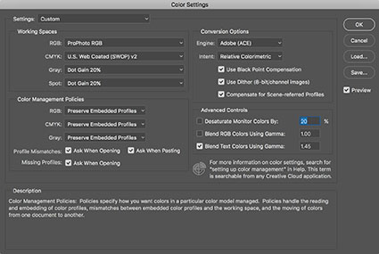
Color Settings
Color Settings Custom RGB option
Creating Synthetic Profiles
You can create synthetic ICC profiles with Photoshop. Go to Edit > Color Settings and making sure More Options is checked go to Working Spaces > RGB > Custom RGB. In the final window that appears, you’ll use three variables to create a synthetic profile; Gamma, White Point, and Primaries.
Gamma affects brightness and contrast. Gamma is the midtone adjustment applied to compensate for nonlinear characteristics of capture and display systems. It’s the slope of the input-output curve. A slope of 1 is linear or with no change between input and output. Values larger than 1 make shadows darker; values less than 1 make shadows lighter. ColorMatch RGB and ProPhoto have gammas of 1.8. sRGB and Adobe RGB (1998) have gammas of 2.2. You can set a value as low as .75 and as high as 3.0.
Gamma is the most useful setting of the three; it’s excellent for making industrial strength adjustments to exposure. It has one variable.
White Point is the color temperature of white produced by combining red, green, and blue primaries at maximum strength. It’s measured in Kelvin degrees Fahrenheit. 5000K is the temperature of daylight (at high noon) and the industry standard viewing light. A higher value is cooler (bluer); a lower value is warmer (yellower).
White Point is useful for gross color adjustment; the results are best fine-tuned with other tools in Photoshop. It has two variables.
Primaries are the chromaticities (hue and saturation) of the red, green, and blue components that define a color space. Each primary is specified by an x and y coordinate. There are nine defaults to choose from including Adobe RGB (1998). If you’d like to start with values from other color spaces (including the other standard editing spaces like sRGB, ColorMatch RGB, Apple RGB, and ProPhoto RGB), using the RGB drop down menu specify a color space first, this sets the starting point, and then pull up to Custom RGB, where you can modify those values.
Primaries is the most complex and difficult to use of the three; it requires a lot of experimentation; it’s capable of making exotic color adjustments that can’t be duplicated with other tools in Photoshop but it’s much harder to predict and control. It has six variables.
To make it easier to preview the results of your explorations with synthetic profiles, discard the profile of the image you are viewing. Go to Edit > Assign Profile > Don’t Color Manage This Document. Photoshop uses the current Color Spaces Working Spaces settings to display files without ICC profiles. If you don’t do this, you’ll have to save a synthetic profile and then take the extra step of applying the profile to see the results, which will slow you down considerably.
When you’re ready to save your synthetic profiles, use Color Settings’ RGB drop down menu and pull up to Save RGB. (Don’t use the Save button on the right side of the Color Settings dialog; instead of saving an ICC profile, this saves all of the Color Settings as a .csf file, useful for syncing multiple Adobe applications.) When you finish creating a synthetic profile click Cancel in the Color Settings dialog; you don’t want synthetic settings to become your default RGB editing space as they are used when creating new files.
If you want to archive or share synthetic profiles, you can copy the profiles out of the folder they’re saved in. (On a Mac, profiles are saved with this path – Library > Color Sync > Profiles.)
To apply a synthetic profile go to Edit > Assign Profile command. You can see before and after appearances by checking the Preview box on and off.
Exploring Your Options
Because using synthetic profiles is so abstract, it’s useful to explore your options by comparing the results of multiple profiles side-by-side. While you’re exploring your options, at any one time, have a minimum of two identical files open in Photoshop so that you can carefully assess the results of different profiles.
Make a number of synthetic profiles based on your standard editing space (My standard editing space is ProPhoto RGB.) with different gamma settings varying in .1 or .2 increments. When you save your synthetic profiles, use a standard naming convention to tell the differences between them, such as SYN ProPhoto G2.2, SYN ProPhoto G2.4, etc.
Once you’ve applied a synthetic profile, should you then convert the file to a standard editing space? You don’t need to. Your synthetic profile uses the standard ICC language and should be accurately read by any software that is ICC compliant. One advantage to keeping it in the synthetic color space is that your file will accurately inform you about its creation. But if it makes you feel better, you won’t pay much of a price if you convert to a standard editing space; the few minor quantization errors associated with such color conversions are almost always invisible to the naked eye.
Fine-Tuning Your Results
While you’ll be able to perform the lion’s share of color adjustment using a synthetic profile, most images will benefit from additional fine-tuning through standard image editing practices in Photoshop.
With just a little experimentation, you’ll find you too can make big changes to your images and pay a small price using synthetic profiles. Using synthetic profiles is color adjustment without editing values; they change no values, but they do change the meaning of those values – and thus their appearance. Don’t believe it? Check your Histogram when you assign a profile. You won’t even see it move! It is kind of unbelievable. Try it. See it with your own eyes. You’ll quickly become a believer too.
Read more on Color Adjustment here.
Learn more in my digital printing and digital photography workshops.
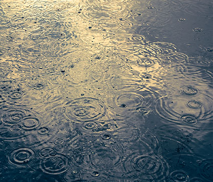
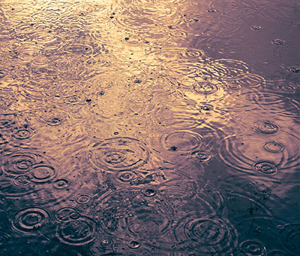
Original Image
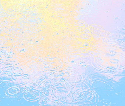
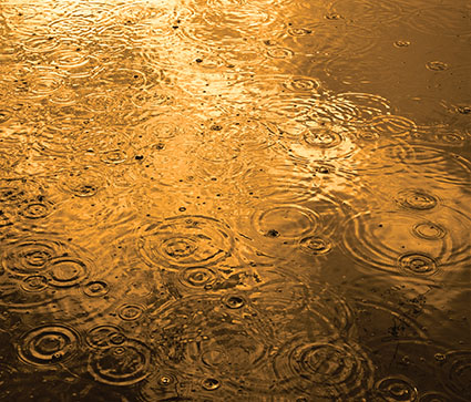
The Color Lookup Pastel8Hues creates very strong color effects.
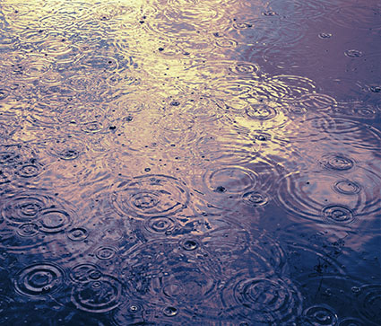
Any Color Lookup adjustment layer can be modified with Blend Modes.
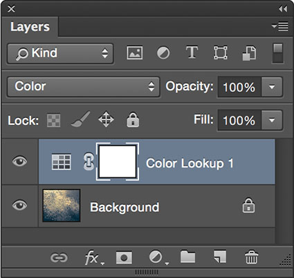
The Color Lookup Adjustment
Originally designed for color grading film and video, Photoshop’s Color Lookup feature offers novel ways to adjust color that will quickly reveal new possibilities in your images. Capable of performing extremely complex calculations extraordinarily efficiently, color lookup tables (LUTs) work by looking up a source color in a table and using the replacement color specified in the grid to transform it for the final destination.
Like Match Color and Gradient Map adjustments (See my last two articles for Digital Photo Pro.) the color effects Color Lookup generates are so complex they are not easy to previsualize. Like anything new, this takes practice. And these are new! Experiment and you’ll find many rich possibilities. Unlike Match Color, Color Lookup is loaded with presets that will allow you to quickly explore many different effects, ones that are far more sophisticated than Gradient Map presets. In this way, using them can be as easy as using many smartphone app effects.
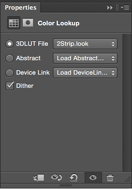
Color Lookup offers three types of LUTs, each with its own drop down menu which contains multiple presets – 3D LUT File (27 presets), Abstract (15 presets), and Device Link (5 presets) for a combined total of 47 presets. While you can only apply one Color Lookup with a single adjustment layer, you can use multiple adjustment layers to successively apply as many Color Lookups as you like. Perhaps not infinite, the possibilities are many.
What is the difference between these three types of LUTs?
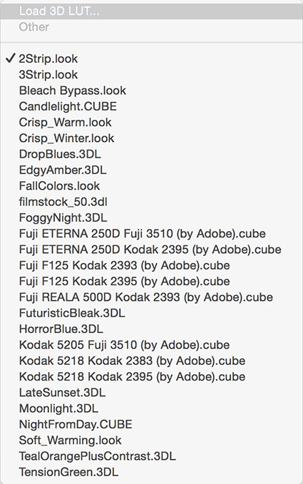
3D LUTs
3D LUT File
Dependent on color space, 3D LUT presets load and export files with 3DL, CUBE, LOOK, and CSP extensions. While Gradient Map adjustments use one channel (the grayscale values of the combined RGB channel), these lookup tables use all three color channels. They do not generate 3D effects as their name might suggest.
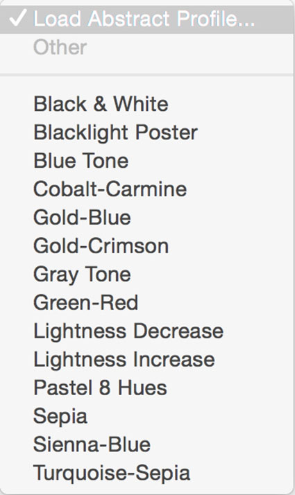
Abstract Profiles
Abstract
Abstract presets load and export ICC profiles. These settings are not color space dependent so they maintain consistent appearances during conversions to alternate color spaces and are favored when the color space of a file is likely to change during a workflow, as it may when moving files across different output devices or to video.
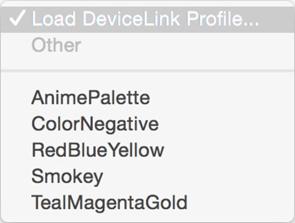
Device Link Profiles
Device Link
Also dependent on color space, this format is smaller and more portable than 3D LUTs.
3D LUT and Device Link presets are color space (sRGB, ColorMatch, Adobe1998, ProPhoto, etc) dependent and are recommended for use in the color space they were created in – all of the RGB presets were designed for use in sRGB. (LAB supports only Abstract presets. CMYK also supports Device Link but not 3D LUT presets.) This won’t stop you from generating impressive color effects other color spaces. You can use many presets with color spaces other than the ones they were intended for, although the visual appearance they generate will be somewhat different. You need to keep this in mind when you’re trying to achieve consistency between different files. Be mindful that if you make a color space conversion with an active Color Lookup adjustment layer, the appearance of the file will most likely change during conversion. (To get around this, you can merge the effect into a layer before making the color space conversion.) Remember this when you create your own Color Lookup presets.
Adjustment Layers offer Blend Modes like Color.
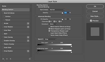
Layer Styles offer Blend If sliders that remove effects from shadows and /or highlights.
Get Even More Control
At first glance, you might be tempted to think that you have limited control over Color Lookup effects. You either like an effect or you don’t. Don’t move on too quickly. Take another look. You actually have lots of control. When you apply a Color Lookup table as an adjustment layer, you can modify the effect by using Opacity and/or Fill (globally reducing strength with a slider), layer masks (locally reducing strength with a brush), Blend If Sliders (removing the effect from shadows and/or highlights with sliders), and blend mode (modifying the ways color adjustments are calculated). Even with all of this control, it’s likely that you’ll want to further refine the effects of a preset with additional color adjustments, using other tools, like Curves and Hue/Saturation.
Make Your Own Presets
You can also generate your own Color Lookup presets. To do this create a color effect you like with any with any combination of adjustments layers, Opacity and Fill, Blend If sliders, blend modes. (Layer masking and transparency will not be included, because alpha channel information in alpha channels is not included in the recipe.) Then go to File: Export: Color Lookup Table, name the file, and click OK. (I recommend the titles you give your presets include the color space you created them in.) These files are stored in Photoshop’s Presets folder or if they’re saved as ICC profiles in your operating systems Profiles folder. You can now use your custom preset at any time on almost any file by making a Color Lookup adjustment layer and choosing your preset. You can share your custom Color Lookups with others by giving them these exported files. Color LUTs created in Photoshop can even be used in other programs such as After Effects, Premiere, SpeedGrade and other applications that use color LUTs.
Using Color Lookup adjustment layers is one way of creating a condensed layer stack but it comes with a price – you won’t be able to adjust or mask individual adjustment layers. If you’d like to do this, as an alternative solution, you can place all of the adjustment layers into a Group and drag and drop the Group from one file into another when needed.
If you want to produce a Color Lookup preset and achieve the greatest consistency in appearance between multiple images you’ll want to use a file that is representative of a majority of the images it will be used on and include a professional color chart like X-Rite’s Color Checker. (This is especially important when processing video.)
Using Photoshop’s Color Lookup you can choose to create color effects as subtle or dramatic as you like. This game-changing color adjustment tool may seem exotic at first because it offers a new way of thinking about and seeing in color. Once you become more familiar with this mindset you’ll truly begin to see with new eyes. Isn’t that what it’s all about?
Read more on Color Adjustment here.
Learn more in my digital printing and digital photography workshops.

Sign up today for my Thursday newsletter.
This issue features HDR techniques and celebrates women in photography.
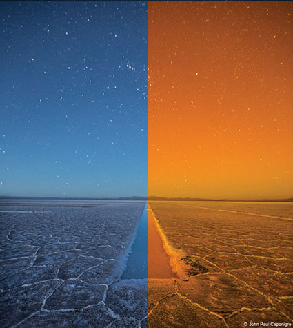
Before and after the Gradient Map
Whether used subtly or dramatically, Photoshop’s Gradient Map color adjustment tool can open up new ways of seeing and working with color for any artist. Photoshop’s Gradient Map assigns new colors to existing brightness values. With it, you can enhance existing colors, transfer colors from one image to another, or create entirely new color relationships. It can be wild!
The Gradient Map
The Gradient Map interface looks difficult to use but with a few pointers you’ll find it surprisingly easy to use. While you can apply a Gradient Map directly to a layer (Images: Adjustments: Gradient Map), I recommend you apply Gradient Maps as adjustment layers (Layer: New Adjustment Layer: Gradient Map), to take advantage of both the greater flexibility and control you’ll gain over the final effect. Once activated, there are a number of default presets you can experiment with but it’s most likely that you will want to create your own. Simply click on an existing gradient in the Properties panel to activate the Gradient Editor. Click New. Click at the bottom of the gradient to add new colors. A pointer will appear, double click it or the Color box to choose a color. You can move the pointer to direct the color into different tonal values (Move left to target darker values and right to target lighter values. Alternately, enter a new number in the Location field.) while the diamonds left and right of it will control how each color fades into surrounding colors. You can add dozens of different pointers/colors, but for most applications I recommend you restrain yourself to as few as possible. You can delete a pointer/color by clicking on it and clicking Delete or by pressing the Delete key. When you create an effect you’d like to use more than once, type a Name and click Save; you can easily store, retrieve, and share these “grd” files.
The color effects you can generate with the Gradient Map are so powerful and so varied you simply must spend a little time experimenting with it to truly understand both how far you can go and how subtle you can get. Consider this kind of visual research time well spent.
After you’re done experimenting, then it’s time to deliver.
Working with the Gradient Map often takes a little finessing. You’re likely to be a little disappointed if you try and get the perfect colors with the Gradient Map alone. You can spend a great deal of time picking and repicking colors until you get it just right. Instead, try working more broadly, getting close to a desired effect and then fine-tuning the results.
Layer Blend Modes give more control

Layer Style removes effects from shadows and/or highlights
Here are the go to tools for fine-tuning the results of Gradient Map adjustment layers. Use the Opacity slider to reduce effects that are too strong. For selective opacity, add a layer mask. Use Blend If sliders (double click on a layer to activate them) to reduce or remove effect from shadows or highlights or both. If transitions created by Blend If sliders aren’t smooth enough, use a luminance mask.
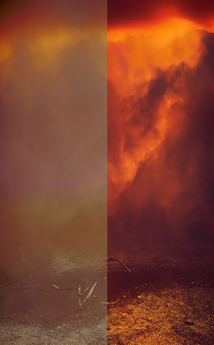
Normal and Hard Light blend modes compared
Blend Modes can be used to add more control over the way colors mix. In particular, focus on the color blend modes (Hue and Color) and the contrast blend modes (Overlay, Soft Light, and Hard Light). Hue restrains the effect to that element of color only. Color restrains the effect to both hue and saturation, removing any effect on luminosity. In order of increasing intensity, Soft Light, Overlay, and Hard Light boost contrast and gradient colors will have a more transparent appearance.
Even with all of this control, it’s likely that you’ll find the best results are most often achieved by using this tool to create an interesting color foundation and then refining it with additional color adjustment tools like Curves and Hue/Saturation.
Once you’ve mastered the interface the real challenge begins – visualizing color possibilities. Pre-visualization can only go so far; instead use software as a tool for visualization. Instead of rushing to a single finished result, I prefer to work on multiple copies of an image to make side-by-side comparisons of a set of variations. The possibilities are seemingly so limitless that you must perform some experiments to find the best solution. If your experiments are both targeted and iterative, then you’ll generate many solutions that are more likely to be optimum.
Here a little color theory can be useful. Use dark colors in shadows and light colors in highlights; otherwise you may posterize or solarize. Use analogous colors (similar color families) to create transitions; transitions between complimentary colors tend to get muddy. Variations on earth tones work well for both realistic and antique effects. Variations on warm colors can add intensity, even fire. Variations on cool colors can generate nocturnal and even aquatic effects.
Remember, you can sample colors from one image and apply them to another. Gradient Map effects are distributed based on lightness values so keep this in mind when selecting and transferring colors.
Black and white conversion plus toning created with Gradient Map
Amazingly, you can even make successful color to black and white conversions with Gradient Maps – just use neutral colors. Again, for naturalistic effects, you’ll want to create progressions that move from dark to light, but the steps and the transitions in between can be varied substantially. Guard against posterization and excessive noise. You can even create black and white toning solutions with the Gradient Map; it’s excellent for split tone effects that target different hues into different tonal values.
Photoshop’s Gradient Map is an exotic color adjustment tool that can be a real game changer. If you truly understand the possibilities this tool opens up you will have learned to see in new ways. What could be more valuable?
Read more on Color Adjustment here.
Learn more in my digital printing and digital photography workshops.
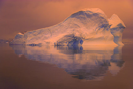
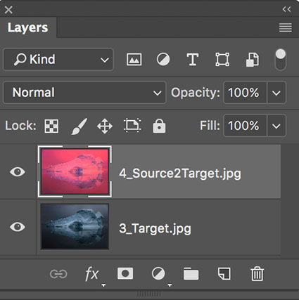
Source
Target
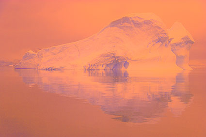
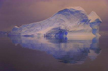
Final Effect
Photoshop’s Match Color
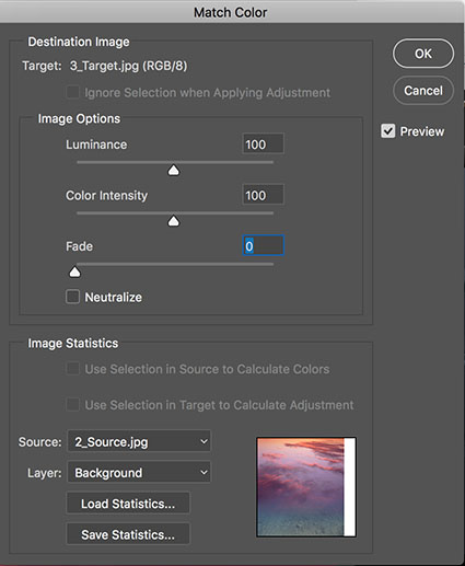
Little explored and capable of opening up whole new frontiers in color adjustment, Photoshop’s Match Color is a tool every user should be aware of – even if it’s only to know what’s possible.
There are three primary reasons to consider using Match Color: one, to match two colors exactly; two, to remove strong color casts; and three, to creatively apply the color in one image to another.
Match Colors Precisely
When a precise color match is critical, for instance when matching the same products in two images, Match Color is hard to beat. And, in terms of easy of use, using it beats placing sample points and moving sliders to make the targets match. You can create statistics from and apply the effect to either an entire image or only a portion of an image using selections.
Remove Strong Color Casts
Match Color does an exceptional job of removing strong color casts. One of the primary reasons it was developed and most common uses for it is to remove the strong color cast in underwater images. It does an amazing job at revealing the complex color relationships below the color cast. Here, you don’t even need a source image. Just check Neutralize. If the effect is too strong you could use the Fade slider, but I recommend you apply the effect to a duplicate layer and use the Opacity slider of the layer or if you want to reduce the effect selectively, use a layer mask. Using this feature on images that don’t contain strong color casts often produces pleasing results too.
Create Complex Color Changes
This is where it really gets interesting. What if you took colors from a candy store and applied them to the sky? What if you took colors from a sunset and applied them to a landscape? What if … I know, I sound like a kid. You’ll feel like a kid when you use Match Color. It seems like anything is possible. When you first view the results, you’ll do a double or triple take. You have to see it to believe it.
The math is complicated, very complicated. The tool’s interface is simple and easy to use. Learning how and when to use it is deliciously challenging. With practice you can develop an intuitive feel for the direction color relationships will move in and start to think predictively when using Match Color, but the final effect it generates is usually so complex you have to see it to believe it.

Normal
Neutralize
Taming The Beast
Match Color samples the colors from one image and applies the resulting statistics to another image; all three elements of color Hue, Saturation, and Luminosity are taken into account in both the source and the target images. To do this a minimum of two files must be open at one time, a source and a target. Once saved, you can load these statistics in the future to any image, as long as it is in RGB. Match Color only works in RGB color mode. Not available as either a non-destructive adjustment layer or a Smart Filter, Match Color must be applied permanently to a layer, so consider applying it to a duplicate or composite merged layer.
You have limited controls over the results. The Neutralize check box; try it, you might like it – a lot. The Luminance slider; be careful of the image’s dynamic range when using it. The Color Intensity slider; in addition to saturation it also control how much variety in hue is generated – higher settings produces more of both. The Fade slider; it’s reduction of the effect is slightly different than applying the full effect to a layer and then reducing its Opacity, but the former cannot be localized so I prefer the latter. One check box, Neutralize, and three sliders give you some controls over the results.
You can either use all the colors in an image or only colors within a selection in a source image to create statistics from; after making a selection in the source image go to the target image and in the Match Color dialog box check Use Selection in Source to Calculate Colors.
One portion of source selected
Another portion of source selected
Alternately, you can modify the calculation by selecting a portion of the target image; after making a selection in the target image, apply Match Color and check Use Selection in Target to Calculate Adjustment. If you’d like to apply that effect to the entire image instead of just a portion of it, instead of applying the effect, check Save Statistics, then press Cancel, and when you reapply Match Color check Load Statistics.
Two sources applied consecutively
You can even apply several statistic sets progressively to the same layer to create still different effects.
Effect layered over original
Layer Blend Modes give more control
Layer Style gives you still more control
You can use the many power of layers to control how the new colors blend with the old. Reduce the layer’s Opacity to restore some of the original color; add a layer mask to do this selectively. Use the layer’s blend mode to control how the new colors mix with the original colors; in particular try the blend modes Color and Hue, which will use the new hues with the original luminosities. Use the layer’s Blend If sliders to remove the effect from shadows and/or highlights; alternately, use a luminosity mask. Applying Match Color to a new layer gives you a safety net (You can always return to the original color.), allows you to easily compare more variations, and gives you more control.
One of the strategies that really makes this technique shine is to first create an interesting color foundation with Match Color and layer options and then refine the colors further with additional color adjustment tools.
Controlling the effect with more any precision is challenging. You can change the colors of either the source or the target images before creating and /or applying the statistics. Use any tool in Photoshop. The question is how? (Here’s one tip. Inverting colors before sampling them often generates interesting results.) Doing this involves a lot of trial and error. Yet, these color experiments can sometimes be profitable. Once in a while, they lead to real breakthroughs. At a bare minimum, they’ll encourage you to think more flexibly about color.
Match Color is an exotic color adjustment tool that can be a real game changer. Try it and you’ll see and think about color in new ways. What could be more exciting?
Read more color adjustment resources here.
Learn more in my digital photography and digital printing workshops.
Do you wish you could improve the quality of the images your lenses deliver after exposure? You can, using software. Adobe’s Lens Corrections feature uses a digital image file’s EXIF metadata about camera and lens to automate cures for standard lens distortions, including geometric distortion, chromatic aberration, and vignetting.
When you’re evaluating print quality, knowing what to look for is almost as important as knowing how to achieve it. Many technical factors contribute to print quality. Here’s a list of things to look for when you’re evaluating print quality – yours and others’.
It’s not that every one of these factors has to be optimal to achieve great print quality. It is that every factor you optimize enhances print quality further.
Well Focused
No Motion Blur
No Sharpening Artifacts
Extended Depth Of Field
Extended Dynamic Range
Appropriate Lightness
Highlight Detail / Separation In Values
Shadow Detail / Separation In Values
Mid-tone Contrast
Gradation
No Posterization
Low Noise
No Noise Reduction Artifacts
Believable Color … or … Color Transformed With Intent
Color Without Artificial Color Casts
Variation In Single Colors
Saturated Color
Appropriate Materials
Appropriate Scale
Appropriate Presentation Materials
Appropriate Contextualization
Appropriate Price
So what’s ‘appropriate’? That all depends on the statement being made. The real question is, “What is the artist trying to do? And how well did they achieve that?” You can successfully break the rules if you break them for a reason.