Simultaneous Contrast

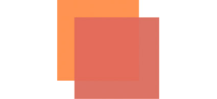
How red is red? That depends in part on its context. We see colors in relationship to other colors in our field of vision. The appearance of any one color is modified by the presence of other colors. (This is a perceptual effect, not a physical effect; while we experience it, we cannot measure it physically.)

Once you identify the elements in play, you can predict the effect. Simultaneous contrast can occur between any one or multiple components of the three elements of color – luminosity, hue, or saturation.

Place dark colors next to light colors and the dark colors will appear darker and the light colors will appear lighter.
Place cool colors next to warm colors and the cool colors will appear cooler while the warm colors will appear warmer. (Additionally, complementary hues increase each other’s saturation.)

Place saturated colors next to less saturated colors and the desaturated colors will appear less saturated while the saturated colors will appear more saturated. (Additionally, the desaturated color will appear to contain a cast of the saturated hue’s complement.)

Want to make a color appear lighter? Make it lighter or make surrounding colors darker or both. Want to make a color appear warmer? Make it warmer or make surrounding colors cooler or both. Want to make a color appear more saturated? Make it more saturated or make surrounding colors less saturated or both.

Contrast (or lack thereof) is the engine that drives color dynamics. To intensify a visual effect, increase the contrast in the appropriate components of color. This effect is intensified between adjacent colors. It is further intensified if one color surrounds another, partially or entirely. (If a color dynamic is particularly intense it may create the visual appearance of a line separating the two fields of color. Op artists often use these effects to create highly dynamic visual effects that appear to pulsate or move.)

Color management doesn’t yet accommodate these kinds of perceptual effects. Standard color correction strategies don’t tend to address them. But you can incorporate them into your color adjustment methods for greater precision and/or expression. All you need to do is take note of them and make appropriate compensations to achieve the result you desire.

Read More

Saturation


One of the most distinctive features of a visual artist’s use of color is their use of saturation.
Many photographers are often asked, “Are you a black and white or color photographer?”  (Curiously other visual artist’s are rarely asked this question.) While many people who ask it don’t mean it to be, it’s a loaded question. There’s often a latent assumption that you can’t do both well. In fact, work with one can strengthen work with another. Moreover,  the question suggests that black and white (and shades of gray) are not colors, when in fact they are very specific colors – neutral colors. And, the question does not address with any specificity how a photographer uses more saturated color. Curiously, this question is rarely asked of painters and filmmakers. A more useful question might be, “How saturated is your palette?”
There are essentially six distinct levels of saturation – neutral, semi-neutral, reduced saturation, fully saturated, highly saturated, and super-saturated.
Read More

Color Analysis


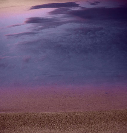
To better see color within an image it can help to abstract it. By de-emphasizing an image’s representational qualities you can more easily direct your attention to the color relationships within it. In short, you can see them better because you’re not distracted by other concerns.
Using Photoshop, there are many ways to modify an image in order to better reveal it’s color structure.

You can blur an image. Blurring an image reduces detail so that you can more easily see the basic composition and the color relationships within it, without getting hung up on the details. (Duplicate the background layer and apply the filter Gaussian Blur.)

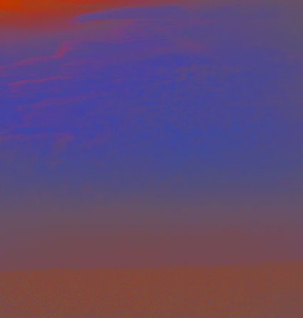
Blur an image substantially and you can reduce an image to a field of color. Compositional elements are significantly downplayed, leaving pure color. (Duplicate the background layer and apply the filter Gaussian Blur with a stronger setting.)

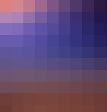
Pixellate an image and you can reduce an image to blocks of color. Composition is eliminated while contrast between colors is more pronounced than in a flat field of color. (Try Filter: Pixellate: Mosaic. This works best for lower resolution files or copies of files.)

Average an image and you can reduce all the colors in an image to one. (Duplicate the Background Layer and apply the filter Average – found under Blur.) This often confirms the dominant color in a composition. Well balanced color photographs containing a variety of hues tend to average towards gray.)
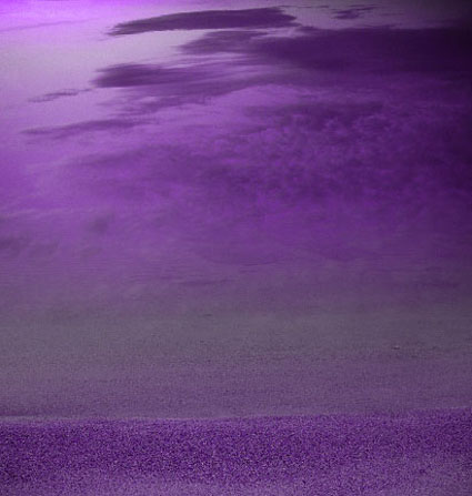
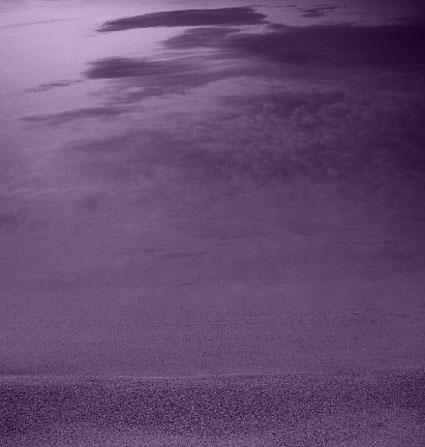
While accents and other important colors can also be used, the dominant color is an excellent choice to further analyze color relationships in an image using Blend Modes. With this technique you can see the variety found in the separate components of color within an image – Luminosity, Saturation, Color, and Hue. (Change the Blend Mode of the averaged layer to the desired color component.)

With a Blend Mode of Hue, all values in an image will be driven to the same hue. This will help you see variety in luminosity and saturation more clearly.

With a Blend Mode of Saturation, all values in an image will be driven to the same saturation. This will help you see variety in luminosity and hue more clearly.

With a Blend Mode of Color, all values in an image will be driven to the same hue and saturation. This will help you see variety in luminosity (the tonal structure) more clearly. (This variant is often the most useful as it is the easiest to interpret. With repeated analysis of many different images, you’re likely to note that images with less variety in hue and saturation (particularly neutral ones) will require more luminosity contrast to have impact. By the same token, images with a great deal of variety in hue and saturation will often appear overly harsh with excessive contrast.)

With a Blend Mode of Luminosity, all values in an image will be driven to the same luminosity. You’ll eliminate contrasts in value which will help you see variety in hue and saturation more clearly.
This type of analysis will better reveal the color relationships at work within an image. You can use the information you’ve gathered by analyzing color relationships in an image not only to better understand it but also to make predictions about how you might improve them.
Increasing contrast in one or more of the elements of color (hue, saturation, luminosity) will increase separation in a composition; conversely, decreasing contrast will create greater unity.
Typically, well structured images use a large amount of contrast in one color component, a medium amount of contrast in a second component, and a small amount of contrast in a third component.
Read more with my color theory ebooks.
View more in my color DVDS.
Learn more in my digital photography and digital printing workshops.

Graphing Color


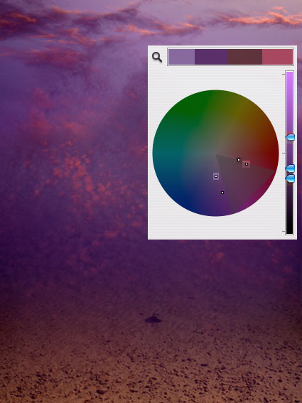
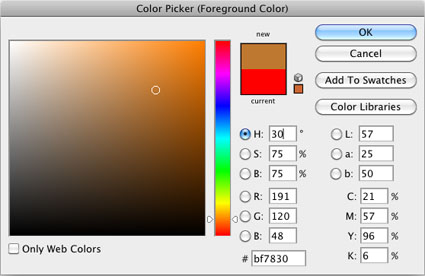
Graphing color can help you identify colors more specifically and understand relationships between color better. One way to graph color is to use the Color Sampler Tool in Photoshop in combination with the Apple color picker.
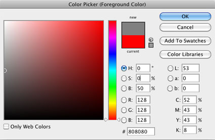
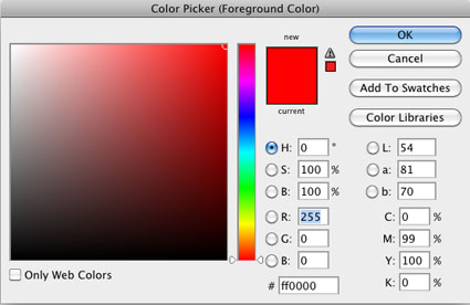
To access the Apple color picker choose Photoshop: General Preferences and change Color Picker from Adobe to Apple and click OK. To see the new the color picker click on Set Foreground Color or Set Background  Color icon in the Tool bar.
Unlike the Adobe color picker, the Apple color picker is a color wheel. Creating and using color wheels to describe color and plot color relationships is a time honored tradition dating back to Leonardo DaVinci. Some of the most famous color wheels were created by Newton, Goethe, and Munsell. The Apple color picker is an additive color wheel where complements are defined as red and cyan, green and magenta, and blue and yellow.
You can sample any color in an image and find its position on the Apple color wheel.  Using the Eyedropper Tool, sample a color in a composition. Then click on the Set Foreground Color icon. The Apple color wheel will appear and a small circle will plot the sampled color. You can make a record of this chart by taking a screenshot of the color wheel (caps lock, Shift, Command, 4). This will create a PDF document on your desktop, which can be opened in Photoshop.
You can combine multiple sample points into a single chart by taking multiple screenshots, opening them in Photoshop, and combining them. Drag the Background layer from one document into another and give it a meaningful title.  Make sure the two layers are registered with one another. Then, mask off everything on the top layer except the circle identifying the color on the color wheel, the triangle identifying it’s luminosity on the slider to the right of the color wheel, and a portion of the color bar above the color wheel. You’ve just graphed the two colors on the Apple color wheel. You can do this with as many colors as you desire.
Once colors have been graphed you will be able to identify a variety of relationships between colors, both colors that exist in a composition and colors that do not.
Read More

The Temperature of Color – Warm or Cool

An essential quality of color is temperature. Temperature can be used to attain a color balance. Temperature can be used to enhance spatial relationships within an image. Temperature can be used to elicit psychological responses within the viewer. Understanding and exploring the dynamics of temperature in color can benefit any visual artist.

There are physical characteristics of color linked to temperature. The color temperature of light (Kelvin degrees) is determined by measuring a black body radiator (an object heated so that it emits light). As the physical temperature of the object rises, color transitions from red (long wavelengths – low energy) to blue (short wavelengths – high energy) through ROYGBIV (red, orange, yellow, green, blue, indigo, violet). When it comes to light sources, physically, blue is warmer than red.

There are also psychological qualities of color linked to temperature. Psychologically, blue is cooler than red. These associative qualities of color with regard to temperature are almost universally accepted. This is due in large part to our physical environment – water is blue, plants are green, sunshine is yellow, fire is red.

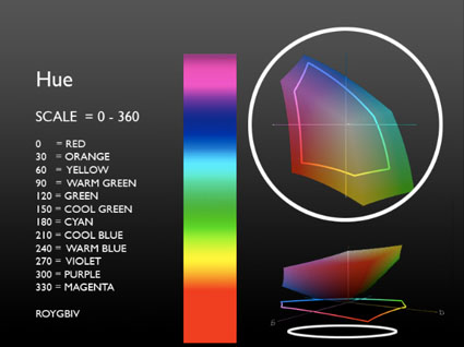
Using the qualities of one sense (touch) to describe the qualities of another (sight) can be a tenuous affair and may lead to ambiguity and confusion. The more precise a language is the more useful it is. The language of HSL (hue, saturation, luminosity) is a very precise language. When using the language of HSL, hue values mark a position measured in degrees on a color wheel. A circle has 360 degrees, so the scale is 0 – 359.

Read More

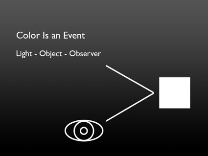
Color Is An Event

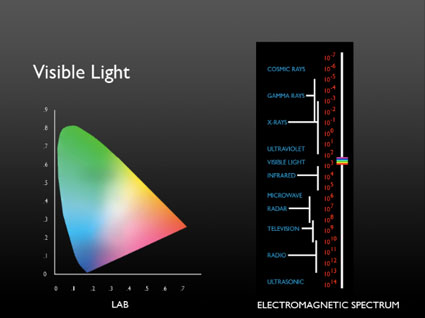
Color doesn’t exist out there. Color is produced inside us. Color is the human response to vibrations in a narrow part of the electromagnetic spectrum.

visiblespectrum

Color is an event. In any color event you need a light source and an observer – and often an object that reflects the light perceived. There is no color without an observer – just energetic vibrations.

colorisanevent

Our perception of color is complex; part physical, part biological, part psychological. Understanding more about our different responses to color and how they interact helps visual artists be more visually sensitive observers and more effective communicators.

Read more Color Theory.
Learn more in my digital photography and digital printing workshops.

Identifying 3 Types of Color

There are essentially three kinds of color.

Antarctica_2009-LXXIX
Ideal
Ideal color (often thought of as accurate color) is produced when the color of objects is unmodified by temporal or atmospheric effects or enhancement. Forensics and product photographers favor this type of color.

Antarctica_2009-LXV
Ambient
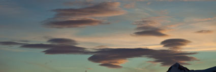
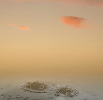
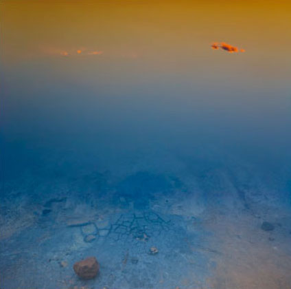
Ambient color is produced when the color of objects is modified by time of day or atmospheric effects, like dust or fog. Landscape photographers often favor this type of color.

MosesPremonition_1998_5
Synthetic
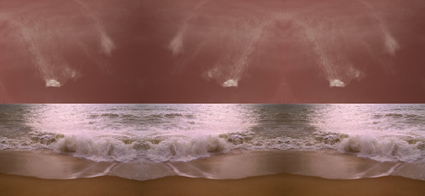
Synthetic color is produced when the color of objects is transformed from its original color to another color. You can produce synthetic color before photographic color or afterward with digital enhancement. Graphic artists often favor this type of color.

It’s useful to distinguish between these three types of color. Doing this provides insights into how (what tools to use and how to use them) to adjust color in your images. It also provides insights into your color preferences and visual voice.

Read more Color Theory.
Learn more in my digital photography and digital printing workshops.

Indentifying the 3 Elements of Color

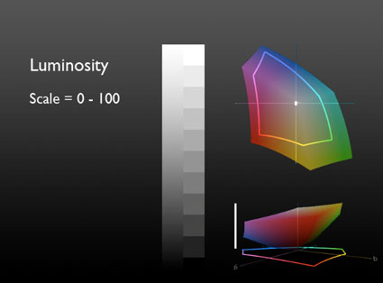
Color has 3 elements – luminosity, hue, and saturation. All colors can be described as some combination of these three values. While we see all three elements simultaneously in a single color, learning to distinguish these three elements from one another is an important perceptual skill.

luminosity
Luminosity, the light and dark of color, can be describe on a scale of 0-100. 0 is pure black. 100 is pure white. (It’s the zone system’s 0-10 times 10.)

hue
Hue, the color temperature of color, can be described on a scale of 0-360. (There are 360 degrees in a circle. Every 30 degrees transitions into a new family of color – i.e. 0 is red, 30 is orange, 60 is yellow, etc.)

saturation
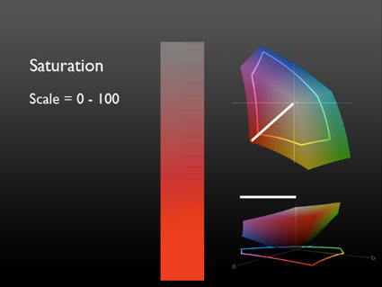
Saturation, the degree of neutrality of color, can be described on a scale of 0-100. 0 is absolutely neutral. 100 is maximum saturation.

LHS (luminosity, hue, saturation) is an excellent language for describing color perceptually (though not necessarily the best for editing and printing). Instead of memorizing RGB values for all the colors in all the standard color spaces, or CMYK values for all devices, or a Pantone swatchbook, you can simply observe color and translate that into 3 values.

LHS is an easy language to learn. Luminosity and Saturation are described on a 0-100 scale, essentially a 1-10 scale with more granularity. Easy. Learning numerical values for Hue is more challenging, but if you memorize a few values you can easily figure out the others. Think of the color wheel as a clock. 0 degrees, red, starts at 3 o’clock. Count back 1 hour, 2 o’clock, to the next color, orange, or 30 degrees. Keep counting back in 1 hour increments to the next color, (i.e. 1 o’clock or 60 degrees is yellow). (An easy mnemonic for remembering the progression of hues is ROYGBIV – red, orange, yellow, green, blue, indigo, violet. You’ll need twelve words to make it all the way around the clock – red, orange, yellow, warm green, green, cool green, cyan, blue, warm blue, purple, violet, magenta.)

Consider LHS a ‘zone system’ for color. It’s a simple sophisticated language that can be used to describe color with greater clarity. You’ll find learning it will lead to better communication. Once you learn it, you’ll be able to communicate more precisely with others who know it – you can even teach it to others quickly.

You’ll also find that once you learn the language of LHS, you’ll see color more clearly, remember it better, understand more about how colors work together, and find ways to adjust colors to reproduce them more accurately or enhance their capacity for expression.
Learning LHS is time well spent.

Exercise
Identify colors with LHS numbers.
Here are three examples.
50-0-0
50/0/0
100-0-100
100/0/100
30:75:75
50/30/50
Now, call out numbers for more of the colors you see.
Make this a habit and you’ll develop razor sharp color perception.

Read more Color Theory.
Learn more in my digital photography and digital printing workshops.

Developing Your Sensitivity to Gradation

reflection_saltlake

The engine that drives color dynamics, contrast, is a measure of the difference between colors. Contrast can be measured by both the amount and kind of difference between colors.

You can discuss contrast in terms of amount. There can be a lot or a little. You can move between two very different colors (i.e. from black to white) or two similar colors (i.e. from dark gray to light gray).

You can discuss contrast in terms of how transitions between colors are made. There can be many (fine) or few (coarse) steps in-between colors. (Having many steps in between contrasting values is an essential criterion for continuous-tone imagery.)

You can discuss contrast in terms of how transitions progress. The steps in between can be made in a regular (even) or irregular (uneven) manner.

If contrast brings variety and energy, ask yourself what kind of energy you seek. Just as each color often elicits a set of associations, so to does each type of contrast.

High contrast images are often thought of as dramatic, while low contrast images are often thought of as quiet. Images, where transitions are made with many steps, are considered smooth, while those with only a few are considered abrupt. When gradations transition evenly they seem calm, graceful, and can be navigated quickly, while when they transition unevenly they seem dynamic, syncopated, and take more time to navigate. There are many subtle distinctions that can be made within these broad generalizations. This is an area that rewards continued exploration.

Sharpen your eye, by developing the ability to identify both the amount and quality of contrast between colors. You’ll find this to be an extremely valuable skill. You’ll increase your sensitivity to color, expand the range of color choices available to you, and add strategies for meeting color challenges. Color will become more intense and pleasurable for you.

intervals_1hue_variL

Luminosity intervals of one hue. Hues achieve maximum saturation at specific luminosities.

intervals_1H_variS

Saturation intervals of one hue – luminosity and hue stable. Achievable only for mid-level luminosities.

intervals_variH_maxS

Hue intervals – maximum saturation, luminosity shifts. Hues achieve maximum saturation at different luminosities.

intervals_variH_1L

Hue intervals – luminosity stable, saturation shifts.

intervals_compsthruS

Hue intervals between two complementary hues passing through the color wheel.

intervals_compsthruH

Hue intervals between two complementary hues passing around the color wheel.

gradation_exercise

Try These Exercises.
1            Create a set of equal luminosity intervals of one hue.
Optionally, repeat for all hues – ROYGBIV.

2            As above, create equal intervals of hue.
Optionally, repeat for all hues – ROYGBIV.
Optionally, repeat for all hues at different luminosity levels.

3            As above, create equal intervals of saturation.
Optionally, repeat for all hues – ROYGBIV.
Optionally, repeat for all hues at different luminosity levels.

4            Match the intervals (luminosity, hue, and saturation) between two color progressions.

Because it’s difficult to separate other forms of image content from color, color exercises are best performed abstractly. While it’s useful to check numerical values for colors and color relationships, because these exercises are perceptual (often incorporating physiological and psychological responses that are not physically measurable), determine your answers visually. Train and trust your eye.

Read more Color Theory.
Learn more in my digital photography and digital printing workshops.

Creating the Illusion of Transparency & Translucency

reflection_iceland

Transparent colors contain a rich clarity that makes them seem charged with light. Incorporating the effect of transparency into your images can produce a luminous impression, even though (typically) the media your images are reproduced on contains no light
While the true effect of transparency cannot be produced without the use of transparent materials, the visual impression of transparency can be produced.

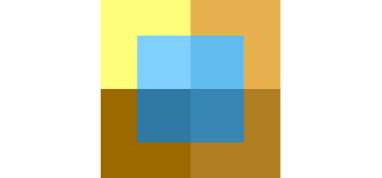
The impression of transparency can be achieved when two sets of color are joined by a third that is perfectly balanced between them. Split the difference between the luminosity, hue, and saturation of the two to arrive at the third.

You can vary the spatial placement of the third color set by making it more similar to one set than another.
Akin to transparency, translucency can also be simulated, by skewing the perfect balance of transparency towards another color (typically a neutral color). Additionally, subtle shifts in luminosity and reductions in contrast may make the effect even more convincing.

Often called color balancing, standard photographic color correction attempts to remove color casts. With a color cast an image seems veiled by color. Removing a color cast makes an image seem clearer, more saturated, and more three-dimensional.  Achieving the effect of transparency will too.

Many color strategies employ optical illusions to create or intensify a visual impression. Once you identify and understand these illusions and the color theory behind them, you can put them to work for you too. In addition to enhancing existing color relationships, you can create new ones.

Careful handling of color can enhance the impression of transparency or translucency.

1_transparency

Three colors are selected to create the impression of transparency. The l, h, and s values of the middle color are placed close to the midpoint between the values of the two outside colors

2_reposition

Changing hue towards one color shifts spatial orientation.

3_translucent

Changing luminosity shifts spatial orientation and creates effect of translucency.

Try this Exercise.
Choose three colors and orient them so that the middle color appears to be transparent. Ideally, select a middle color that produces an additional optical illusion where each total shape (1+2 and 2+3) can be seen as lying either on top or below.

Because it’s difficult to separate other forms of image content from color, color exercises are best performed abstractly. While it’s useful to check numerical values for colors and color relationships, because these exercises are perceptual (often incorporating physiological and psychological responses that are not physically measurable), determine your answers visually. Train and trust your eye.

Read more Color Theory.
Learn more in my digital photography and digital printing workshops.