Can color accuracy be increased? Yes. In many ways. Targets like gray cards and color checkers can help to a limited degree; they’re useful in idealized lighting situations (5000K) but not others (the gray card isn’t gray in the ‘golden hours’ – it’s golden). Add ambient light readings (amount, temperature, spectral distribution) for more precision. Written observations on site about colors and color relationships can help too, if the language used to describe color is precise. (I recommend LHS.) And, onsite verification and adjustment; compare the image made with the subject at the time of capture.
Find out more in my downloads , DVDs, and workshops.
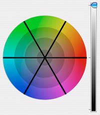
A precise language for color (LHS)(Luminosity-Hue-Saturation) can increase not only the precision of color communication but also color observations. There are too many flavors of RGB and CMYK. Lab takes too much calculation. But LSH is a great language conceptually (and you see it in the interfaces of Lightroom and Photoshop). Luminosity and Saturation are both specified on a scale of 1-100. On a scale of 1-10 (10 high) how light or saturated is a given color? Now multiply by 10. Simple. Hue is more challenging because it’s plotted as a color wheel or circle with 360 degrees. 0 is cherry red. Add 30 degrees to the next color family (30 is orange, 60 is yellow, 90 is yellow green, 180 is cyan, etc). Learn this one variable and you’ve got a new language for color which is precise and simple enough to use. (Or you can memorize all the numbers in the Pantone swatchbook.) You can quickly learn to specify these numbers within plus or minus 10%. That’s a lot more accurate than linguistic observations. What color is mauve? How green is seafoam? You’ll also find that better language leads to better perception. Learn this language and you’ll begin to see color more precisely.
Want proof? The color above is 50/0/100 in LHS.
Now go mix that color in Photoshop.
Enter the values into the Color Picker in the HSB field.
Find out more in my downloads , DVDs, and workshops.
A lot of photographers set an objective to match color the way they remember it. But how reliable is their color memory? Not very.
Try this. Look at this color. Then hide it. Mix it in Photoshop. Then compare your results with the original. Were you too light or dark, warm or cool, saturated or desaturated? Do this with 50 different colors and you’ll start to be able to identify consistent errors, which indicates your color tendencies and preferences.
Find out more in my downloads , DVDs, and workshops.
See the results my workshop students generated this week. Read More
Photographers are often not introduced to the same color theory painters are. At best, color theory is a matter of identifying complements to produce neutrality or color balance. But there are few strategies presented for conceptualizing color relationships in a photographic curriculum, while there are many for painters. In part, this is because painters could change color relationships so easily. The photographer couldn’t – until Photoshop. Now, the language and concepts of other disciplines becomes very useful to photographers. This video give you a taste.
But, be careful of one thing. Painters define complementary colors based on mixing pigments, which contain impurities. They use Red/Green, Yellow/Purple, Blue/Orange. True optical complements are found in photography (light without impurities). Use Red/Cyan, Green/Magenta, and Blue/Yellow instead. You can find confirmation of this by studying retinal after images. Stare at a color for 20 seconds. Then look to a neutral ground. The color residue you see will be the optical complement of the color you stared at. Learn more about color in my DVDs. Learn more about color in my workshop The Power of Color.
Color theory can help describe what is perceived more precisely. It offers a language that is shared and reasonably precise. Color theory can help make perception more precise. Language encodes thought and a more precise and nuanced language can lead to more sensitive perception. Color theory can help analyze what makes some color relationships particularly successful and what makes others less successful. It illuminates the dynamic interactions between the elements of color, which can be used to guide decisions in selecting and adjusting color relationships.
Color theory is best used to inform color choices rather than to make them. Theory lays a foundation for exploration (guiding inquiry toward areas with greater potential and away from areas with less potential). It is not a substitute for discovery. Jazz musicians Keith Jarrett and Theolonius Monk mastered music theory, but even they were surprised by their most original compositions; their compositions were informed and empowered by theory but not determined by it. Theory is the sum of what we know, but it does not contain what we do not yet know. It can prime conditions for a breakthrough, but it cannot make one. It can be used to empower a unique or authentic sensibility, but it is not a substitute for one. Find out more in the current issue of Digital Photo Pro. Find out more in my color theory ebooks.
There are many types of black and white images. Here are six.
1 Neutral
2 Monochrome (uniformly warm or cool toned)
3 Duochrome (split-toned – i.e. warm highlights cool shadows)
4 Polychrome (tinted – i.e. handcolored)
5 Full Color – neutral subject
6 Full Color – black, gray, and/or white subject
They’re all black and white images, but they’re very different types of black and white images and the differences are important.
This is just a taste of the unique perspective (born of traditional training in both painting and photography) that you’ll find in my work, on my website, on my DVD, and in my workshops. Get my free download here. Find out more about black and white in my DVD Black & White Mastery. Find out more about black and white in my Workshop Black & White Mastery.
Special discounts are available until January.