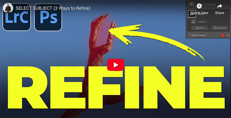
3 Ways To Refine Adobe’s Select Subject Masking Results
.
Matt Kloskowski demonstrates 3 ways to refine the Select Subject masking that we get in Lightroom and Photoshop Camera Raw.
.

.
The new Photoshop 2023 non ai features are easy to overlook – but really useful!
00:00 Intro
00:20 Adjustment Presets
02:12 Making your own Adjustment Presets
04:33 Color grade with new gradients
06:15 Add point of light
06:56 New Gradients on Masks to blend layers
08:04 Remove tool in Photoshop
08:54 Contextual menu bar
Find out more from Colin Smith at Photoshop Cafe.
Learn more in my digital photography and digital printing workshops.

.


.
Generative ai is now inside Photoshop. Instantly retouching or replacing anything inside Photoshop. Adobe Firefly, generative AI is now in Photoshop. Colin Smith shows you how to extend images, replace images and generate art within Photoshop 2023.
00:00 Intro on Generative ai in Photoshop
00:09 Extend a photograph with ai
00:49 Replace a Dress with a shirt
01:10 How to get Firefly in Photoshop now
01:46 Replace a background and replace an object
03:09 Advanced replacement of clothing
04:54 Generative ai Tips
05:27 Generating objects out of nothing
05:52 Duplicating dogs
06:45 How to place an object on a surface
07:05 Where do the images come from? How does ai deep learning work
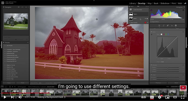
“Finally, we get curves in masks in Lightroom. Learn why this is important. Colin Smith teaches you how to use Curves in masks to target tones and take absolute control over color grading.”
00:00 Intro
00:21 Create Mask
00:45 5 adjustment zones
01:03 Adjust the tones
01:48 Making a Background mask
02:27 Adjusting Foreground with recovery and Curves
03:33 Curves Color Mode
04:10 Understanding Color Channels
06:08 adding color to tonal regions
06:48 Adjusting the color on the Background
08:010 Adjusting the Intensity of the adjustment