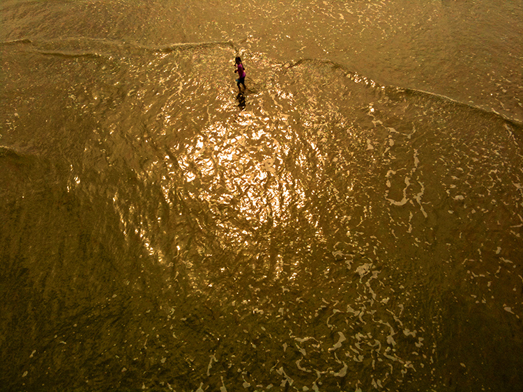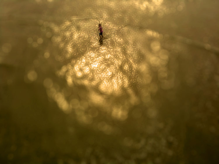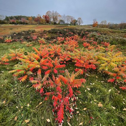
original

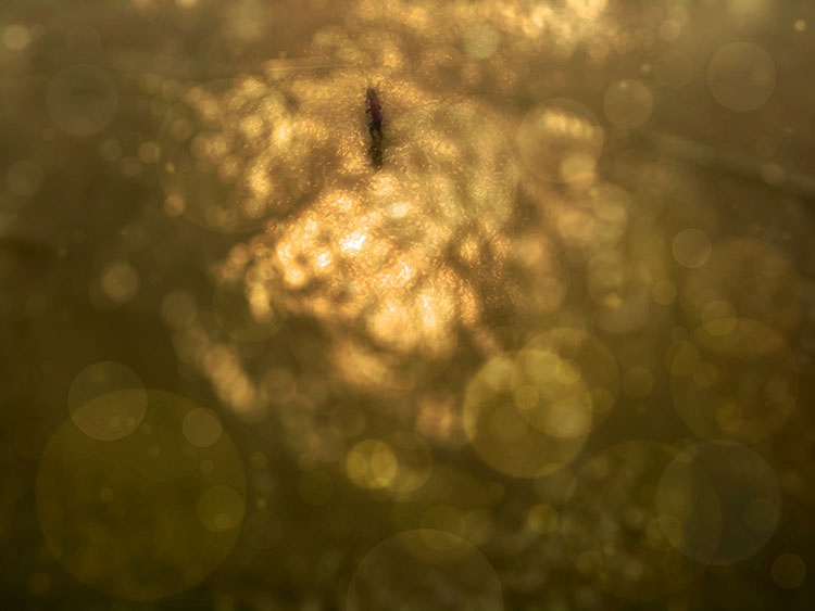
background color adjusted
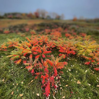
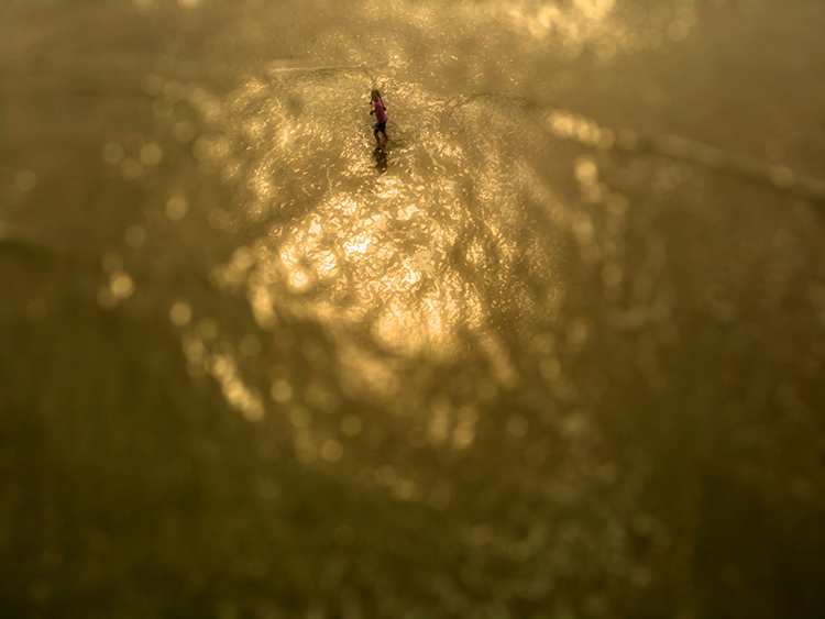
background color adjusted plus detail blurred
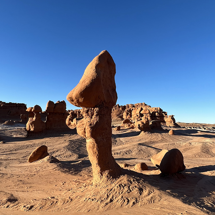
The principles of atmospheric perspective can be used to enhance the illusion depth in two-dimensional images. The three elements of color each encode space. Some colors rise forward – light, warm, saturated. Some colors recede – dark, cool, desaturated. When applied strategically and selectively, they can produce powerful visual effects, making your images appear even more realistic.
You can combine these tendencies (They’re not absolute rules and can all be reversed in the right contexts.) with selective blur to make the illusion of space in your images even more powerfully felt.
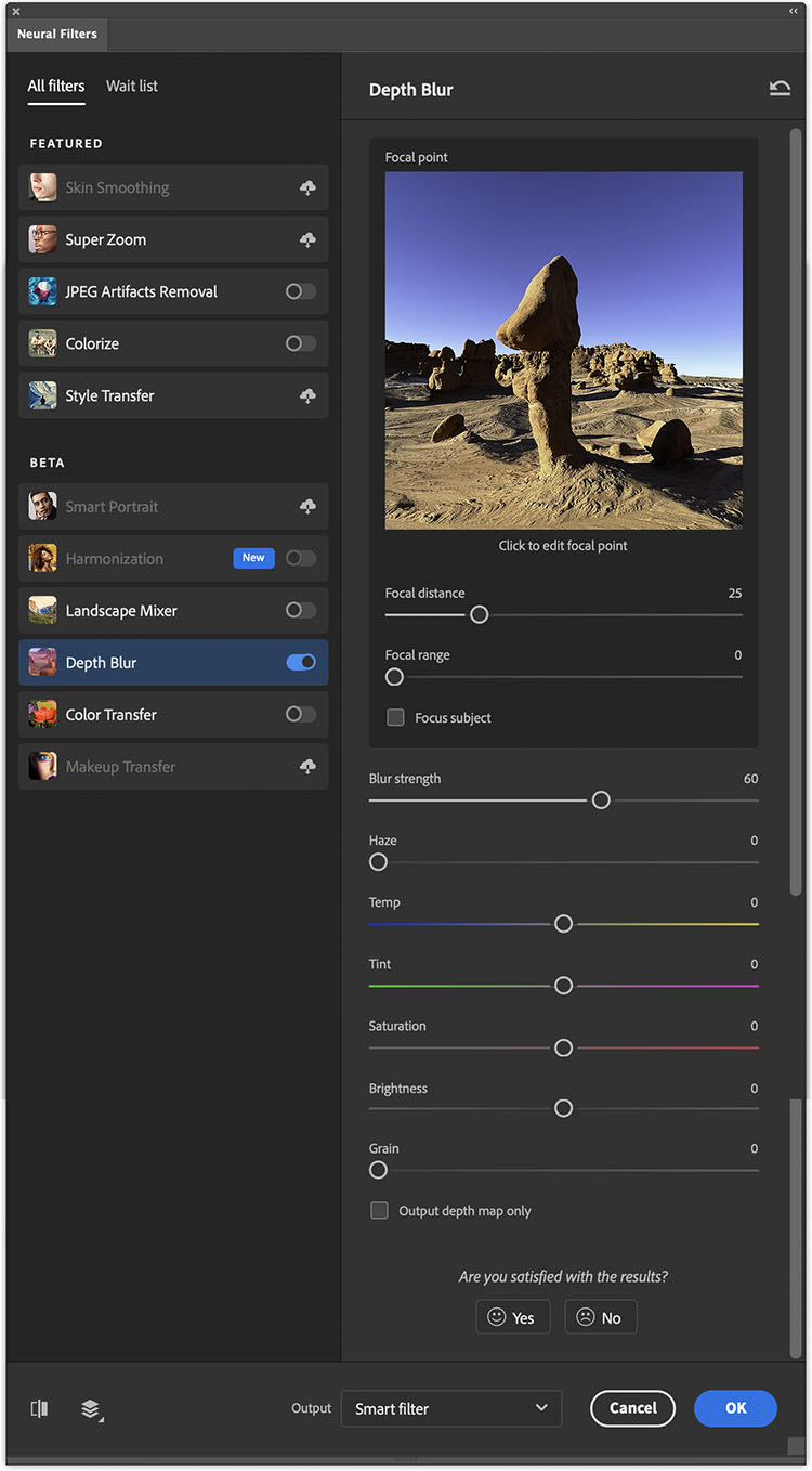
Photoshop’s Depth Blur neural filter offers sliders to make it quick and easy to make these kinds of color adjustments and make blurring effects more powerfully felt.