How To Make Your Images More Expressive With Adobe’s Color Grading
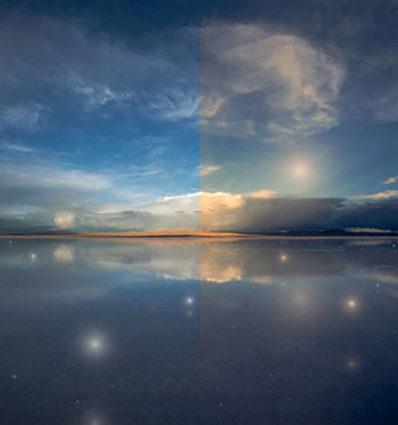
There was a time when color crosses were thought of as poor form, as so many were struggling to remove color casts consistently and accurately while managing the inaccuracies inherent in analog color photographic media. When you saw these kinds of effects, it was hard to ascertain whether the artist was not in control of their craft or insensitive to color or whether they deliberately deviated from the norm. But over time color effects like these have become celebrated both because their differences catch the eye, standing out amid a sea of images, and for their expressive capabilities. What used to require time-consuming chemical processing became quicker and easier digitally. Now there’s a new tool that makes it even easier and allows you to make these kinds of color choices more intuitively - Color Grading.
What Is It
Color Grading is the new Split Toning in Adobe Lightroom’s Develop and Photoshop’s Camera Raw processors. Color Grading offers major improvements including global, control, midtone control, blending sliders, luminance sliders, and the addition of color wheels for a more intuitive interface.
It’s Backwardly Compatible
Don’t panic. All of the Split Toning adjustments you’ve made with previous versions will be compatible with this improved tool if you choose to update files processed with older versions. The sliders will automatically be set new settings that generate the same results. All new controls (midtone, global, luminance) will be set to zero. Blending will be set to 100. You can also make the new tool behave like the old tool by setting Blending to 100 and moving only the hue and saturation of shadows and highlights.
How To Use It
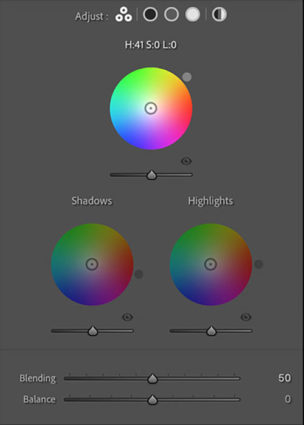
Accessed by clicking the five circles to the right of word Adjust at the top of the panel, you can choose the way you view the Color Grading tool. It’s likely you’ll spend a majority of your time in the first panel (3-Way), which condenses into one panel the next three panels (Shadows, Midtones, Highlights). The larger view of these separate panels offers only one additional feature, the ability to use the Custom Colors swatches to apply preselected colors or sample colors within an image. The fifth and final panel Global adds color to all values equally, for finishing touches rather than the grand effect.
Color Wheels
The most eye-catching part of the new interface may present the biggest learning curve for those who have not used color wheels before but once you try it a few times you’ll find it’s incredibly intuitive.
Move the circle from the center of the color wheel towards the color you want to add, increasing saturation the further away from the center you go, and you’ll see the Hue and Saturation sliders move as you do. Rather than rendering them useless, they become fine control. The second circle on the edge of the wheel moves Hue only and is redundant but perhaps more intuitive to use. The Luminance slider affects brightness for the tonal range you’ve selected, but you’ve got to ask yourself why you wouldn’t use the more precise Tone sliders in the Basic panel. The Luminance slider is fine for some occasions, (It’s great for quickly lifting blacks or lowering whites so they’ll show color effects in ways that pure black and pure whites will not.) but don’t trade convenience for exceptional results.
Balance & Blending
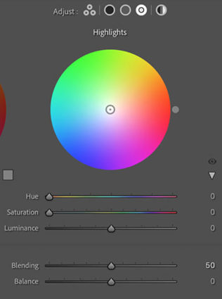
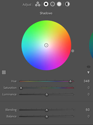
The Balance and Blending sliders both control how the color you add fades into surrounding luminance values. What’s the difference? Balance places the middle of the transition while Blending affects how short or long it is. Blending sets whether the transition is short (Set low it affects fewer surrounding values thought the transitions it makes are still smooth.) or long (Set to 100 it’s capable of affecting all values but not equally.) Be careful setting both Balance and Blending high; you can create curious color cross-over effects.
You’ll find that the Blending setting will affect the saturation of your color choice significantly. A higher Blending setting with less saturated color allows more of the image to be affected less intensely. A lower Blending setting with a more saturated color affects less of the image more strongly.
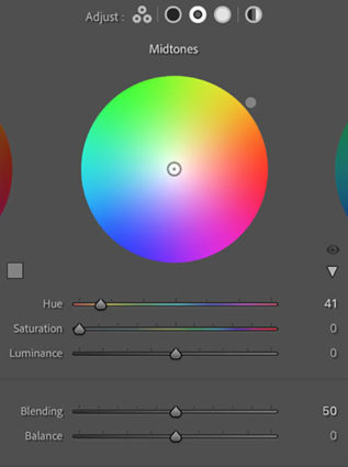
Midtone Control
One of the game-changing features of Color Grading is the ability to add a third color into the midtones, one that is different from the color added into the shadows and different from the color added into the highlights.
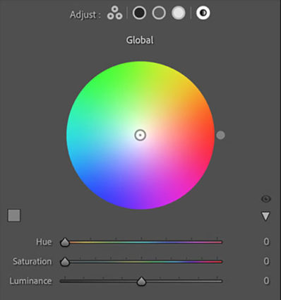
Global Control
You might think it strange to add Global Control to a tool designed to affect select levels of luminosity, but once you try it you’ll find it very useful, often as your last stop in this panel. The addition of an overall color effect frequently helps unify the disparate effects added into shadows, midtones, and/or highlights.
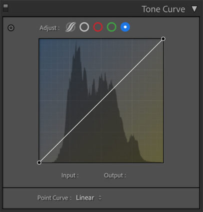
Curves
Color Grading’s interface is much more intuitive and direct than Tone Curve’s. Nevertheless, with a little more work, you can get very similar and even identical effects to Color Grading by using Tone Curve’s Red, Green, and Blue Point Curve feature, which allows you to add color into shadows, midtones, and highlights and control the blend of these effects into one another. I tend to use the Curve for its precision and often further refine Color Grading effects with it; the two are not mutually exclusive. But, you can get even stronger effects with Tone Curve than you can with Color Grading. So if you find yourself using these kinds of Color Grading effects frequently, you owe it to yourself to also see what you can also do with the Tone Curve panel.
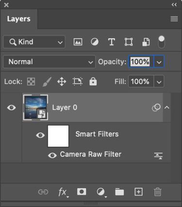
Use Photoshop's smart filters to apply Raw adjustments locally
Apply It Locally
Color Grading is a global effect, that is it will affect all shadows, midtones, and highlights equally – unless you apply it as a Camera Raw smart filter in Photoshop. If you do this, you can mask the Color Grading effect to apply it to any portion of an image in any percentage you choose and away from other portions.
Color Strategies
Before you apply Color Grading make your Basic adjustments first, setting black and white points, brightness, midtone contrast and white balance. How you set these things will change the subsequent settings you use in Color Grading. There are always exceptions but, usually, you’ll want to clear any color casts as a more neutral base will show Color Grading effects with fewer color influences and you can do more with less. Black and white images show Color Grading effects most quickly and even a tiny bit of color can produce significant differences.
Here are five strategies for applying Color Grading.


Wick Beavers
01.03.2021 at 16:10I was wondering…
Thanks, JP. This has been a very valuable lesson for me.
Best,
Wick
Dave Trout
02.03.2021 at 18:28Hi, just a quick comment on your new web styling: Please consider using something darker than #545454 for your main text color. One of my real pet pieves is websites that use light gray colors for text which makes it MUCH harder to read (especially on a properly calibrated monitor which will have reduced contrast to start with).
FWIW, Dave
johnpaulcaponigro
08.03.2021 at 17:34I agree.
David Gibb
03.03.2021 at 17:08Thank you for sharing this, John Paul. I attended a workshop in Cushing many years ago and have enjoyed it and subsequent issues of Insights ever since.